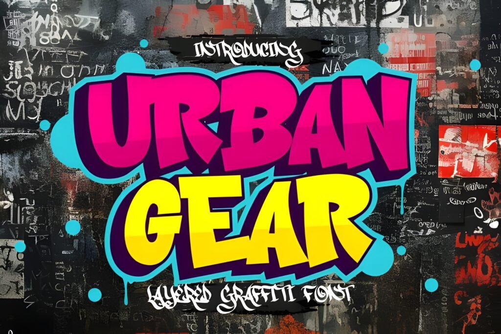
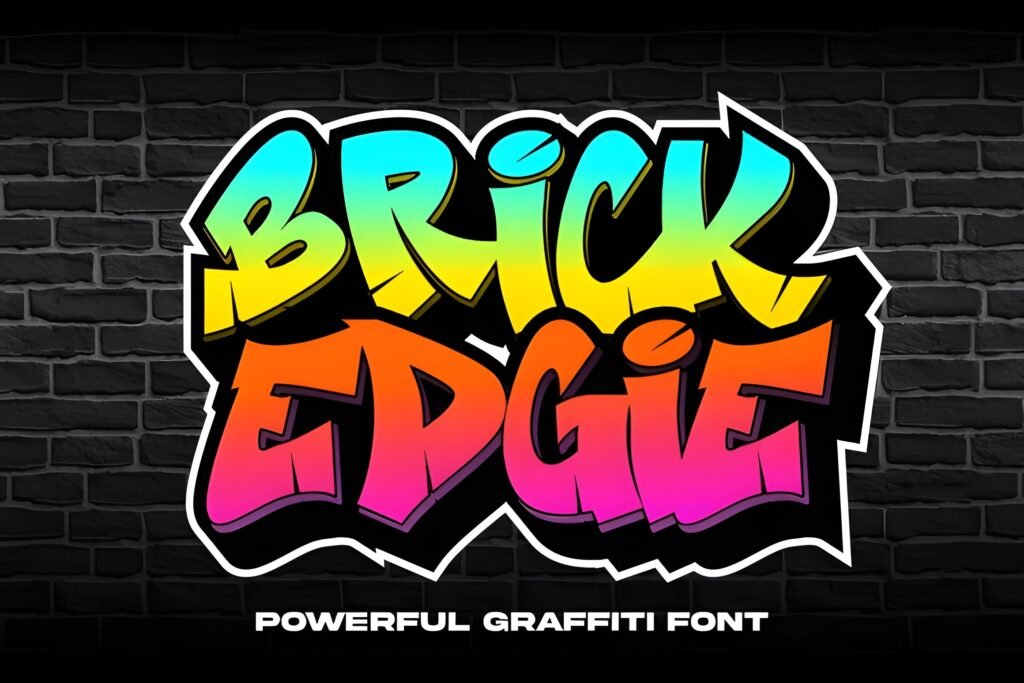
Laskar is a modern graffiti font that channels the energy and attitude of urban street art. Characterized by bold strokes and confident curves, it offers a dynamic and edgy style that suggests movement and personality. This font is tailored for designs that aim to evoke contemporary street culture, making it a strong choice for projects needing a distinctive urban flair.
Disclosure: This post contains an affiliate link. We may earn a commission at no extra cost to you.
What Makes Laskar Font Distinctive?
The letterforms of Laskar present a sleek, stylized edge reminiscent of graffiti lettering, with a sense of rhythm and flow. Its boldness and confident shapes suggest it works well at larger sizes where its details and energy can be fully appreciated. The font’s style implies suitability for expressive, statement-making text rather than subtle or highly legible body copy.
Best Uses for Laskar Font
Laskar is particularly suited for posters, logos, streetwear branding, album covers, and digital graphics related to hip-hop events, skate culture, or edgy fashion projects. It can effectively convey a youthful, rebellious spirit or urban authenticity in visual communications.
How to Pair Laskar Font
To complement Laskar’s bold and dynamic style, pair it with clean, neutral sans-serif fonts used for body text or subheads to provide contrast and readability. For example, use Laskar for headlines or logos, combined with a simple sans-serif like Helvetica or Open Sans for subheadings and body copy. This hierarchy helps maintain visual balance while emphasizing Laskar’s urban energy.
Practical Design Tips
Use ample whitespace around Laskar to let its bold letterforms stand out without visual clutter. Employ it at larger scales for headlines or branding elements to maximize impact. When combining with other fonts, choose restrained, geometric sans-serifs to avoid competing with Laskar’s expressive curves. Consider layouts with strong vertical or diagonal lines to echo the font’s dynamic movement. Avoid using it for dense paragraphs or small text where legibility might suffer.
Frequently Asked Questions
Is Laskar suitable for body text in print or digital formats?
Given its bold and stylized graffiti-inspired letterforms, Laskar is likely best reserved for headlines or display use rather than extended body text, where legibility and reading comfort are priorities.
Can Laskar be used effectively in logo design?
Yes, its distinctive urban vibe and confident strokes make it a strong candidate for logos that want to convey street culture or edgy branding, especially in fashion, music, or lifestyle sectors.
What kind of projects benefit most from using Laskar?
Projects related to hip-hop events, skate culture, streetwear branding, or album covers that require a modern graffiti aesthetic will benefit most from this font’s energetic and urban style.