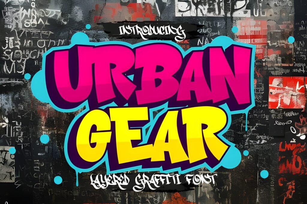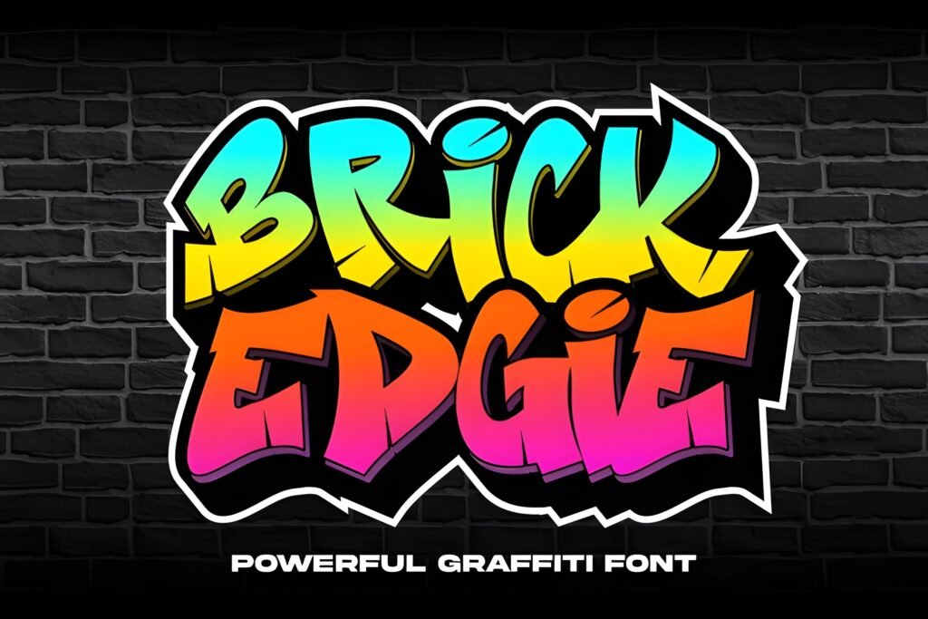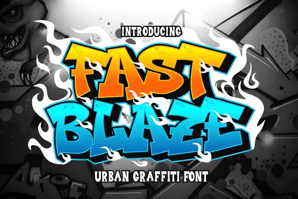

King Graffiti is a display typeface that embodies the raw energy of street art through bold outlines and a graffiti-inspired aesthetic. Its characters evoke the look of spray-painted letters on urban surfaces, suggesting a design that thrives on attitude and visual impact rather than subtlety.
Disclosure: This post contains an affiliate link. We may earn a commission at no extra cost to you.
What Makes King Font Distinctive?
This font features strong, outlined letterforms that resemble hand-sprayed graffiti, giving it a distinctive urban edge. The style suggests a dynamic, rebellious voice suitable for designs that need to stand out with a streetwise personality. The overall impression is one of boldness and immediacy, making it less suited for body text and more for attention-grabbing headlines or graphic statements.
Best Uses for King Font
King Graffiti works well for projects that want to channel urban culture or underground vibes, such as posters, streetwear branding, album covers, or digital art pieces that benefit from a loud, expressive typographic voice. It is particularly effective where the goal is to convey energy and defiance, or to celebrate graffiti and street style visually.
How to Pair King Font
To balance King Graffiti’s bold and outlined style, pair it with clean, minimal sans-serif fonts for body text or subheads. For example, use King Graffiti for headlines, a simple sans-serif like Helvetica or Open Sans for subheadings, and a neutral serif or sans-serif for body copy. This hierarchy ensures the headline commands attention without overwhelming the overall design.
Practical Design Tips
Use generous whitespace around King Graffiti to let its bold outlines breathe and avoid visual clutter. Scale the font large for maximum impact in headlines or titles. Contrast its dynamic, hand-crafted feel with restrained, geometric fonts in supporting text to maintain readability. Consider dark backgrounds or textured urban imagery to complement its street art character. Avoid using it in dense paragraphs or small sizes where detail and legibility may suffer.
Frequently Asked Questions
Is King Graffiti suitable for body text?
Due to its bold outlines and decorative style, King Graffiti is best reserved for headlines or display use rather than extended body text, where legibility and reading comfort are priorities.
What types of projects benefit most from King Graffiti?
Projects that aim to evoke urban culture, street art, or rebellious energy—such as posters, streetwear branding, or album covers—can effectively use this font to convey those themes.
How can I create a balanced layout using King Graffiti?
Use King Graffiti at large sizes for headlines with ample whitespace, paired with simple, clean fonts for subheadings and body text to maintain hierarchy and readability.