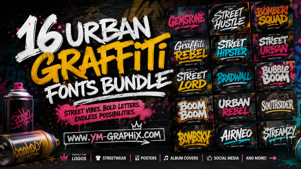
16 Best Urban Graffiti Fonts I’d Use for Bold Street-Style Design
When I want a design to feel louder, sharper, more playful, or just more alive, I almost always start with typography. A good graffiti font does more than decorate a headline. It brings attitude, movement, personality, and that unmistakable urban energy that turns plain text into a visual statement. Whether I’m building a poster, a YouTube thumbnail, a streetwear mockup, a logo concept, or social media graphics that need to stop the scroll, the right urban graffiti font can completely change the mood of the piece.
In this guide, I’m sharing my picks for the 16 best urban graffiti fonts from Creative Fabrica. I chose them because each one gives a different flavor of street-inspired typography. Some feel chunky and bubbly. Some lean raw and rebellious. Some are cleaner and easier to use for branding, while others are made to grab attention fast on posters, covers, flyers, or merch. That variety matters because not every project needs the same kind of edge.
I also wanted this list to be practical. So instead of just dropping names and links, I’m explaining how I would use each font, what kind of project it fits best, and why it deserves a spot on a shortlist for anyone searching for the best urban graffiti fonts right now. If you are designing for music, youth culture, bold branding, sports visuals, gaming, event promotion, or anything with street-style character, this roundup will save you time.
Some links in this guide are sponsored, and every font button below opens in a new tab so you can explore each option quickly and compare styles for yourself.
What I Look for in the Best Urban Graffiti Fonts
When I evaluate a graffiti font, I’m not only looking for something that appears “street.” I’m looking for typography that feels intentional. The best urban graffiti fonts usually do at least one of these things really well: they create impact from a distance, they carry a strong attitude even in a short wordmark, or they introduce enough personality to make a basic composition feel custom.
For me, great graffiti lettering usually lands somewhere between expressive and usable. If a font is too chaotic, it can be hard to place in real-world design work. If it’s too clean, it loses the urban character that makes graffiti-inspired typography special in the first place. The sweet spot is a font that still reads clearly while bringing bounce, movement, swagger, or grit.
- Strong first impression for posters, headers, thumbnails, and covers
- Memorable letter shapes that do not feel generic
- Enough character to support branding and merch
- Versatility across urban, playful, rebellious, and youthful concepts
- A style that feels confident without needing a lot of extra effects
My 16 Favorite Urban Graffiti Fonts
Below, I’m breaking down each pick one by one. I’ve kept the descriptions practical, so you can quickly decide which font feels right for your next project.
1. Urban Graffiti Font Bundle
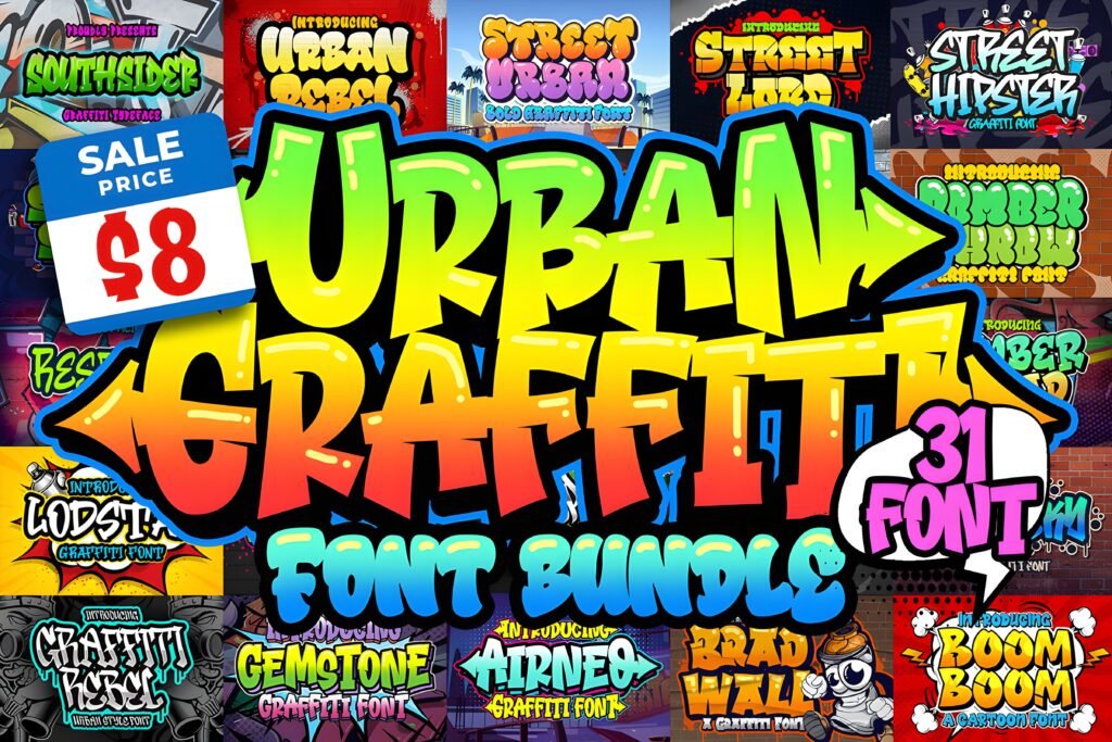
If I needed one place to start, this would be it. A bundle is incredibly useful when I don’t want to lock myself into one graffiti mood too early. Some projects need playful bubble energy, some need a rougher wall-tag feeling, and some need something bold enough for a headline but still clean enough for merch. A bundle gives me room to test different directions before I commit.
That flexibility is exactly why I like this option so much for designers, content creators, and brand builders. Instead of downloading one typeface and hoping it fits everything, I can build a fuller street-style toolkit in one move. For posters, logo drafts, event art, apparel mockups, and social media graphics, having a wide urban font range makes the whole creative process faster.
Best for: designers who want maximum variety, fast experimentation, and multiple graffiti-inspired looks in one package.
2. Gemstone Font
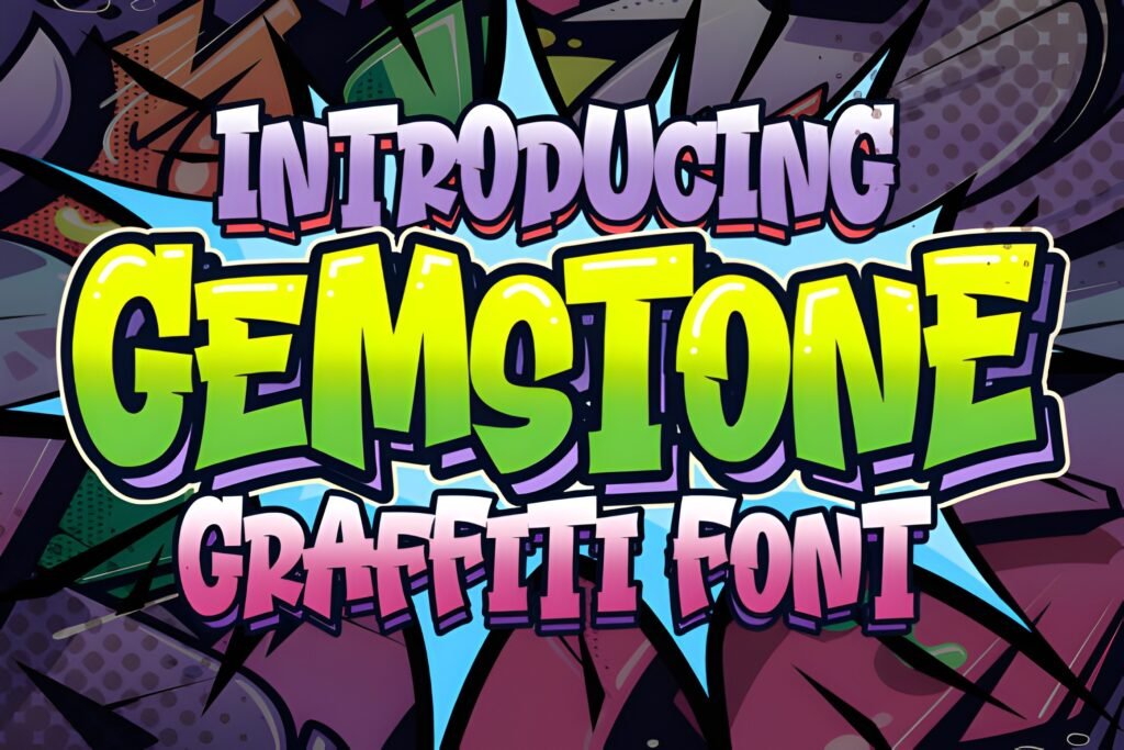
Gemstone feels like a smart choice when I want urban style with a slightly cleaner edge. Not every graffiti-inspired design has to look wild or oversized. Sometimes I want something that still carries street personality but also feels organized enough for a polished composition. That is where Gemstone stands out for me.
I’d use this kind of font for fashion graphics, urban lifestyle branding, creator logos, sticker designs, and social headers that need a modern street tone without becoming messy. It has the kind of look that can hold its own even when the rest of the layout stays simple. That balance makes it easier to style with textures, outlines, gradients, or monochrome treatments.
Best for: clean urban branding, polished poster headlines, and street-inspired logos with a more controlled feel.
3. Street Hustle Font
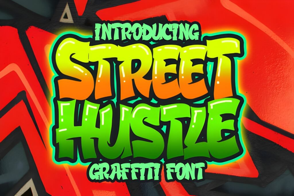
Street Hustle instantly sounds like motion, grind, energy, and ambition, and that is exactly how I would use it. This is the kind of urban graffiti font I reach for when the design needs to feel driven. It works especially well for music visuals, sports content, streetwear drops, promo flyers, and any piece where the message needs momentum.
What I like about this style is that it feels active rather than decorative. It gives a project a push. If I were designing album art, a hype banner, or a launch graphic for a brand with a younger audience, Street Hustle would be one of the first fonts I’d test. It feels direct, urban, and full of personality without asking for too many extra effects to make an impact.
Best for: music artwork, youth campaigns, energetic posters, and bold social content with movement.
4. Bomber Squad Font
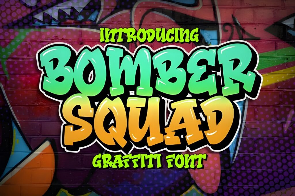
Bomber Squad feels playful, loud, and highly visual. I like fonts like this when I want urban energy with extra fun built into the letterforms. It is the kind of graffiti display style that feels comfortable on posters, event flyers, youth merchandise, gaming graphics, and content that wants to look expressive without becoming too aggressive.
For me, this font would work best when the design has room to be colorful. I can imagine it shining in thumbnails, title cards, sticker packs, apparel mockups, or printed promo pieces where bounce and personality matter more than seriousness. If your project needs urban style but also wants a lighter and more approachable tone, Bomber Squad is a very strong candidate.
Best for: colorful graphics, fun promos, youth merch, gaming visuals, and expressive headings.
5. Graffiti Rebel Font
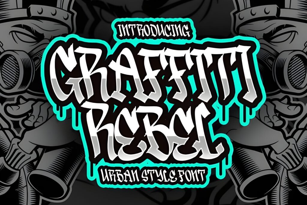
Graffiti Rebel is one of those font names that tells me exactly what kind of tone to expect. When I need a headline to feel assertive and a little disruptive, I naturally lean toward styles like this. It has the kind of street-inspired attitude that works beautifully for anti-polished branding, rebellious poster layouts, creator merchandise, or edgy campaign visuals.
What makes fonts like this useful is their confidence. I do not need a lot of decorative support around them. Even simple black text on a textured background can feel complete. For urban design projects that need a stronger voice, Graffiti Rebel gives me a starting point that already carries the mood. That saves time and helps the message feel more immediate.
Best for: rebellious branding, underground-style posters, statement graphics, and bold merch concepts.
6. Street Hipster Font
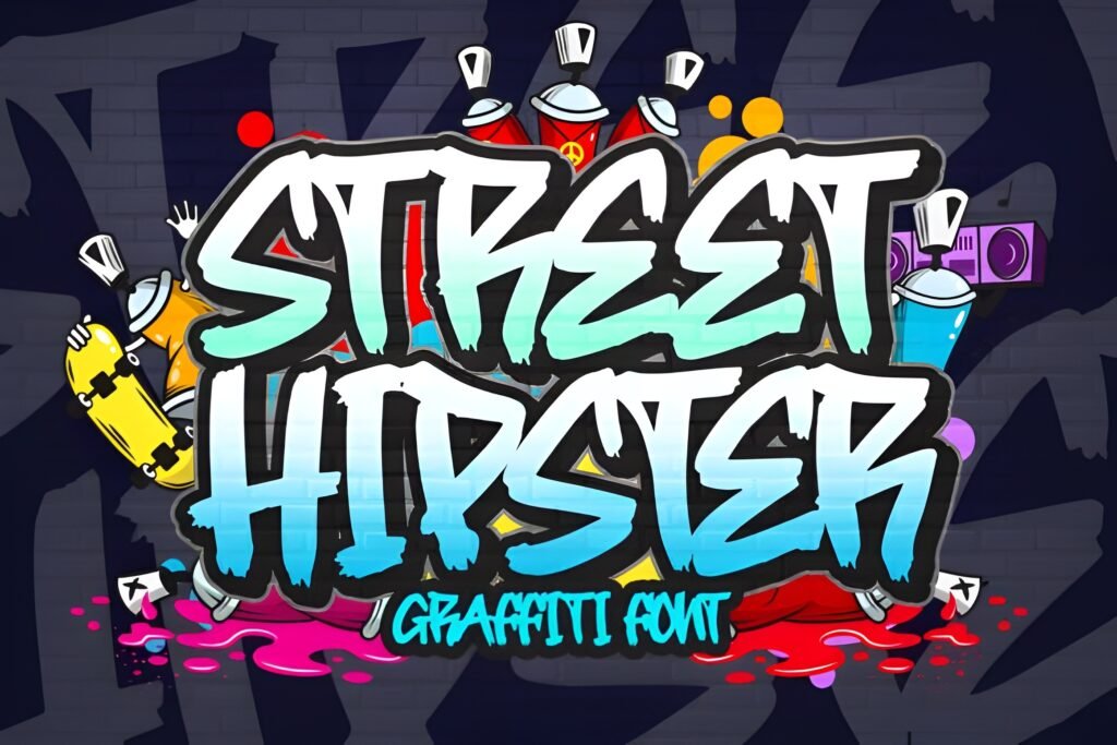
Street Hipster feels like a useful crossover font. It has urban influence, but I would not box it into just one type of project. I can see it working for café branding, apparel tags, posters, lifestyle blogs, creator packaging, or social media headers where I want street energy with a more curated look. That makes it easier to use across branding systems instead of only one-off graphics.
Personally, I like fonts like this when I want to signal personality without going full chaos. It can still feel bold and authentic, but it also leaves room for better layout control. If I were building a youth-focused brand with urban inspiration and a cleaner visual direction, Street Hipster would absolutely be on my shortlist.
Best for: lifestyle branding, apparel visuals, editorial-style urban graphics, and stylish social content.
7. Street Urban Font
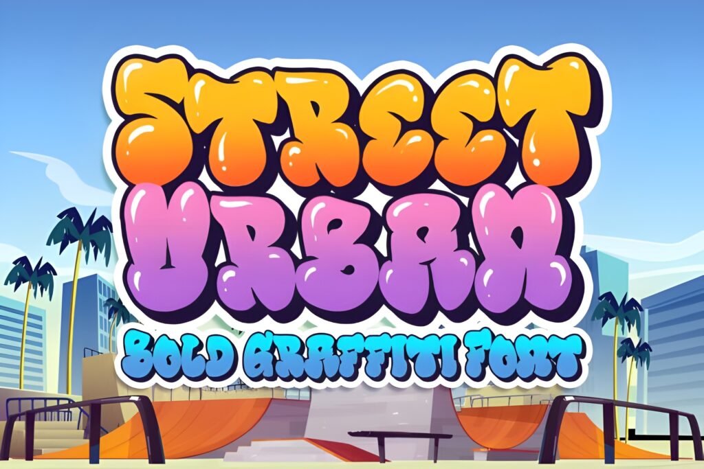
Street Urban brings a softer, more bubbly direction to the list, and that matters because the best urban graffiti fonts are not all sharp and aggressive. Sometimes I want a font that still feels street-based but looks more fun, rounded, and inviting. This kind of style is excellent for designs that need personality without intimidation.
I’d use Street Urban for creator branding, playful posters, stickers, youth events, school-themed content, or upbeat merchandise. It has the kind of visual bounce that keeps typography interesting, especially when paired with bright backgrounds, outlined shapes, or layered compositions. If you want a graffiti-inspired font that feels accessible and energetic, this is a very appealing option.
Best for: playful merch, stickers, upbeat posters, creator branding, and cheerful street-style graphics.
8. Street Lord Font
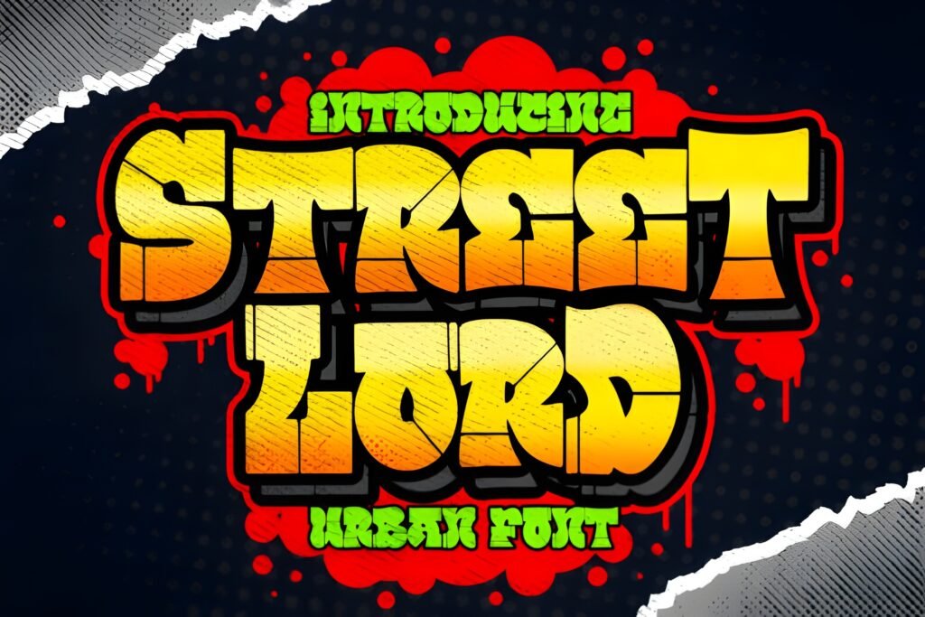
Street Lord feels heavier and more commanding to me. When I read that name, I think of large-format posters, event headers, mixtape covers, and branding that wants to dominate the composition. This is the kind of graffiti font that can act as the visual anchor of the whole layout, especially when I need the text to do most of the talking.
I like fonts in this lane because they simplify decision-making. I do not need many extra headline tricks when the type already feels thick, bold, and confident. For print-heavy work, apparel graphics, or promotional visuals where strength matters more than playfulness, Street Lord gives off exactly the kind of authority I’d want.
Best for: dominant poster titles, streetwear graphics, strong logo concepts, and print-focused urban layouts.
9. Bradwall Font
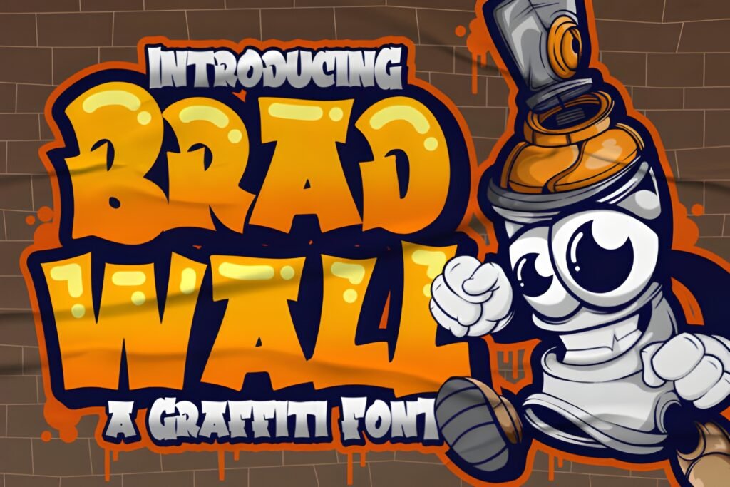
Bradwall gives me a more cartoon-friendly graffiti feel, which is actually a big advantage. There are plenty of situations where I want urban personality without a rougher, more underground tone. This kind of font fits beautifully into fun packaging, kid-friendly graphics, animated titles, creator assets, sticker sets, and colorful branding work that still wants a street-inspired spark.
What I like about this direction is its flexibility. It can feel youthful and lively while still carrying a distinctive graffiti identity. If your brand or content leans playful, Bradwall can help you tap into urban style without making the design feel too intense. For many digital projects, that makes it surprisingly useful.
Best for: playful branding, cartoon-inspired titles, colorful packaging, and fun urban-themed graphics.
10. Bubble Boom Font
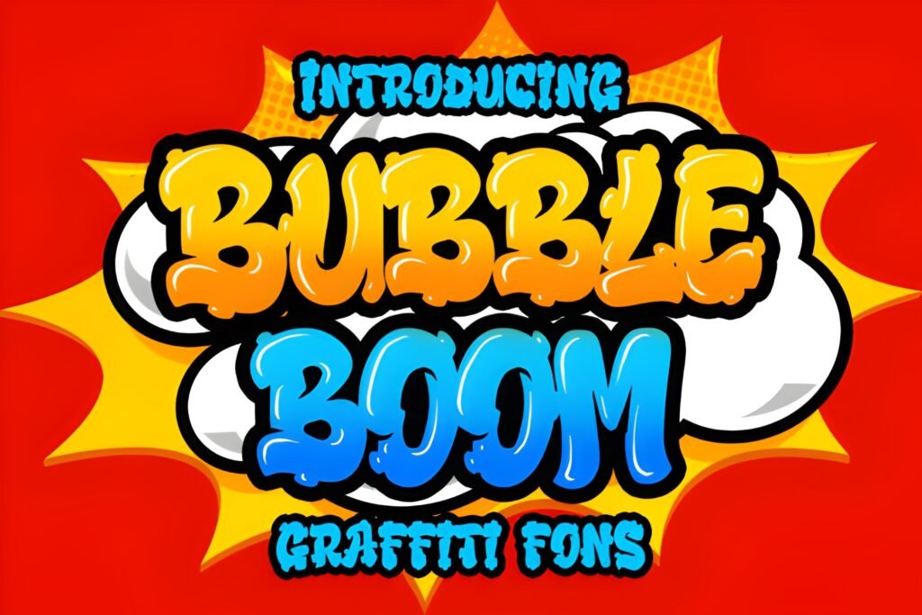
Bubble Boom is exactly the kind of font I’d use when I want a classic bubble-inspired graffiti mood. Bubble lettering has a different energy from sharper street fonts. It feels more fun, more pop-driven, and often more approachable. That makes it perfect for projects that need urban charm but still want to stay friendly and highly visual.
I can imagine Bubble Boom working really well for posters, stickers, social graphics, YouTube art, kids’ products, party materials, and colorful clothing designs. The rounded look naturally attracts attention, especially when paired with outlines, drop shadows, or bright fills. If you love bubble graffiti fonts, this is an easy recommendation to keep on your radar.
Best for: bubble lettering effects, stickers, social media graphics, playful posters, and fun merch.
11. Boom Boom Font
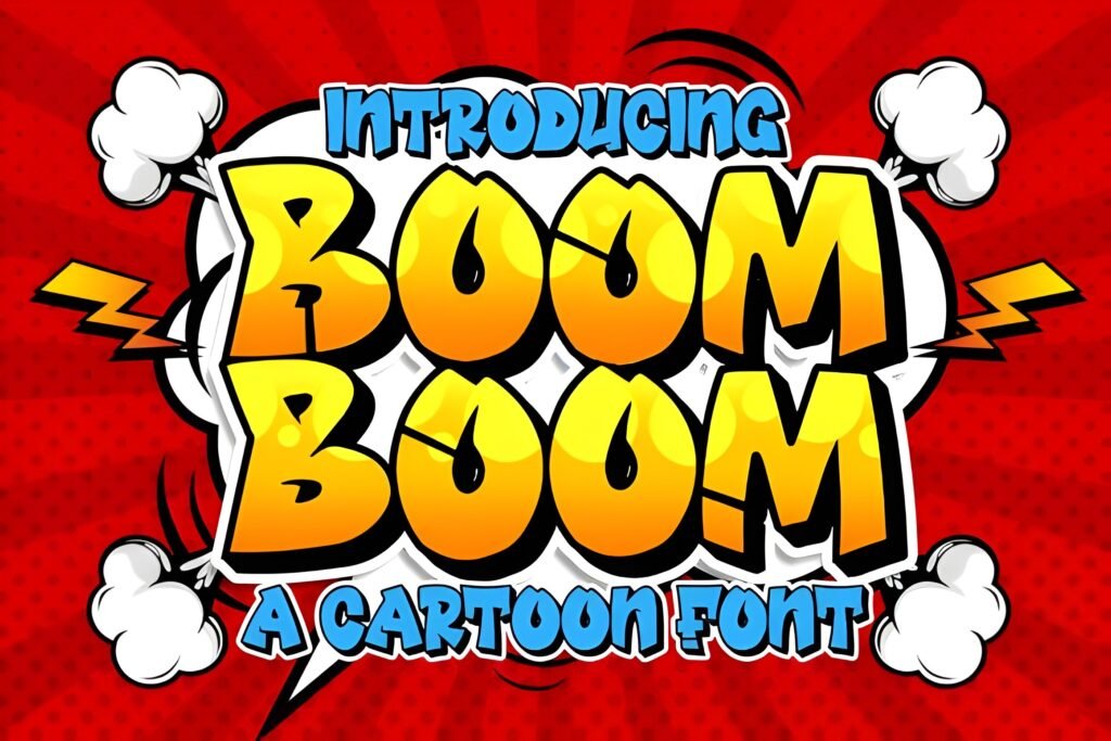
Boom Boom gives me another bubbly option, but with a slightly punchier personality. I like having more than one bubble-style graffiti font available because small differences in weight, spacing, and overall attitude can change the final design more than people expect. Sometimes one bubbly font feels too soft, and another feels exactly right for the message.
This one feels like a strong fit for large words, attention-grabbing titles, promo graphics, and designs where readability matters as much as style. If I wanted a street font that still felt energetic, friendly, and very visible at first glance, Boom Boom would be a smart pick. It has that immediate impact that works so well in both print and digital formats.
Best for: big headlines, promotional graphics, visible social text, and bubbly urban designs with impact.
12. Urban Rebel Font
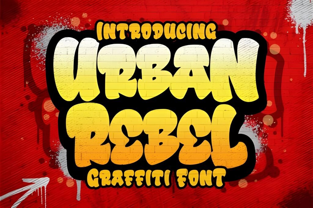
Urban Rebel feels like a great option when I want bold graffiti style with a polished, layout-ready presence. Some urban fonts feel highly expressive but harder to place. Others feel easier to use because the letters still carry enough structure to work in posters, logos, banners, and merch without much friction. Urban Rebel sits nicely in that useful middle zone.
For me, this is the kind of font I would test on streetwear branding, sports-inspired visuals, campaign headlines, thumbnail art, and product graphics. It has a confident voice, but it is still flexible. If you need one urban graffiti font that can move between digital content and print concepts without losing impact, Urban Rebel is worth strong consideration.
Best for: flexible urban branding, posters, apparel, thumbnails, and strong all-purpose graffiti styling.
13. Southsider Font
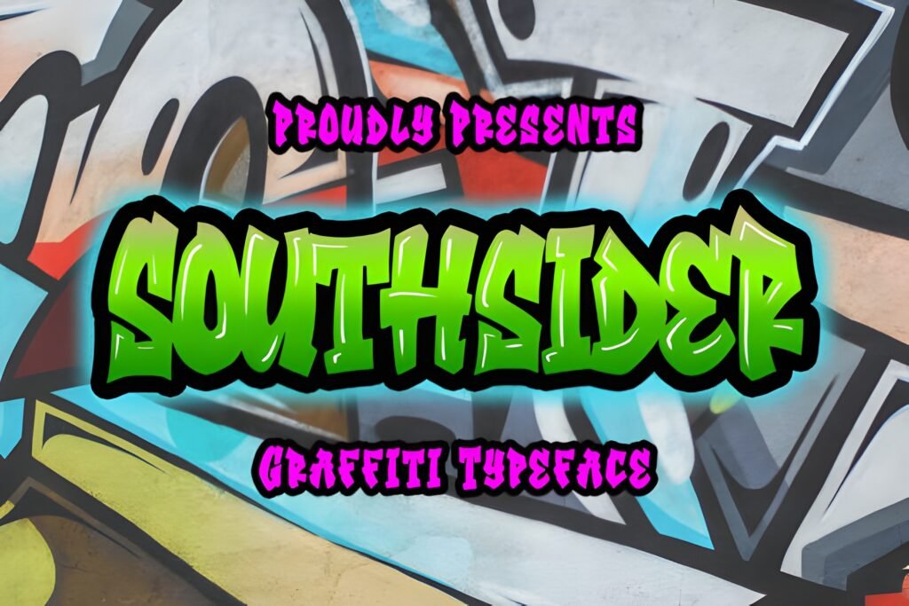
Southsider gives me a more character-driven urban look, and I like fonts like this when I want the design to feel rooted in place, culture, and identity. It has that kind of title energy that can instantly become the voice of a piece. I would use it for posters, creator branding, event promotion, local campaigns, and expressive cover art.
What stands out to me here is the vibe. Some fonts are mainly about clean usability. Others are about mood first, and that can be powerful when the project needs personality. Southsider feels like one of those fonts that helps establish tone right away. If you want a graffiti-inspired option that feels bold but still memorable, this is a strong pick.
Best for: event posters, identity-driven graphics, cover art, and urban visuals with a memorable voice.
14. Bombsky Font
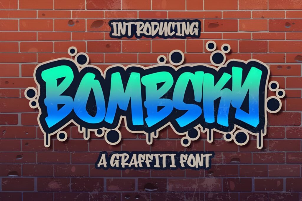
Bombsky feels bold and unusual, which is exactly what I want from a display font when a project needs to stand apart. In a sea of repetitive typography, unique letter personality is valuable. That is especially true in urban design, where so much of the visual power comes from character and shape rather than just readability alone.
I’d use Bombsky when I want a headline that feels less predictable. Think poster titles, campaign banners, limited-edition drops, cover concepts, or branded graphics that need a custom-looking feel without building lettering from scratch. If you are searching for the best urban graffiti fonts because you want something that does not look like everyone else’s choice, Bombsky makes a compelling case.
Best for: standout display work, unconventional headlines, bold branding, and eye-catching promotional art.
15. Airneo Font
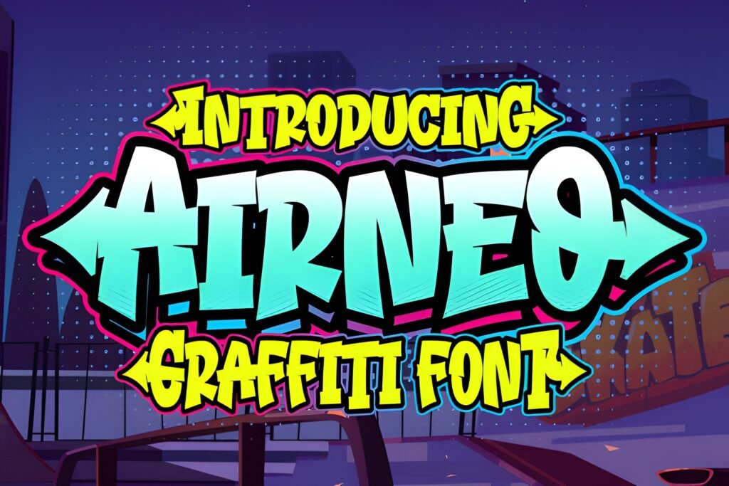
Airneo feels like a strong everyday urban display font. That might sound simple, but it is actually a huge advantage. I always want a few graffiti-style fonts in my library that can step into many different projects without feeling too niche. Airneo gives me that kind of flexibility. It looks ready for posters, logo drafts, apparel graphics, social posts, and branding experiments.
I would recommend this one to designers who want a street-inspired typeface they can use again and again. It has enough personality to feel distinctive, but it still seems adaptable. When I build a font shortlist, I try to include a few options that are not tied to only one trend or one audience, and Airneo fits that role well.
Best for: versatile urban design work, repeat-use branding projects, posters, and merch graphics.
16. Streamzy Font
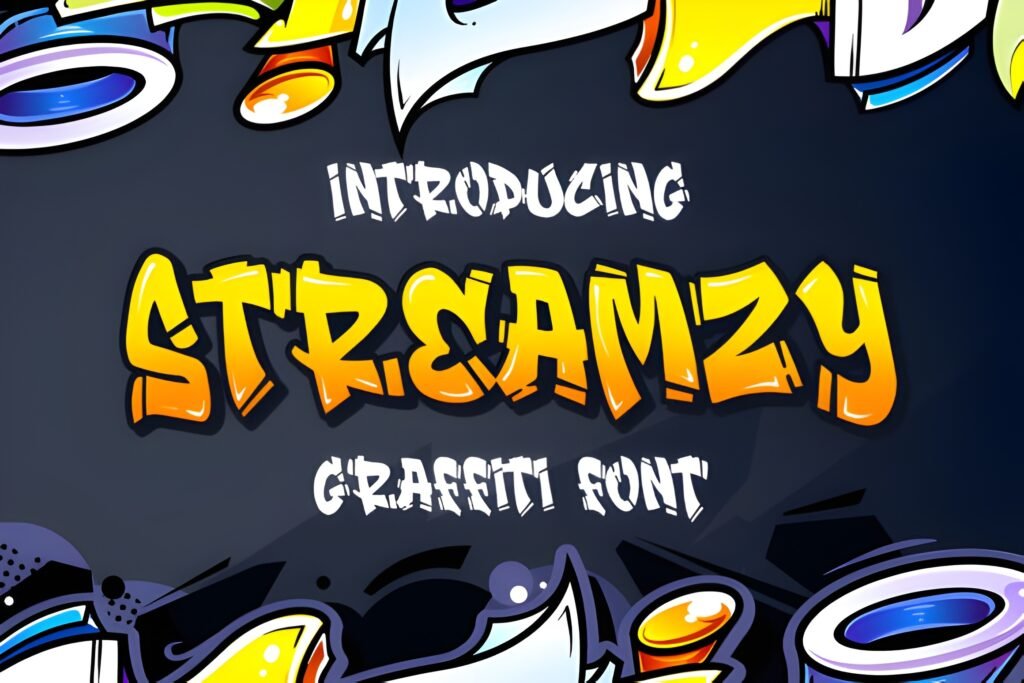
I like ending this list with Streamzy because it feels confident and modern. When I hear the name, I think of movement, flow, and urban scenery. That makes it a natural fit for current digital design work, especially content that needs to feel youthful and street-aware without becoming overly rough or cluttered.
This is the kind of font I would test for creator channels, social headers, promo visuals, title screens, and graphics aimed at audiences who respond well to bold but polished typography. If your goal is to find a graffiti-style font that still feels current and usable in modern content ecosystems, Streamzy is a strong closer for this roundup.
Best for: modern digital graphics, creator branding, title screens, social visuals, and confident urban typography.
How I’d Narrow This List Down Fast
If you do not want to test all 16 fonts, I’d make the decision based on project type first. For maximum variety, I would go with the Urban Graffiti Font Bundle. For clean-but-street branding, I’d look at Gemstone, Street Hipster, Urban Rebel, or Airneo. For playful bubble energy, I’d start with Street Urban, Bubble Boom, or Boom Boom. For stronger, more forceful poster typography, Street Hustle, Street Lord, Graffiti Rebel, Bombsky, and Southsider all make sense.
That kind of grouping is useful because urban graffiti fonts cover a surprisingly wide range. Some are made for fun. Some are made for impact. Some are made for personality-driven branding. Once I decide which of those three goals matters most, the shortlist becomes much easier to manage.
My advice is simple: choose the font that already carries the emotion you want before you add colors, textures, shadows, or effects. When the typeface does the heavy lifting, the final design almost always feels stronger.
Didn't find what you were looking for?
Use the search below to explore more options on Creative Fabrica.
FAQ About Urban Graffiti Fonts
What makes a font feel like an urban graffiti font?
For me, it comes down to attitude, shape, and movement. Urban graffiti fonts usually have expressive letterforms, a strong visual rhythm, and a sense of personality that feels less formal than standard display fonts. Some lean bubbly and playful, while others feel rebellious, thick, sharp, or raw. The best ones capture street-style energy while still being readable enough for real design work.
Are graffiti fonts good for logos?
Yes, but I would choose carefully. Graffiti logo fonts work best when the brand wants bold personality, urban influence, youth appeal, or expressive energy. I would avoid overly chaotic styles for long brand names, but strong, controlled graffiti-inspired fonts can look excellent for streetwear labels, music projects, creators, entertainment brands, and merch lines.
Where do urban graffiti fonts work best?
I use them most often on posters, flyers, album art, social media graphics, video thumbnails, apparel designs, sticker packs, event branding, and bold headline treatments. They are especially useful when the typography itself needs to become part of the visual identity rather than just sitting quietly on the page.
How do I pair a graffiti font with another font?
I usually pair a graffiti-style headline with a very simple supporting font. A clean sans serif works well because it gives the expressive display type room to lead. The contrast is important. If both fonts are too loud, the design can feel crowded. I prefer letting the graffiti font handle emotion while the secondary font handles clarity and structure.
What is the difference between bubble graffiti fonts and sharper urban fonts?
Bubble graffiti fonts usually feel friendlier, more playful, and more approachable. They are great for stickers, kids’ products, social content, and upbeat merch. Sharper or heavier urban fonts tend to feel more forceful, rebellious, or dramatic, so I use those more often for music graphics, strong posters, campaign headers, and statement branding.
If I only download one option, which one should I pick?
If you want the safest all-around starting point, I’d choose the Urban Graffiti Font Bundle because it gives you range. If you already know the mood you want, then choose by direction: Gemstone or Airneo for cleaner urban work, Street Hustle or Street Lord for stronger impact, and Bubble Boom or Boom Boom for playful bubble-style energy.
Final Thoughts
If I had to sum this list up in one sentence, I’d say this: the best urban graffiti fonts are the ones that already feel alive before you do anything else to them. That is what makes them so effective. They bring tone instantly. They help a design feel louder, cooler, more memorable, and more expressive in seconds.
Whether you want something bubbly, rebellious, clean, playful, or powerful, there is a strong option in this roundup. I’d start by thinking about the mood of your project first, then choose the font that already feels closest to that energy. That one decision can make the rest of the design process much easier.
And if this list helped you find a font you love, share it with another designer, creator, or friend who loves street-style typography too.
Share This Article
Use the buttons below to share this post on social media.