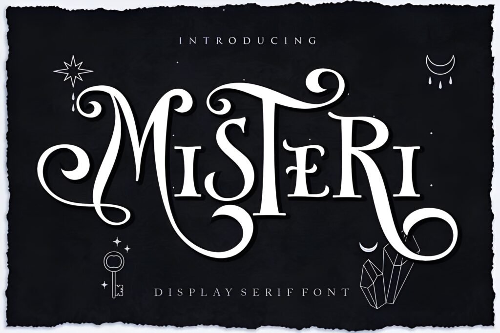
Misteri Instagram Font offers a delicate, display-oriented style that leans into an enchanting and mysterious aesthetic. Its flowing swashes and carefully crafted ligatures suggest a calligraphy-inspired design, making it suitable for projects that aim to evoke a magical or fantasy atmosphere. This font is tailored for Instagram visuals but can extend to other creative uses where a refined, artistic touch is desired.
Disclosure: This post contains an affiliate link. We may earn a commission at no extra cost to you.
What Makes Misteri Instagram Font Distinctive?
The font features a delicate stroke weight with ornamental swashes that enhance its mystical appeal. Its ligatures contribute to a seamless, flowing appearance, which may add a handcrafted feel to text. Misteri’s design emphasizes intentional curves and emotional strokes, positioning it as a display font rather than a body text option. The style suggests a strong suitability for short phrases, quotes, or headings where visual impact is key.
Best Uses for Misteri Instagram Font
Ideal for social media graphics, especially Instagram quotes and captions that benefit from a whimsical or fantasy-inspired look. It also fits well in branding projects, invitations, posters, and DIY crafts that require a touch of elegance combined with mystery. The font’s delicate nature suggests it works best at larger sizes where its details can be appreciated, rather than in dense or small text blocks.
How to Pair Misteri Instagram Font
Pair Misteri with clean, minimal sans-serif fonts for body text to maintain readability and balance the ornate display style. For example, use Misteri for headlines or highlight covers and a simple sans-serif like Montserrat or Open Sans for subheadings and body copy. Another approach is combining it with a neutral serif font for subheads to create a classic yet magical hierarchy: headline (Misteri), subhead (serif), body (sans-serif).
Practical Design Tips
Use generous whitespace around text set in Misteri to let its swashes and ligatures breathe and avoid visual clutter. Scale the font to sizes where its delicate details are visible, such as in Instagram post headlines or story highlight covers. Limit the amount of text in Misteri to short phrases or single words to preserve legibility. Contrast its ornate style with simple, geometric fonts in supporting text to maintain clarity and hierarchy. Consider using muted or dark backgrounds to enhance the font’s mysterious and enchanting qualities.
Frequently Asked Questions
Is Misteri suitable for body text in social media posts?
Due to its delicate and ornamental design, Misteri is best reserved for headlines or short phrases rather than body text, where readability at smaller sizes is crucial.
Can Misteri be used for fantasy-themed branding?
Yes, its flowing swashes and mysterious aesthetic make it a strong candidate for fantasy or magical-themed branding, especially in display contexts like logos or packaging.
What font styles pair well with Misteri for Instagram layouts?
Simple sans-serif fonts for body text and neutral serif fonts for subheadings complement Misteri’s ornate style, helping to create clear visual hierarchy and maintain readability.