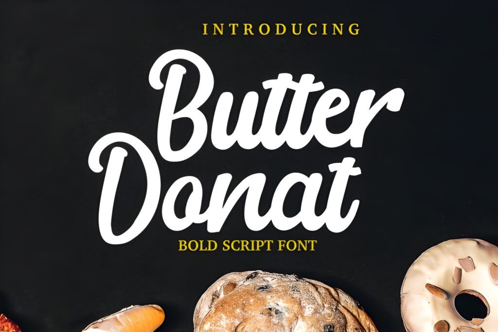
Butter Donat is a bold cursive script font characterized by smooth, energetic strokes that convey a playful yet confident personality. Designed with Instagram content in mind, it lends a lively and stylish flair to text, making it suitable for projects that seek to stand out with a handcrafted, dynamic look.
Disclosure: This post contains an affiliate link. We may earn a commission at no extra cost to you.
What Makes Butter Donat Instagram Font Distinctive?
This font features a flowing cursive style with bold weight and smooth curves, creating an expressive visual impact. Its design balances boldness with elegance, making it adaptable for both playful and polished layouts. The overall effect suggests a handcrafted aesthetic that can bring energy and artistic flair to various creative outputs.
Best Uses for Butter Donat Instagram Font
Butter Donat is well suited for Instagram posts, captions, and highlight covers where a vibrant, eye-catching script is desired. It also fits DIY projects such as invitations, posters, greeting cards, branding elements, stickers, logos, and digital illustrations that benefit from a bold, expressive handwritten style.
How to Pair Butter Donat Instagram Font
For effective typography combinations, consider pairing Butter Donat as the headline or display font with a clean sans-serif for subheadings and body text. For example, use Butter Donat for Instagram post headlines or invitation titles, complemented by a simple sans-serif like Montserrat or Open Sans for supporting text. This contrast enhances readability while maintaining a lively visual hierarchy.
Practical Design Tips
Use generous whitespace around Butter Donat to let its bold, flowing strokes breathe and avoid visual clutter. Scale it larger for headlines or focal text to emphasize its expressive qualities. When applying it to Instagram highlight covers or posters, balance the font’s energetic style with minimal background elements to maintain clarity. In layouts combining it with other fonts, keep supporting text neutral and straightforward to prevent competition with Butter Donat’s distinctive personality.
Frequently Asked Questions
Can Butter Donat be used for body text in long paragraphs?
Given its bold cursive style and expressive strokes, Butter Donat is better suited for headlines or short text rather than extended body copy, where readability might be compromised.
Is Butter Donat appropriate for formal branding projects?
While it has an elegant side, the font’s playful and bold character makes it more fitting for casual or creative branding rather than strictly formal or corporate identities.
How can I create contrast when using Butter Donat in a design?
Pair it with clean, simple sans-serif fonts in smaller sizes for subheadings or body text. This contrast in style and weight helps Butter Donat stand out without overwhelming the overall layout.