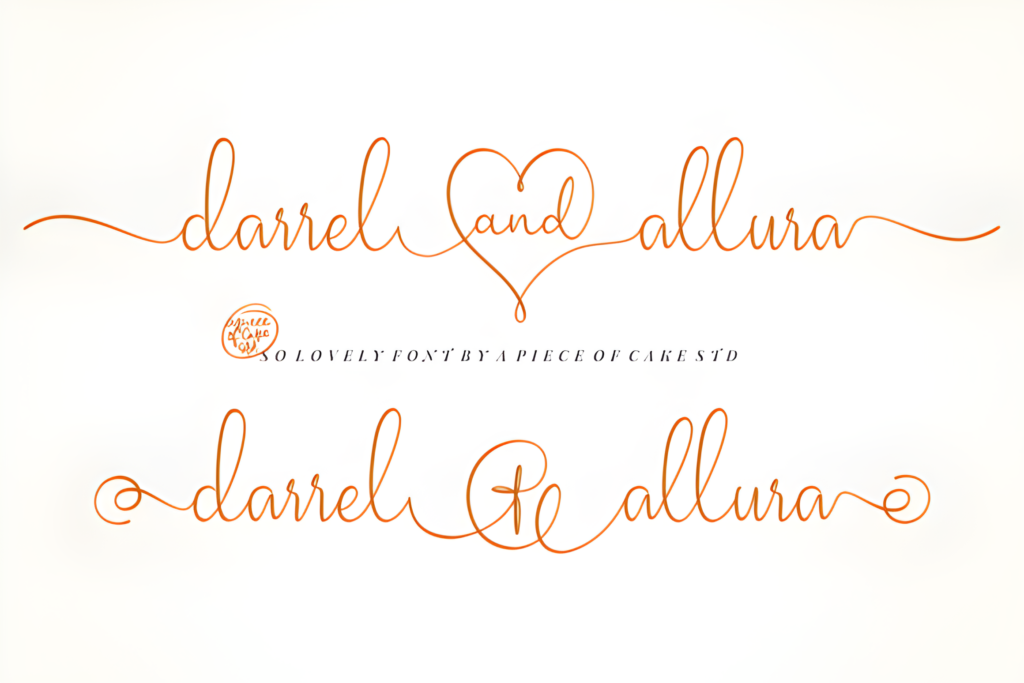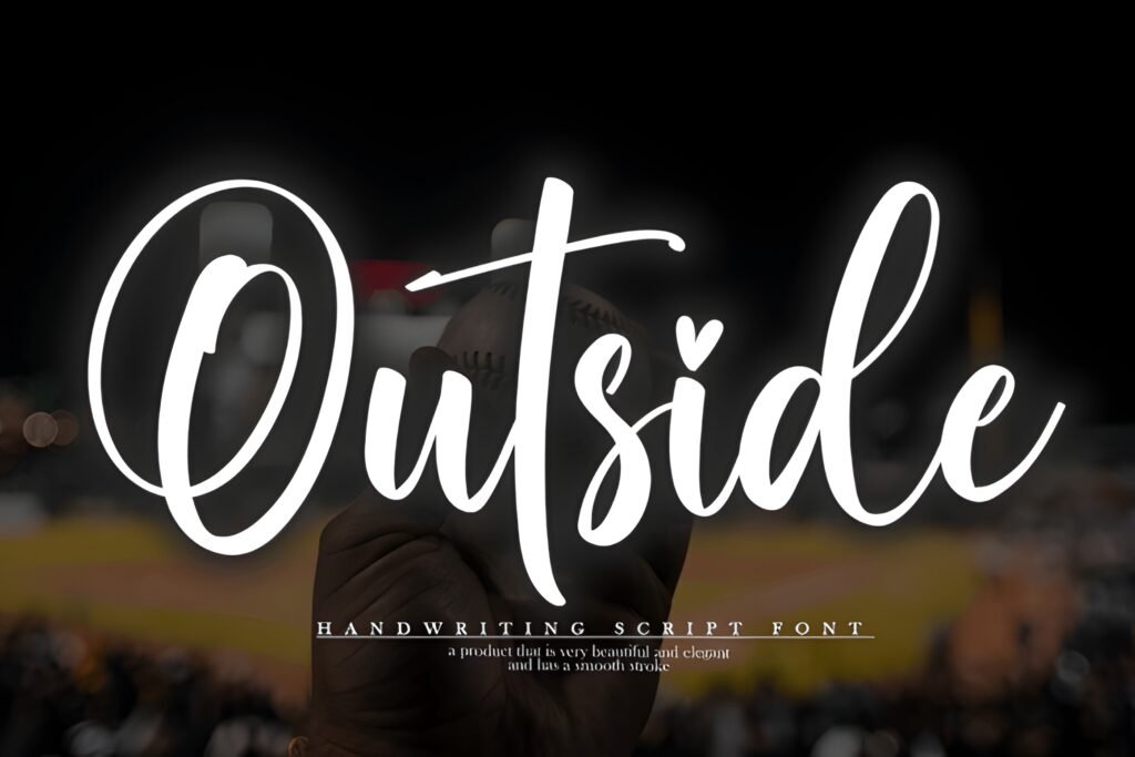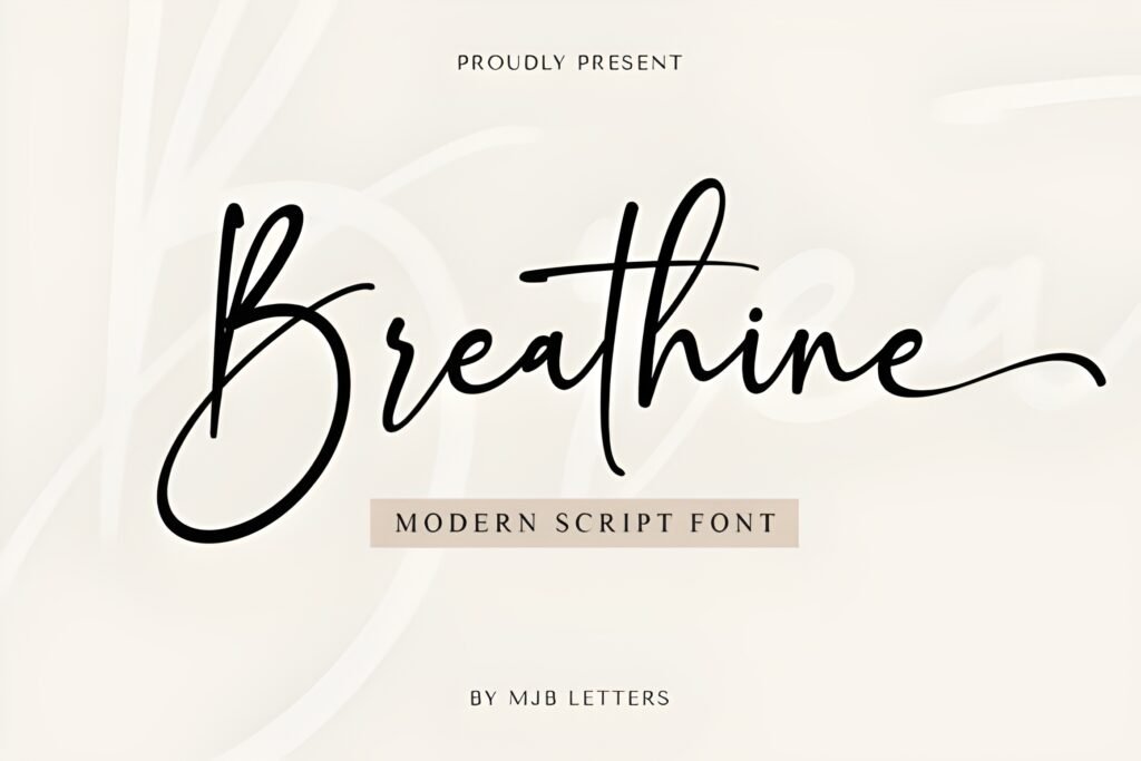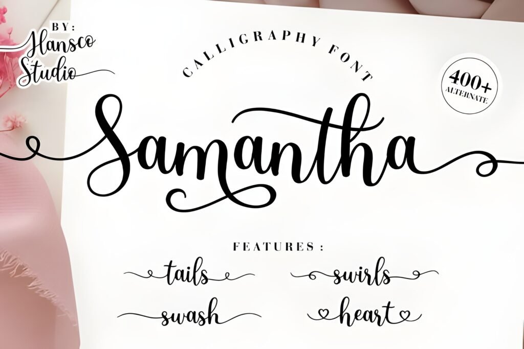
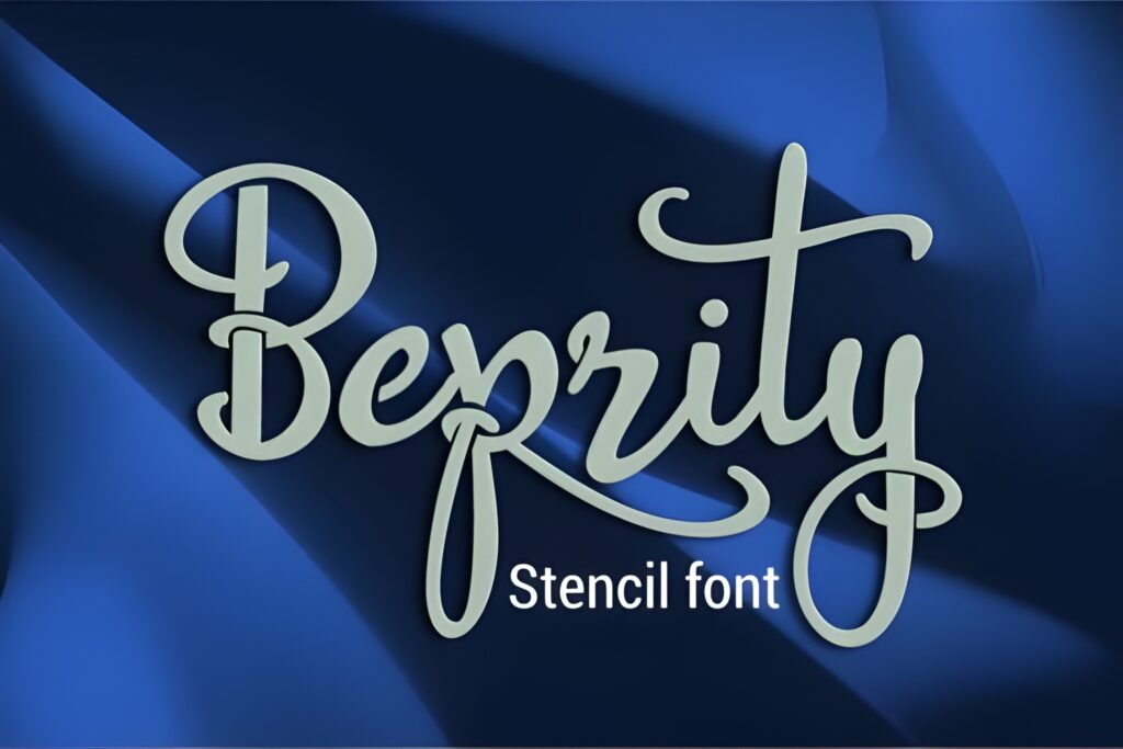
Beprity Stencil Font offers a distinctive blend of script elegance and stencil-inspired cuts, creating a visual style that is both artistic and modern. Its design suggests a handcrafted quality with smooth flowing letterforms interrupted by deliberate stencil breaks, making it suitable for projects seeking a bold yet refined expression.
Disclosure: This post contains an affiliate link. We may earn a commission at no extra cost to you.
What Makes Beprity Stencil Instagram Font Distinctive?
The font combines classic script lettering with stencil elements, resulting in letters that maintain fluidity while featuring artistic gaps. This duality provides a unique texture and rhythm to text, which can enhance visual interest in digital and print media. Its style appears well suited for standout headlines or decorative text rather than extended body copy.
Best Uses for Beprity Stencil Instagram Font
Beprity Stencil is particularly fitting for Instagram graphics where personality and creative flair are priorities, such as quotes, captions, or highlight covers. It also lends itself to branding projects, posters, invitations, greeting cards, and digital illustrations that benefit from a handcrafted, artistic touch. The font’s balance between elegance and boldness makes it adaptable for both minimal and more embellished layouts.
How to Pair Beprity Stencil Instagram Font
Pair this font with a clean, sans-serif typeface for body text to maintain readability and provide contrast. For example, use Beprity Stencil for headlines or key phrases and a simple sans-serif like Montserrat or Open Sans for subheadings and paragraphs. This hierarchy helps the stencil script stand out without overwhelming the overall design.
Practical Design Tips
Use generous whitespace around Beprity Stencil to let its stencil breaks and script flow breathe visually. Scale the font larger for headlines or focal points to emphasize its artistic details. Avoid using it in dense text blocks to preserve legibility. Combining it with minimalist layouts or subtle backgrounds can highlight its unique character without clutter. Consider using it in all caps or mixed case depending on the mood—caps for bold impact, mixed case for a more casual feel.
Frequently Asked Questions
Is Beprity Stencil suitable for long paragraphs of text?
Given its stencil breaks and script style, it is best used for short phrases, headlines, or decorative text rather than extended body copy to maintain readability.
Can this font be used effectively in branding projects?
Yes, its artistic and modern qualities make it a good choice for branding elements that require a distinctive, handcrafted look, especially in logos, packaging, or social media visuals.
What kind of font pairs well with Beprity Stencil?
Simple, clean sans-serif fonts work well as complementary text to balance the decorative nature of Beprity Stencil, providing clear hierarchy and enhancing overall legibility.