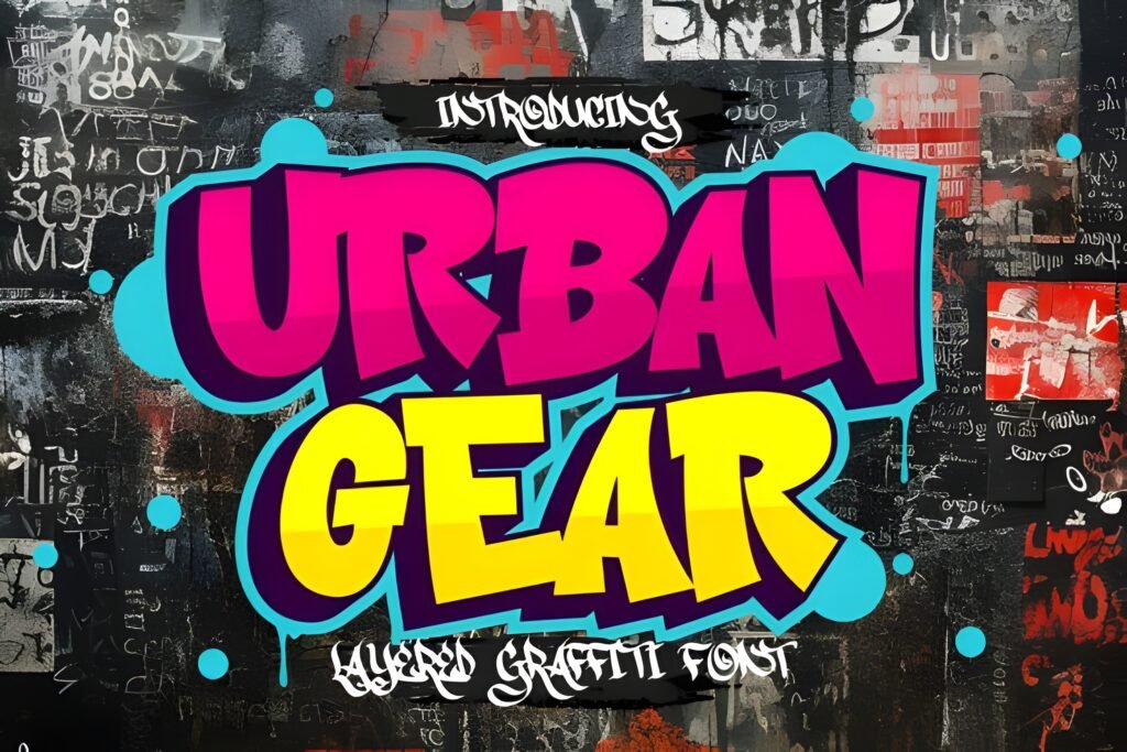
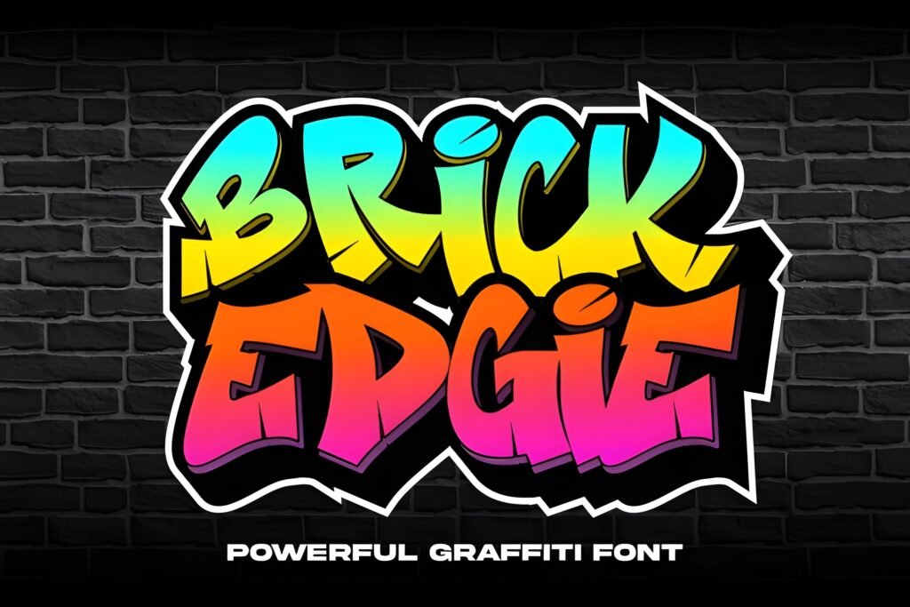
Metro Graffi is a graffiti-inspired font featuring bold, slightly chunky letterforms with an urban edge. It offers two styles—regular and shadow—that enable layered, three-dimensional effects, lending depth and visual interest to text. This typeface channels the energy of street art, making it suitable for designs that aim to evoke a raw, city-inspired atmosphere.
Disclosure: This post contains an affiliate link. We may earn a commission at no extra cost to you.
What Makes Metro Graffi Font Distinctive?
The font includes a shadow style that can be combined with the regular version to create a 3D layered look. Its letterforms are robust and edgy, reflecting graffiti aesthetics. The design is tailored for impactful display use rather than extended body text, emphasizing boldness and visual presence.
Best Uses for Metro Graffi Font
Metro Graffi works well for posters, logos, apparel graphics, stickers, and digital artwork where an urban, street culture vibe is desired. It suits projects related to hip-hop events, skateboarding culture, or streetwear branding that benefit from a strong, dynamic typographic statement.
How to Pair Metro Graffi Font
Pair Metro Graffi with clean, simple sans-serif fonts for body text to balance its boldness. For example, use Metro Graffi as the headline font and a neutral sans-serif like Helvetica or Open Sans for subheadings and body copy. This contrast helps maintain readability while preserving the graffiti font’s impact.
Practical Design Tips
Use ample whitespace around Metro Graffi to prevent visual clutter, especially when employing the shadow style for 3D effects. Scale the font larger for headlines or logos to maximize its bold character. When layering the regular and shadow styles, align them precisely to enhance the dimensional effect without compromising legibility. Limit the use of this font to short phrases or titles to maintain clarity.
Frequently Asked Questions
Can Metro Graffi be used for body text?
Given its bold, chunky letterforms and graffiti style, Metro Graffi is best reserved for headlines or display purposes rather than extended body text, where readability is critical.
How can I create a 3D effect with this font?
Use the shadow style layered behind the regular style, aligning them carefully to produce a three-dimensional look that adds depth to your typography.
What types of projects benefit most from Metro Graffi?
Projects that want to convey an urban, street art vibe—such as event posters, skate culture branding, or streetwear designs—are good candidates for this font.