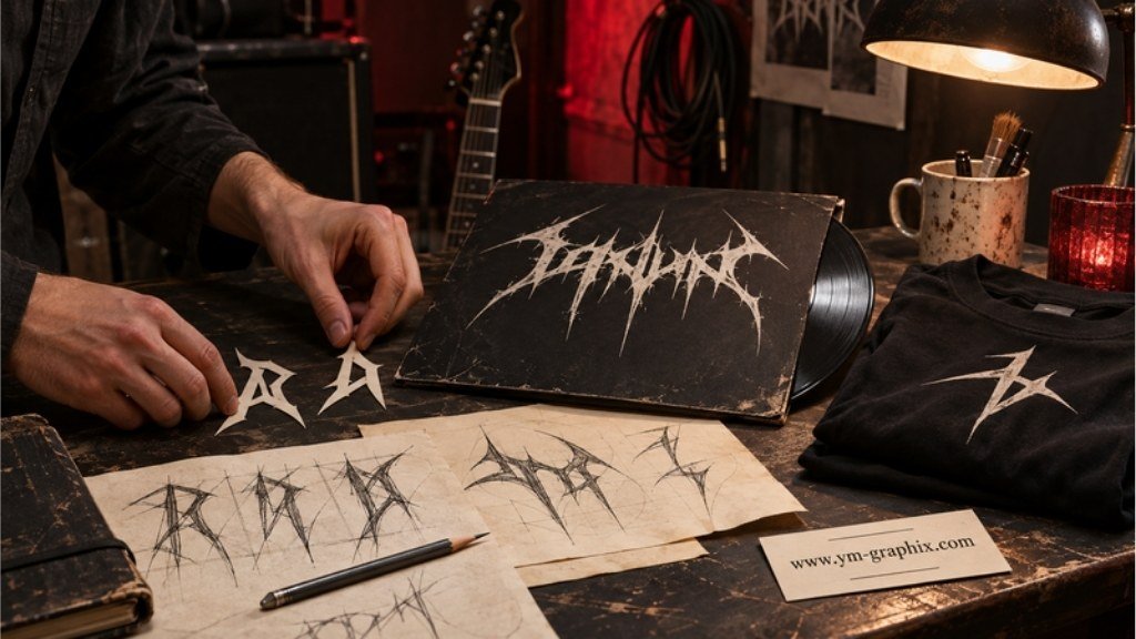
SHARP LETTERS · HEAVY RIFFS · YOUR OWN IDENTITY
Give your band name a sound before anyone presses play
The best metal fonts for a band logo combine the right mood with a recognizable word shape. Start with the name you actually need to set, decide how readable it should be, and compare the lettering at the size where people will see it: an album thumbnail, a gig poster or a shirt.
Below are 12 selected Creative Fabrica fonts, from rough rock lettering and Gothic forms to thorny extreme-metal styles, with a practical design direction for each.
A dramatic logo can begin with one letter: an extended terminal, a sharp diagonal or a memorable opening capital. The useful question is how those details work across your whole name. A font that looks impressive in its own specimen may behave differently when your band has repeated letters, a long name or a small social avatar.
This guide focuses on metal fonts for original band logos, album covers and merchandise. If a sharp-edged rock wordmark or a playful band-logo mashup brought you here, use the selection to explore the shapes and build a direction around your own words.
Disclosure: This article contains affiliate links. If you purchase through them, we may earn a commission at no extra cost to you. These are digital font downloads. Review each current listing for included files, character support, software requirements and access options.
Quick Picks: choose your direction
Start with the character of your project, then compare the real specimens below.
How to choose a metal band logo font
Begin with the mood of the music
A rough brush face can suggest movement and live performance. Gothic structures give the wordmark a more ceremonial or dramatic presence. Thorn-like extensions and tightly packed shapes push the design toward an extreme-metal silhouette. Choose the direction deliberately; a font’s name alone does not tell you which one will suit your project.
Choose the level of readability you want
Some logos invite an immediate reading; others behave almost like an emblem. Both can be intentional choices. The tradeoff becomes practical when your name appears on a small streaming tile, a festival lineup or a phone screen. If the logo is highly intricate, plan a clear secondary treatment of the name for information-heavy layouts.
Look at your actual letters
Try your full name in the listing’s preview field where available. Pay attention to the first and last letters, repeated shapes, tight pairs and any punctuation you use. If you need accented characters, check those exact characters in the current glyph set before choosing the font.
Separate the logo from the supporting information
Your display font can carry the band name while a simpler companion handles the date, venue, track list or website. A poster becomes easier to navigate when the visual identity has one job and the event information has another. Avoid asking every line to be equally loud.
Quick selection rule
Choose the font with the strongest usable version of your name. Keep a second candidate if you are still deciding between a readable wordmark and a more intricate emblem.
12 metal and rock fonts to explore
Each card explains why the font belongs in the selection and suggests a way to use it. The images are the actual product previews; the design suggestions are editorial starting points, rather than claims that we have tested every font in every application.
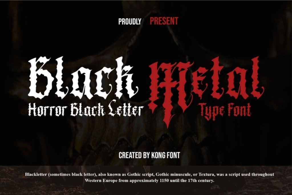
Best for a horror-leaning blackletter direction
1. Black Metal
By Kong Font Studio
Black Metal is a modern blackletter font by Kong Font Studio, with jagged edges and a dark, horror-inspired character.
Choose it for a band identity that sits between Gothic lettering and eerie artwork. The pointed forms give a short name an expressive outline without requiring a metallic texture or a complex background.
A sharp blackletter starting point for darker music artwork.
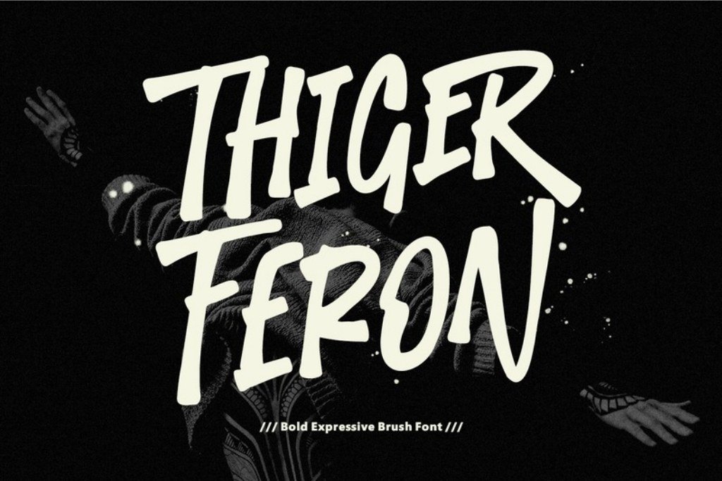
Best for raw rock energy
2. Thiger Feron
By Maulana Creative
An expressive brush display face with slanted forms, rough texture and a hand-painted character.
Thiger Feron brings a different rhythm to the selection: the movement of a brush rather than a dense web of spikes. Consider it for a rock project that needs an energetic headline, rough wordmark or live-performance mood.
A rough brush direction for rock posters and band names.
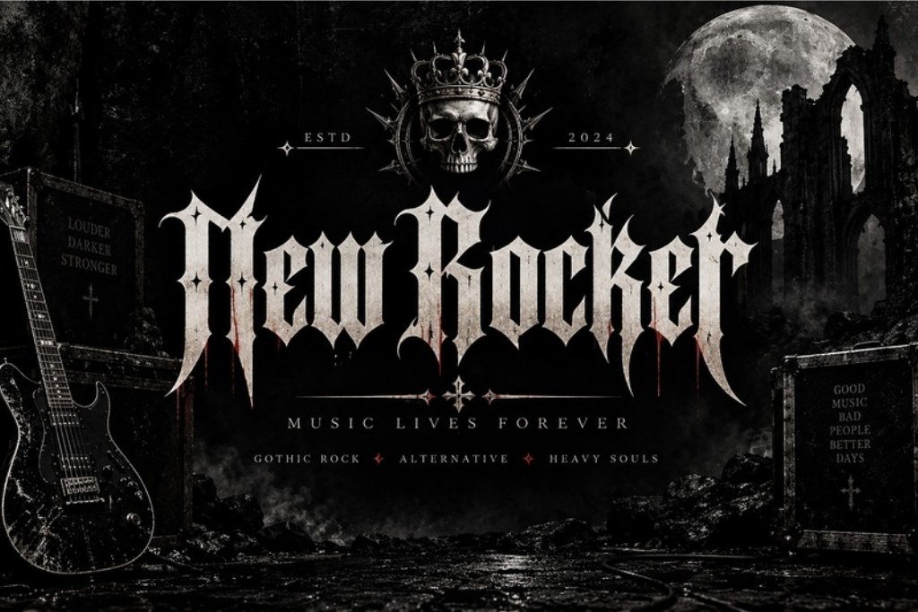
Best for a condensed Gothic direction
3. New Rocker
By BILLI
A Gothic blackletter display font with angular forms, condensed proportions and medieval-inspired character.
New Rocker is worth comparing when your project needs a Gothic atmosphere with a more structured typographic presence. The condensed proportions give it a distinct rhythm beside the wider or more sprawling styles in this list.
Condensed Gothic lettering for an alternative visual identity.
Best for a Gothic music wordmark
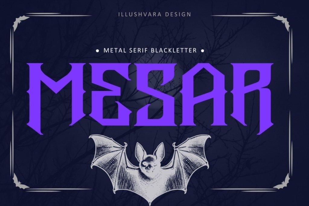
4. Metal Mesar
By illushvara
An all-caps blackletter face combining metal-style edges with serif structure; the listing also specifies PUA encoding.
Metal Mesar is a useful starting point when you want to explore a forceful music identity while keeping the underlying typographic structure part of the design. The blend of serif and Gothic influences offers a different character from the most tangled extreme-metal options.
A strong first candidate for Gothic band lettering.
Best for a structured Gothic wordmark
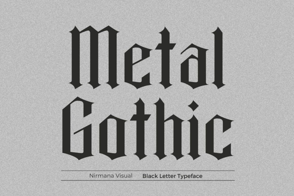
5. Metal Gothic
By Sigit Dwipa
Metal Gothic is a bold blackletter face with angular strokes. Its listing describes uses including logos, branding and product designs.
This is a useful direction when you want a Gothic identity with a more deliberate, typographic rhythm. Compare it with the more intricate selections when your project needs strong lettering alongside a photograph or illustration.
Bold Gothic lettering for a focused music identity.
Best for Regular and Outline options
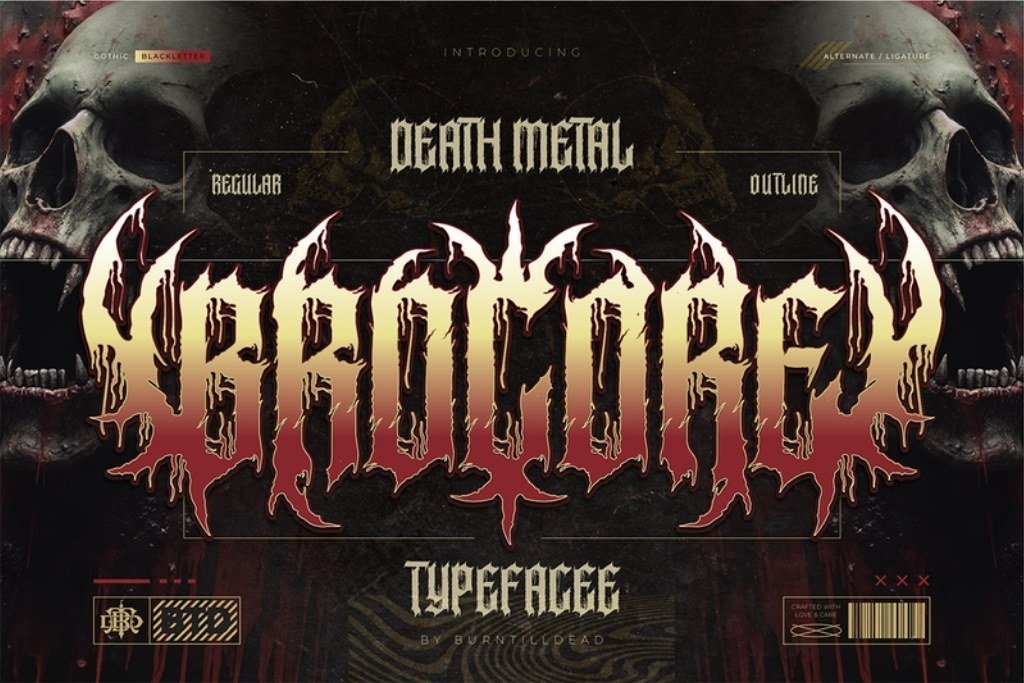
6. Brocore
By Burntilldead
Regular and Outline styles in OTF and TTF, plus alternates, ligatures, numbers, punctuation and multilingual support.
Brocore combines a death-metal mood with a blackletter foundation, including spikes and dripping details. The two styles give you a useful design decision to explore when building related cover, poster and merchandise compositions.
Two listed styles for exploring an extreme-metal identity.
Best for an oblique extreme-metal option
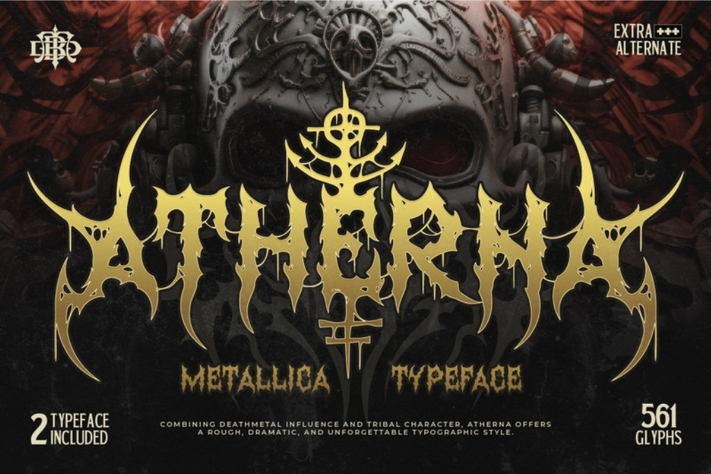
7. Atherna
By Burntilldead
Regular and Oblique styles in OTF, TTF and WOFF, with alternates, numbers, punctuation and multilingual support.
Atherna pushes the identity toward distorted death-metal lettering with tribal influences. It suits a project where the name should become an expressive visual shape and the surrounding layout can remain comparatively restrained.
Explore Regular and Oblique treatments for a heavier direction.
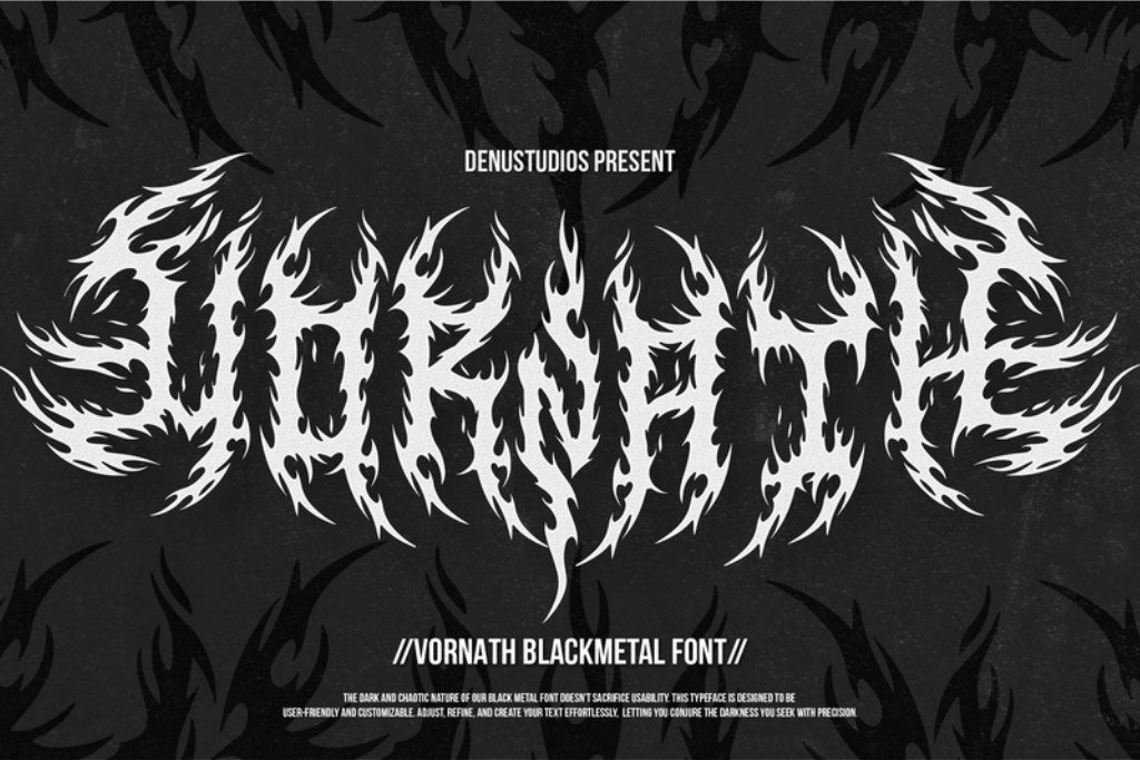
Best for jagged black-metal character
8. Vornath
By Denustudios
A black-metal font built around bold, spiky and jagged letterforms.
Vornath is a candidate for a band name that needs a pointed, confrontational silhouette. Its angular, aggressive character makes it worth comparing against the more brush-driven and traditional Gothic faces here.
Jagged letterforms for a focused black-metal look.
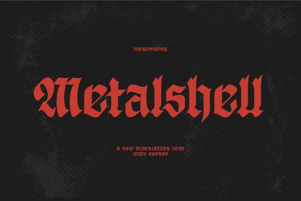
Best for a sharp traditional Gothic direction
9. Metalshell
By Creative Fabrica Fonts
Metalshell is a blackletter font with razor-sharp strokes and traditional Gothic forms. The listing describes uses including metal band logos and apparel.
Metalshell keeps a recognizable blackletter structure while adding pointed details. Try it when you want a dark band identity that can sit alongside an album illustration, a simple symbol or a strong monochrome photograph.
A Gothic direction for dark logos and apparel artwork.
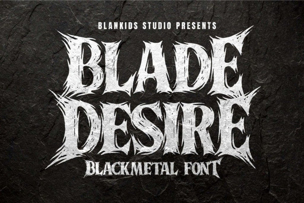
Best for alternate-character exploration
10. Blade Desire
By Blankids Studio
A black-metal face with uppercase and lowercase letters, numerals, punctuation and an alternate character; the listing specifies PUA encoding.
Blade Desire is worth considering when you want to explore a metal-music wordmark and examine how an alternate changes the name. Its listed applications include band logos, album covers, posters and shirt graphics.
A sharp metal direction with an alternate to explore.
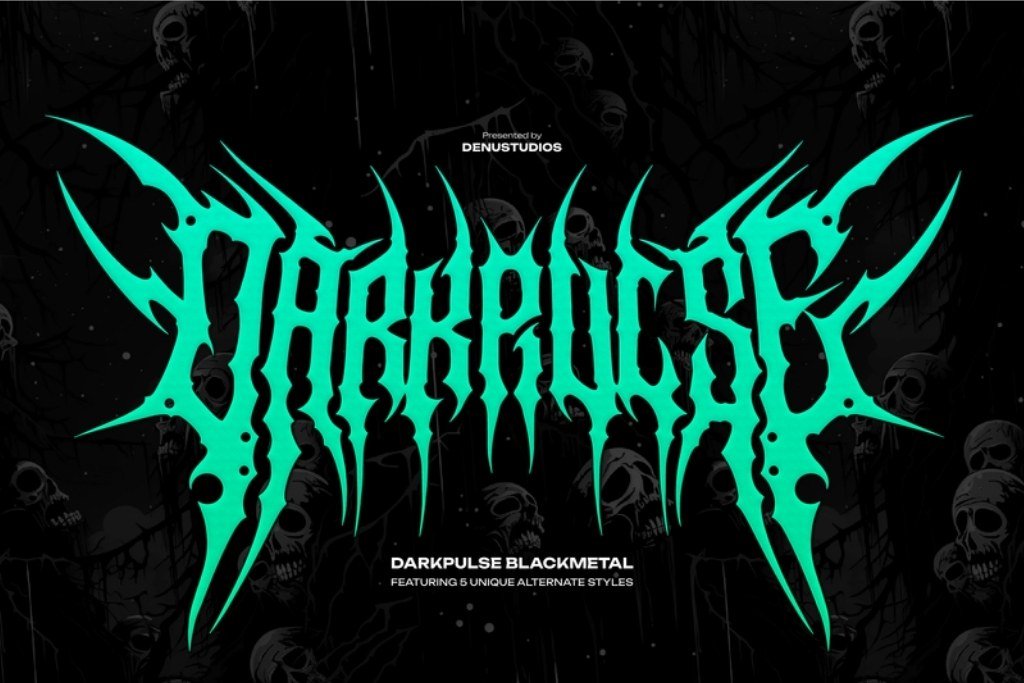
Best for comparing alternate styles
11. Darkpulse
By Denustudios
A black-metal face with aggressive spikes and sharp serifs; the listing describes five alternate styles.
Darkpulse gives you several listed alternate directions within one extreme-metal design. That makes it a useful shortlist candidate when you know the overall mood but still want to compare how the wordmark’s character can shift.
Five listed alternate styles for a dark visual identity.
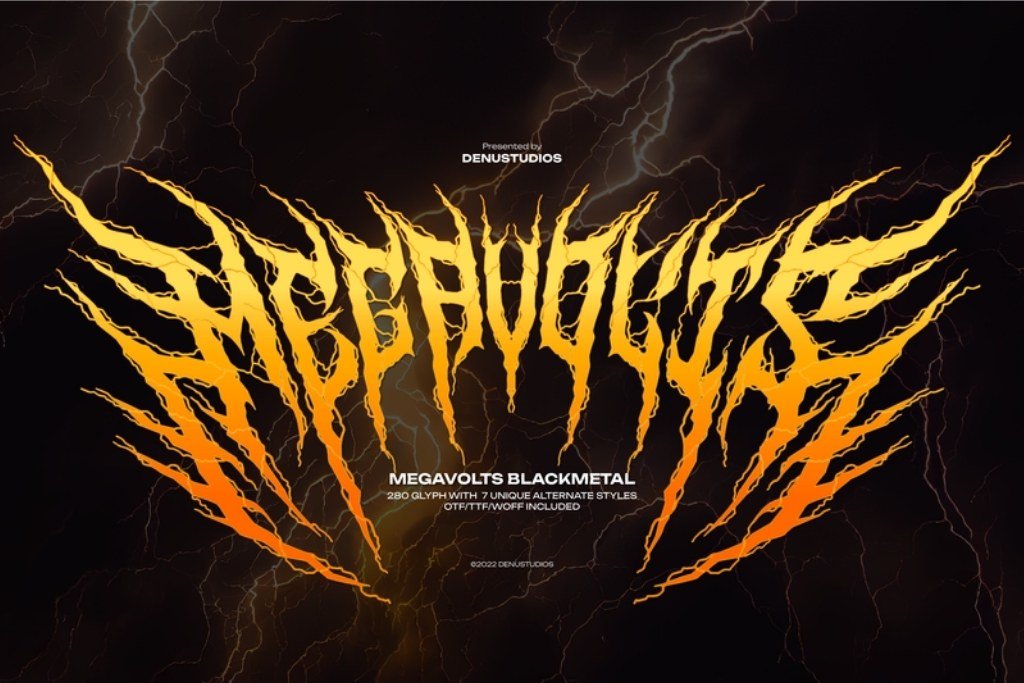
Best for lightning-inspired complexity
12. Megavolts
By Denustudios
A hand-drawn black-metal typeface with more than 280 glyphs and seven alternate styles, according to the current listing.
Megavolts is the most exploratory kind of pick here: jagged, intricate and energetic, with a larger set of glyphs to inspect. Consider it for a bold central wordmark, underground zine cover or music-merch composition.
An intricate, lightning-inspired direction with alternates.
Didn't find what you were looking for?
Use the search below to explore more options on Creative Fabrica.
3 design directions for a band logo, cover and shirt
The rehearsal-room rock identity
Start with: Thiger Feron for a rough, moving brush treatment. Set a short name large enough for the texture to read, and keep the rest of the composition straightforward.
Build the scene: A monochrome rehearsal photograph, one muted accent color and a clear line of venue information. Let the lettering be the energetic part of the design instead of adding several competing textures.
Check: Reduce the poster to phone size. If the smaller words disappear into the brush strokes, separate them further and simplify their typeface.
The Gothic album-cover identity
Start with: Metal Mesar, Metal Gothic or New Rocker. Look for a strong relationship between the shape of the name and the image beneath it.
Build the scene: Use a restrained photographic or illustrated background and give the wordmark a clear area of contrast. A small secondary title can provide a quieter counterpoint to the large display letters.
Check: View the cover as a small square, not only at full resolution. Decide whether the name needs a clearer second appearance in the surrounding page or release artwork.
The extreme-metal merch identity
Start with: Brocore, Atherna, Vornath or Megavolts. Choose one dense, expressive wordmark and leave enough space around its outer silhouette.
Build the scene: Place the design on a simple shirt mockup, then compare a large chest treatment with a smaller placement. Try a single-color version before adding distress, illustration or extra effects.
Check: Ask the print provider about the smallest lines and gaps it can reproduce for the chosen process. Thin details that survive on a screen may need adjustment in the final artwork.
From a font specimen to your own wordmark
- Write a short brief. Name the music or visual mood, the audience and the three places the logo must work. A band’s social avatar, a release cover and a shirt create different layout constraints.
- Make a shortlist of three. Compare one simpler option with one Gothic and one more extreme direction. Use the same words and background so the lettering is the main variable.
- Start with plain type. Work in one color before adding strokes, shadows, textures or supporting artwork. This makes it easier to judge spacing and the overall silhouette.
- Review the spaces between letters. Look at both the dark shapes and the gaps. Large extensions can make a pair feel connected even when the main stems sit far apart.
- Explore the available alternates. Where the listing includes alternate characters, try them selectively. One useful change at the beginning or end of a name can be more effective than using a decorative version of every letter.
- Make versions for the intended placements. Compare the full wordmark, a smaller treatment and any supporting name line. Keep the editable source alongside the final artwork.
- Review at real viewing sizes. Check the album thumbnail, phone screen and merchandise placement before making the final choice. Judge the name as part of the complete design.
For a wider Gothic direction, explore our Old English and blackletter font selection. If your project leans toward painted marks and street lettering, our urban graffiti fonts offer a different route to expressive display type.
Details that can weaken a strong metal logo
Adding effects before the word shape works
A glow or a chrome finish can make a specimen look exciting without solving an awkward letter combination. Judge the plain silhouette first. Add effects only when they support the artwork and remain useful at the intended size.
Using the display face for every line
The band name, date, location and supporting copy do not all need the same treatment. A simpler companion lets people find practical information while preserving the personality of the wordmark.
Filling every gap with another spike or symbol
Leave room around the logo to make its outer shape recognizable. If you add a symbol, decide what it contributes to the identity. A well-placed detail can give the name a focal point; several unrelated motifs can make the whole design harder to follow.
Choosing a preview instead of choosing a font
The texture, color treatment, photograph or mockup in a product image may be part of the presentation rather than the download. Read the file description and glyph information. Choose the underlying letterforms for your project, then build your own artwork around them.
Metal font FAQ
What is a metal font?
In this guide, a metal font is a display typeface suited to metal-music graphics, often using sharp angles, Gothic structures, thorns, distressed edges or an aggressive silhouette. A metallic font effect, such as chrome or brushed steel, is a separate visual treatment.
Which metal font should I try first for a band logo?
Choose according to the lettering you need. Try Metal Mesar or New Rocker for a Gothic direction, Thiger Feron for a rough rock treatment, or Brocore and Atherna for more extreme visuals. Compare the actual name at the final viewing size before deciding.
Can these fonts be used for album covers and merchandise?
Several selected listings describe music artwork, logos and apparel among their intended design uses. Check the current product and applicable license for your specific project, including how you plan to distribute or sell the finished design.
How can I make a highly detailed logo easier to read?
Give it a clear background, enough space and a strong size relationship to nearby elements. Consider a simpler secondary rendering of the name for small placements, lineups or practical information.
Do I need an editable logo template as well as a font?
A font gives you letterforms you can use to set your own words. A logo template supplies a starting composition and may require particular software. For a typography-led band identity, begin by choosing the font and testing the name before deciding whether you need a template.
Are the preview backgrounds and shirt mockups included?
Check each listing’s file description. A font product preview can show a finished composition to demonstrate the typeface without including every background, texture or mockup used in that image.
Choose the lettering that belongs to your sound
A memorable metal wordmark starts with a clear direction: rough and moving, Gothic and structured, or intricate and extreme. Pick three candidates, set the same name and compare them where the design will actually appear.
Start with Metal Mesar for a Gothic music identity, Thiger Feron for brush-driven rock artwork, or Brocore for an extreme-metal direction.