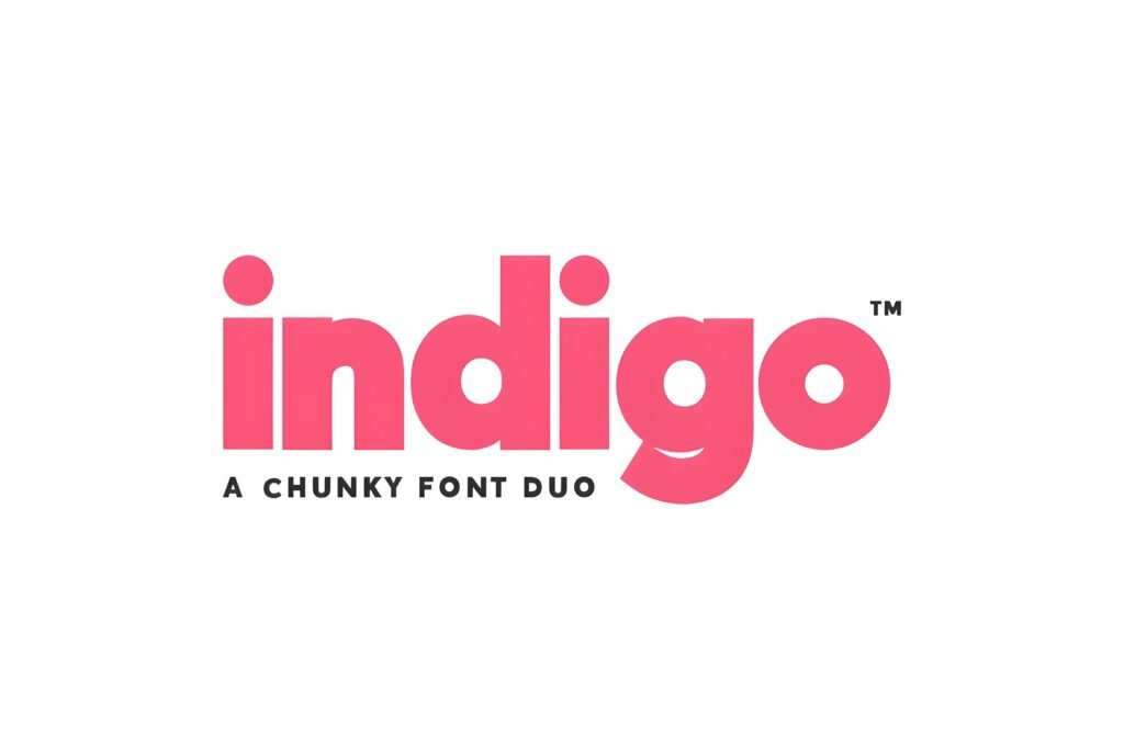
Indigo Font Duo presents a combination of two distinct styles: a clean, modern regular weight and a striking outline variant. This pairing is designed to create visual contrast and rhythm, lending itself to contemporary and bold design projects, particularly those aimed at social media and branding contexts.
Disclosure: This post contains an affiliate link. We may earn a commission at no extra cost to you.
What Makes Indigo Font Duo Distinctive?
The duo consists of a solid, sleek style alongside an artistic outline version, allowing for layered compositions or standalone use. The regular style offers clarity and structure, while the outline adds an expressive, edgy dimension. Together, they provide flexibility for creating hierarchy and emphasis within a single font family.
Best Uses for Indigo Font Duo
This font duo suits projects that benefit from a modern and confident aesthetic, such as Instagram posts, headers, logos, posters, packaging, and web design. Its balance of minimalism and artistic flair makes it appropriate for creatives seeking to combine polish with personality in their visuals.
How to Pair Indigo Font Duo
For effective typography combinations, consider pairing the Indigo Font Duo as headline/subhead with a neutral sans-serif for body text, such as a simple geometric or humanist sans. For example, use Indigo Regular for headlines, Indigo Outline for subheads or accent text, and a clean sans-serif like Montserrat or Open Sans for body copy. Alternatively, pair the outline style with a serif font for contrast in editorial or branding layouts.
Practical Design Tips
Use the regular style at larger sizes for clear, impactful headlines, and layer the outline style over or alongside it to create depth and visual interest. Maintain generous whitespace around the duo to prevent the outline from feeling cluttered. In social media posts, scale the outline variant slightly smaller or use it as a secondary element to complement the solid text. For logos, consider using the outline style for initials or monograms paired with the regular style for full names to balance legibility and artistic expression.
Frequently Asked Questions
Can Indigo Font Duo be used effectively for body text?
Given its design focus on headline and display use, especially with the outline style, it may not be ideal for extended body text. The regular style could work for short paragraphs but is best reserved for headings or subheads.
Is it possible to layer the two styles for a single word or phrase?
Yes, the duo is intended for creative layering, combining the solid and outline styles to produce dynamic visual effects. Careful alignment and spacing are recommended to maintain readability.
What types of projects benefit most from this font duo?
Projects that require a modern, bold, and stylish look—such as Instagram graphics, branding, posters, and packaging—can leverage the duo’s contrasting styles to create standout visuals.