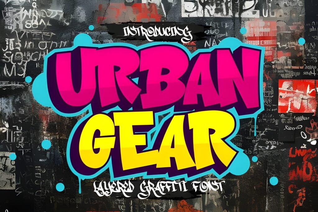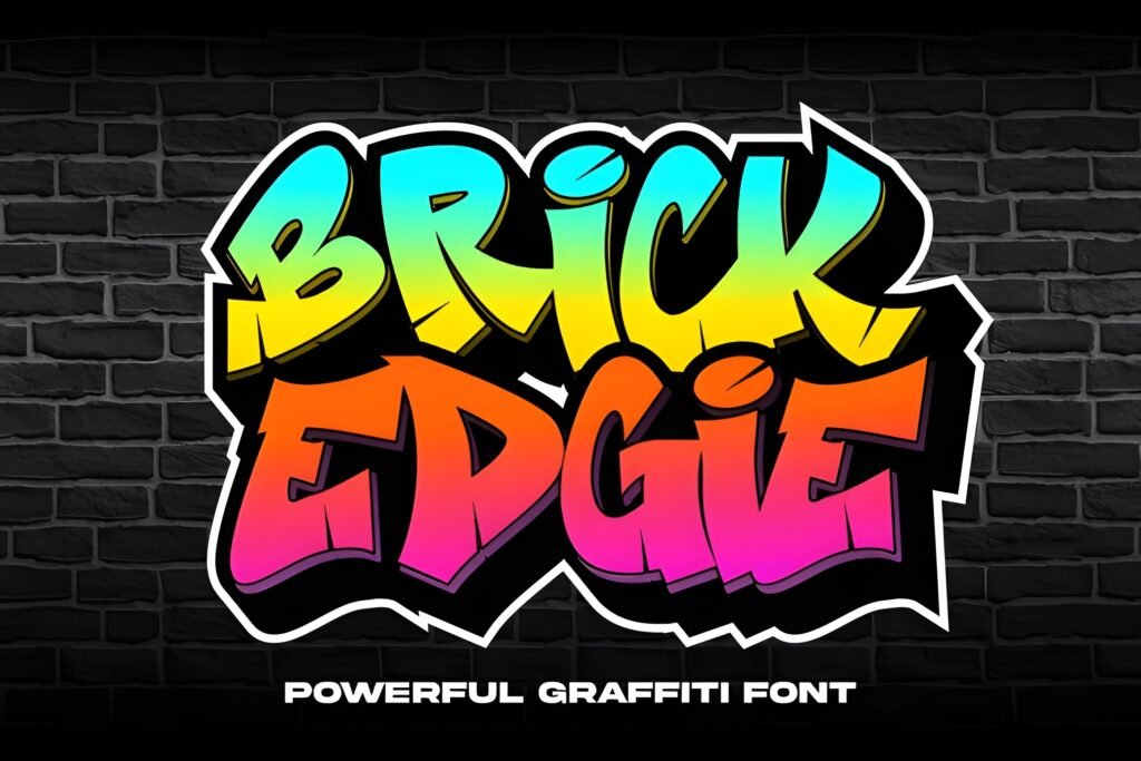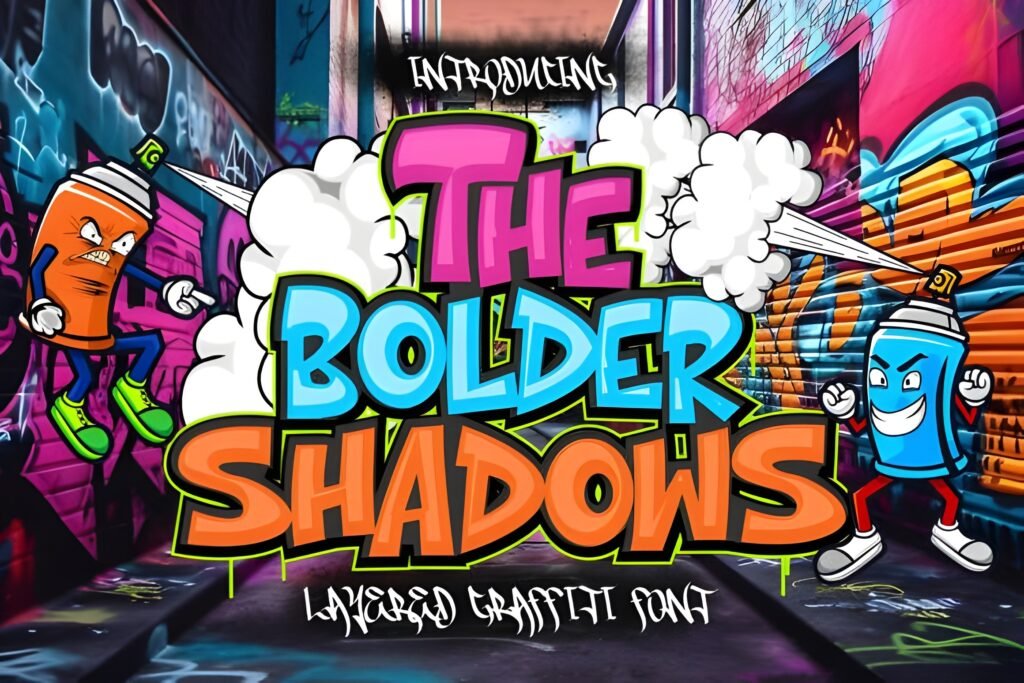
The Bolder Shadow Font is a bold urban graffiti typeface characterized by sharp edges and strong lines that evoke the energy of city life. Its letterforms suggest a streetwise attitude, making it suitable for projects that require a commanding and rebellious visual presence.
Disclosure: This post contains an affiliate link. We may earn a commission at no extra cost to you.
What Makes The Bolder Shadow Font Distinctive?
This font features striking, angular shapes that emphasize boldness and urban style. The design leans into a raw, graffiti-inspired aesthetic with a sense of power and defiance. It is tailored to create impactful headlines or graphic elements rather than subtle text blocks.
Best Uses for The Bolder Shadow Font
Ideal applications include music event posters, streetwear branding, skate graphics, and apparel designs where an urban, edgy vibe is desired. It works well for projects connected to hip-hop culture, rock concerts, or modern street fashion, where a strong visual statement is needed.
How to Pair The Bolder Shadow Font
Pair The Bolder Shadow Font with clean, minimal sans-serif fonts used for body text to balance its intensity. For example, use it as a headline font with a simple sans-serif like Montserrat or Open Sans for subheadings and body copy. This contrast helps maintain readability while preserving the font’s bold impact.
Practical Design Tips
Use generous whitespace around text set in this font to prevent visual clutter and allow its sharp edges to stand out. Scale it prominently for headlines or logos to maximize its urban attitude. Avoid using it in long paragraphs; instead, reserve it for short, emphatic phrases or titles. Combining it with subdued color palettes can enhance its street-style feel without overwhelming the viewer.
Frequently Asked Questions
Can The Bolder Shadow Font be used for body text?
Due to its bold and angular design, it is best suited for headlines or display use rather than extended body text, where readability could be compromised.
What types of projects benefit most from this font?
Projects related to urban culture, music events, streetwear branding, and skate graphics are natural fits, as the font conveys a strong, rebellious energy.
How should I pair this font with others?
Pair it with clean, simple sans-serif fonts for supporting text to create a clear hierarchy and maintain legibility alongside its bold style.