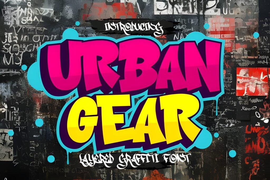
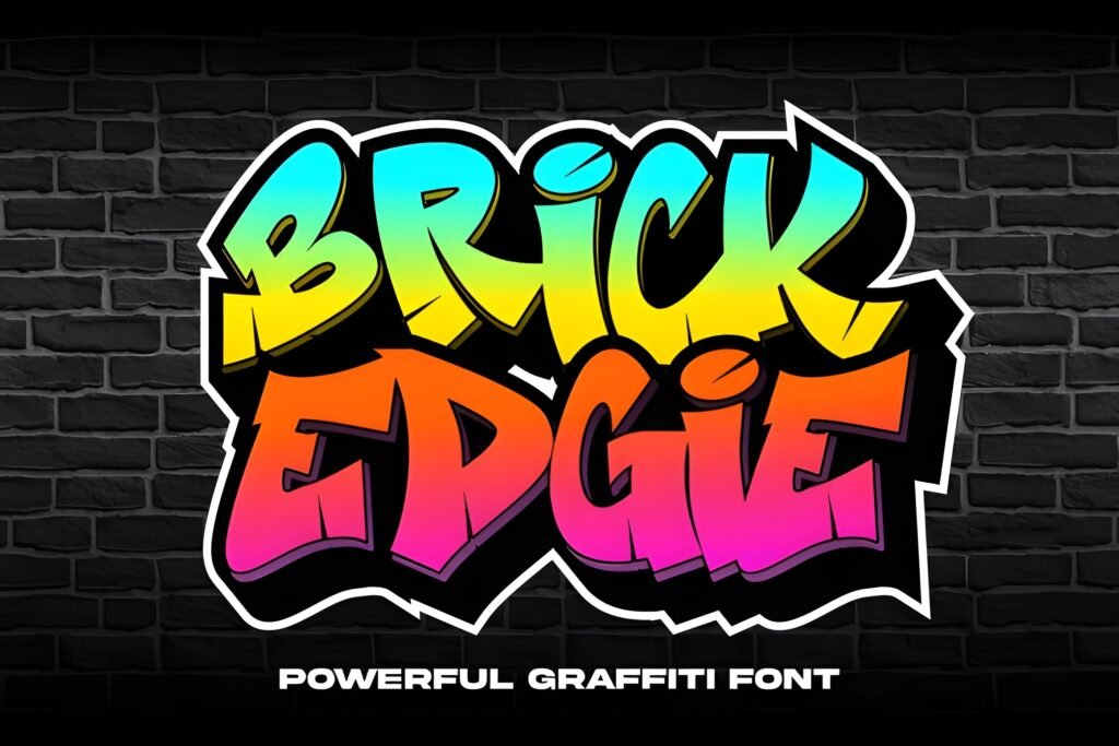
Boy Graffiti Font channels the dynamic spirit of street art through bold, detailed letterforms that evoke urban graffiti aesthetics. Its design suggests a strong, expressive presence suited for projects aiming to capture a raw, city-inspired energy.
Disclosure: This post contains an affiliate link. We may earn a commission at no extra cost to you.
What Makes Boy Graffiti Font Distinctive?
This font features bold lettering combined with intricate details that contribute to its distinctive urban style. Its visual weight and complexity make it well-suited for display use where impact is key, such as posters or album covers. The style suggests a hand-crafted, artistic approach rather than a clean or minimal look.
Best Uses for Boy Graffiti Font
Boy Graffiti Font is particularly appropriate for creative projects related to street culture, music genres like hip-hop, or any design requiring a gritty, authentic graffiti vibe. It works well on apparel graphics, stickers, and digital art where a bold statement is desired. Due to its strong personality, it is best applied in headlines or titles rather than body text.
How to Pair Boy Graffiti Font
To balance the boldness of this font, pair it with clean, simple sans-serif fonts for subheads or body text. For example, use Boy Graffiti Font for headlines and a neutral sans-serif like Helvetica or Open Sans for supporting copy. Alternatively, pairing with a minimal geometric sans-serif can maintain modernity while allowing the graffiti style to stand out.
Practical Design Tips
Use ample whitespace around the font to prevent visual clutter and allow its intricate details to be appreciated. Scale the font large enough to showcase its boldness but avoid overcrowding the layout. Combine it with solid color backgrounds or subtle textures that complement urban themes without competing with the lettering. Consider limiting the use of multiple font styles in the same design to keep focus on the graffiti aesthetic.
Frequently Asked Questions
Can Boy Graffiti Font be used for body text?
Given its bold and detailed design, this font is best reserved for headlines or display purposes rather than extended body text, where readability could be compromised.
What types of projects suit this font best?
Projects that benefit from an urban, street-art feel—such as posters, apparel designs, album covers, and stickers—are ideal contexts for this font.
How should I pair Boy Graffiti Font with other fonts?
Pair it with clean, simple sans-serifs for subheadings or body copy to create contrast and maintain legibility while highlighting the graffiti style in headlines.