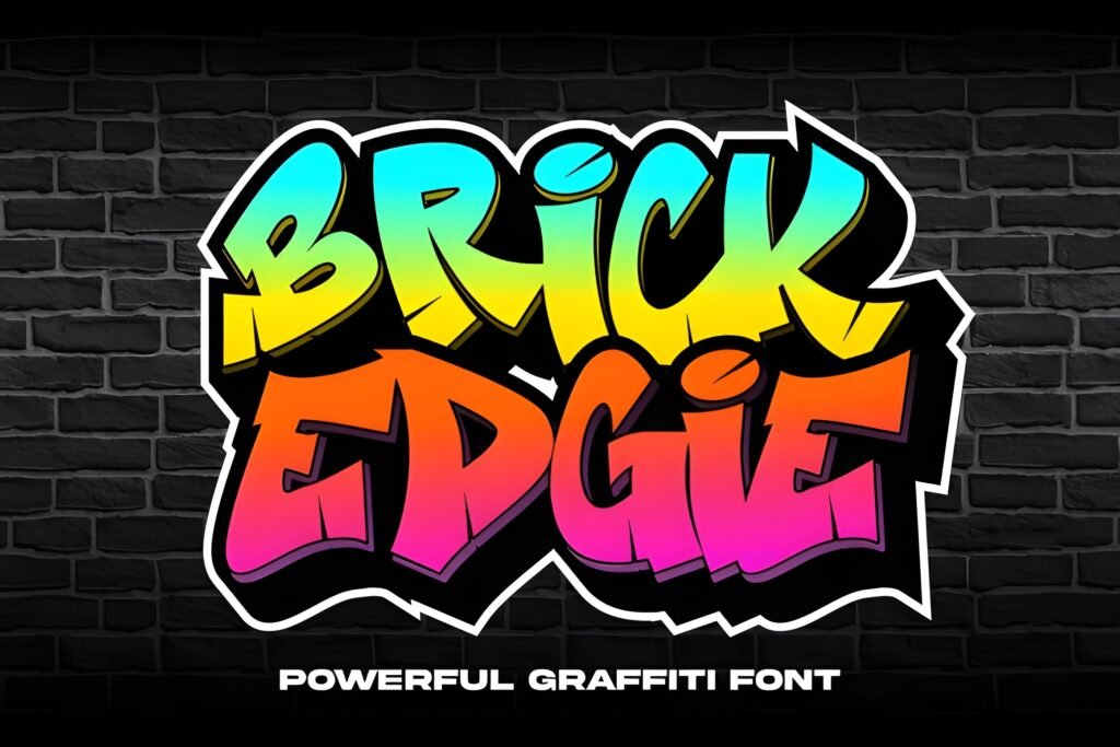
Brick Edgie presents a bold, jagged letterform style that channels the raw energy of urban graffiti. Its sharp edges and striking shapes evoke the look of concrete walls and street art, making it suitable for designs that aim to convey a rebellious, street-smart attitude. This font is designed to stand out with a loud, impactful presence.
Disclosure: This post contains an affiliate link. We may earn a commission at no extra cost to you.
What Makes Brick Edgie Font Distinctive?
The font’s defining characteristic is its sharp, edgy letterforms that suggest a hand-painted or spray-painted aesthetic. Each character appears crafted to mimic the intensity and spontaneity of graffiti tags, lending a sense of urgency and boldness. The overall style is aggressive and visually striking, intended for high-impact display rather than subtlety.
Best Uses for Brick Edgie Font
Ideal for posters, album covers, apparel graphics, and digital art that require a gritty, urban vibe. It works well in contexts where the design needs to capture attention immediately and convey a sense of underground culture or street expression. Because of its strong personality, it is best used at larger sizes for headlines or titles rather than body text.
How to Pair Brick Edgie Font
Pair Brick Edgie with clean, simple sans-serif fonts for subheadings or body text to provide contrast and improve readability. For example, a geometric sans-serif can serve as body copy beneath Brick Edgie headlines in a music event poster. Alternatively, a neutral grotesque font can support apparel branding by balancing the font’s aggressive style with understated text elements.
Practical Design Tips
Use generous whitespace around Brick Edgie to prevent the sharp letterforms from overwhelming the layout. Scale the font prominently for headlines or key messaging to maximize its impact. Avoid using it in dense paragraphs; instead, reserve it for short, punchy phrases or titles. Combining it with minimalist design elements or monochrome color schemes can enhance its street-art feel without cluttering the composition.
Frequently Asked Questions
Can Brick Edgie be used for body text?
Due to its bold and jagged letterforms, Brick Edgie is best suited for display use such as headlines or titles rather than extended body text, where readability could be compromised.
What types of projects benefit most from Brick Edgie?
Projects that aim to evoke urban culture, street art, or a rebellious aesthetic—such as music posters, apparel designs, or digital art—can leverage this font’s strong visual voice effectively.
How should I pair Brick Edgie with other fonts?
Pair it with simple, clean sans-serif fonts for supporting text to create contrast and maintain clarity, especially in layouts where Brick Edgie serves as the headline or focal point.