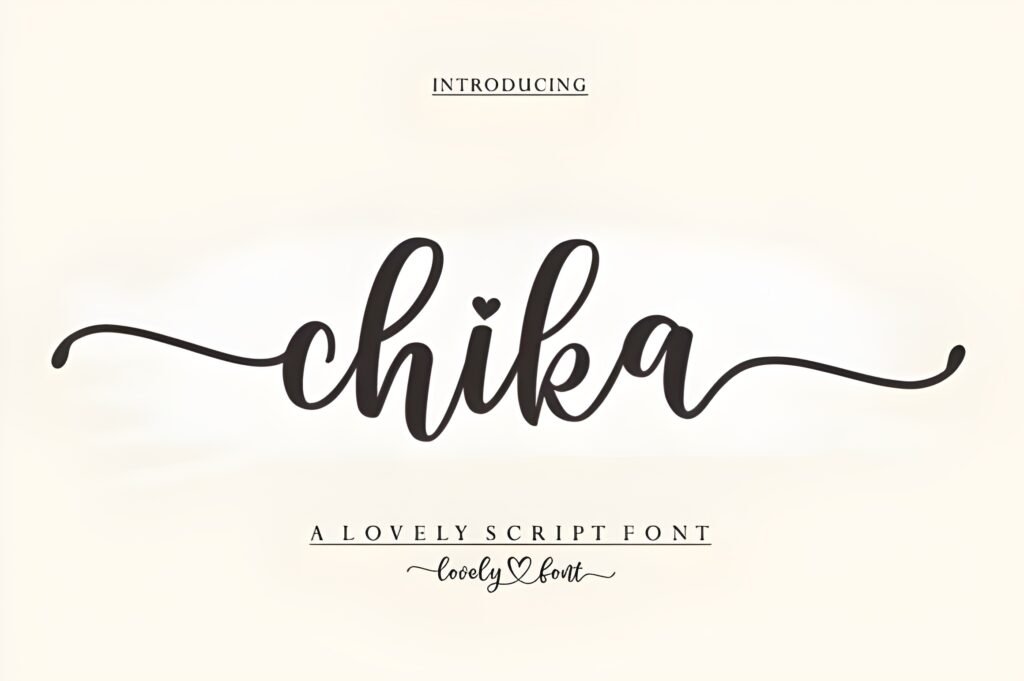
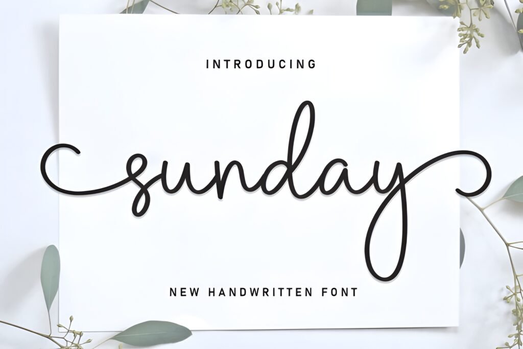
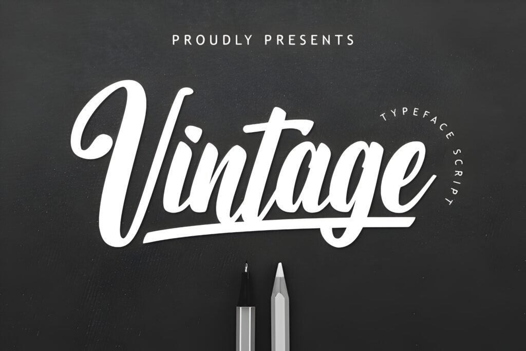
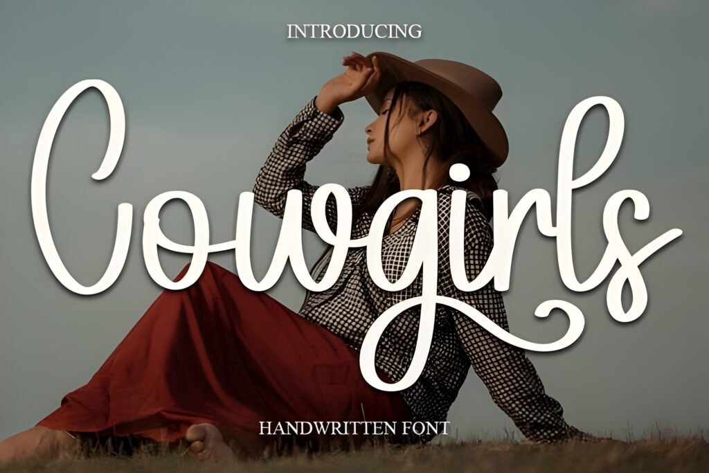
Cursive Font 2 is a calligraphy-inspired typeface characterized by flowing, graceful strokes that suggest a handcrafted, ink-on-paper aesthetic. It aims to balance classical elegance with a modern artistic sensibility, offering a visual rhythm that can bring warmth and sophistication to designs.
Disclosure: This post contains an affiliate link. We may earn a commission at no extra cost to you.
What Makes Cursive Font 2 Distinctive?
The font features fluid curves and intricate detailing in each letterform, creating a sense of movement and refinement. Its style leans toward a personal, artistic touch rather than rigid formality, which may enhance readability while maintaining a decorative quality. The overall impression is one of timeless charm suited for projects requiring a handwritten calligraphic feel.
Best Uses for Cursive Font 2
This font is well suited for wedding invitations, greeting cards, and branding projects where a romantic or elegant tone is desired. It can also be effective in creative print materials that benefit from a personal, artistic flair. Its balance of beauty and readability makes it a candidate for any design aiming to evoke warmth and sophistication without sacrificing clarity.
How to Pair Cursive Font 2
Pair Cursive Font 2 with clean, sans-serif fonts for contrast and hierarchy. For example, use Cursive for headlines or logos to provide expressive flair, and a simple sans-serif like Helvetica or Montserrat for subheadings and body text to maintain legibility. In editorial layouts, Cursive can headline sections while a neutral serif font handles longer paragraphs. This approach highlights the font’s decorative qualities without overwhelming the reader.
Practical Design Tips
Use generous whitespace around text set in this font to let its intricate strokes breathe and avoid visual clutter. Scale the font larger for headlines or focal points to emphasize its calligraphic details. Avoid using it in dense blocks of text where its flourishes might reduce readability. Combining it with minimalistic layouts enhances its timeless charm, and limiting color palettes can help maintain an elegant, cohesive look.
Frequently Asked Questions
Is Cursive Font 2 suitable for body text?
Due to its detailed and flowing letterforms, it is best used sparingly and not for extended body text where readability is critical. It works better in headlines, logos, or short phrases.
Can this font be used for branding?
Yes, especially for brands seeking a personal, artistic, or romantic identity. It can add sophistication and warmth to logos and brand materials.
What kind of projects benefit most from this font?
Projects like wedding invitations, greeting cards, and creative print designs that require a handwritten, elegant appearance are ideal candidates.