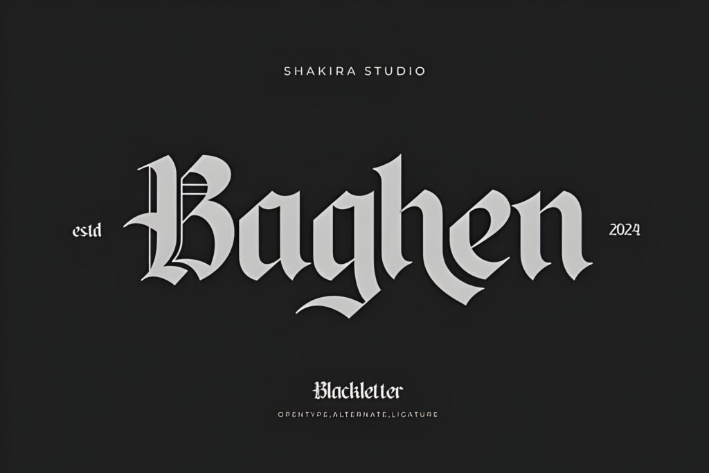
Regius presents a distinctive blend of Old English tradition and Art Deco minimalism, originally designed for corporate packaging. Its geometric forms and restrained ornamentation create a retro yet clean aesthetic, suitable for projects seeking a vintage-inspired but uncluttered typographic voice.
Disclosure: This post contains an affiliate link. We may earn a commission at no extra cost to you.
What Makes Regius Font Distinctive?
This font draws from Old English pub sign lettering, reinterpreted through simple geometric shapes and subtle Art Deco influences. The result is a bold yet refined style that balances heritage with modern clarity. Its minimal decorative elements avoid overwhelming complexity, making it adaptable across various visual contexts.
Best Uses for Regius Font
Regius is well-suited for branding elements that require a historical nod without sacrificing legibility, such as logos and labels. It can also enhance posters, apparel prints, book covers, and web design where a retro flair with contemporary restraint is desired.
How to Pair Regius Font
Pair Regius as a headline font with a clean sans-serif for subheads and body text to maintain readability and contrast. For example, use Regius for headlines, a geometric sans-serif like Futura for subheads, and a neutral sans-serif such as Open Sans for body copy. This hierarchy emphasizes Regius’s decorative qualities while supporting overall clarity.
Practical Design Tips
Use generous whitespace around Regius to let its shapes breathe, especially in larger sizes where its Art Deco details can be appreciated. Avoid overcrowding text blocks and consider contrasting it with simpler typefaces to highlight its unique character. For packaging or logos, scale Regius prominently to leverage its boldness; in posters, combine it with minimalist layouts to balance vintage style with modern design.
Frequently Asked Questions
Is Regius suitable for long paragraphs of text?
Given its decorative Old English and Art Deco influences, Regius is better suited for display use such as headlines or logos rather than extended body text, where readability may be compromised.
Can Regius work well in digital interfaces?
Its clean geometric shapes suggest potential for digital use, particularly in headings or branding elements, but testing at various screen sizes is advisable to ensure legibility.
What styles complement Regius in a design system?
Simple, modern sans-serifs with neutral weights complement Regius by providing contrast and supporting readability, especially in subheadings and body copy roles.