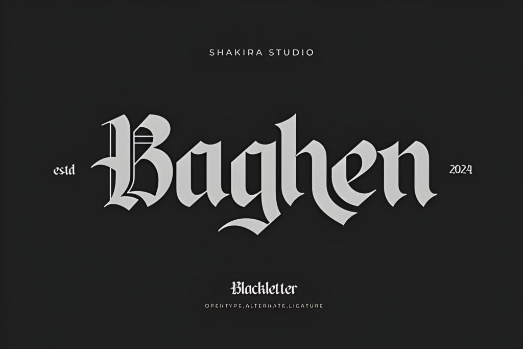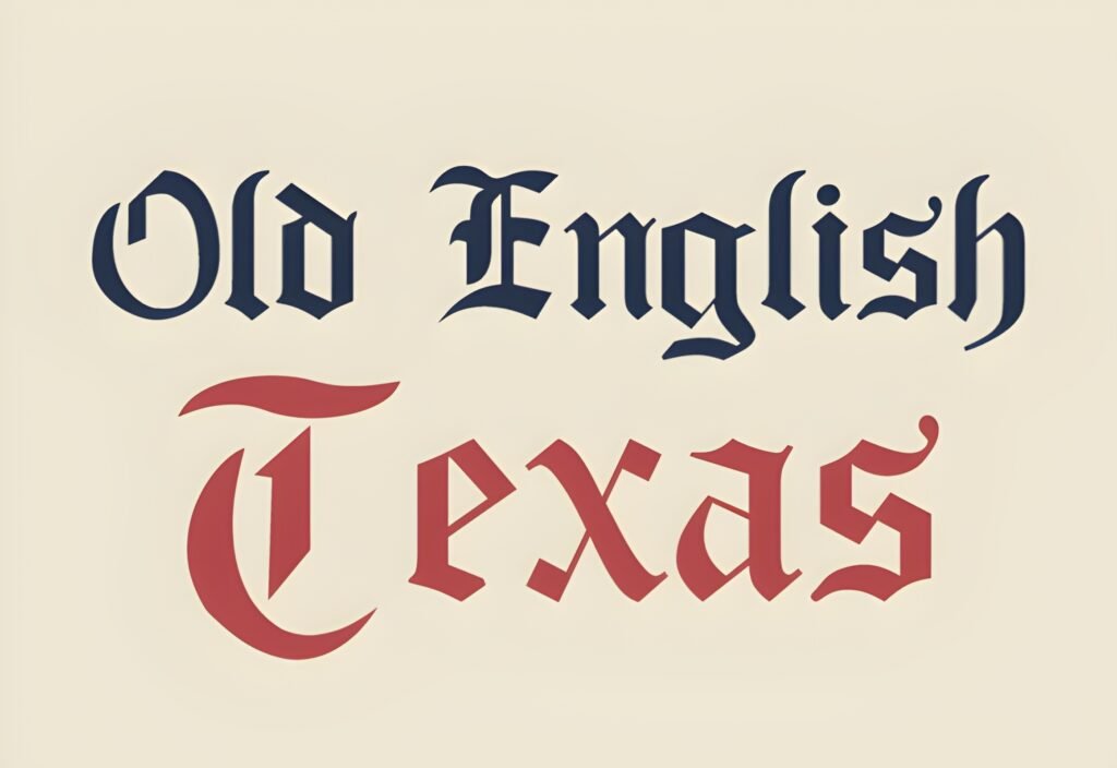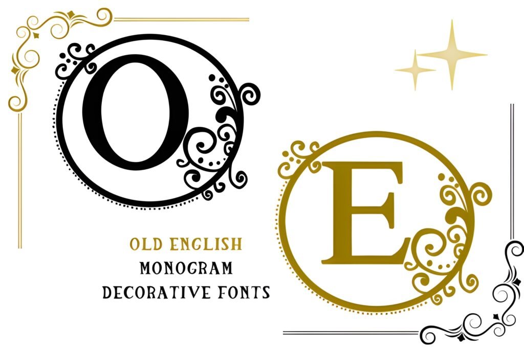
Old English Monogram is a decorative typeface that channels vintage aesthetics with ornate, manuscript-inspired letterforms. Its design suggests a connection to historical calligraphy, making it suitable for projects seeking a refined, classical atmosphere rather than straightforward readability.
Disclosure: This post contains an affiliate link. We may earn a commission at no extra cost to you.
What Makes Old English Monogram Font Distinctive?
This font features intricate detailing reminiscent of handwritten manuscripts, lending a handcrafted feel to text. Its vintage character suits applications where decorative impact is prioritized over body text clarity. The style implies a strong presence, likely best used at larger sizes to showcase its ornamental qualities.
Best Uses for Old English Monogram Font
Ideal for personal stationery such as diaries, greeting cards, and invitations, this font also extends well to branding elements like logos and product packaging that benefit from a nostalgic or antique vibe. It can enhance apparel prints and social media visuals where a touch of historical flair or romantic styling is desired.
How to Pair Old English Monogram Font
Pair Old English Monogram with clean, modern sans-serif fonts to balance its complexity. For example, use Old English Monogram for headlines or monograms, combined with a simple sans-serif for subheads and body text to maintain legibility. Suitable categories include: headline (Old English Monogram) / subhead (geometric sans-serif) / body (neutral sans-serif).
Practical Design Tips
Use generous whitespace around text set in this font to prevent visual clutter and allow its details to stand out. Employ it primarily at larger scales, such as titles or monograms, rather than dense paragraphs. Contrast its ornate style with minimalist layouts or solid color backgrounds to emphasize its vintage charm without overwhelming the design.
Frequently Asked Questions
Can Old English Monogram be used for body text?
Given its decorative and intricate design, this font is better suited for display purposes like headlines or monograms rather than extended body text, where readability is essential.
What types of projects benefit most from this font?
Projects with a vintage, romantic, or historical theme—such as invitations, greeting cards, logos with antique appeal, or apparel designs—can effectively utilize this font to add character and elegance.
How should I pair this font with others in a layout?
Combine it with simple, clean sans-serif fonts for supporting text to create contrast and maintain legibility, using Old English Monogram primarily for prominent text elements.