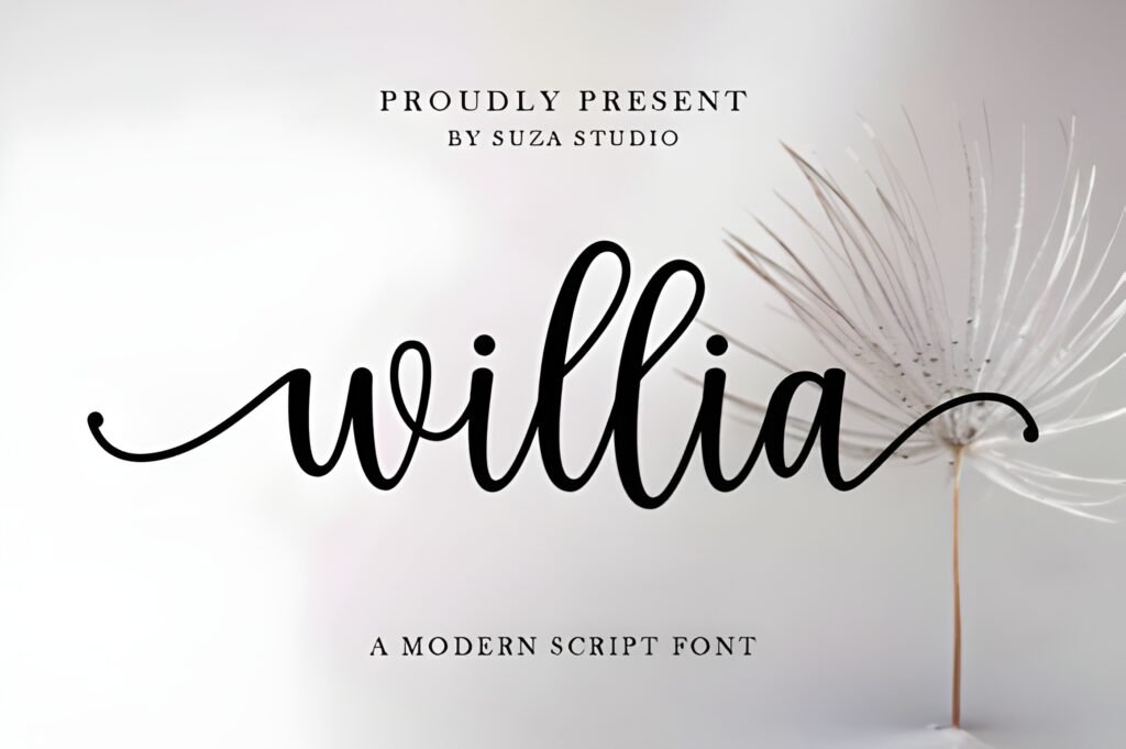
Willia Instagram Font presents a flowing, script style that suggests a handwritten spell in motion. Its smooth curves and rhythmic strokes create a sense of quiet sophistication, lending a soft, artistic character to text. This font is described as suitable for modern and artistic designs, particularly those aiming for a refined yet expressive handwritten appearance.
Disclosure: This post contains an affiliate link. We may earn a commission at no extra cost to you.
What Makes Willia Instagram Font Distinctive?
The font is characterized by graceful, flowing letterforms with a natural rhythm that supports readability. Its delicate strokes contribute to a luxurious handwritten vibe without sacrificing clarity. The style is versatile enough to suit various creative applications, from social media content to printed materials, emphasizing warmth and personality in layouts.
Best Uses for Willia Instagram Font
Willia is well suited for Instagram posts that require a stylish, expressive script, such as quotes or branding elements. It can also be applied effectively in invitations, greeting cards, posters, fashion branding, business cards, stationery, and blog titles. The font’s balance of elegance and readability makes it a practical choice for projects seeking a handcrafted charm with a modern touch.
How to Pair Willia Instagram Font
For effective typography hierarchies, pair this script font with clean sans-serif fonts for contrast. For example, use Willia for headlines or prominent Instagram quotes, complemented by a simple sans-serif for subheads or body text to maintain legibility. In branding, Willia can serve as the logo or signature font, paired with a neutral sans-serif or serif for supporting text such as taglines or descriptions.
Practical Design Tips
When using Willia, allow generous whitespace around text to highlight its flowing strokes and avoid visual clutter. Scale the font larger for headlines or quotes to emphasize its artistic qualities, while keeping supporting text smaller and simpler. Avoid pairing it with other decorative fonts to maintain clarity. For layouts like invitations or greeting cards, center the text and use subtle color palettes to enhance the font’s refined feel without overpowering its delicate rhythm.
Frequently Asked Questions
Is Willia suitable for long paragraphs of text?
Given its script style and flowing strokes, Willia is best reserved for shorter text elements like headlines, quotes, or branding rather than extended body copy, where readability could diminish.
Can Willia be used for professional branding projects?
Yes, especially for brands seeking a modern, handcrafted aesthetic with a touch of elegance. It works well for logos, business cards, and fashion branding where expressive script adds personality.
What kind of color schemes complement Willia?
Subtle, muted, or monochromatic palettes tend to enhance the font’s delicate and sophisticated nature, allowing its smooth curves to stand out without distraction.