Halloween typography guide
What makes a font spooky? Usually it is not one single “horror font” feature. Spooky typography works by combining visual tension: irregular shapes, sharp or decayed edges, unusual spacing, dramatic contrast, eerie texture and letterforms that feel unstable, old, supernatural or handmade.
The good news is that you can create a Halloween mood without making every word unreadable. These seven typography tricks explain why spooky lettering works—and how to use the same ideas in posters, invitations, Cricut projects, social graphics, signs and Halloween designs.
The Short Answer: What Makes Typography Feel Spooky?
A font feels spooky when its shapes break the visual rules we associate with calm, polished typography. Uneven baselines suggest instability. Sharp points feel dangerous. Drips and distress imply age, decay or mess. Tall gothic curves evoke old books and haunted architecture. Tight spacing creates pressure, while stretched spacing can feel empty and eerie.
For inspiration, compare these effects with our best Halloween fonts collection, where different styles use these cues in very different ways.
1. Jagged Edges & Uneven Baselines Create Tension
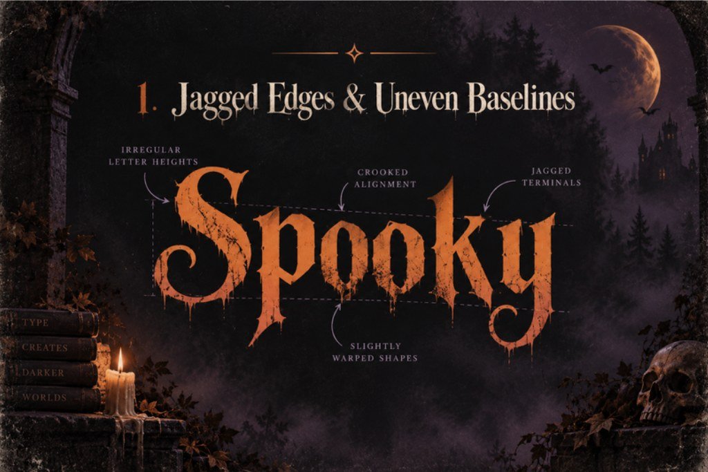
Perfectly aligned letters feel controlled. Spooky lettering often does the opposite. A shaky baseline, mismatched letter heights, chipped edges or irregular angles introduce a small amount of visual discomfort. Your eye notices that something is “off” before you consciously identify why.
That does not mean every letter needs to look broken. One or two irregular details are often enough. For a Halloween title, try keeping the word readable while letting selected letters tilt, dip below the baseline or end in rough points. The result feels handmade, haunted or unstable instead of simply messy.
2. Drips, Distress & Texture Suggest Decay
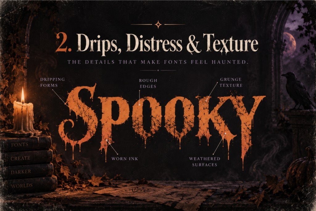
Texture tells a story before the reader finishes the word. Dripping forms can suggest melting wax, slime, ink or classic horror imagery. Distressed patches can make lettering feel weathered, burned, scratched or printed on an old Halloween poster. Rough brush textures add frantic energy.
The trick is to make texture support the message instead of covering it. Use the strongest distress on large display words and keep smaller information—dates, addresses, instructions or captions—clean. This creates a hierarchy where the spooky font supplies the atmosphere and a simple supporting font supplies the information.
3. Sharp Serifs & Gothic Curves Add a Haunted-History Mood
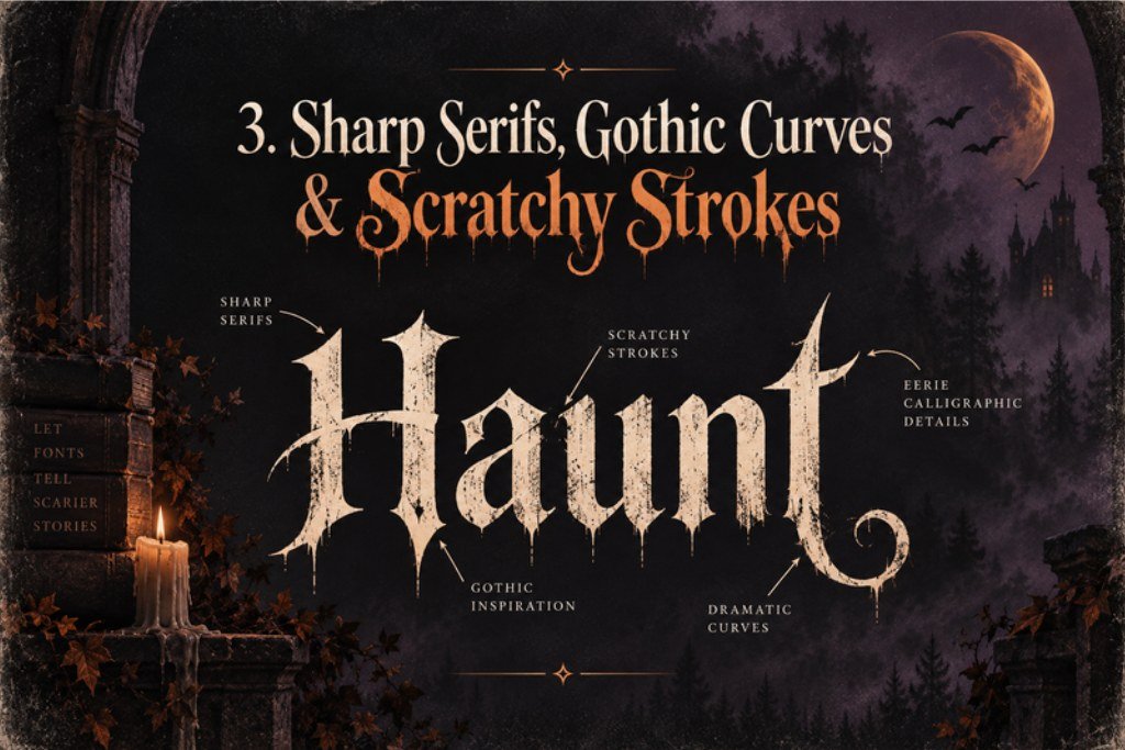
Some spooky typography does not need drips at all. Sharp serifs, blackletter-inspired details, narrow proportions and dramatic curves can create a dark, old-world feeling. These forms are strongly associated with antique books, cathedral shapes, vintage labels, folklore and gothic visual culture.
This direction is especially useful when you want Halloween to feel elegant rather than cartoonish. It also overlaps naturally with witchy fonts, where moonlit, mystical and occult-inspired designs often rely on long strokes, decorative terminals and high-contrast letterforms.
4. Extreme Contrast Makes Letters Feel Dramatic
Contrast is one of the fastest ways to turn ordinary lettering into a Halloween focal point. Thick stems beside hairline-thin details feel theatrical. Huge uppercase words paired with tiny handwritten text feel cinematic. Bright lettering against a nearly black background creates a glowing, poster-like effect.
You can also create contrast inside the phrase itself. Make one word oversized, condensed or rough while the rest stays neutral. A simple line such as “Enter If You Dare” becomes more memorable when Dare carries the visual danger and the other words remain calm.
5. Spacing Can Feel Claustrophobic—or Ghostly
Letter spacing changes the emotional temperature of typography. Tight tracking and overlapping letters create pressure and density, which works well for intense horror titles. Wide tracking creates silence and empty space, which can feel colder, mysterious or supernatural.
Vertical spacing matters too. Stacking words close together can build a heavy poster block; separating a small phrase from the main title can make it feel like a whisper. When designing in Canva, start with a readable font and experiment with spacing before changing fonts again. Small spacing changes can produce more atmosphere than another decorative effect. If you work in Canva often, our guide to Halloween fonts in Canva gives you more ready-to-use directions.
6. Color, Shadow & Outline Change the Personality of the Same Font
A font is only part of the final look. The same lettering can feel playful, gothic, retro or frightening depending on how it is styled. Orange with cream outlines feels festive and vintage. Acid green can suggest slime or monsters. Deep red pushes a design toward horror. Purple, black and muted gold can feel magical or witchy.
Shadows and outlines matter just as much. A hard offset shadow gives retro poster energy. A soft glow can feel supernatural. A rough duplicated shadow can create a misprinted or haunted effect. For Google Images and Pinterest, strong contrast also helps the headline remain recognizable when the image is shown as a small thumbnail.
7. Match the Spookiness Level to the Audience
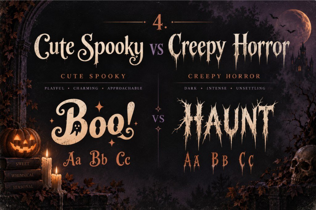
“Spooky” is not one mood. A preschool party invitation and a haunted-house poster can both use Halloween typography, but they need completely different levels of fear. Cute spooky lettering uses rounded shapes, chunky strokes, bouncing baselines, smiling ghosts and soft curves. Creepy horror lettering leans harder into sharp points, decay, distortion, aggressive contrast and darker imagery.
If the project is for kids, crafts, candy labels or friendly party graphics, start with our cute Halloween fonts collection. For darker posters, apparel and dramatic seasonal graphics, use stronger texture and sharper shapes.
A Simple Formula for Better Halloween Typography
For most designs, use one strong spooky cue + one supporting cue + one readable neutral font.
Example: jagged display font + distressed texture + clean sans serif. Or gothic serif + wide spacing + simple small caps. This keeps the Halloween personality obvious without sacrificing readability.
How to Make a Regular Font Look Spooky
You do not always need a dedicated Halloween font. Start with a bold serif, condensed sans serif or handwritten display font and change the treatment around it. Add slight rotation to individual letters, tighten or stretch the spacing, apply a rough texture, use an offset shadow, add a thin outline, or place the word against an eerie high-contrast background.
The best transformations are selective. Keep the core letterforms readable and push the Halloween mood through two or three controlled choices. This approach is especially useful when a brand font must stay recognizable or when a decorative font does not include all the characters you need.
Halloween Typography FAQ
What makes a font look scary?
Sharp angles, irregular forms, extreme contrast, distressed texture, drips, compressed spacing and unstable baselines can all create visual tension. The strongest scary typography usually combines only a few of these cues so the words remain readable.
What makes a font look gothic?
Gothic-looking type often uses sharp serifs, narrow proportions, high stroke contrast, blackletter-inspired construction or decorative curves associated with historical manuscripts and architecture.
Can a cute font still look spooky?
Yes. Rounded or bubbly letters can feel Halloween-ready when paired with wobbly baselines, ghost shapes, pumpkins, bats, playful outlines or seasonal colors. Spooky does not have to mean frightening.
How many fonts should I use in a Halloween design?
Two is a strong default: one expressive display font for the main message and one simple font for supporting information. A third style can work for a small accent, but every added font should have a clear job.
Are spooky fonts good for body text?
Usually not. Highly decorative Halloween fonts are most effective in short headlines, names and labels. Longer paragraphs are easier to read in a clean serif or sans serif.
Build the Mood, Not Just the Word
The best spooky typography is readable first and atmospheric second. Save this guide for your next Halloween project, share it with another designer or crafter, and experiment with shape, texture, spacing and contrast before piling on more effects.