Architecture content wins on Instagram when it feels intentional, not random. The problem I see most often is not “bad design” — it’s missing structure. A Story sequence looks pretty, but it doesn’t guide the viewer from attention to trust to action.
That’s why I treat instagram story template architecture like a system: a repeatable layout logic you can plug different projects into — new build, renovation, interiors, materials, team process, and client proof — without reinventing the wheel every week.
Below are 5 template packs I’d use to build a consistent “architecture design Instagram” presence. I’ll compare them fast, then show you the story framework I use to turn templates into a clean, high-converting content flow.
Affiliate Disclosure
Some links in this post are affiliate links. If you buy through them, I may earn a small commission at no extra cost to you. I only include products that fit the workflow I’d recommend for building a consistent Instagram content system.
Jump to
My method (how I choose templates)
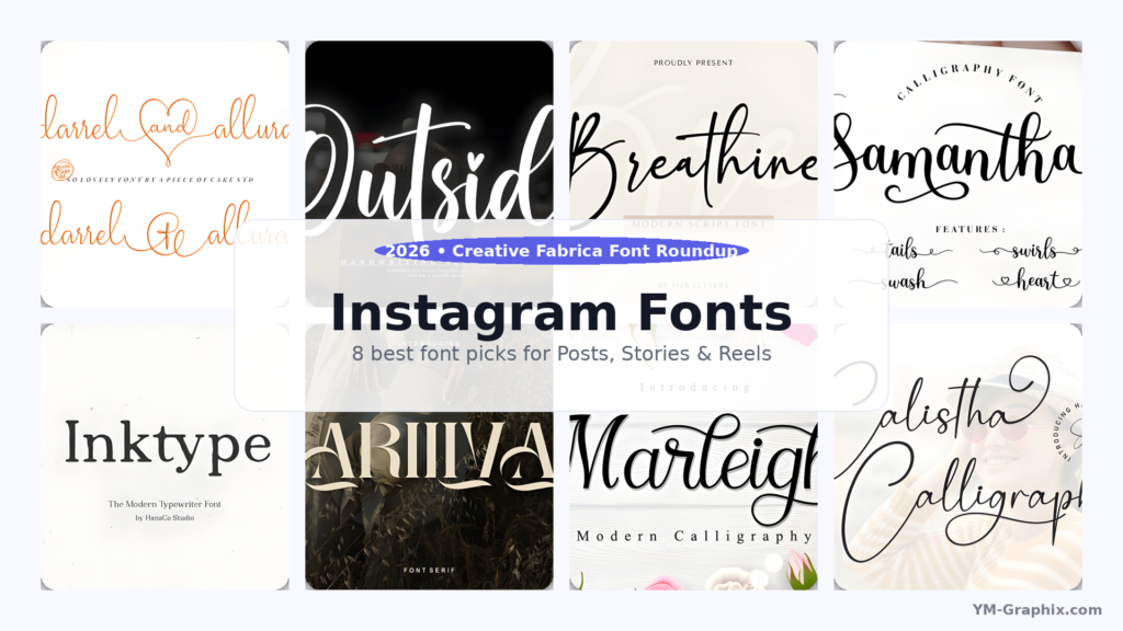
1) Instagram Post, Architecture Content
2) Corvus Architecture Instagram Pack
3) Modern Home Real Estate Instagram Story
4) 8400+ Social Media Canva Template Bundle
5) Canva Medical Social Media & Printables Bundle
Instagram story template architecture (my framework)
Quick comparison
My method: how I choose templates for the best architecture Instagram
When I evaluate a pack, I’m not only judging “looks.” I’m judging whether the pack supports architecture content architecture — meaning your posts and stories feel like one brand system across weeks and campaigns.
My checklist (the fast version)
1) Story sequence logic: Can I create a 6–10 frame flow (Hook → Context → Proof → Process → CTA) without fighting the design?
2) Negative space & hierarchy: Architecture visuals need breathing room. If the template is too busy, the building loses.
3) Modular components: I want swap-friendly blocks: title, caption, numbers, icons, image windows, CTA bar, footer.
4) Editing speed: If it takes 25 minutes to “make it work,” it’s not a system.
5) Consistency across formats: Stories, posts, carousels, Reels covers should share one visual grammar.
A “template architecture” mini-cheat sheet (copy/paste into your workflow)
HEADER: short hook (5–9 words) + brand mark
BODY: 1 idea per frame (no multi-paragraph slides)
IMAGE: strong crop + consistent margins
FOOTER: location / project name / page number
CTA FRAME: one action only (DM, link, save, call)
The 5 template packs (with my expert notes)
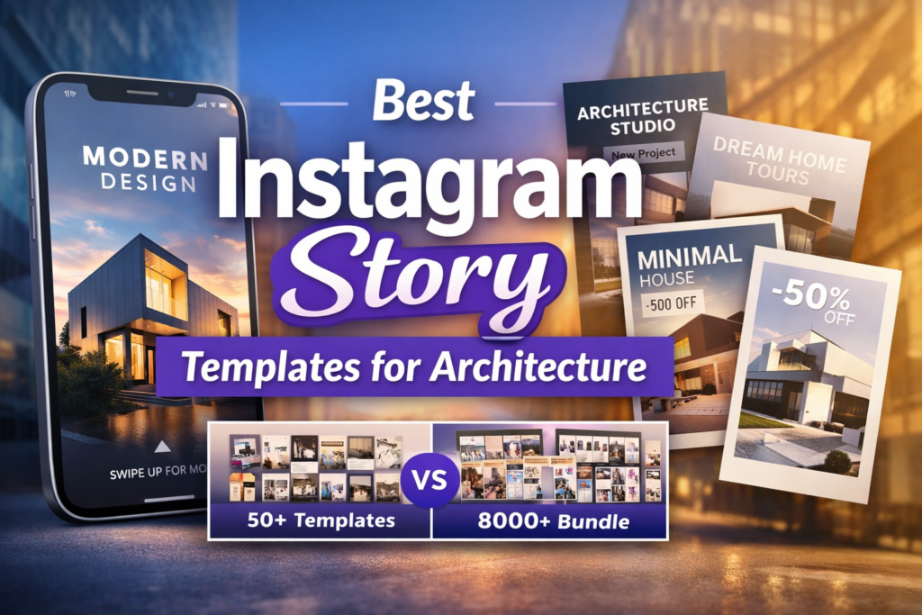
1) Instagram Post, Architecture Content
Chips: Vibe: clean + portfolio-ready Best for: fast weekly content Readability: high (simple blocks)
This is a compact pack that’s easy to turn into a consistent architecture posting rhythm. What I like is the balanced mix: you get post layouts, a handful of feed pieces, and a few stories — enough to build a mini system without drowning in options.
What I’m basing this on: the listing describes 25 total templates (posts/feed/stories) and includes multiple file formats (Photoshop/Illustrator/EPS/PDF) with font links. That’s a practical combo if you collaborate with different designers or move between tools.
How I would use it for architecture design Instagram:
Use the post templates for “hero renders + one-line takeaway,” and the story templates for “process snapshots.” The key is to keep your story series visually identical each week (same header position, same footer, same type sizes).
If you want a stronger instagram story template architecture, add one extra frame type yourself: a dedicated CTA slide with a consistent DM keyword (example: “DM ‘FLOORPLAN’”).
Use case (Post/Carousel): “Project reveal carousel” — Slide 1 hero shot, Slide 2 plan detail, Slide 3 material palette, Slide 4 before/after, Slide 5 outcome metric (timeline, area, budget range if you share it).
Use case (Story/Reels): “Site-to-studio” story chain — teaser frame → 2 process frames → 1 detail frame → 1 CTA frame.
Save/Share trigger: If you need a simple architecture content week you can repeat, save this pack as your “baseline system” and build your own 2–3 branded story frames on top.
Quick pick for a small, consistent architecture content system.
2) Corvus Architecture Instagram Pack
Chips: Vibe: minimalist + dark editorial Best for: studios, portfolios, interiors Readability: strong (negative space)
If you want your Instagram to feel like a modern architecture magazine, Corvus is the one. The listing highlights a dark color scheme, square posts, and vertical story layouts — and that combination is exactly what you want when your visuals (buildings/interiors) should do the talking.
Why it fits architecture instagram story ideas: the pack is described as highly customizable and built in Photoshop, and it includes both posts and stories in equal quantity. That symmetry matters: it makes your feed and stories feel like one system, not two separate styles.
My expert note (from the listing details):
Corvus lists 40 post templates and 40 story templates (80 PSD files total), with smart objects for image placement and editable elements. For me, that “smart object + editable typography” combo is what makes a pack feel professional, not decorative.
I also like that the listing notes free Google fonts and basic instructions. That’s small, but it reduces friction if you hand the templates to a team member.
Use case (Post/Carousel): “Architecture portfolio carousel” — I’d keep Slide 1 ultra-clean (single hero, one title), then use Slides 2–6 for details (façade texture, lighting, plan snippet, material tag, location).
Use case (Story/Reels): “Concept-to-build story” — Frame 1 concept line, Frames 2–3 progress photos, Frame 4 detail close-up, Frame 5 CTA (“Want the floorplan? DM.”).
Save/Share trigger: If your brand needs a premium, minimalist look without redesigning every week, save Corvus as your “core design system.”
Best if you want a modern, editorial architecture Instagram system.
3) Modern Home Real Estate Instagram Story
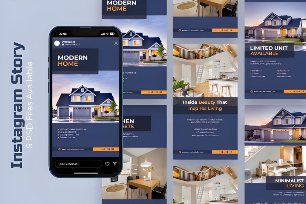
Chips: Vibe: clean + modern Best for: listings & property promos Readability: high (simple messaging)
This is the most direct “sell the space” option on the list. The description is explicit about what it’s for: promoting property or architecture projects with a clean, elegant story layout that helps you show listings and portfolios in a polished way.
How I position it in an instagram story template architecture: I’d use this template for the middle of your funnel — when someone already watched your stories before and now needs clarity: price range, location, features, and next steps.
What stood out to me (from the listing):
It’s described as fully editable (text/colors/layout), clean and modern, and intended for Instagram Stories. The listing also says it’s ready to use for Canva, Photoshop, or Illustrator, which signals it’s meant to be practical, not complicated.
If your content is “project heavy,” a straightforward story template like this keeps you consistent — and consistency is what builds trust for architects, developers, and realtors.
Use case (Post/Carousel): Turn the story sequence into a carousel: cover slide → key features → floor plan snippet → neighborhood highlights → CTA.
Use case (Story/Reels): Use it as a “story wrapper” around your video: intro frame → video walkthrough → detail frame → CTA frame (DM / link / call).
Save/Share trigger: Save this pack if you post listings, walkthroughs, or project promos and want them to look consistent every time.
Story-first layout for real estate & architecture promos.
4) 8400+ Social Media Canva Template Bundle
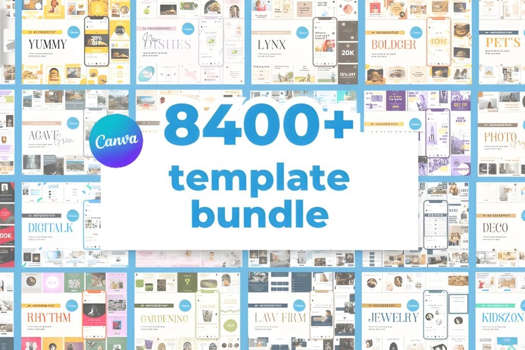
Chips: Vibe: “content machine” Best for: scaling output fast Readability: depends on your curation
This is the volume play. If you run an agency, manage multiple brands, or you simply want to stop staring at a blank Canva canvas, a massive bundle can be a shortcut — but only if you approach it with a system.
Why it matters for instagram story template architecture: you’re not buying “one style,” you’re buying a library. Your job becomes curation: pick 12–20 slides you’ll reuse, then lock your typography rules and spacing.
Listing-based notes (why I trust it more than most mega bundles):
The page shows a 5.0 score based on 4 reviews and includes visible, very short verified-purchaser comments. That tells me people actually downloaded it and were satisfied.
Two short review snippets shown on the listing:
“awesome! thank you”
“amazing!”
The listing also describes a simple workflow: ZIP file, open a PDF, click links to open templates in Canva, then edit fonts/colors/photos. That’s the exact onboarding flow I want when I’m building a template library for a team.
How I would use this for best architecture Instagram (without losing brand consistency):
Pick one “look” (fonts + spacing + color) and ignore 95% of the bundle. Save a tight set of repeatable slides: cover, project detail, quote, FAQ, timeline, CTA, and 2–3 layout variations.
The listing mentions templates for IG Stories, Carousels, Reels, Highlights, and Posts. That range lets you build a cross-format system fast — if you keep your design rules consistent.
Use case (Post/Carousel): “Architecture education carousel” — 1 myth, 3 quick truths, 1 detail photo, 1 CTA (“save this”), 1 portfolio link.
Use case (Story/Reels): “Weekly Q&A stories” — ask box frame → 3 answers → 1 proof frame (site photo) → 1 CTA (DM keyword).
Save/Share trigger: If your problem is volume (not taste), save this bundle and commit to a strict curation rule: one style, one grid, one sequence.
Best for scaling content fast (curation is the skill).
5) Canva Medical Social Media & Printables Bundle
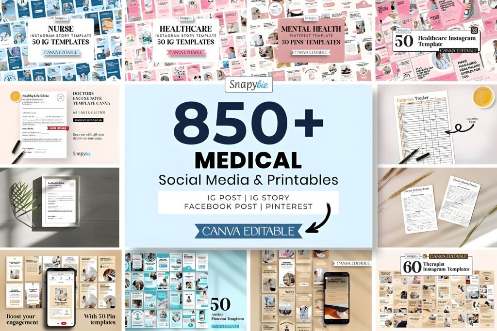
Chips: Vibe: educational + trust-first Best for: healthcare & wellness systems Readability: strong (info-forward)
This one is not architecture-specific — and that’s exactly why I still like it as a “systems” reference. Architecture brands that post educational content (materials, cost drivers, timelines, planning permissions) can learn a lot from how healthcare templates organize information.
What the listing emphasizes: a large set of Canva-editable social templates plus printable PDFs (non-editable) for tracking/education. In other words: it’s not only “pretty posts,” it’s a content ecosystem.
How I would steal the structure for architecture instagram story ideas:
Use the same “education-first” rhythm: definition slide → misconception slide → checklist slide → example slide → CTA (“save this”). This is the kind of structure that earns saves and shares, which is what grows reach over time.
Also, mixed media (social templates + printables) is a reminder: you can pair Stories with a downloadable checklist (materials guide, renovation timeline, lighting checklist) to turn attention into leads.
Use case (Post/Carousel): “Client education carousel” — 5 slides explaining a process (design phases, permit steps, contractor selection).
Use case (Story/Reels): “Mini lesson stories” — 1 concept → 1 example → 1 checklist → 1 CTA (download / DM keyword).
Save/Share trigger: If you work with clinics, wellness, or education-heavy brands (or you want to add more educational structure to architecture content), save this as a reference system.
A “systems bundle” you can adapt for education-driven content.
My Instagram story template architecture (the framework I actually use)
Here’s the core idea: your Stories should behave like a guided tour. Architecture is perfect for this, because people already think in sequences — site → concept → plan → details → outcome.
If you want a repeatable framework that works with any of the packs above, use this 8-frame “architecture story spine.” You can keep the same slide order every week and only swap content.
The 8-frame Story Spine (repeat weekly)
Frame 1 — Hook: one bold line. Example: “A 2-bedroom layout that feels bigger than it is.”
Frame 2 — Context: location, constraints, client goal. Keep it to 1–2 lines.
Frame 3 — Concept: the “why” behind your decisions (light, flow, privacy, acoustics).
Frame 4 — Proof: photo/render + one annotation. Don’t add a paragraph.
Frame 5 — Detail: material choice, joinery, lighting, texture, or plan snippet.
Frame 6 — Process: 3-step process or timeline block (fast, scannable).
Frame 7 — Social proof: testimonial line, award mention, “before/after,” or a quick result (keep it honest and simple).
Frame 8 — CTA: one action only: “Save,” “DM,” “Book a call,” or “Tap the link.”
The rule that makes templates look premium
Use one consistent footer line across all stories: project name + location + slide number. It’s a tiny detail, but it creates “design system” energy instantly.
This is the simplest upgrade you can make to any pack above, even if you only edit in Canva.
Extra picks: how I’d combine these into one system
If you want the fastest path to a cohesive system, don’t try to use all packs equally. Assign each pack a role:
Combo A (architecture studio: premium + consistent)
Core look: Corvus for your “portfolio feel” (posts + stories).
Support content: Instagram Post, Architecture Content for extra layout variety when you need to post quickly.
Story sequence: use the 8-frame spine above every week.
Combo B (real estate / development: listings + velocity)
Listings: Modern Home Real Estate Instagram Story for clean property promos.
Volume engine: 8400+ bundle for Reels covers, highlights, Q&A slides, and quick education posts.
Guardrail: set one font pair and one margin system, then stick to it.
Conclusion
If you take one thing from this post, let it be this: templates are not the strategy. The strategy is the architecture behind them — the sequence, hierarchy, spacing, and repeatable flow that makes your Instagram feel like a brand.
Pick one pack as your base, commit to one story sequence, and your content will start to look consistent fast — even before you redesign anything.
My quick picks
Most “architecture studio”: Corvus Architecture Instagram Pack
Best story-first listing promo: Modern Home Real Estate Instagram Story
Best for scaling content: 8400+ Social Media Canva Template Bundle
FAQ
What does “instagram story template architecture” actually mean?
It’s the structural logic behind your stories: consistent slide roles (hook, context, proof, detail, CTA), consistent typography hierarchy, and reusable layout modules so every story feels like one brand system.
Can I mix Canva templates with Photoshop templates?
Yes — but keep your brand rules consistent (font pair, spacing, footer, and CTA style). Use one tool for speed (often Canva) and one for deeper design control (often Photoshop), but don’t let each tool create a different “brand look.”
How many story frames do I need for architecture content?
Most architecture stories convert best in 6–10 frames. Less than 6 often lacks proof; more than 10 usually dilutes attention unless it’s a deep educational mini-series.
What’s the fastest way to make templates feel “custom”?
Add a consistent footer line (project + location + slide number) and a consistent CTA frame. Those two elements create an immediate design-system feel across all your stories.
Is a big bundle better than a niche architecture pack?
A big bundle is better for volume and experimentation. A niche architecture pack is better for brand cohesion. If you want both, use the niche pack as the “brand source of truth,” then curate a small subset from the big bundle that matches it.
What are good architecture instagram story ideas that get saves?
Try: material comparison mini-guides, “3 mistakes to avoid” checklists, lighting do/don’t, timeline breakdowns, and “before/after with one lesson.” Saves come from usefulness, not only aesthetics.
Open list (all items)
Instagram Post, Architecture Content
Corvus Architecture Instagram Pack
Modern Home Real Estate Instagram Story
Published for www.ym-graphix.com