If you’ve been searching for a calligraphy graffiti font that feels polished (not messy), you’re in the right place. In this guide, I’m sharing 12 picks that combine calligraphy flow with graffiti attitude—so your headline text looks premium, expressive, and readable.
I wrote this as a practical curator: I care about how these fonts behave in real layouts, not only in the preview. You’ll get a quick comparison table, a simple method for choosing the right style, and individual font cards with use-cases you can apply immediately.
Whenever Creative Fabrica shows public metrics, I include them (rating/reviews and “added to favorites”) so you can spot popular choices faster.
Affiliate Disclosure
Some links in this post are affiliate links. If you click and download, I may earn a small commission at no extra cost to you. This helps me keep publishing typography guides on www.ym-graphix.com.
Jump to
Table of contents
Quick comparison table
This table helps you shortlist fast. Ratings/reviews and “added to favorites” are shown where visible on the product page.
My method: how I choose elegant graffiti fonts that stay readable
I’m picky with graffiti script fonts. A font can look amazing on a product page and still fail in real work—especially when you use it in smaller sizes or on complex backgrounds.
Here’s my simple method to pick a modern calligraphy graffiti lettering style that actually holds up:
- Headline discipline: Use decorative fonts for 1–5 words. Anything longer should switch to a clean, neutral font.
- Small-size reality: Shrink your text until it matches your smallest use-case. If strokes merge, the font is “headline only.”
- Contrast flexibility: A reliable font works on light and dark backgrounds without heavy editing.
- Effect compatibility: If a font breaks when you add a simple outline or shadow, it will slow you down in production.
- Pairing potential: The best elegant graffiti fonts leave room for a clean companion font to carry details.
The 12 fonts (cards + use-cases)
1) Floxy Font
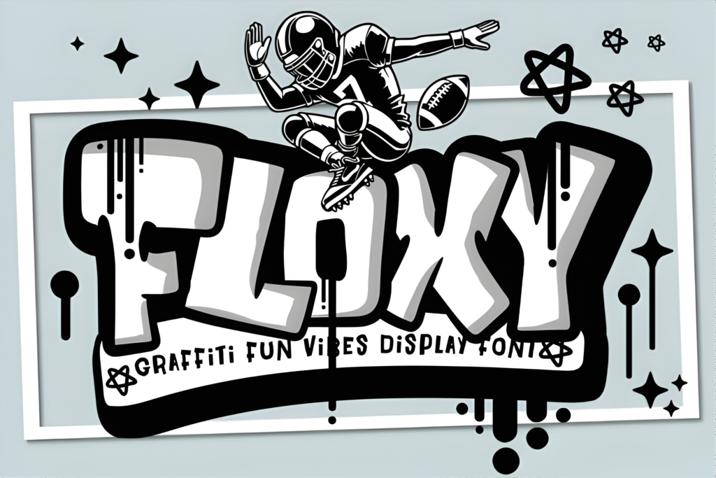
Chips: Vibe: elegant street calligraphy | Best for: premium headline words | Readability: high
★★★★★ 4.9 (9 reviews)
♥ 1,396 added to favorites
Floxy is the kind of calligraphy graffiti font I reach for when I want “street-luxe.” The rhythm feels polished, and the curves keep the word looking deliberate rather than chaotic. It’s a strong choice when you want style without sacrificing clarity.
My favorite way to use Floxy is as a single hero word—then I let a clean companion font handle everything else. That keeps your design premium and easy to scan.
- Use-case A (Post/Carousel): Slide 1: one big word (your theme). Slide 2–5: keep details in a neutral font for perfect readability.
- Use-case B (Story/Reels): Use Floxy for a short title, add a thin outline to separate it from the background, and keep the layout minimal.
Save/Share trigger: If you only save one elegant headline script today, make it Floxy.
Download and test it with one bold word—your layout will instantly look more premium.
2) Urban Gear Font
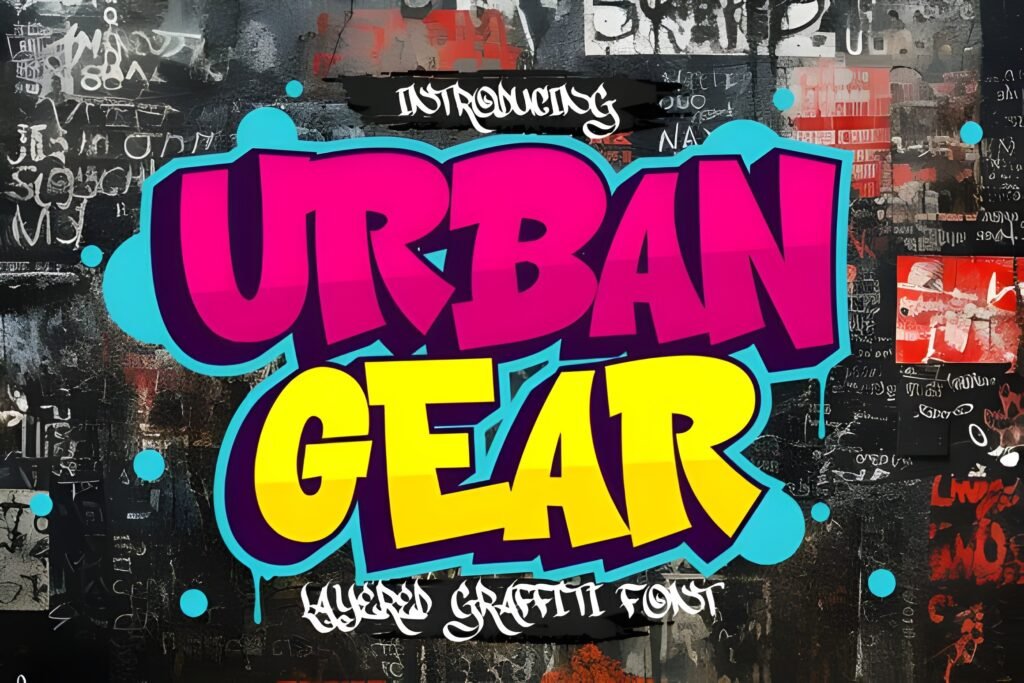
Chips: Vibe: bold urban marker | Best for: readable street headlines | Readability: high
★★★★★ 5.0 (6 reviews)
♥ 437 added to favorites
Urban Gear is a confidence font. It leans heavier, more “marker-bold,” and it keeps its shape even when you scale down. If you need elegant graffiti fonts that still read fast, this is one of the safer bets.
I like Urban Gear when the design needs power more than flourish. It’s not delicate—and that’s exactly why it performs well across many layouts.
- Use-case A (Post/Carousel): Use it for your headline and keep body text simple. The contrast makes your design feel intentional.
- Use-case B (Story/Reels): Perfect for a short title line. Add a subtle shadow, and it separates nicely from busy backgrounds.
Save/Share trigger: Save Urban Gear as your “always readable” street headline option.
Download now and try it in your fastest “headline + details” template.
3) Back Wild Font
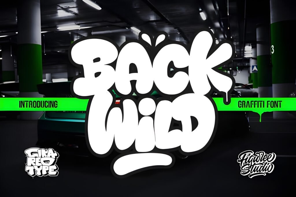
Chips: Vibe: rugged calligraphy graffiti | Best for: bold promos | Readability: medium-high
★★★★★ 5.0 (5 reviews)
♥ 379 added to favorites
Back Wild is the “texture and energy” pick. It has a wilder stroke personality, which makes it great when you want movement in the word itself—without adding extra effects.
To keep it elegant, use it as the hero, and give it breathing room. Overcrowding is the fastest way to make a rugged font look messy.
- Use-case A (Post/Carousel): A bold slide-one headline over a clean background. Keep later slides structured and minimal.
- Use-case B (Story/Reels): Use short phrases only (1–3 words). If you need a long line, switch to a clean font.
Save/Share trigger: Save this for designs that need a little “wild” without losing control.
Download it and test one big headline word—then decide if it’s your “energy” pick.
4) The Bolder Shadow Font
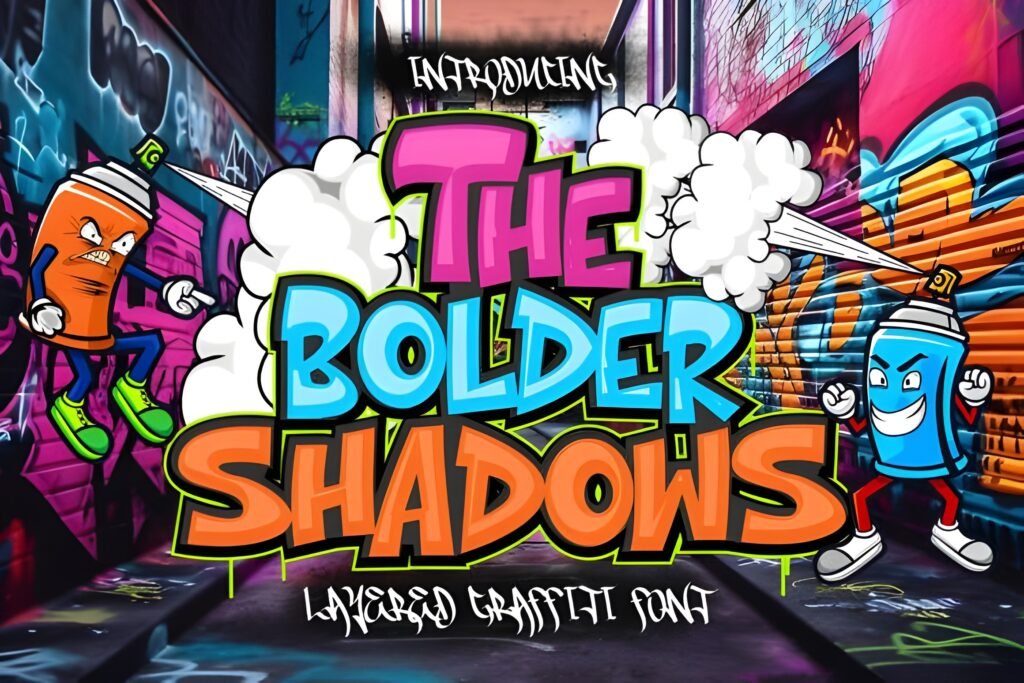
Chips: Vibe: 3D shadow pop | Best for: attention hooks | Readability: high
★★★★★ 5.0 (20 reviews)
♥ 3,494 added to favorites
This is one of the easiest “instant impact” fonts in the list. The shadow treatment gives you separation from the background without extra work, which is exactly what you want when speed matters.
If your goal is to create a headline that pops in one step, The Bolder Shadow is a practical, production-friendly choice.
- Use-case A (Post/Carousel): Use it on slide one as the hook, then switch to a cleaner style for the content slides.
- Use-case B (Story/Reels): Make one large word centered, keep everything else minimal, and your design looks intentional fast.
Save/Share trigger: Save this if you want a “done in 5 minutes” headline that still looks designed.
Download and try it as your main cover word—no extra effects needed.
5) Slime Font
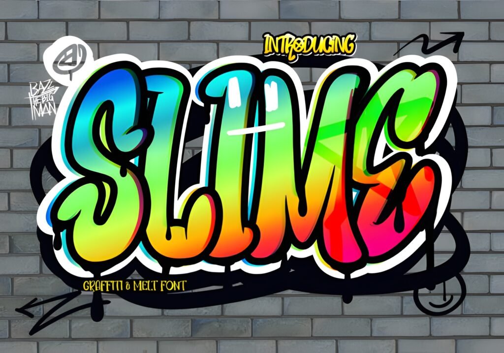
Chips: Vibe: drip / goo | Best for: edgy promos | Readability: medium
★★★★★ 5.0 (13 reviews)
♥ 3,716 added to favorites
Slime is the “attitude” pick. It’s not subtle, and it doesn’t try to be. When you want a bold aesthetic that feels playful and edgy, this font does the job.
My advice: keep the layout clean around it. Slime is already a strong effect. If you stack too many effects on top, it becomes hard to read.
- Use-case A (Post/Carousel): Use one word as a visual centerpiece (a theme or hook). Pair with a neutral font for everything informational.
- Use-case B (Story/Reels): Best on simple backgrounds. If the background is busy, add a subtle block behind the text (simple and clean).
Save/Share trigger: Save this for your “edgy week” designs when you want instant personality.
Download it and test one short word—if it hits, you’ll know instantly.
6) Graffiti Font
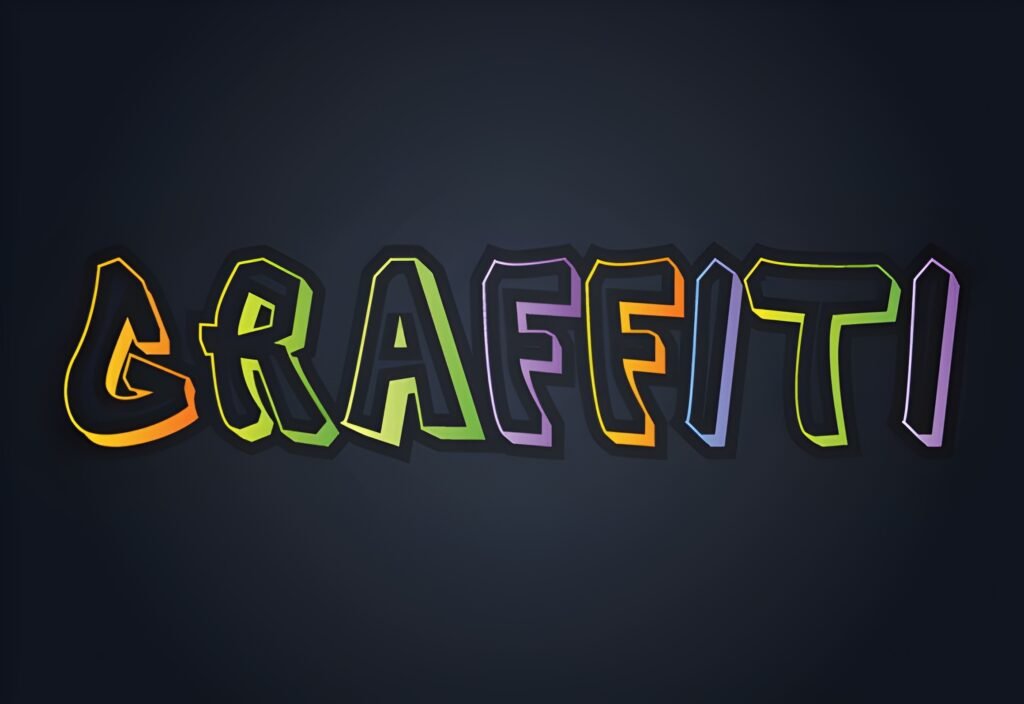
Chips: Vibe: classic street display | Best for: raw titles | Readability: medium-high
No rating shown on the product page
♥ 46 added to favorites
This is the simple “classic graffiti” option—useful when you want the message to look street-first. It’s a good baseline style to keep in your collection, especially if you like having a straightforward backup.
To keep it elegant, focus on spacing. Give the word enough margin and avoid squeezing it into tight boxes.
- Use-case A (Post/Carousel): Strong on minimal backgrounds with high contrast. Use it for the title and keep supporting text clean.
- Use-case B (Story/Reels): Works well for short hooks. Keep details in a neutral font so the message stays readable.
Save/Share trigger: Save this as your “classic street” backup when you want the vibe without extras.
Download and test it as a bold title—then pair it with a clean font for details.
7) Ink Rush Font
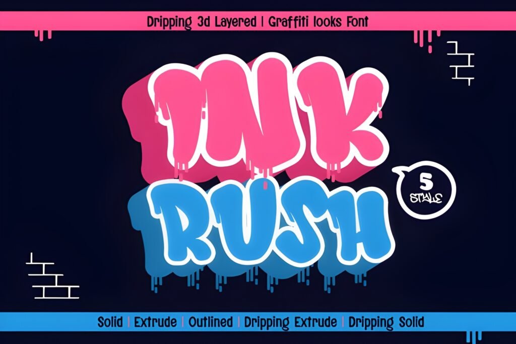
Chips: Vibe: fast ink brush | Best for: signature lines | Readability: medium-high
★★★★★ 5.0 (1 review)
♥ 50 added to favorites
Ink Rush has that sharp brush motion that sits right between calligraphy and graffiti. It can feel expressive without being overly decorative—great when you want “hand energy” with cleaner structure.
In real design work, Ink Rush shines when you keep it short and let it breathe. It’s an ideal font for a hero word, a signature line, or a short title where rhythm matters.
- Use-case A (Post/Carousel): Use it for a short quote title, then set the quote body in a clean font to stay readable.
- Use-case B (Story/Reels): Use a 1–3 word title, add a tiny shadow if needed, and keep the rest minimal.
Save/Share trigger: Save Ink Rush if you want a brushy, expressive headline that still stays controlled.
Download and test it on one short phrase—if it feels right, keep it as your “signature” style.
8) Shine Graffiti Font
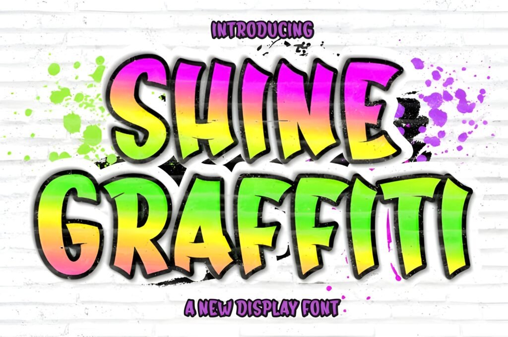
Chips: Vibe: smooth + bold | Best for: clean headlines | Readability: high
★★★★★ 5.0 (1 review)
♥ 219 added to favorites
Shine Graffiti is a clean, confident display style. It’s the type of font that gives you graffiti energy while still looking tidy and modern. If you want a “safe” option that doesn’t look messy quickly, this is a strong pick.
I like Shine Graffiti for layouts where the typography must look designed and structured. It pairs easily with neutral fonts and keeps your hierarchy clear.
- Use-case A (Post/Carousel): Use it for the headline and keep the rest simple—your design will look balanced automatically.
- Use-case B (Story/Reels): Great for short titles; if the background is busy, a thin outline helps separation.
Save/Share trigger: Save this if you want a reliable headline font you can use often.
Download and pair it with a clean sans-serif for a polished, modern look.
9) Fast Blaze Font
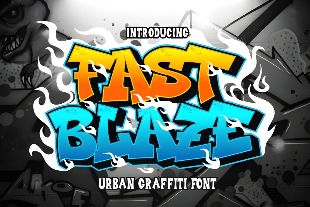
Chips: Vibe: speed strokes | Best for: announcements | Readability: medium-high
★★★★★ 5.0 (3 reviews)
♥ 546 added to favorites
Fast Blaze communicates motion. If you want your title to feel like it’s moving forward, this font does that job without needing extra graphics.
In practice, I treat it as a “one line only” headline. Keep the word short and bold. Let the rest of the layout stay calm.
- Use-case A (Post/Carousel): Slide-one hook word (NEW / DROP / NOW). Then switch to a clean font for the content slides.
- Use-case B (Story/Reels): One short phrase for the title, neutral font below for details (date, time, link info).
Save/Share trigger: Save Fast Blaze if you often design “announcement” graphics and need urgency.
Download it and test it on a short hook word—if it feels fast, it’s a keeper.
10) Subawy Ripple Font
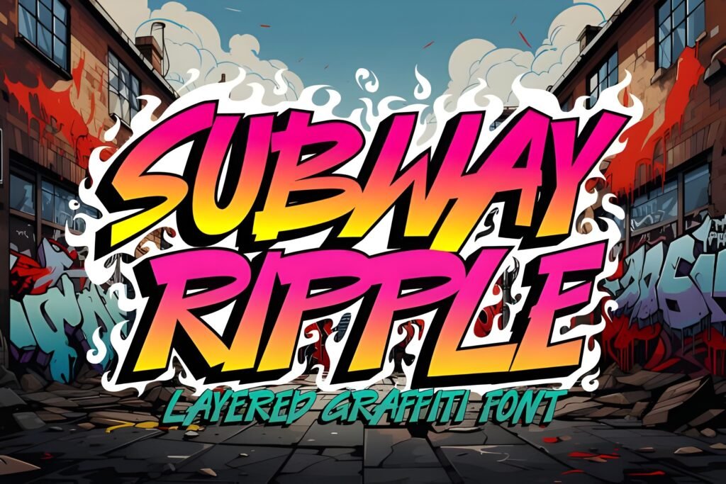
Chips: Vibe: ripple motion | Best for: kinetic titles | Readability: medium
★★★★★ 5.0 (1 review)
♥ 107 added to favorites
Subawy Ripple is a fun option when you want your headline to feel dynamic. The ripple effect adds movement and texture. It’s best used as a hero element, not as body text.
To keep it elegant, don’t over-style it. Let the ripple do the work, and keep your composition clean.
- Use-case A (Post/Carousel): Use it on the cover slide as the main headline, then switch to a cleaner style inside.
- Use-case B (Story/Reels): Works best on a simple background so the ripple detail stays visible.
Save/Share trigger: Save this if you want motion and texture without extra editing.
Download and try it as a single-word headline—keep the rest minimal for a premium look.
11) Hiper Hoper Font
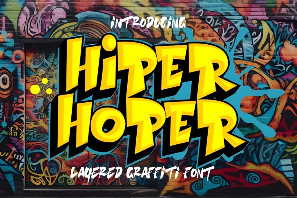
Chips: Vibe: hip-hop tag | Best for: culture-led titles | Readability: medium-high
★★★★★ 5.0 (2 reviews)
♥ 104 added to favorites
Hiper Hoper leans into tag culture. It’s expressive, but it still reads well as a headline. If you like graffiti that feels authentic and energetic, this one is a solid pick.
Use it for titles and short phrases, then pair with a clean font for anything informational. That keeps the vibe strong and the message clear.
- Use-case A (Post/Carousel): Use for the main headline, then set subtitles and details in a clean sans-serif.
- Use-case B (Story/Reels): Great as the top-line title with a simple secondary line below (clean font).
Save/Share trigger: Save this as your “tag vibe” font when you want culture energy fast.
Download and test it on a short title—if it feels authentic, add it to your favorites.
12) Brick Edgie Font
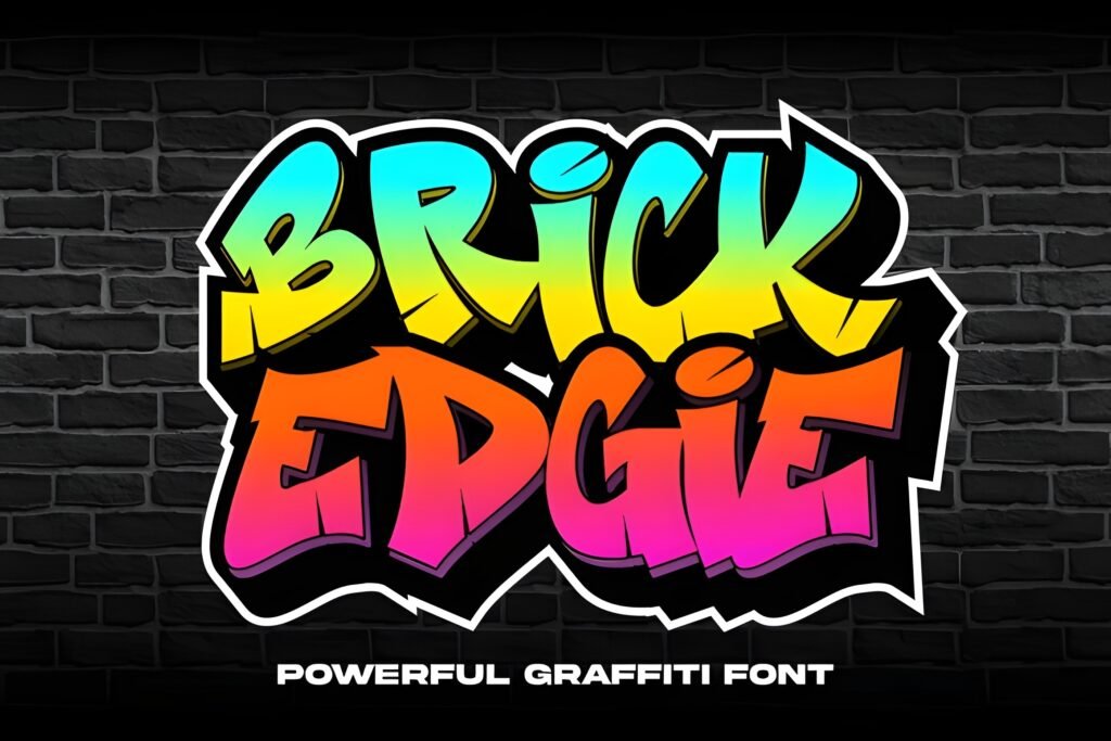
Chips: Vibe: brick / street display | Best for: bold urban headlines | Readability: high
★★★★★ 5.0 (1 review)
♥ 568 added to favorites
Brick Edgie is a bold, blocky street-style display font with a “brick” texture vibe. If you want a graffiti-adjacent headline that feels urban, structured, and easy to read, this is a strong pick. It’s especially good when your design needs impact without messy strokes.
My favorite way to use Brick Edgie is for short, punchy titles. It delivers strong presence even at smaller sizes, and it pairs cleanly with a simple neutral font for any supporting text.
- Use-case A (Post/Carousel): Use one powerful word as the headline, then put the rest of the content in a clean sans-serif for perfect clarity.
- Use-case B (Story/Reels): Great for a cover title—keep the word short, center it, and add a subtle outline if the background is busy.
Save/Share trigger: Save this one if you want a “bold street headline” font that stays readable fast.
Download it now and test one bold headline word—if it pops instantly, keep it.
Quick checklist before you download a font
If you want a calligraphy graffiti font that looks premium in real designs (not only in previews), run this quick test. It helps you choose faster and avoid fonts that need constant fixing.
- Readability test: type 1 short word (3–5 letters) and 1 longer word (10–14 letters). If the long one blurs, use the font for headlines only.
- Small-size test: shrink the text to your smallest use-case. If strokes merge, it’s not an “everyday” font.
- Contrast test: place the same word on a light and a dark background. Strong fonts stay clear in both.
- Effect test: add a simple outline or soft shadow. If the shapes break, it may slow you down later.
- Pairing rule: keep the decorative font for 1–5 words, then use a neutral font for details.
- Glyph check: look for alternates, swashes, or ligatures (when available) to make headlines feel custom.
- License sanity check: confirm the license fits your project before using the font commercially.
Tip: Test 2–3 favorites in the same template and keep the one that stays readable with the least effort.
Didn't find what you were looking for?
Use the search below to explore more options on Creative Fabrica.
Extra picks & pairing ideas (so it looks premium, not messy)
Pairing is where elegant graffiti typography becomes truly “designed.” Here are my practical rules to keep your layouts clean:
- One hero, one support: choose one expressive font (headline) and one neutral font (details).
- Limit effects: outline OR shadow OR texture—don’t stack everything at once.
- Give it air: decorative fonts need margins. White space is what makes them feel premium.
- Use contrast intentionally: bold headline + clean small text is usually the fastest path to “professional.”
If you want easy starting pairs: use Floxy for elegance, Urban Gear for readability, and The Bolder Shadow for instant “pop.”
Conclusion
The best calligraphy graffiti font is the one that stays readable in your real work. Start by deciding what the font must do: deliver elegance, deliver impact, or deliver speed. Then pick one from this list and test it using the checklist above.
My quick recommendations: Floxy for premium elegance, Urban Gear for reliable readability, and The Bolder Shadow for headline impact with minimal effort.
FAQ
What makes a font a “calligraphy graffiti font”?
It combines calligraphy-like rhythm (flow, contrast, expressive strokes) with graffiti energy (attitude, boldness, street-inspired shapes). The best ones keep structure so the word remains readable.
How do I keep graffiti script fonts readable?
Keep the decorative font to 1–5 words, increase contrast, and avoid placing it on overly busy backgrounds. Put all details in a clean, neutral font.
Are these “elegant graffiti fonts” good for branding?
Yes—especially for headlines and logo-like wordmarks. The key is consistency: choose one hero font and stick to it, then build a pairing system around it.
What if I need a free download option?
Some product pages show “Download for free” messaging. Availability can depend on platform offers and account status, so always check the product page before planning a project.
How many fonts should I keep in my toolkit?
A practical set is 3–5: one elegant headline script, one bold readable street font, one effect font (shadow/drip), and one classic backup style.
What’s the easiest way to test modern calligraphy graffiti lettering styles?
Use the same short headline in multiple fonts, test at small size, and try a simple outline/shadow. Keep the font that remains clear with the least fixing.
Open list (all items)
- Floxy Font
- Urban Gear Font
- Back Wild Font
- The Bolder Shadow Font
- Slime Font
- Graffiti Font
- Ink Rush Font
- Shine Graffiti Font
- Fast Blaze Font
- Subawy Ripple Font
- Hiper Hoper Font
- Birdsong Font
Note: Ratings/reviews and “added to favorites” metrics were taken from the product pages where visible.