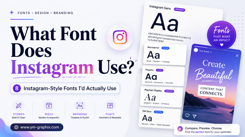
If you have ever looked at Instagram and wondered what typeface sits behind its clean visual identity, the short answer is Instagram Sans.
But that answer only gets us started. The logo, interface, Stories, Reels and the fonts creators use in their own graphics are not all exactly the same thing. I wanted to separate those pieces first, then pick genuinely useful alternatives for creating your own Instagram-style designs.
Instagram’s official brand typeface is Instagram Sans. It is a custom global type family influenced by both grotesque and geometric typography and by Instagram’s own visual identity.
What Font Does Instagram Use?
The font most closely associated with Instagram’s current visual identity is Instagram Sans. Instead of relying entirely on an existing commercial typeface, Instagram developed a custom family designed around the brand.
What I like about Instagram Sans is that it feels contemporary without becoming sterile. The geometry keeps the design clean, while the letterforms retain enough personality to avoid looking like a generic system font.
If you are creating Instagram-inspired graphics, I would not waste time chasing a perfect clone. Look for the qualities that make the style work: clean proportions, high readability, modern shapes and enough personality to make your own content recognizable.
What Type of Font Does Instagram Use?
Instagram Sans sits broadly in the sans-serif world and combines contemporary grotesque and geometric influences. In practical design terms, that makes clean modern sans-serif fonts the most natural place to begin.
Modern Geometry
High Readability
Social Friendly
What Font Does the Instagram Logo Use?
I would keep the Instagram wordmark and Instagram Sans separate in my head. The wordmark is a distinctive brand asset, while Instagram Sans is the broader typography system supporting the visual identity.
If you are designing your own logo, copying Instagram letter by letter is not the useful lesson. The better idea is to borrow the principle: create a recognizable identity and support it with typography that stays clear everywhere else.
What Font Does Instagram Use for Stories and Reels?
Stories and Reels give creators much more freedom. Instagram Sans belongs to Instagram’s expressive typography, but text inside creator tools can take different visual forms.
For graphics made outside Instagram, I usually use lighter sans-serif fonts for elegant Stories and stronger weights for Reel covers. When a cover only has a second to catch someone’s eye, readability beats decorative effects.
What Font Does Instagram Use for Captions, Usernames and DMs?
There is no separate downloadable “Instagram caption font” that I would recommend chasing. Captions, usernames, comments and messages are interface elements, and their exact rendering can depend on the app, platform and device.
If your goal is an Instagram-style mockup or social graphic, a neutral contemporary sans serif is the safer option. It gives you the visual feeling without pretending that one random third-party font is an exact universal match.
What Font Does Instagram Use in Canva?
Instagram does not use a special Canva font. What people normally mean is: which font should I choose in Canva if I want an Instagram-like visual style?
I would start with modern or geometric sans-serif typography, simple letterforms and good readability. If the goal is to create a recognizable branded feed instead of imitating an interface, then I would allow much more personality.
8 Instagram-Style Fonts I Would Actually Use
These are not official Instagram fonts. I selected each one for a different job — minimal feeds, Stories, Reels, branding, luxury or editorial content — so you are choosing by purpose rather than scrolling through eight almost identical fonts.
Minimalist Aesthetic
Clean, airy and geometric — an understated direction that feels naturally at home in modern social design.
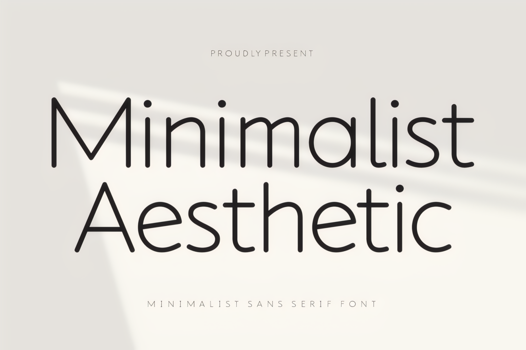
Best for: Stories
Style: Minimal Sans
My take: This is the font I would open first for a skincare account, lifestyle brand, interiors page or minimalist personal feed. It has enough character to feel intentional without competing with the photography.
- Light geometric forms keep layouts visually spacious.
- Pairs naturally with photography and product images.
- Lets typography support the content instead of dominating it.
Modern Limited
Modern minimalism with a more polished, brand-focused personality.
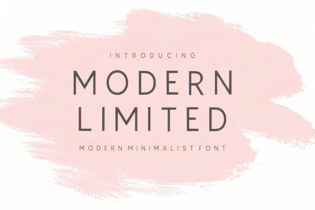
Best for: Branding
Style: Sans Serif
My take: I would choose Modern Limited when an Instagram page needs to feel like a coherent brand rather than a collection of unrelated posts. Beauty, photography and creative businesses are obvious fits.
- Clean construction feels contemporary rather than trendy.
- Strong enough for branded headlines while remaining refined.
- Easy to build a consistent feed around.
Maison
Simple, modern and quietly editorial.
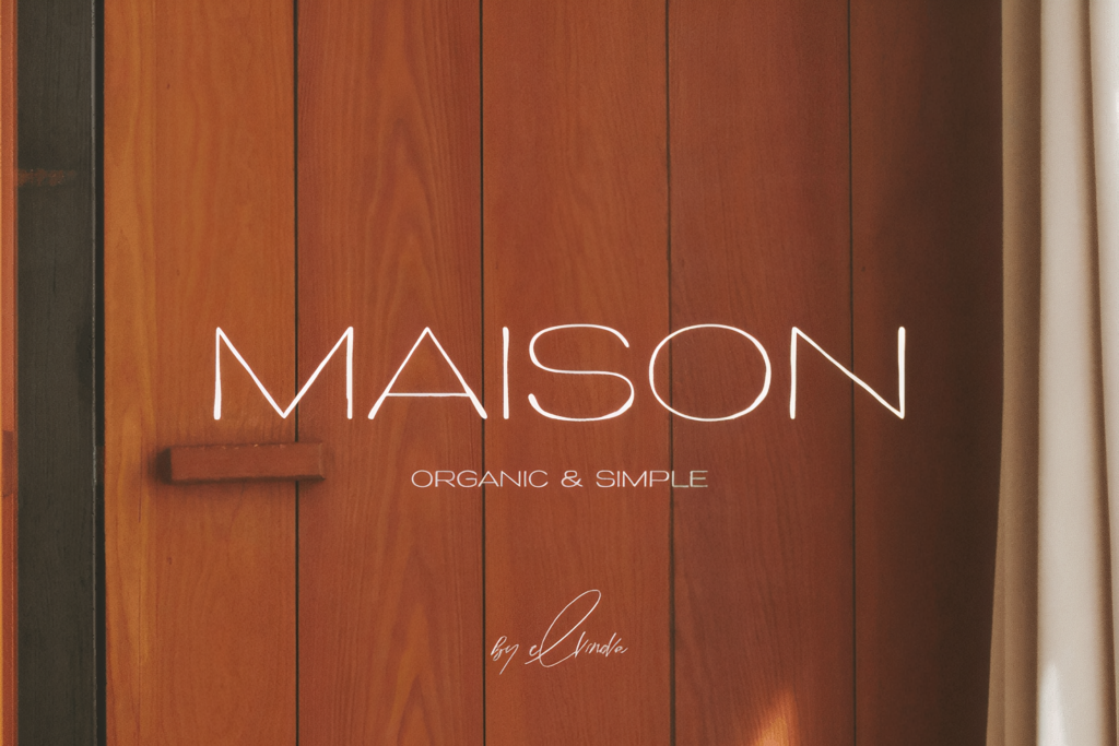
Best for: Carousels
Style: Modern Sans
My take: Maison is the kind of typeface I would use when I want a post to feel carefully designed without looking over-designed. It works nicely for carousel covers, announcements and editorial social layouts.
- Clean shapes keep the layout easy on the eye.
- Works with both imagery and text-led compositions.
- Feels more refined than a generic utility font.
Craftery Extra Light
Light geometric typography for designs where whitespace is part of the aesthetic.
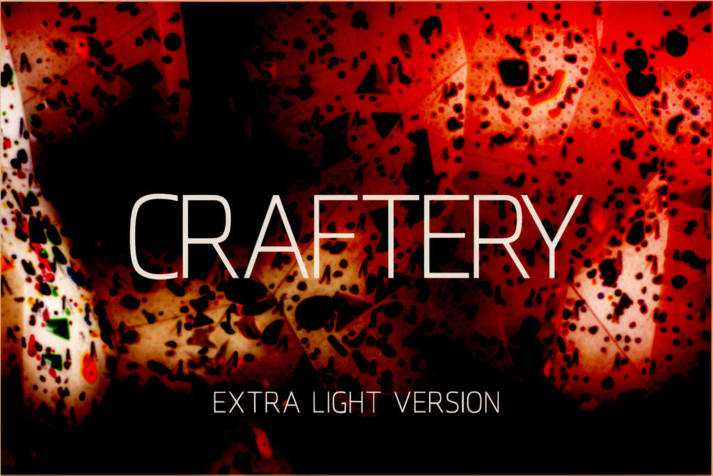
Best for: Mood Boards
Weight: Extra Light
My take: This font is more about atmosphere than impact. I would use it in spacious Story layouts, mood boards, lookbooks and elegant headings where the typography is intentionally subtle.
- Simple geometric construction feels modern.
- Extra-light weight creates an airy visual rhythm.
- Looks especially good with generous negative space.
Cremona
A practical choice when one font family needs to handle more than one job.
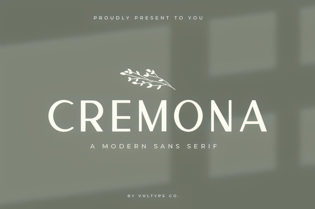
Best for: Templates
Vibe: Clean
My take: Cremona earns its place here because it gives me useful hierarchy. A stronger weight can handle the headline while Regular supports it without introducing another unrelated typeface.
- Regular and Bold make hierarchy easier.
- One family can cover several social-template roles.
- Clean styling keeps branding consistent.
East
Bold, clean and suited to moments where a headline needs immediate visual weight.
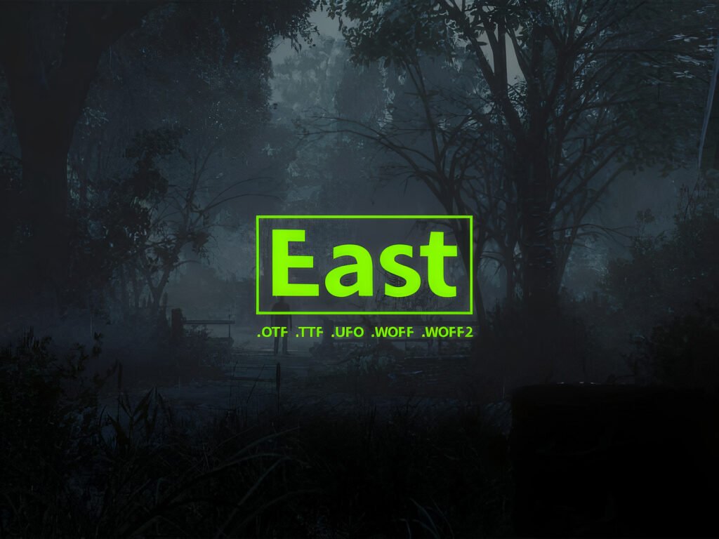
Best for: Reels
Use: Headlines
My take: Not every Instagram graphic needs delicate typography. East is the one I would reach for when a title has to register quickly, especially on Reel covers and short promotional graphics.
- More weight helps short headlines stand out.
- Minimal forms prevent the design from becoming messy.
- Creates useful contrast against lighter typography.
Geista Mond
An elegant serif direction for brands that want more personality than an interface-style sans serif.
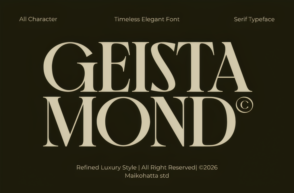
Best for: Fashion
Style: Serif
My take: I deliberately wanted at least one strong serif option here. If the goal is luxury branding rather than recreating Instagram’s interface, contrast can be much more interesting than imitation.
- Serif contrast immediately separates it from utility typography.
- Fits fashion, beauty and premium-product layouts.
- Can make a simple post feel closer to an editorial campaign.
Flowsky Editorial
A magazine-inspired serif for fashion-forward and editorial social layouts.
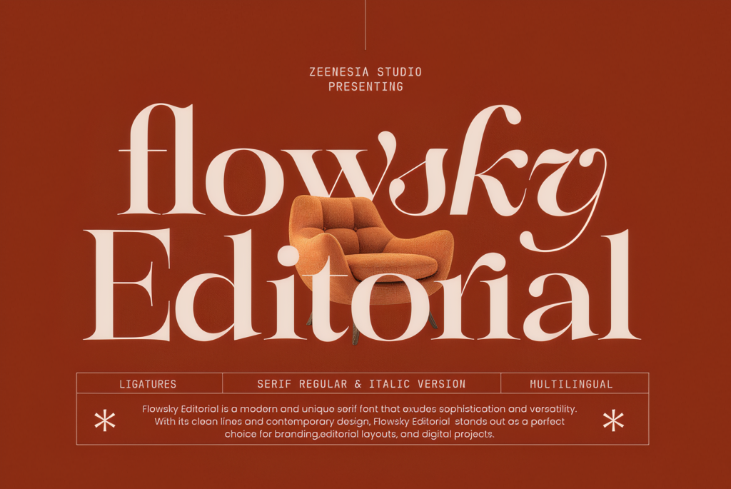
Best for: Fashion
Styles: Regular + Italic
My take: Flowsky Editorial is for the moment when clean sans serif begins to feel too safe. I would use it for magazine-style carousels, fashion launches and premium campaign graphics.
- Editorial character creates an immediate sense of style.
- Regular and Italic allow more visual variety.
- Creates strong contrast with standard social-app typography.
Which Instagram-Style Font Should I Pick?
Still deciding? Use this quick shortcut. Click any font name and you will jump straight to its full review above.
Want More Instagram Fonts?
Sometimes I prefer browsing a complete style rather than choosing from a shortlist. These are the four categories I would open first.
Sans Serif Fonts
The most logical starting point for clean, readable and modern Instagram-inspired typography.
Modern Fonts
A good place to explore when you want something contemporary with a little more personality.
Aesthetic Fonts
Ideal for feeds built around lifestyle, mood, beauty, interiors, quotes and personal branding.
Elegant Fonts
My choice for fashion, cosmetics, luxury products and refined editorial content.
How I Would Recreate the Instagram Typography Feel
Use typography that can sit next to photography and video without fighting for attention.
Try Regular, Medium or Bold before adding outlines, shadows and unnecessary effects.
A beautiful font at poster size can become unreadable once the design is reduced to a mobile screen.
Take inspiration from Instagram’s clarity, but give your own brand enough personality to be remembered.
FAQ About Instagram Fonts
Click any question below to reveal the answer.
Final Thoughts
So, what font does Instagram use? The official answer is Instagram Sans. But if what you really want is the visual language behind Instagram — clean, contemporary, readable and flexible — you have much more freedom.
For a minimalist direction, I would begin with Minimalist Aesthetic, Modern Limited, Maison or Craftery Extra Light. For stronger social headlines, I like East. And for beauty, luxury or editorial accounts, Geista Mond and Flowsky Editorial give the design more personality.
My preference is simple: understand why the style works first, then choose typography that fits your own brand instead of turning your content into a copy of somebody else’s.
Found This Instagram Font Guide Useful?
If this guide helped you find the right typography direction, save it for your next project — and share it with a friend, designer or content creator who might find it useful too.
A quick share on Pinterest, Facebook or another social network helps more creators discover the guide.