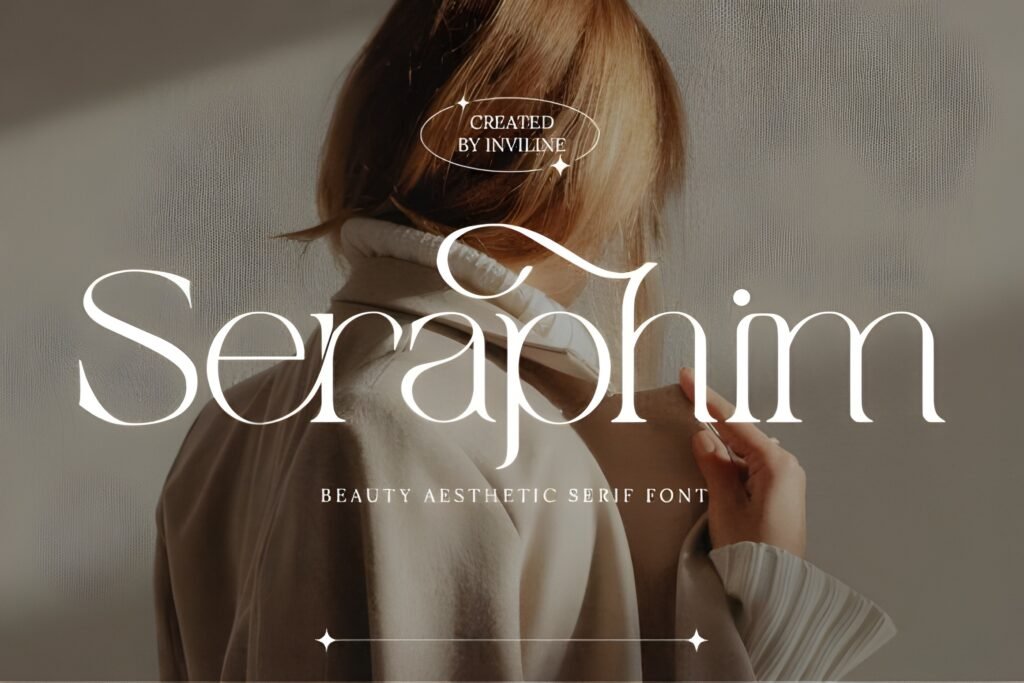
Seraphim Instagram Font is a refined serif typeface characterized by high-contrast strokes and graceful curves. It conveys a sense of classic beauty combined with modern elegance, creating an ethereal and polished appearance. The font’s sculpted letterforms suggest a timeless quality suitable for projects aiming for a sophisticated and artistic look.
Disclosure: This post contains an affiliate link. We may earn a commission at no extra cost to you.
What Makes Seraphim Instagram Font Distinctive?
This font exhibits delicate details and a balance between gentle and striking elements, resulting in a visual presence that feels both intentional and elevated. Its design lends itself to applications where clarity and style are essential, such as editorial fashion branding, beauty packaging, and mood boards. The font is available in OTF and TTF formats, supporting professional use.
Best Uses for Seraphim Instagram Font
Seraphim is well suited for Instagram visuals that require a luxurious or artistic touch, including quote graphics and branding elements. It also fits wedding invitations and magazine layouts that benefit from a quiet grandeur. Use it where a refined serif can enhance the perception of sophistication without overwhelming the design.
How to Pair Seraphim Instagram Font
Pair Seraphim with a clean sans-serif for body text to maintain readability while preserving elegance. For example, use Seraphim for headlines or subheads and a neutral sans-serif like Helvetica or Open Sans for body copy. Alternatively, combine it with a simple script font for accents or callouts, keeping Seraphim as the primary display font to anchor the design.
Practical Design Tips
Use generous whitespace around Seraphim to emphasize its delicate details and high-contrast strokes. Scale the font larger for headlines or Instagram quotes to showcase its sculpted letterforms. When setting longer text, limit Seraphim to headings or short phrases to avoid visual fatigue. Contrast its refined serif with minimalistic, geometric fonts to create a balanced hierarchy.
Frequently Asked Questions
Is Seraphim suitable for long paragraphs of text?
Given its high-contrast strokes and refined details, Seraphim is best reserved for headlines, subheads, or short phrases rather than extended body text, where readability may be affected.
Can Seraphim be used for branding beyond Instagram?
Yes, its elegant and timeless qualities make it appropriate for branding in fashion, beauty packaging, and editorial contexts where a sophisticated serif is desired.
What kind of projects benefit most from Seraphim’s style?
Projects aiming for a luxurious, artistic, or quietly grand aesthetic—such as wedding invitations, mood boards, and high-end social media visuals—can leverage Seraphim’s distinctive presence effectively.