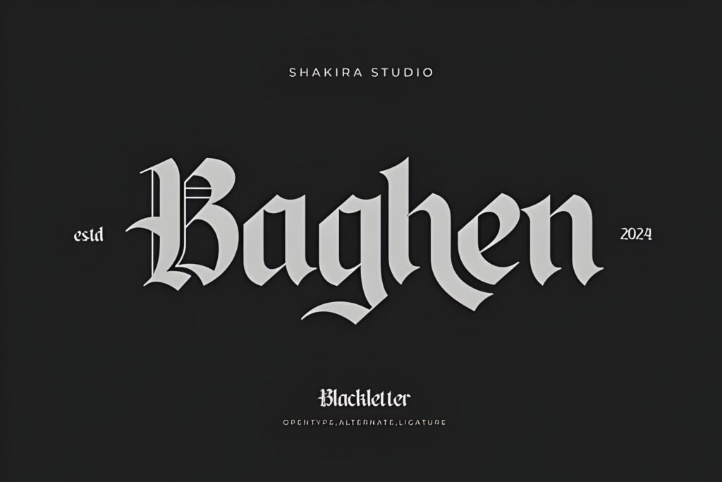
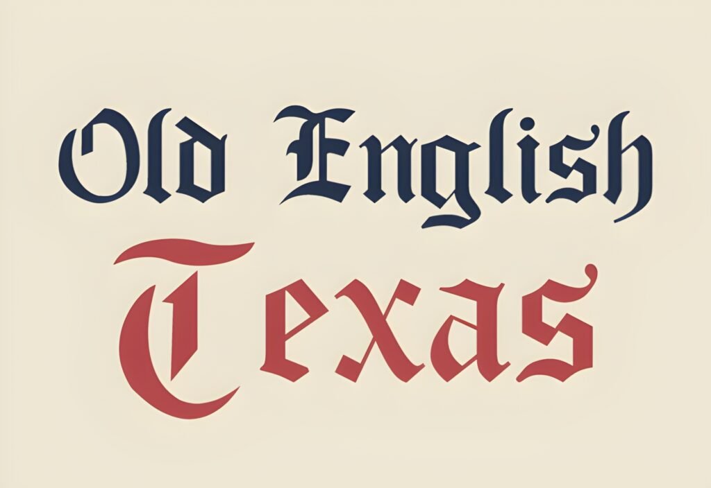
Tarmone is a sharp Old English blackletter font that channels the 1800s with a blend of historic Gothic style and modern design elements. Its bold strokes and refined serifs create a distinctive visual impact, making it suitable for projects that require a strong, vintage-inspired presence with contemporary versatility.
Disclosure: This post contains an affiliate link. We may earn a commission at no extra cost to you.
What Makes Tarmone Font Distinctive?
The font features bold lines and striking Gothic character, combining traditional Old English aesthetics with a modern twist. Its refined serifs contribute to a sharp, elegant appearance that can add depth to various design contexts. While the description highlights its adaptability, specific technical details such as glyph sets or stylistic alternates are not provided.
Best Uses for Tarmone Font
Tarmone is well suited for headlines, posters, branding, album covers, certificates, badges, apparel prints, and social media graphics where a dramatic and historic feel is desired. It works best in display sizes where its intricate details and sharp serifs can be appreciated, rather than in body text or small captions.
How to Pair Tarmone Font
Pair Tarmone as a headline font with clean, simple sans-serifs for subheadings and body text to maintain readability and balance. For example, use Tarmone for headlines, a geometric sans-serif for subheads, and a neutral sans-serif or serif for body copy. This hierarchy preserves the font’s dramatic impact while supporting legibility in longer text.
Practical Design Tips
Use generous whitespace around Tarmone to let its bold, intricate letterforms stand out without visual clutter. Scale the font prominently for headlines or titles to emphasize its Gothic character. Avoid using it in dense paragraphs; instead, reserve it for short, impactful text elements. Combining it with minimalist layouts can enhance its vintage-modern contrast. Consider dark or muted backgrounds to complement its historic tone and increase legibility.
Frequently Asked Questions
Is Tarmone suitable for body text?
Given its sharp blackletter style and bold strokes, Tarmone is best reserved for headlines or display use rather than body text, where readability could be compromised.
Can Tarmone be used for branding purposes?
Yes, its dramatic and historic aesthetic makes it a strong choice for branding projects that want to evoke vintage or Gothic themes with a modern edge.
What types of projects benefit most from Tarmone?
Projects like posters, album covers, certificates, badges, and apparel prints that require a bold, historic look with contemporary flair can benefit from this font.