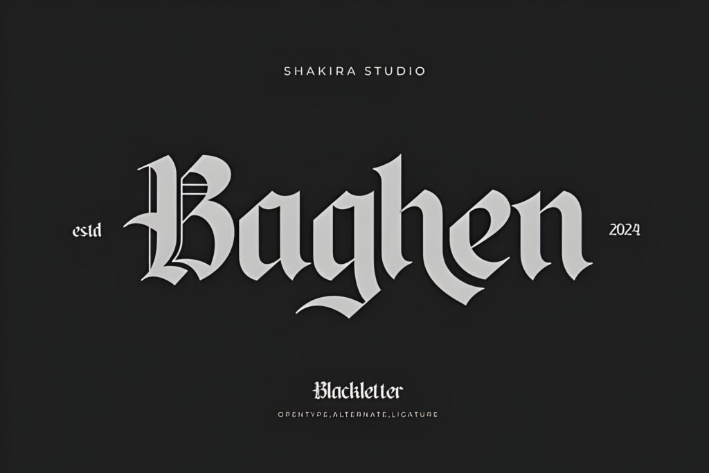
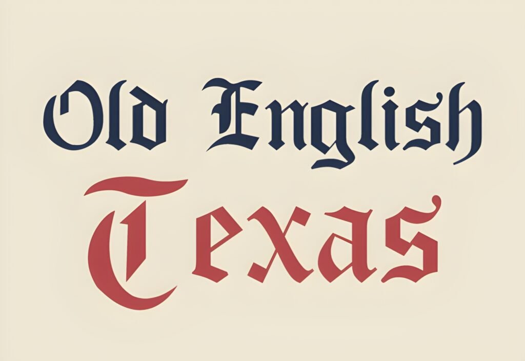
Iron Manuscript is a geometric Gothic blackletter font that merges the sharp angularity of Old English and Fraktur styles with a bold, modern aesthetic. Its techno-medieval character lends a distinctive, robust presence suited primarily for display use, where dramatic impact is desired.
Disclosure: This post contains an affiliate link. We may earn a commission at no extra cost to you.
What Makes Iron Manuscript Font Distinctive?
This typeface features a striking blend of traditional blackletter elements with contemporary geometric forms, resulting in a font that commands attention. Its style suggests strong, sharp lines and a dense texture typical of Gothic scripts, adapted for modern visual contexts. The font is designed to work well in large sizes, emphasizing headline or logo applications rather than extended body text.
Best Uses for Iron Manuscript Font
Iron Manuscript is best applied in projects requiring a powerful visual statement, such as magazine headlines, book covers, music posters, and corporate branding that benefits from a Gothic yet futuristic vibe. It also suits apparel design and digital content like YouTube thumbnails or Instagram posts where a bold, charismatic font can enhance visual storytelling.
How to Pair Iron Manuscript Font
For complementary typography, pair Iron Manuscript as the headline font with a clean, neutral sans-serif for subheadings and body text to balance its complexity. For example, use Iron Manuscript for main titles, a sans-serif like Helvetica or Open Sans for subheads, and a simple serif or sans-serif for body copy. This hierarchy maintains readability while preserving the font’s dramatic effect.
Practical Design Tips
Use generous whitespace around Iron Manuscript to prevent visual overcrowding, as its dense, angular forms can feel heavy in tight layouts. Scale the font large enough to showcase its detailed shapes, especially in logos or posters. Contrast it with minimalistic, low-contrast typefaces to avoid competition. Avoid using it in small sizes or long paragraphs, as legibility may suffer. Consider monochrome or limited color palettes to emphasize its structural qualities.
Frequently Asked Questions
Is Iron Manuscript suitable for body text?
Given its intricate blackletter style and geometric sharpness, Iron Manuscript is best reserved for display purposes rather than body text, where readability at smaller sizes is crucial.
Can Iron Manuscript be used for digital platforms like Instagram?
Yes, it can add a bold, eye-catching element to digital content such as Instagram posts or YouTube thumbnails, especially when used for headlines or key phrases.
What type of projects benefit most from this font?
Projects that require a strong, Gothic-inspired visual identity with a modern edge—such as branding, posters, apparel, and editorial headlines—are ideal contexts for this font.