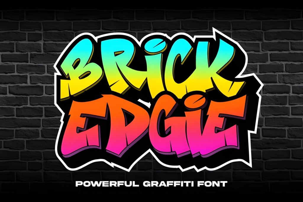
Thorm Floxy is a bold graffiti typeface that channels urban street culture into sharp, dynamic letterforms. Its design balances the raw energy of graffiti with the clarity of a display font, creating an edgy aesthetic suited to projects that seek a strong city vibe.
Disclosure: This post contains an affiliate link. We may earn a commission at no extra cost to you.
What Makes Thorm Floxy Font Distinctive?
This font features sharp lines and a dynamic flow that evoke the rebellious spirit of street art. The letterforms appear energetic and modern, making it suitable for impactful visual statements. While the exact character set and stylistic options are not detailed, the overall style suggests a focus on headline or display use rather than extended body text.
Best Uses for Thorm Floxy Font
Thorm Floxy works well for branding that aims to convey urban authenticity, album covers with a streetwise edge, apparel graphics, posters, and other urban-themed designs. Its bold presence is best leveraged in contexts where grabbing attention quickly is key, such as event flyers or social media visuals targeting a youthful audience.
How to Pair Thorm Floxy Font
To complement this graffiti font, consider pairing it with clean sans-serif typefaces for body text to maintain readability and balance. For example, use Thorm Floxy for headlines or titles, paired with a simple sans-serif like Helvetica or Montserrat for subheads and body copy. This contrast highlights the font’s energetic style without overwhelming the overall design.
Practical Design Tips
Use generous whitespace around Thorm Floxy to let its bold strokes stand out without clutter. Scale the font prominently for headlines or key phrases, ensuring it dominates the visual hierarchy. Avoid using it in long paragraphs; instead, reserve it for short, impactful text elements. Combining it with minimalist layouts or solid background colors can enhance its urban edge and maintain legibility.
Frequently Asked Questions
Is Thorm Floxy suitable for body text?
Given its bold, graffiti-inspired style and dynamic letterforms, it is best used for headlines or display purposes rather than extended body text, where readability could be compromised.
What types of projects benefit most from this font?
Projects with an urban, street culture theme—such as album covers, apparel branding, posters, and event flyers—can effectively use this font to convey energy and attitude.
How can I pair Thorm Floxy with other fonts?
Pair it with clean, simple sans-serif fonts for subheads and body text to create contrast and maintain readability, using Thorm Floxy primarily for headlines or key design elements.