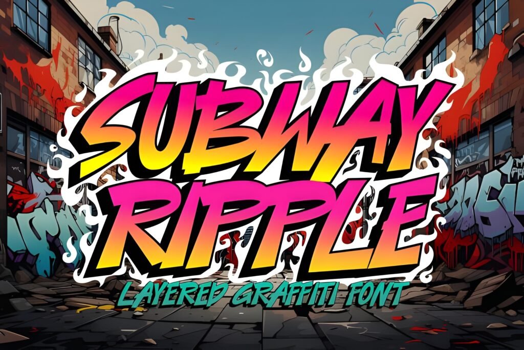
Subway Ripple is a slim, layered graffiti font that merges street art’s raw energy with a modern, minimalist structure. Its letterforms suggest a balance between urban mural complexity and streamlined design, offering a distinctive visual rhythm that can add depth and movement to typographic compositions.
Disclosure: This post contains an affiliate link. We may earn a commission at no extra cost to you.
What Makes Subawy Ripple Font Distinctive?
The font’s layered nature allows for creative customization, enabling designers to experiment with overlays and color contrasts to enhance dimensionality. Its slender proportions and clean edges contribute to a sleek appearance, making it suitable for projects seeking a contemporary graffiti-inspired look without overwhelming detail.
Best Uses for Subawy Ripple Font
Ideal for posters, streetwear branding, album covers, skate graphics, and digital art where an urban, edgy vibe is desired. The font’s style suits applications that benefit from a statement-making headline or display text with a sense of motion and individuality.
How to Pair Subawy Ripple Font
Pair Subway Ripple as a headline font with a simple sans-serif for subheadings and a neutral sans-serif or clean serif for body text. For example, use Subway Ripple for main titles, a geometric sans-serif like Montserrat for subheads, and a readable serif such as Merriweather for paragraphs. This hierarchy maintains clarity while emphasizing the font’s urban flair.
Practical Design Tips
Use generous whitespace around Subway Ripple to prevent its layered details from feeling cluttered. Scale the font prominently for headlines to maximize its impact, and consider layering colors or shadows to exploit its dimensional potential. When combining with other fonts, choose simpler, low-contrast styles to avoid visual competition. For digital layouts, subtle animation or color shifts on the layered elements can enhance the sense of movement inherent in the design.
Frequently Asked Questions
Can Subway Ripple be used effectively for body text?
Given its slim, layered graffiti style, Subway Ripple is best reserved for display or headline use rather than extended body text, where readability and simplicity are paramount.
What types of projects benefit most from Subway Ripple’s layered design?
Projects that aim to convey urban culture, streetwear aesthetics, or dynamic digital art can leverage the font’s layered structure to create visual depth and a contemporary edge.
How can I enhance Subway Ripple’s layered effect in print or digital media?
Experiment with contrasting colors or subtle shadows on the layers, and maintain ample spacing around the text to let the layered details stand out without overcrowding.