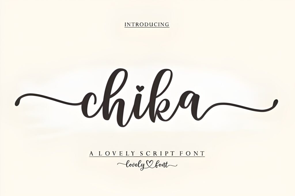
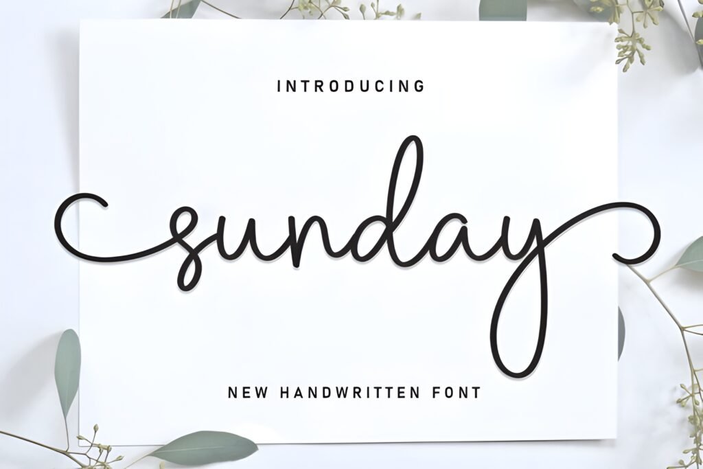
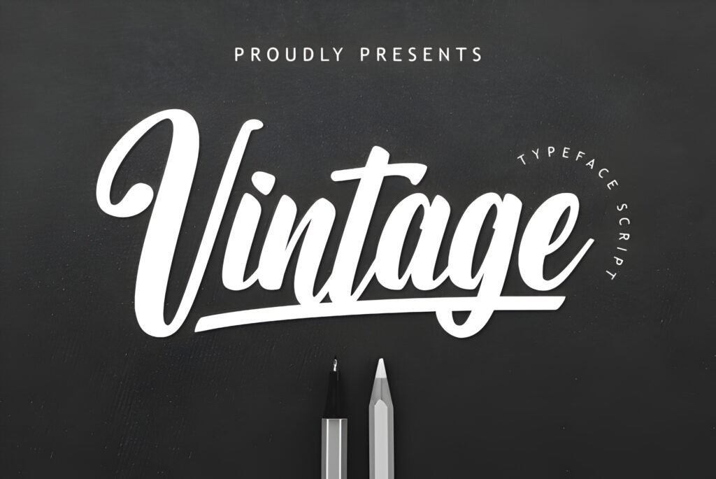
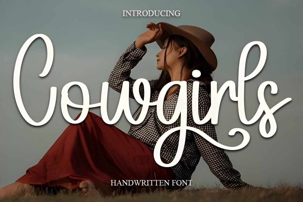
Sandbox is a display font characterized by bold strokes and expressive cursive lines that evoke a vintage, retro aesthetic reminiscent of classic signage and posters. Its design suggests a playful yet confident tone, making it suitable for projects seeking a nostalgic yet energetic visual impact.
Disclosure: This post contains an affiliate link. We may earn a commission at no extra cost to you.
What Makes Sandbox Font Distinctive?
The font combines strong, rounded shapes with cursive elements, creating a dynamic interplay between structure and fluidity. This balance lends itself to headlines and logos where a distinctive, memorable style is desired. The curves and weight distribution imply a lively rhythm, though the exact letterforms and spacing should be reviewed carefully to ensure legibility at smaller sizes.
Best Uses for Sandbox Font
Sandbox works well for branding projects, especially those aiming to capture a retro or vintage vibe. It can enhance headlines, logos, and posters where a bold, expressive statement is needed. Due to its decorative nature, it is less suited for body text or dense informational layouts but excels in contexts where personality and visual flair are priorities.
How to Pair Sandbox Font
For complementary typography, consider pairing Sandbox with a clean, neutral sans-serif for body text to maintain readability and balance. For example, a geometric sans-serif like Montserrat or a humanist sans-serif like Open Sans can serve as body copy, while Sandbox handles headlines or subheads. This contrast highlights the font’s unique curves without overwhelming the overall design.
Practical Design Tips
Use ample whitespace around Sandbox to let its bold curves breathe and avoid visual clutter. Scale the font prominently for headlines or logos to maximize its impact. When combining with simpler fonts, maintain a clear hierarchy by reserving Sandbox for the most attention-grabbing elements. Experiment with color contrasts to enhance its retro feel, such as pairing warm tones with muted backgrounds. Avoid using it in long paragraphs or small sizes where its details may be lost.
Frequently Asked Questions
Is Sandbox suitable for body text?
Given its bold and decorative cursive style, Sandbox is best reserved for headlines or logos rather than extended body text, where legibility and reading comfort are priorities.
Can Sandbox be used for branding projects?
Yes, its strong retro character and expressive curves make it a good choice for branding that seeks a vintage or nostalgic identity, especially in headlines or logo marks.
What type of fonts pair well with Sandbox?
Neutral, clean sans-serifs work well as complementary fonts, providing contrast and readability when Sandbox is used for prominent text elements.