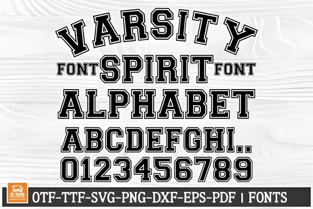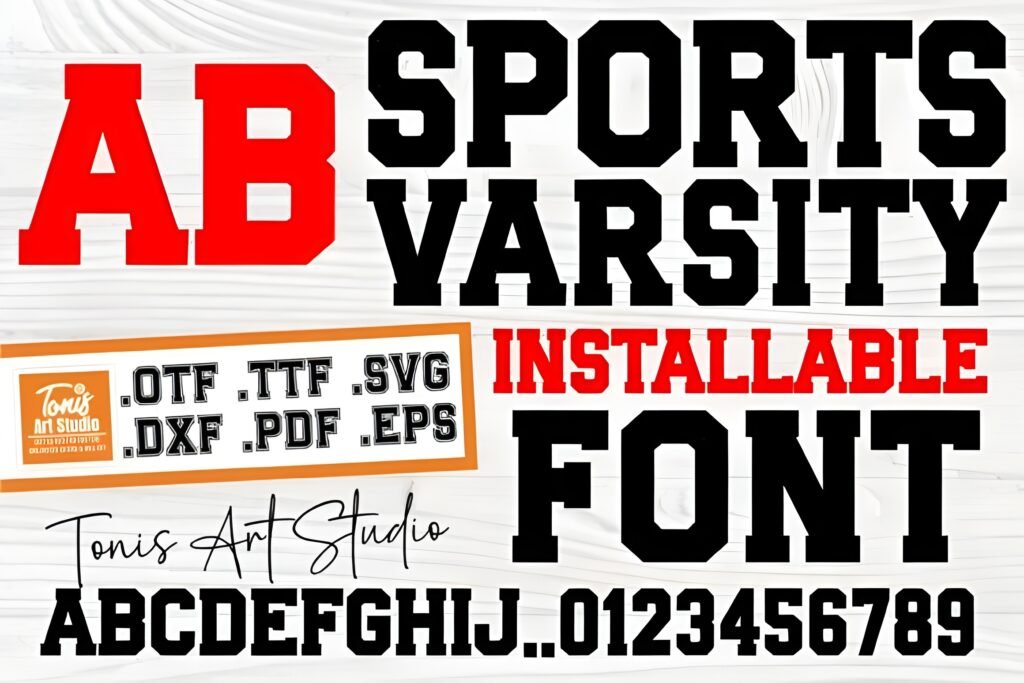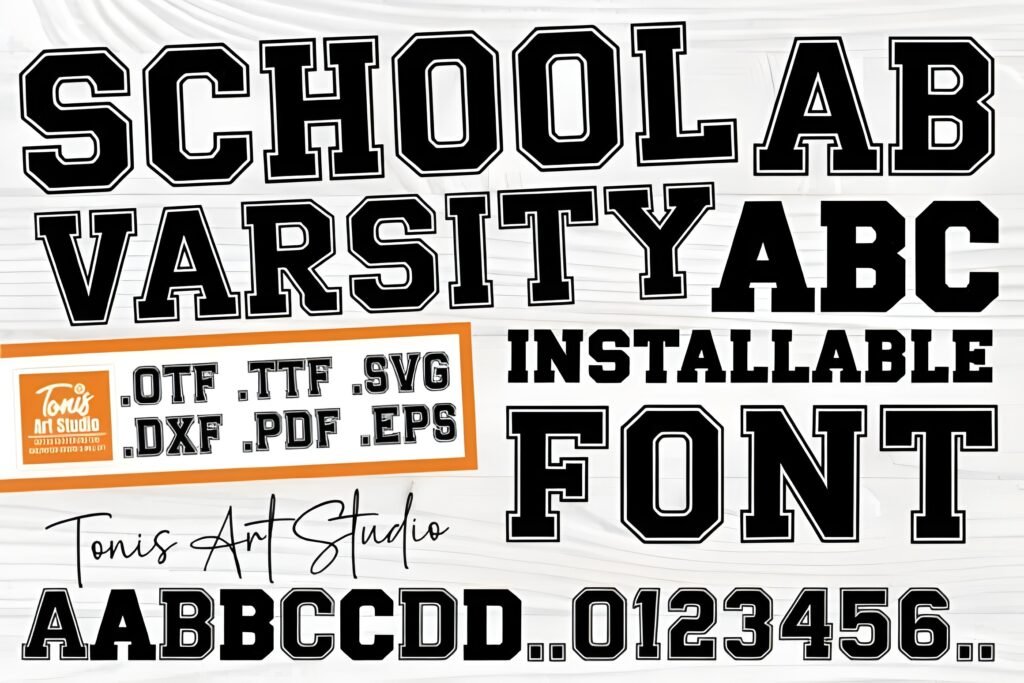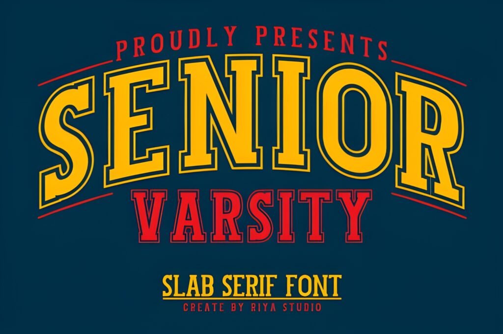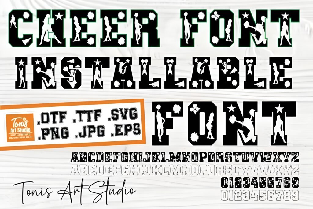
Cheer Varsity presents a distinctive collegiate style by combining bold uppercase letters with outlined lowercase characters. This contrast creates a dynamic visual rhythm that can energize designs related to sports, school spirit, and team pride. The font’s construction suggests a strong, competitive atmosphere, making it suitable for projects that aim to convey enthusiasm and unity.
Disclosure: This post contains an affiliate link. We may earn a commission at no extra cost to you.
What Makes Cheer Varsity Font Distinctive?
The font’s uppercase letters are solid and commanding, while the lowercase letters are outlined, offering a layered text effect when used together. This interplay allows for creative typographic treatments without needing multiple fonts. The design evokes traditional varsity aesthetics, aligning well with athletic and academic themes. Its compatibility with common design software and cutting machines facilitates versatile application across digital and physical media.
Best Uses for Cheer Varsity Font
Cheer Varsity is particularly well-suited for sports-related projects such as pep rally posters, team merchandise, spirit wear, and event branding. It can also enhance graduation announcements or community event materials where a bold, spirited tone is desired. The font’s energetic style lends itself to headlines and display text rather than extended body copy.
How to Pair Cheer Varsity Font
For effective typography hierarchies, pair Cheer Varsity with clean sans-serif fonts used for body text or subheadings. For example, use Cheer Varsity for headlines or main titles to capture attention, complemented by a simple sans-serif like Montserrat or Open Sans for subheads and paragraphs. This contrast maintains readability while preserving the varsity theme’s impact.
Practical Design Tips
Use ample whitespace around Cheer Varsity text to let its bold and outlined letterforms stand out without visual clutter. Scale the uppercase headlines larger to emphasize their solid presence, while lowercase outlined letters can be used at smaller sizes for secondary information or decorative accents. Consider layering solid and outlined text in the same layout to create depth and reinforce the sporty, spirited vibe. Avoid dense text blocks in this font to maintain clarity and visual energy.
Frequently Asked Questions
Can Cheer Varsity be used for body text?
Given its bold uppercase and outlined lowercase style, this font is best reserved for headlines and display purposes rather than extended body text, where readability may be compromised.
Is Cheer Varsity suitable for digital and print projects?
Yes, the font is compatible with popular design software and cutting machines, making it adaptable for both digital graphics and physical merchandise or signage.
What types of projects benefit most from this font?
Projects centered on sports, school spirit, team branding, and events like pep rallies or graduations can leverage this font’s energetic and collegiate style effectively.