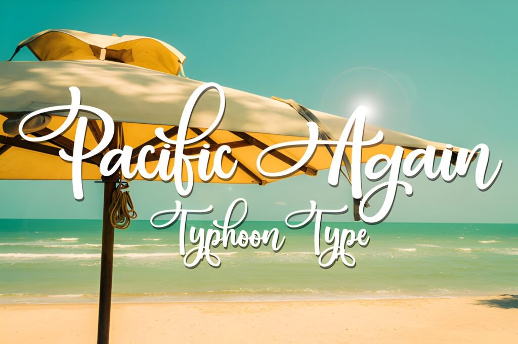
Pacific Again channels the spirit of vintage coastal signage through flowing cursive lines that suggest handwritten artistry. This display font carries a nostalgic air reminiscent of sun-faded billboards and classic seaside postcards, making it suitable for projects seeking a retro yet adaptable aesthetic.
Disclosure: This post contains an affiliate link. We may earn a commission at no extra cost to you.
What Makes Pacific Again Font Distinctive?
The font’s cursive style features smooth, connected strokes that evoke a handcrafted feel. Its design balances vintage charm with modern usability, allowing it to function well in both bold logo treatments and more delicate, invitation-style layouts. The overall impression is one of warmth and timelessness, with a distinctive coastal vibe.
Best Uses for Pacific Again Font
Ideal for themed branding that leans into retro romance or seaside nostalgia, Pacific Again works well in display roles such as logos, headlines, and invitations. It can enhance projects that benefit from a personal, handcrafted touch, especially those related to lifestyle, travel, or hospitality sectors with a vintage twist.
How to Pair Pacific Again Font
Pair Pacific Again with clean, sans-serif fonts for body text to maintain readability and create contrast. For example, use it as a headline font paired with a simple sans-serif like Montserrat or Open Sans for subheadings and body copy. This hierarchy helps the cursive style stand out without overwhelming the overall design.
Practical Design Tips
Use generous whitespace around Pacific Again to let its flowing curves breathe, especially in larger sizes. When applying it to logos or invitations, consider scaling the font prominently to emphasize its vintage character. Avoid pairing it with other script fonts to prevent visual clutter; instead, contrast it with straightforward, geometric typefaces. For layouts, placing it on textured or muted backgrounds can enhance its nostalgic feel.
Frequently Asked Questions
Can Pacific Again be used for body text?
Given its cursive and display-oriented design, Pacific Again is best reserved for headlines or short phrases rather than extended body text to ensure legibility.
What types of projects benefit most from this font?
Projects that evoke vintage seaside themes, retro branding, or invitations with a handcrafted look can benefit from Pacific Again’s nostalgic style.
How should I pair Pacific Again with other fonts?
Pair it with clean, simple sans-serifs for body copy to create clear visual hierarchy and avoid competing script styles.