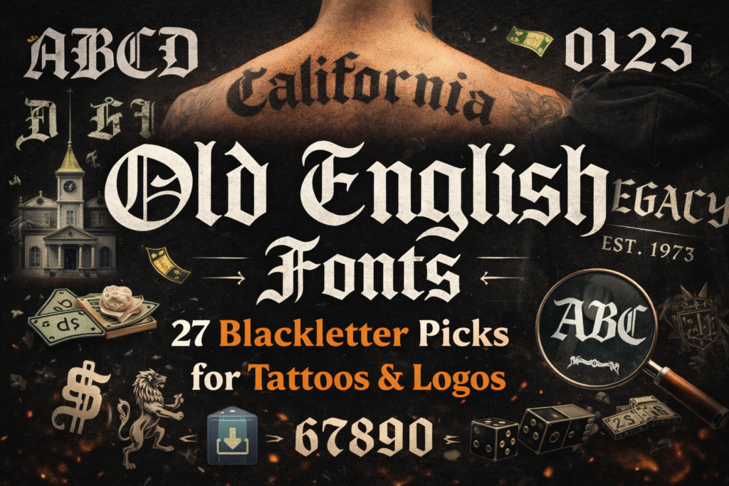
If your design needs instant authority—heritage, grit, tradition, drama—an Old English Font (often used as a blackletter style) delivers it in one line.
The problem is: many “Old English” options look great in a preview, then fall apart in real work—tight spacing, unreadable small sizes, messy numbers, or alphabets that don’t match the vibe.
In this guide, I’ll show you how I pick Old English fonts for real creator workflows (digital + physical), plus 27 downloadable options you can use for everything from logos and posters to an old english font tattoo mockup and merch layouts.
Affiliate Disclosure
Disclosure: This post contains affiliate links. If you click through and download, I may earn a commission (at no extra cost to you). I only include items that fit the use-cases discussed in this article.
Jump to
- Quick comparison (Top 7)
- My method: how I choose an Old English font
- Full reviews: all 27 Old English fonts
- Creator tips for digital + physical projects
- Conclusion
- FAQ
- Open list: all items
Quick comparison table (Top 7 picks)
These are my “start here” picks when you need a strong blackletter look fast. (Always open the listing to confirm the exact old english font alphabet letters, numbers, and license details.)
| Font | Best for | Vibe | Quick note | Link |
|---|---|---|---|---|
| Wicked Olde English Font | Tattoo-style lettering, bold headlines | Classic gothic | Strong “Old English” impact; test readability first | |
| Old English Monogram Font | Monograms, initials, wedding/brand marks | Ornate + formal | Great when you need a centered emblem look | |
| Regius Font | Luxury packaging, crests, editorial titles | Regal + traditional | Use generous spacing for premium feel | |
| Danger Gothic Font | Posters, music drops, high-energy merch | Aggressive + modern | When you want “gothic” without looking antique | |
| Elderscroll Font | Fantasy titles, game assets, book covers | Mythic + story-driven | Great for “chapter title” typography | |
| Black Old English Font | Bold headlines, decals, large print | Heavy + confident | Start big; scale down only after a legibility check | |
| Old English Font | Basic templates, quick client mockups | Classic + direct | A good “baseline” to compare others against |
My method: how I choose an Old English font
I treat “Old English” as a practical category, not a single look. In real projects, you’ll see it overlap with old english font blackletter and “gothic” styles. My goal is simple: pick a font that keeps its character after it hits the real world (printing, cutting, embroidery, thumbnails, signage).
My 7-step selection checklist
- Alphabet reality check: I open the preview and scan the old english font alphabet for consistency. If uppercase looks amazing but lowercase looks random, I treat it as “headlines only.”
- Numbers matter: I always check old english font numbers (0–9). If the numerals feel like a different font, the design will look “patched.”
- Spacing test (kerning vibe): I type three brutal words: “WAVY,” “MIMI,” and “TATTOO.” If the shapes collide or look cramped, I plan extra letter-spacing.
- Small-size legibility: I shrink the text to thumbnail size. If counters fill in, I keep the font for big headlines only.
- Print/cut friendliness: For vinyl and physical products, I look for clean shapes that won’t create fragile islands. Blackletter can be detailed; your cutter doesn’t care how cool it looks.
- Project fit: A gothic old english font for a band tee is different from an “estate winery label” vibe. I choose based on audience expectations first.
- License check: Before any client delivery or product listing, I open the font’s license details on the listing page and confirm usage rights for commercial work.
Pro tip: If you’re designing a tattoo layout (including an old english font back tattoo mockup), I recommend printing at 1:1 scale at least once. Screen previews lie. Paper tells the truth.
Full reviews: all 27 Old English fonts (with creator-focused use cases)
Below you’ll find one block per item with a clear vibe, best-for guidance, two real project examples, and a download CTA. For social proof (rating/reviews/favorites), I always recommend checking the listing directly because it can change over time.
Agerola Font
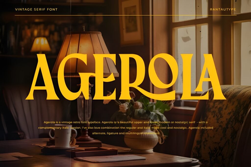
Level: intermediate
Best for: logos + labels
Quick note: check the alphabet + numbers on the listing
Expert opinion: When I want an Old English headline that feels “established,” I reach for a font like Agerola. I keep it bold, give it air (letter-spacing), and let the shapes do the storytelling without extra effects.
- Example A: A boutique coffee label: “AGEROLA ROAST” on top, small sans serif underneath for roast notes.
- Example B: A YouTube thumbnail pack: one-word blackletter title with a thick outline for contrast.
Save/share: Save this font if you build brand kits—Old English headers are a fast way to add “heritage” to templates. Share it with a client who wants classic but still bold.
Saverny Font
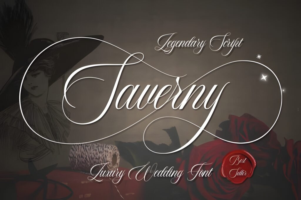
Level: beginner-friendly
Best for: posters + covers
Quick note: verify numerals for date-based designs
Expert opinion: Saverny fits when you want that “printed title” feel—like a modern editorial layout borrowing Old English energy. I like it most paired with minimal grids and lots of whitespace.
- Example A: A book cover mockup: big title in blackletter, author name in a clean serif beneath.
- Example B: An Instagram quote card: one short line in Old English, everything else neutral and small.
Save/share: Save this for cover templates and headline packs. Share it with a creator who needs a readable blackletter vibe for digital layouts.
Areus Font
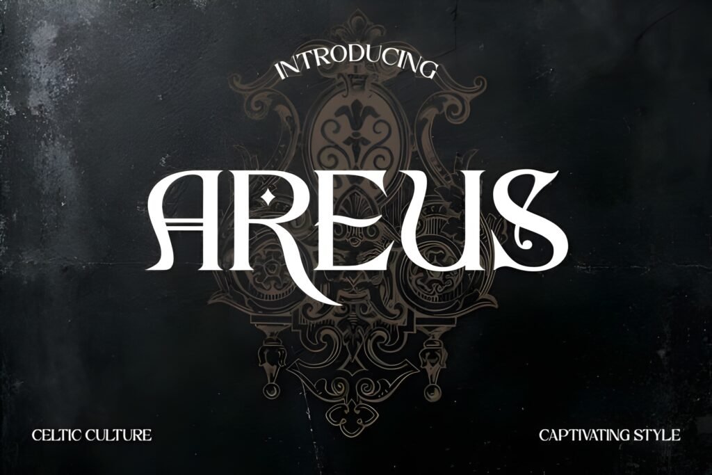
Level: intermediate
Best for: jerseys + merch text
Quick note: test stroke thickness for embroidery
Expert opinion: For merch that needs “team energy,” I prefer an Old English font that can handle big, blocky words. With Areus, I’d keep the message short and push contrast with a single accent color.
- Example A: A hoodie chest print: one large word in blackletter, small coordinates below in a sans font.
- Example B: A sports flyer: headline in Old English, schedule and location in a clean condensed type.
Save/share: Save it if you make streetwear collections or sports-style graphics. Share it with a teammate who builds merch mockups and needs a strong headline font.
Pioneer Boulevard Font
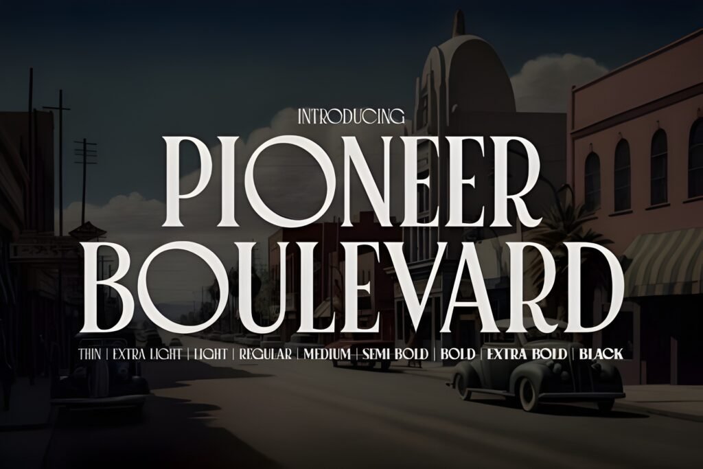
Level: beginner-friendly
Best for: branding + posters
Quick note: add spacing for long street names
Expert opinion: The name alone makes me think “street signage” and local brand identity. I’d use Pioneer Boulevard for bold headers, then pair it with simple body text so it stays readable.
- Example A: A local event poster: title in Old English, details in a clean sans, QR code at the bottom.
- Example B: A café tote bag: one-word brand lockup in blackletter, minimal icon beneath.
Save/share: Save it for poster templates and local-brand packs. Share it with a creator who wants a “classic street” vibe without heavy ornament.
Elderscroll Font
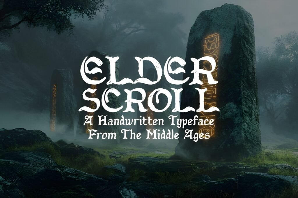
Level: intermediate
Best for: titles + chapters
Quick note: perfect for short, dramatic phrases
Expert opinion: Elderscroll is the kind of Old English font I use when the project needs lore. I avoid long sentences and instead design around two or three words that feel iconic.
- Example A: A fantasy book cover: “THE OATH” in blackletter, subtitle in small caps below.
- Example B: A tabletop RPG handout: section headers in Old English, body copy in a readable serif.
Save/share: Save this for story-driven packs—covers, chapters, game assets. Share it with a writer/creator who needs a title font that instantly sets a world.
Enchanted Land DS Font

Level: beginner-friendly
Best for: invitations + fantasy brands
Quick note: use gentle contrast, not harsh outlines
Expert opinion: This is where I blend “Old English” energy with something softer. If you’re making products that need a magical tone without feeling aggressive, a pick like this can bridge the gap.
- Example A: A wedding signage mockup: names in a stylized Old English headline, details in a clean serif.
- Example B: A fantasy shop logo: short brand name + small ornament icon, kept simple for stamping.
Save/share: Save it if your audience is more “storybook” than “street.” Share it with a creator building printable sets (invites, signage, table cards).
Regius Font

Level: intermediate
Best for: crests + premium labels
Quick note: looks best with wide margins
Expert opinion: If I’m building a crest-style layout, I want the letterforms to feel intentional and ceremonial. With Regius, I keep the copy minimal and focus on hierarchy: one strong title, one supporting line, done.
- Example A: A wine label concept: brand name in Old English, region + year in a restrained serif.
- Example B: A YouTube intro card: channel name in blackletter, tagline in small caps beneath.
Save/share: Save this for premium brands and crest templates. Share it with someone who designs packaging and needs instant “authority.”
Old English Monogram Font
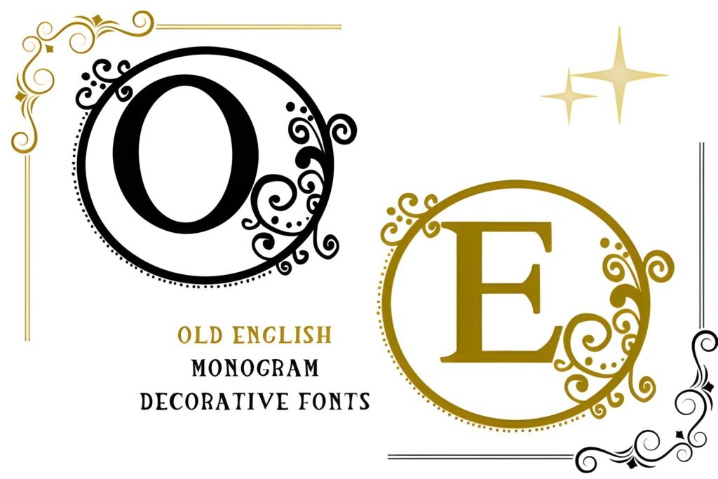
Level: beginner-friendly
Best for: initials + monograms
Quick note: perfect for single letters and pairs
Expert opinion: Monograms are a different game: you’re designing for one letter to carry the whole identity. I like using an Old English monogram when the project needs tradition—weddings, family crests, boutique packaging.
- Example A: A wedding suite: one-letter monogram on the invitation, full names set in a readable serif.
- Example B: A maker stamp: single initial on product tags and box seals.
Save/share: Save this if you sell monogram templates or offer personalized products. Share it with a creator who does wedding printables or gift branding.
Fallen Bishop Font
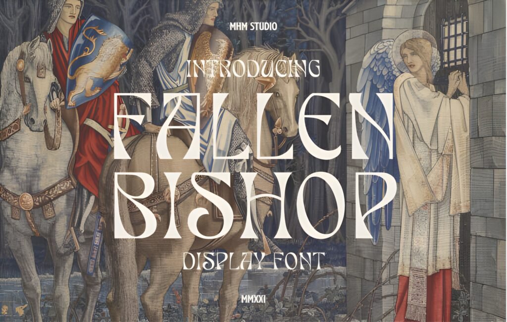
Level: intermediate
Best for: album art + edgy posters
Quick note: keep copy short for impact
Expert opinion: This is the vibe I choose when the design needs weight and shadow—even in plain black ink. If your project is music, streetwear, or gothic branding, a dark Old English look can instantly frame the mood.
- Example A: Album cover mockup: title in blackletter, tracklist in a narrow sans font.
- Example B: Night event flyer: headline in Old English, big date set with a clean numeric font for clarity.
Save/share: Save it for dark-themed drops and poster packs. Share it with a creator who wants a gothic stamp on a brand without adding extra visuals.
Danger Gothic Font
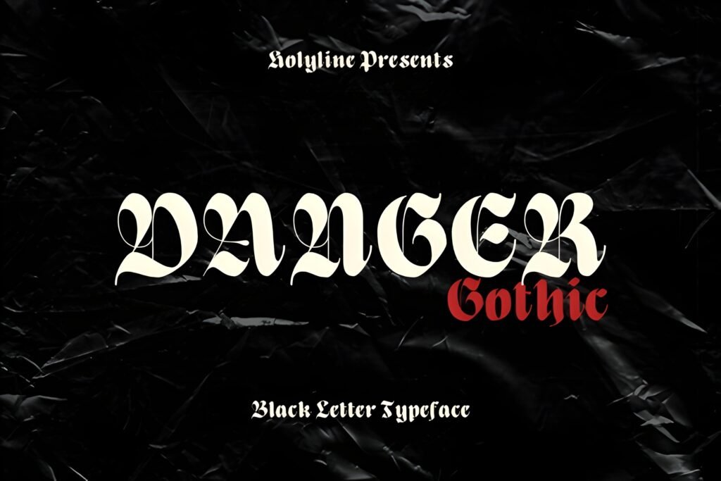
Level: beginner-friendly
Best for: merch headlines + promos
Quick note: great for high-contrast layouts
Expert opinion: When creators say they want a “gothic old english font,” they often mean: bold, intense, and readable. That’s how I use Danger Gothic—strong words, simple layout, no over-designing.
- Example A: Streetwear drop banner: “LIMITED” in gothic type, product photos beneath.
- Example B: Podcast cover: big show name in bold gothic, episode number clean and clear.
Save/share: Save it for promo templates and drop announcements. Share it with a creator who wants gothic energy that still reads fast on mobile.
The Senden Font
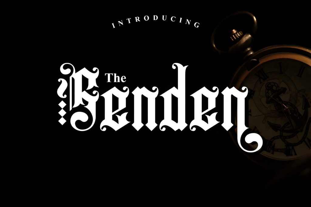
Level: beginner-friendly
Best for: logos + brand systems
Quick note: pair with a neutral sans for balance
Expert opinion: I like a “clean” Old English font when I’m building a brand system that needs to work everywhere: website headers, social posts, packaging, and print. The Senden is the kind of pick I’d test across all those formats first.
- Example A: Brand logo + submark: main word in blackletter, subline in uppercase sans.
- Example B: Product labels: big name in Old English, ingredients in a readable text font.
Save/share: Save it if you build templates and brand kits. Share it with a creator who needs a blackletter look that plays nicely with modern layouts.
Wicked Olde English Font
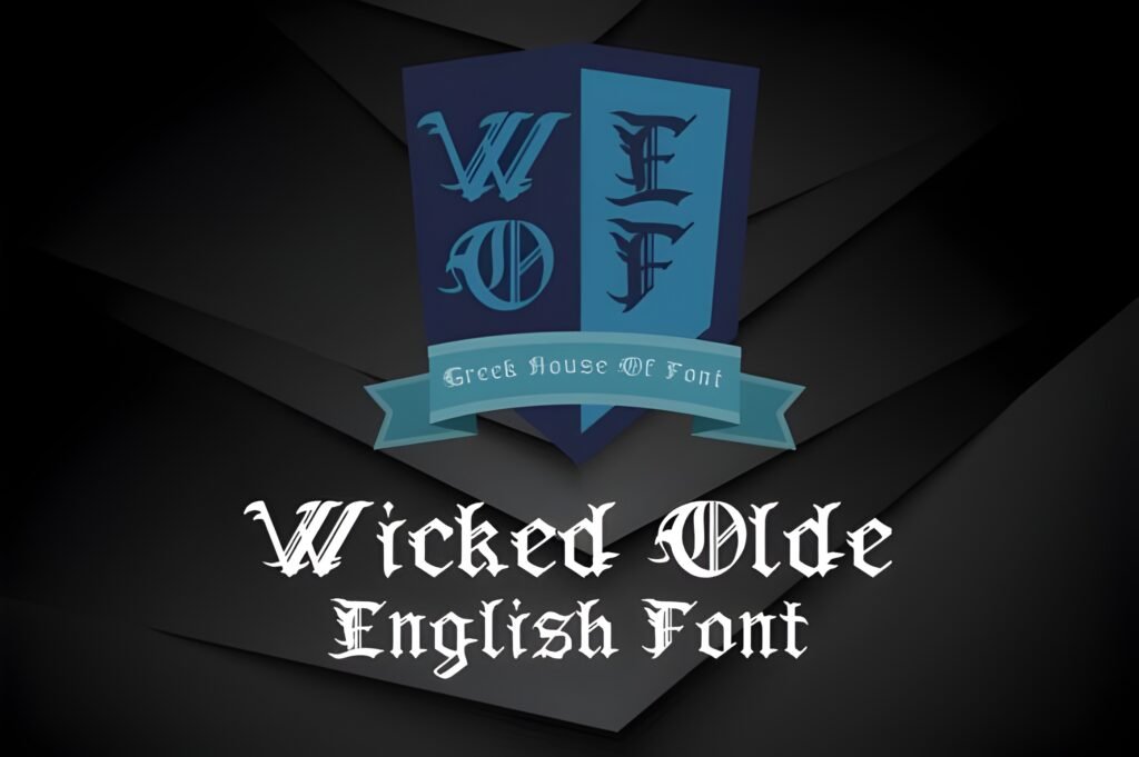
Level: intermediate
Best for: tattoo mockups + bold titles
Quick note: print 1:1 to confirm readability
Expert opinion: If you’re looking for the “I mean it” Old English look, this is a strong direction. For an old english font tattoo mockup, I focus on spacing and letter clarity more than effects—tattoo-inspired lettering is about clean decisions.
- Example A: Tattoo concept sheet: name + short phrase, aligned and spaced, printed at real size.
- Example B: Tee design: one main word in Old English, small “EST. 2026” beneath (check the numerals first).
Save/share: Save this if you regularly mock up tattoo lettering or bold merch. Share it with a client who asks for “Old English letters” specifically.
Arkhaven Font
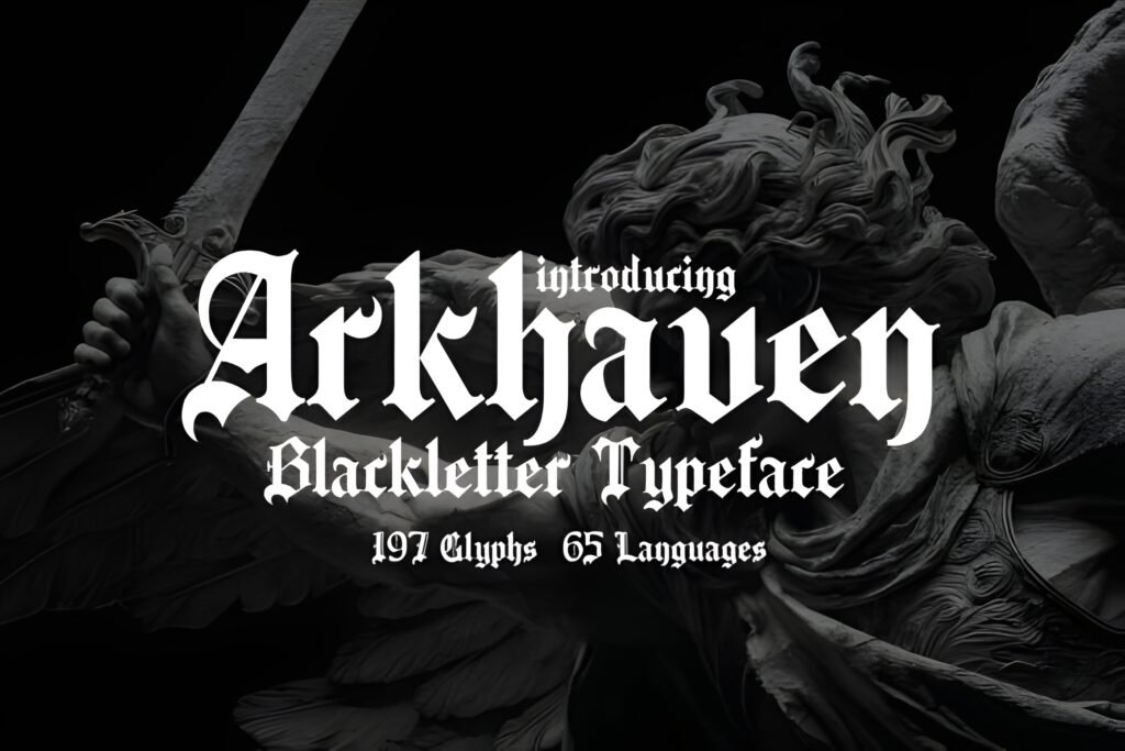
Level: intermediate
Best for: game UI + titles
Quick note: use for headings, not paragraphs
Expert opinion: For fantasy projects, I like a blackletter headline that can feel like a logo on its own. Arkhaven is a strong pick for title cards, chapter headers, and “mode selection” UI screens where mood matters.
- Example A: Game main menu mockup: title in Old English, buttons in a clean sans.
- Example B: Book chapter divider: chapter number (check numerals), title in blackletter, small ornament line.
Save/share: Save it for fantasy packs and cinematic layouts. Share it with a creator building a game or story brand that needs instant atmosphere.
Merchant Ledger Font

Level: beginner-friendly
Best for: labels + packaging
Quick note: looks great with paper textures
Expert opinion: Merchant Ledger screams “old-world commerce” to me—in a good way. I’d use it on packaging mockups, product tags, or any brand story that leans traditional and crafted.
- Example A: Soap label: brand name in Old English, scent and ingredients in a simple serif.
- Example B: Vintage market poster: big headline, small dates and location (check number set first).
Save/share: Save it for packaging templates and handmade-product branding. Share it with a seller who needs a vintage headline font for labels and tags.
Bundles Blackletter Font
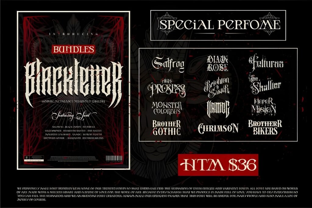
Level: beginner-friendly
Best for: template libraries
Quick note: check styles/weights included on the listing
Expert opinion: When I’m stocking a template library, I like having a “go-to” blackletter option that can cover a lot of projects. Bundles Blackletter is a practical pick for design systems where you reuse typography across many assets.
- Example A: Canva-style social templates: headline in blackletter, body in a modern sans for readability.
- Example B: Sticker packs: short words in Old English, thick outline to hold up in cutting.
Save/share: Save this if you build many templates and need consistency. Share it with a creator who wants one blackletter font to cover multiple niches.
Malitia Vetus Font
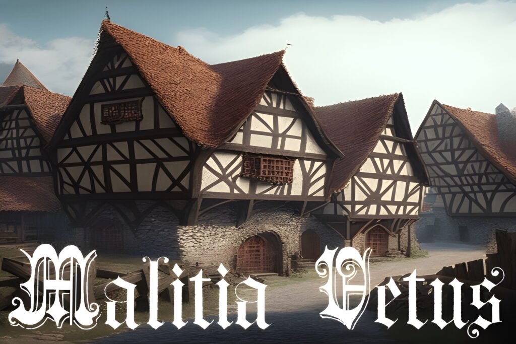
Level: intermediate
Best for: mottos + emblems
Quick note: pairs well with seals and badges
Expert opinion: If your project is built around a short motto, crest, or “seal” layout, a font like Malitia Vetus can bring that old-world seriousness. I use this vibe to make the typography feel like an artifact.
- Example A: Badge logo: brand name arched in Old English, small stars or dots separating words.
- Example B: Book chapter opener: one Latin-style phrase in blackletter, minimal ornament line under.
Save/share: Save it for crest packs and emblem design. Share it with a creator who builds vintage badges and stamp-style logos.
Black Old English Font

Level: beginner-friendly
Best for: decals + big prints
Quick note: ideal for short words and names
Expert opinion: When you need a bold old english font that doesn’t whisper, this direction works. I like it for signage-style text, big decals, and merch where the typography must read from a distance.
- Example A: Car decal mockup: short name in Old English, stretched slightly, clean single-color output.
- Example B: Large tote print: one-word statement in blackletter, minimal icon below.
Save/share: Save it if you design for physical visibility—signs, decals, big prints. Share it with a creator who sells cut files and needs strong letterforms.
Westend Ridge Font

Level: beginner-friendly
Best for: shop branding + posters
Quick note: works great in all-caps headlines
Expert opinion: Westend Ridge feels like a “front window” font choice: confident, visible, and easy to build around. I’d use it when I want the Old English vibe, but still need clean hierarchy and simple layout.
- Example A: Shop banner: brand name in blackletter, “OPEN DAILY” in a condensed sans beneath.
- Example B: Event poster: headline in Old English, date and venue in a big readable numeric font.
Save/share: Save it for signage mockups and poster kits. Share it with a creator who designs local business branding or event promo packs.
Old English Font
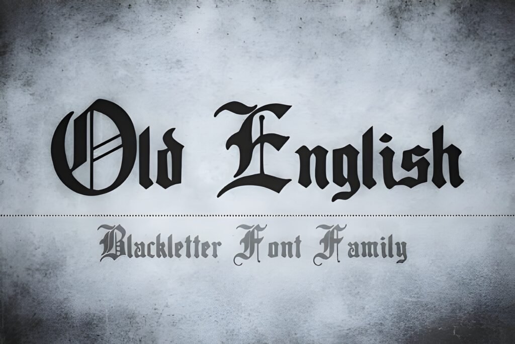
Level: beginner-friendly
Best for: fast mockups + templates
Quick note: use as your baseline comparator
Expert opinion: A “basic” Old English font is incredibly useful. I use it as a baseline: if a more decorative blackletter option becomes unreadable, I revert to a clean classic and rebuild from there.
- Example A: Client logo draft: show two options—basic Old English vs. ornate—then decide based on audience.
- Example B: Template pack: create 10 headline variations using the same font for consistency across products.
Save/share: Save it as your “default Old English” for quick drafts. Share it with a creator who needs speed and consistent results.
Queen Old English Font
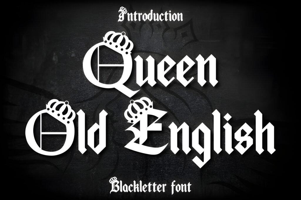
Level: intermediate
Best for: beauty brands + premium print
Quick note: looks great with subtle gold/cream palettes
Expert opinion: When a brand wants “royal” but not aggressive, Queen Old English is a great direction. I’d use it for short titles and pair it with a soft serif or modern sans for the supporting text.
- Example A: Product packaging mockup: brand name in Old English, product type in clean serif below.
- Example B: Event invitation: headline in Old English, date and venue in a readable text font.
Save/share: Save it for premium printables and elegant brand kits. Share it with a client who wants “luxury heritage” without heavy gothic darkness.
Tattoo Old English Font
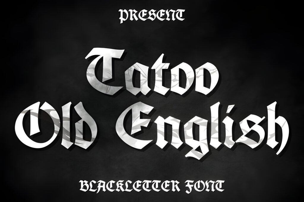
Level: intermediate
Best for: tattoo mockups + name designs
Quick note: confirm every letter before final art
Expert opinion: For tattoo-style lettering, my priority is clarity, spacing, and a consistent alphabet. I build the phrase, then I zoom in and check how every join and corner behaves—especially if the design will be placed across a curve (like shoulders or a back layout).
- Example A: Old english font back tattoo mockup: center-aligned phrase, curved baseline, print at 1:1 for spacing checks.
- Example B: Name + date layout: name in Old English, date in a clean numeric font if the Old English numbers are hard to read.
Save/share: Save it for tattoo lettering mockups and client approval sheets. Share it with a collaborator who needs “tattoo Old English” without guesswork.
Cokerfill Font
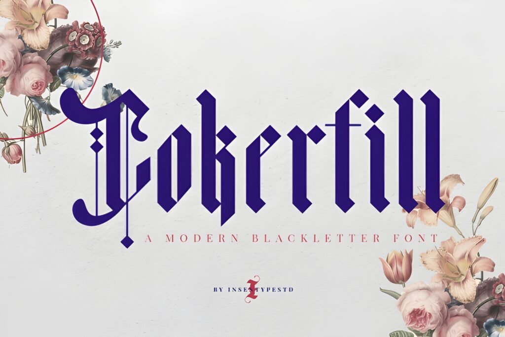
Level: beginner-friendly
Best for: bold posters + stickers
Quick note: test counters at small sizes
Expert opinion: A filled, heavy Old English style is great when you want impact without relying on outlines. My move: keep the layout simple, then add supporting text in something extremely readable so the design doesn’t become visually “heavy everywhere.”
- Example A: Sticker design: one-word blackletter, thick border, minimal icon, high contrast.
- Example B: Promo poster: headline in Old English, date and location in a clean sans (don’t sacrifice clarity).
Save/share: Save it for sticker packs and bold print layouts. Share it with a creator who needs a loud headline font for quick promos.
Dark Old English Font
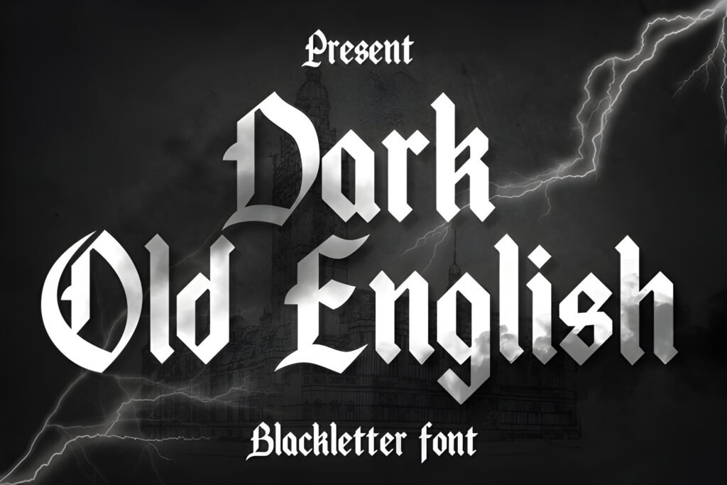
Level: intermediate
Best for: music + nightlife promos
Quick note: pair with simple icons for clarity
Expert opinion: Dark Old English is a direct tool: it tells the viewer “this is intense.” I’d use it on strong headlines and avoid long lines of text. If you need a readable paragraph, this is not the font for that job.
- Example A: Night event flyer: headliner name in Old English, date in large clear numerals.
- Example B: Merch drop graphic: 1–2 words in blackletter, simple background texture, no clutter.
Save/share: Save it for dark-themed promo packs and music branding. Share it with a creator who designs for clubs, bands, or streetwear.
Vintage Old English Font
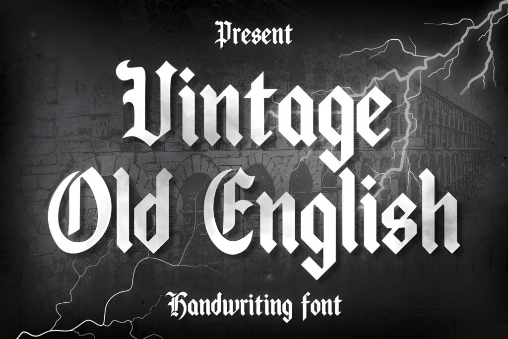
Level: beginner-friendly
Best for: vintage labels + posters
Quick note: looks great with grain textures
Expert opinion: I use “vintage” Old English when I want the blackletter flavor but with an aged poster vibe. It’s perfect for packaging mockups, label templates, and retro-styled social promos.
- Example A: Vintage label: name in Old English, “HANDMADE” stamp in a simple sans circle.
- Example B: Retro poster: headline in Old English, supporting details in a readable serif.
Save/share: Save it for vintage product mockups and label templates. Share it with a creator who sells retro packs and needs a classic headline font.
Letinegra Font
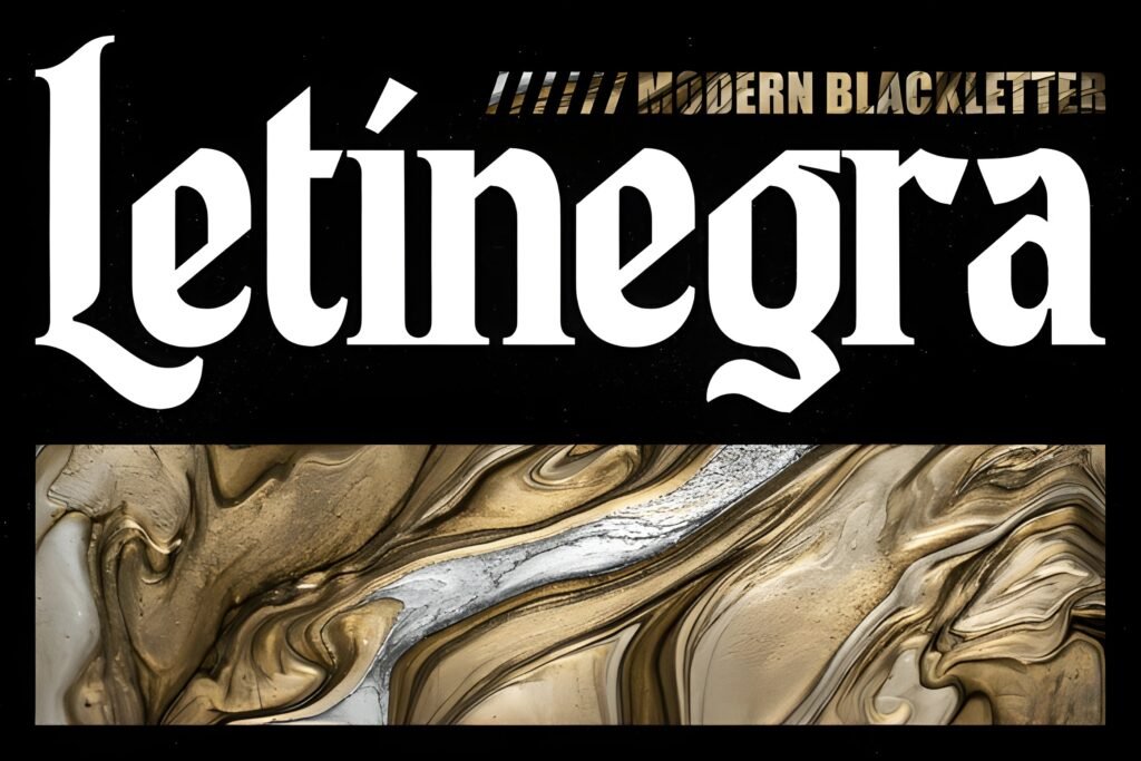
Level: advanced
Best for: ceremonial headers + invitations
Quick note: give it room to breathe
Expert opinion: If you want something closer to an old english font cursive feel (more flow, more calligraphy), a pick like Letinegra can get you there—without losing the blackletter identity. I use this vibe on formal print layouts.
- Example A: Formal invitation header: names in blackletter, event details in a clean serif.
- Example B: Certificate-style design: main title in Old English, body copy in a readable font, seal icon.
Save/share: Save it if you design invitations or ceremonial documents. Share it with a creator who needs a more elegant blackletter tone.
Old English Texas Font
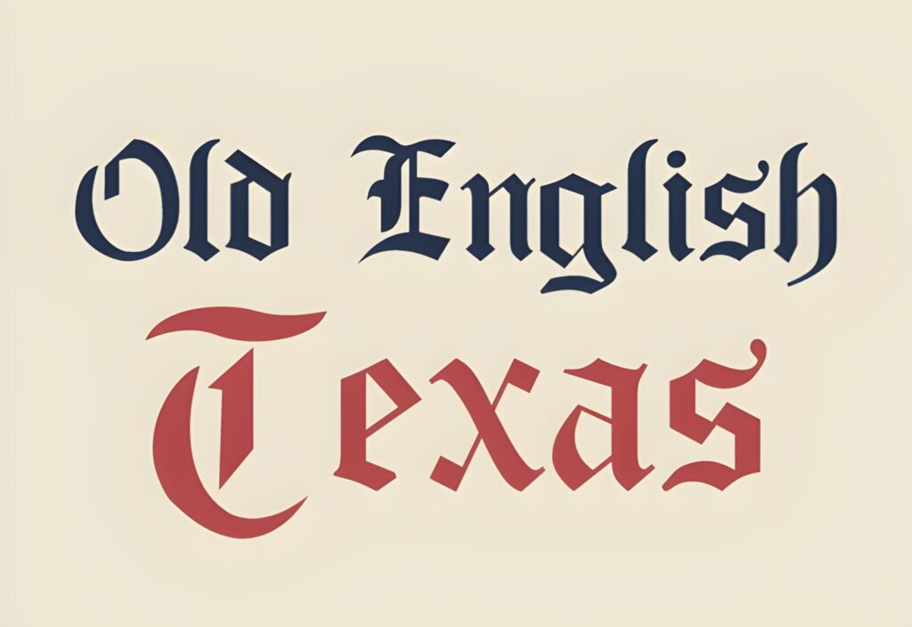
Level: beginner-friendly
Best for: western branding + merch
Quick note: great for short brand names
Expert opinion: When you combine Old English with a regional or western theme, the design can feel iconic fast—if you keep it clean. I’d use Old English Texas for bold brand marks and merch where the name is the hero.
- Example A: Western tee: big word in Old English, small “RANCH CO.” in a condensed sans below.
- Example B: Event poster: title in Old English, date and address in clear type for usability.
Save/share: Save it for western-themed packs and bold merchandise designs. Share it with a creator who needs a strong regional vibe without extra illustration.
Baghen Font
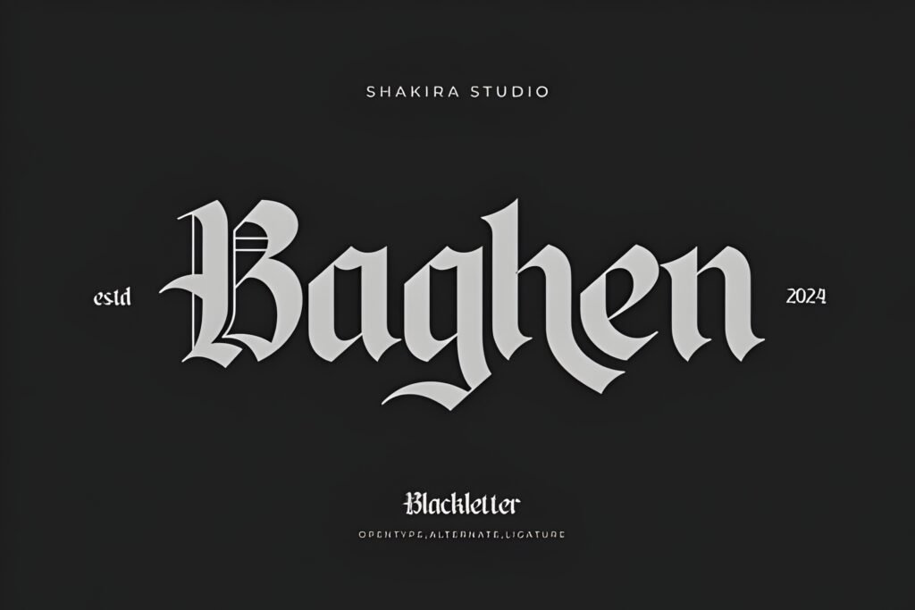
Level: beginner-friendly
Best for: general Old English needs
Quick note: a solid “go-to” option
Expert opinion: Baghen is the type of Old English pick I keep around for “I need it now” moments: quick mockups, fast client drafts, and template variations. It’s a practical choice when you want the style without overthinking.
- Example A: Logo draft board: present three typographic directions, with Baghen as the classic Old English option.
- Example B: Etsy listing mockup: product title in Old English, bullet features in a readable sans font.
Save/share: Save it for quick-turnaround projects. Share it with a creator who needs a dependable Old English style for templates and mockups.
Didn't find what you were looking for?
Use the search below to explore more options on Creative Fabrica.
Practical creator tips (digital + physical projects)
If you create for both screens and real-world products, Old English fonts can be a cheat code—if you use them intentionally.
First, decide if the font is a “headline only” tool or a “brand system” tool. Blackletter is powerful, but it’s rarely a paragraph font.
Second, always check the old english font alphabet before committing. A single weak letter can ruin a logo or name design.
Third, verify the old english font numbers when your design includes dates, prices, jersey numbers, or episode numbers.
Fourth, for vinyl and cutting machines, simplify: avoid ultra-small details, and test a small cut before you sell a cut-file pack.
Fifth, for embroidery, thicker strokes usually survive better—thin sharp details can disappear in thread.
Sixth, for print, outline your text before sending to vendors (PDF/SVG workflows), so nothing changes unexpectedly.
Seventh, pair Old English with something boring (in a good way). A neutral sans or readable serif makes the blackletter headline look even stronger.
Eighth, if you’re designing tattoo lettering mockups, print at real size and check spacing on paper. Your eyes catch issues faster in physical form.
Ninth, keep your message short. Blackletter rewards confident minimal copy.
Tenth, always confirm licensing details on the font listing before you publish client work or products.
Conclusion
An Old English font is one of the fastest ways to make a design feel iconic—but only if the alphabet, numbers, and spacing hold up in real use. Use the quick table to start, then open each listing to confirm glyphs and licensing. When you find the one that fits your project, download it and build a repeatable template around it.
FAQ
Is “Old English Font” the same as blackletter?
In creator workflows, people often use the terms interchangeably. I treat “Old English” as the practical label clients ask for, while “blackletter” describes the broader style family.
Do Old English fonts include a full alphabet and numbers?
Some do, some don’t—and even when they do, the quality varies. Always open the listing preview to check the old english font alphabet letters and old english font numbers before committing.
What’s the best Old English font tattoo approach?
Use the font for a mockup, then print the final phrase at real size. Check spacing, readability, and letter clarity—especially for curved placements like a back or shoulder layout.
How do I make a gothic Old English font readable on mobile?
Keep it to 1–3 words, increase letter spacing slightly, and pair it with a clean font for supporting text. High contrast helps more than extra effects.
Can I use these fonts commercially?
Licensing depends on the specific listing. Before you sell products or deliver client files, open the license details on the font page and confirm your intended usage.
How do I choose between a bold Old English font and a basic Old English font?
Use bold for physical visibility (signage, decals, big merch) and basic for flexibility (templates, fast drafts, cleaner readability). When in doubt, start basic and add drama with layout, not complexity.
Open list: all items (click to open)
- Agerola Font
- Saverny Font
- Areus Font
- Pioneer Boulevard Font
- Elderscroll Font
- Enchanted Land DS Font
- Regius Font
- Old English Monogram Font
- Fallen Bishop Font
- Danger Gothic Font
- The Senden Font
- Wicked Olde English Font
- Arkhaven Font
- Merchant Ledger Font
- Bundles Blackletter Font
- Malitia Vetus Font
- Black Old English Font
- Westend Ridge Font
- Old English Font
- Queen Old English Font
- Tattoo Old English Font
- Cokerfill Font
- Dark Old English Font
- Vintage Old English Font
- Letinegra Font
- Old English Texas Font
- Baghen Font