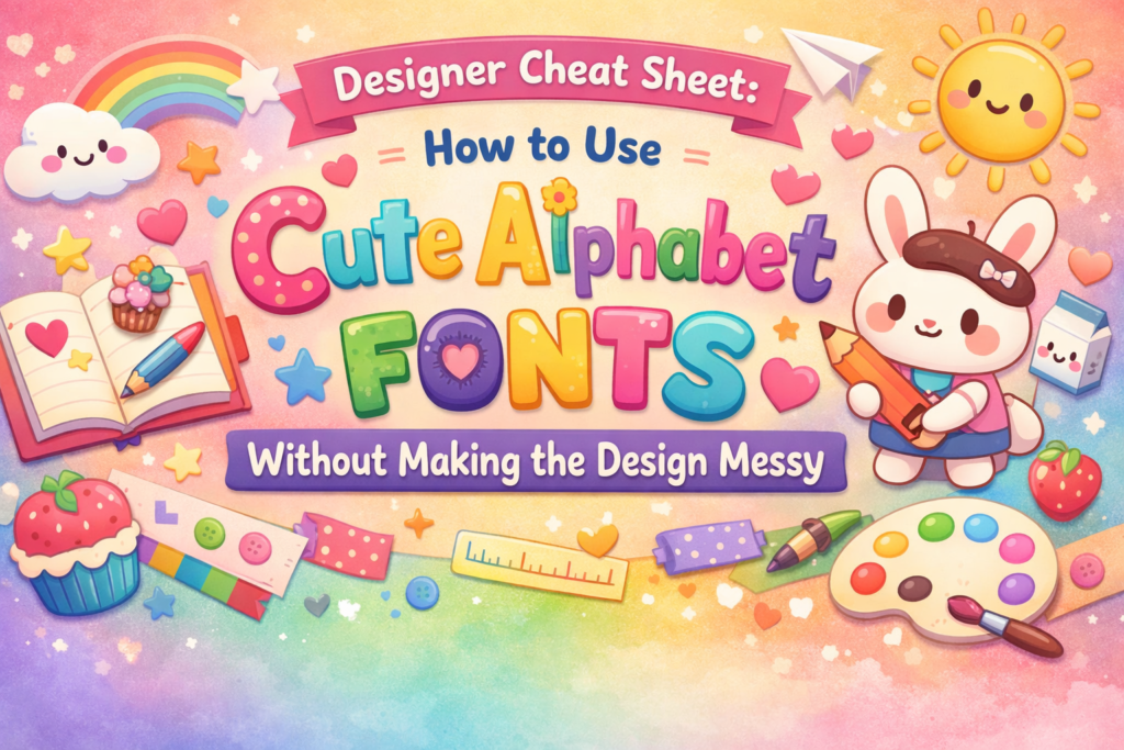
Quick vibe check: a cute fonts alphabet should feel playful, but still read clean on a phone. If your “cute” turns into “chaos,” it’s usually a spacing + contrast problem, not the font itself.
What you’ll get here: a scannable table, 19 font cards with real ⭐ ratings and ❤️ favorites where Creative Fabrica shows them, and my practical workflow for using cute alphabets in posts, carousels, Stories, and Reels.
Affiliate Disclosure
Some links on ym-graphix.com are affiliate links. If you download through them, I may earn a commission at no extra cost to you. I only list fonts I’d genuinely use in real design workflows.
Jump to / Table of Contents
Quick comparison table (all 19 items)
| Font | Vibe | ⭐ Rating | ❤️ Favorites | Best for | Jump |
|---|---|---|---|---|---|
| Marvel Brothers Font | Comic-hero, bold | ⭐4.9 (17) | ❤️ 6014 | Punchy headlines | Go |
| Gold Glitter Font | Glitzy, festive | ⭐ 5.0 (2) | ❤️ 587 | Holiday promos | Go |
| Daisy Block Alphabet | Cute block, floral | ⭐ 5.0 (5) | ❤️ 703 | Kid-friendly banners | Go |
| Crayon Font | Hand-drawn, school | ⭐ 5.0 (3) | ❤️ 1141 | Back-to-school | Go |
| Safari Font | Wild, playful | ⭐ 5.0 (1) | ❤️ 463 | Kids themes | Go |
| Colors Polka Dots | Colorful, bubbly | ⭐ 5.0 (7) | ❤️ 1379 | Cute stickers | Go |
| Bubble Rainbow Scribble | Rainbow, sketchy | ⭐ 5.0 (2) | ❤️ 1248 | Fun titles | Go |
| Spider Boy | Comic kid, bright | ⭐ 5.0 (3) | ❤️ 892 | Youth sports | Go |
| Neon Colored | Neon glow | ⭐ 5.0 (2) | ❤️ 1075 | Night promos | Go |
| American Football | Sports, bold | ⭐ 5.0 (1) | ❤️ 93 | Team graphics | Go |
| Daisy Font | Floral, soft | ⭐ 4.4 (32) | ❤️ 7441 | Spring posts | Go |
| Dotted 3D Back to School | 3D dots | ⭐ 5.0 (2) | ❤️ 159 | School promos | Go |
| Color of Christmas | Christmas color | ⭐ 4.7 (3) | ❤️ 652 | Holiday packs | Go |
| Boho Fall | Boho autumn | ⭐ 5.0 (3) | ❤️ 599 | Seasonal launches | Go |
| Halloween Bone | Spooky cute | ⭐ 4.9 (9) | ❤️ 1538 | Halloween promos | Go |
| Sweet Scribble | Handwriting cute | ⭐ 5.0 (19) | ❤️ 723 | Notes, labels | Go |
| School Font | Playful school | ⭐ 5.0 (6) | ❤️ 1098 | Teachers, kids | Go |
| Super Font | Bold, colorful | ⭐ 4.7 (45) | ❤️ 10814 | Big headlines | Go |
| Friendship Bracelet | Beads, playful | ⭐ 4.1 (10) | ❤️ 1272 | Fun labels | Go |
My method: how I choose a cute fonts alphabet (and why it works)
1) Phone-first readability (the real test)
If the alphabet looks adorable on desktop but turns into confetti on a phone, it’s not doing its job. I always mock it up at “Story size” first and keep strokes chunky enough to survive compression.
2) Contrast + spacing control
Most “cute fonts alphabet handwriting” styles need extra tracking (letter spacing) and calmer backgrounds. I pick fonts that still look good when I give them breathing room.
3) Use-case fit (not just vibes)
A calligraphy cute fonts alphabet can be perfect for a logo-style word, but awful for a carousel headline. So I match each font to a job: headline, sticker, label, number-heavy promo, or seasonal banner.
4) Social proof only when it’s visible
Where Creative Fabrica shows ⭐ rating and ❤️ favorites, I include them. If a product page doesn’t show a public rating, I won’t “guess” one.
Designer cheat sheet: how to use cute alphabet fonts without making the design messy
Keep the “cute,” kill the clutter
- One star of the show: use the cute fonts alphabet for the headline only. Everything else goes in a calm sans serif.
- Rule of two colors: one main color + one accent. Cute alphabets already bring visual noise.
- Give it air: increase padding and line spacing. Crowding is what makes cute look cheap.
- Stop stacking effects: if the font is textured (glitter/neon), skip heavy shadows and outlines.
- Contrast checklist: if you can’t read it at arm’s length, your audience can’t read it while scrolling.
- Numbers matter: for promos, test “50% OFF” and “$19” first. If numbers look weird, pick another font.
- Template hack: build 3 reusable layouts: (1) big word + subline, (2) badge + number, (3) carousel title + bullets.
My go-to pairings
Use the cute font for 2–5 words max. Pair it with a clean body font for everything else. Think of the cute alphabet as frosting—not the whole cake.
The 19 cute fonts alphabet picks (A–Z downloads)
1) Marvel Brothers Font
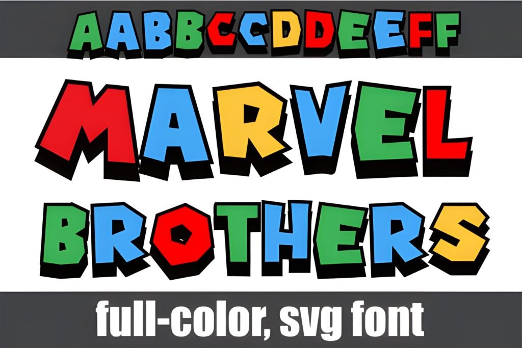
Chips: Vibe: comic-hero • Best for: bold covers • Readability: high for short words
Signals: ❤️ 6014 • ⭐ 4.9 (17)
This is my “instant energy” pick. When you need a cute fonts alphabet that still hits like a headline, this one behaves like a friendly shout—big shapes, confident presence, and great for short titles.
Use-case 1 (Post/Carousel): 1–3 word headline, then a clean sans serif for the details.
Use-case 2 (Story/Reels): punchy hook text like “NEW DROP” or “TODAY ONLY” with a simple background.
Save/Share trigger: Save this if you want “cute” but still need strong contrast in fast-scrolling feeds.
Popular pick ⭐ 4.9 (17) (❤️ 6014) for bold alphabet-style titles.
2) Gold Glitter Font
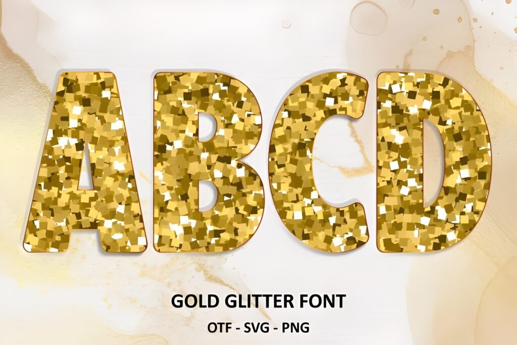
Chips: Vibe: glitter glam • Best for: seasonal promos • Readability: medium (best at big sizes)
Signals: ⭐ 5.0 (2) • ❤️ 587
Glitter fonts can get messy fast, but this one shines when you keep it simple: big word, lots of space, minimal extra effects. For an aesthetic cute fonts alphabet look, it’s basically “holiday sparkle in one click.”
Use-case 1 (Post/Carousel): “SALE” / “GIFT” / “LIMITED” as a big focal word.
Use-case 2 (Story/Reels): quick overlay for “Black Friday” or “New Year” promos (keep backgrounds plain).
Save/Share trigger: Save this for your next glittery holiday weekend campaign.
⭐ 5.0 (2) and a solid ❤️ 587—great for festive headlines.
3) Daisy Block Alphabet Font
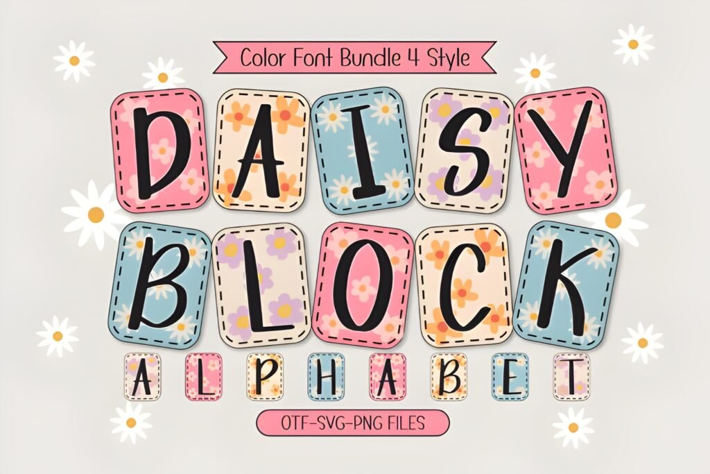
Chips: Vibe: daisy-cute blocks • Best for: kid-friendly brands • Readability: high
Signals: ⭐ 5.0 (5) • ❤️ 703
This is the “cute fonts alphabet handwriting” alternative for people who still want structure. The block shapes keep words readable, while the daisies add personality without needing extra doodles.
Use-case 1 (Post/Carousel): product name + 1-line promise (keep copy in a clean sans).
Use-case 2 (Story/Reels): cute sticker-style overlay for “new menu,” “new collection,” “new class,” etc.
Save/Share trigger: Save if you want cute that stays readable even on mobile.
⭐ 5.0 (5) + ❤️ 703—cute blocks that don’t blur in Stories.
4) Crayon Font
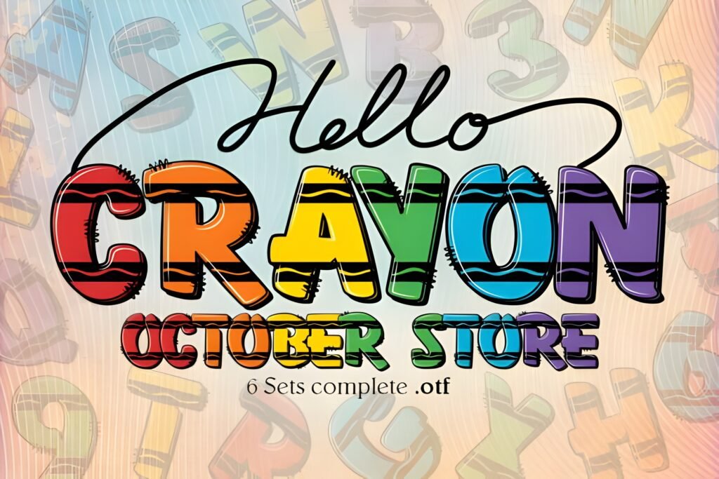
Chips: Vibe: crayon-drawn • Best for: classroom vibes • Readability: medium-high
Signals: ⭐ 5.0 (3) • ❤️ 1141
If you need an easy cute fonts alphabet that looks handmade but not sloppy, crayon texture is a cheat code. I like it for back-to-school promos, teacher content, kids party invites, and playful packaging labels.
Use-case 1 (Post/Carousel): classroom tip carousel: big section headers in Crayon, body in clean sans.
Use-case 2 (Story/Reels): “Today’s lesson” overlays with flat color backgrounds.
Save/Share trigger: Save for your next school-season content kit.
⭐ 5.0 (3) with ❤️ 1141—strong “school cute” energy.
5) Safari Font
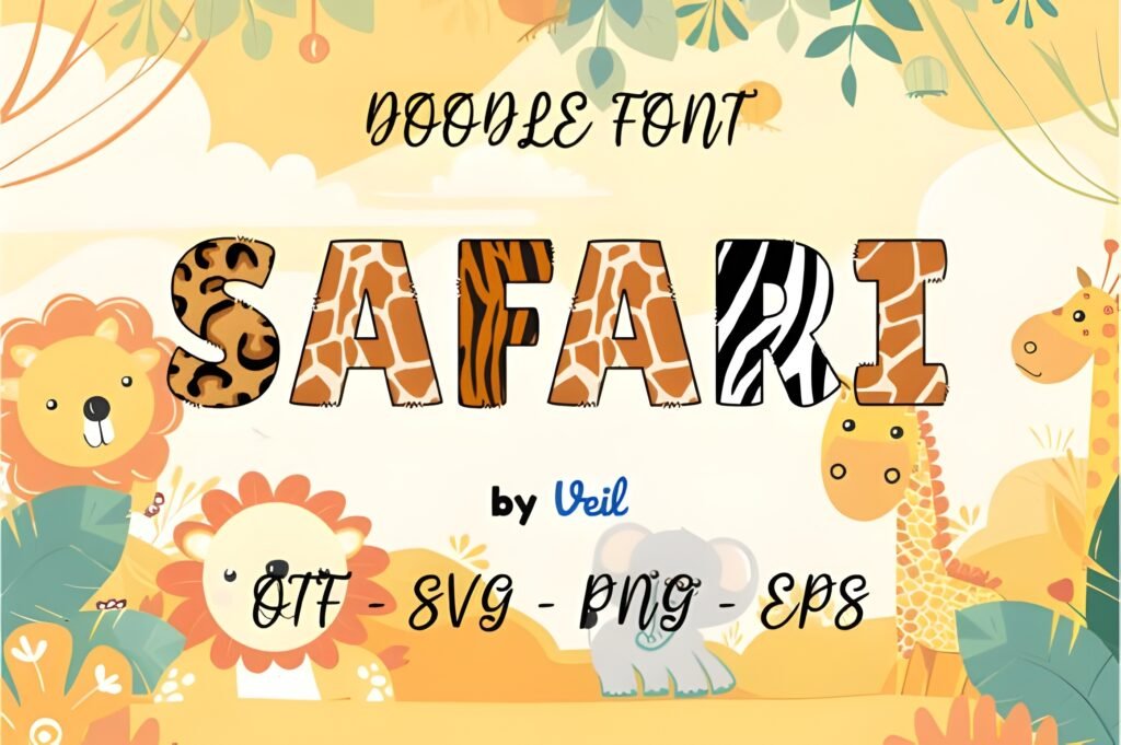
Chips: Vibe: playful safari • Best for: kids themes • Readability: high in short lines
Signals: ⭐ 5.0 (1) • ❤️ 463
Safari-style alphabets are great when you want “adventure cute” without going full jungle clipart. I’d use it for zoo trips, kids events, camp promos, and themed product drops.
Use-case 1 (Post/Carousel): event announcement with a big title + icon accents.
Use-case 2 (Story/Reels): “Join us” overlay plus date/time in a plain font.
Save/Share trigger: Save if you build kids-themed templates regularly.
⭐ 5.0 (1) + ❤️ 463—nice for big titles and kids graphics.
6) Colors Polka Dots Font
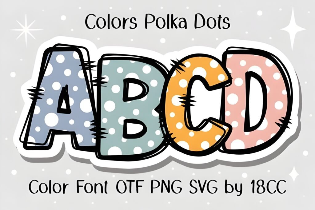
Chips: Vibe: playful polka • Best for: stickers/badges • Readability: medium (best big)
Signals: ⭐ 5.0 (7) • ❤️ 1379
This one is basically confetti—but in a controlled way. I’d use it as a highlight layer: one word, one badge, one moment. It’s a fun “aesthetic cute fonts alphabet” look if your layout stays calm.
Use-case 1 (Post/Carousel): badge words like “NEW,” “FREE,” “WOW,” “HOT.”
Use-case 2 (Story/Reels): playful overlays for giveaways (keep text minimal).
Save/Share trigger: Save if you love making sticker-style typography packs.
⭐ 5.0 (7) + ❤️ 1379—strong for “one-word” sticker moments.
7) Bubble Rainbow Scribble Font
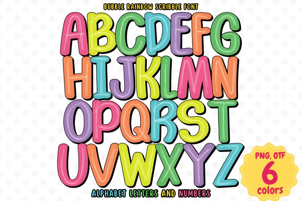
Chips: Vibe: rainbow scribble • Best for: playful titles • Readability: medium-high
Signals: ⭐ 5.0 (2) • ❤️ 1248
If you want “bubble cute” but with a handmade edge, this does it. I like it for youth brands, event graphics, and anything where the text itself should feel like an illustration.
Use-case 1 (Post/Carousel): carousel cover title, then switch to a plain font inside slides.
Use-case 2 (Story/Reels): title overlay for “challenge,” “launch,” “today,” etc.
Save/Share trigger: Save if you build bright, playful headline templates.
⭐ 5.0 (2) + ❤️ 1248—strong choice for fun cover slides.
8) Spider Boy Font
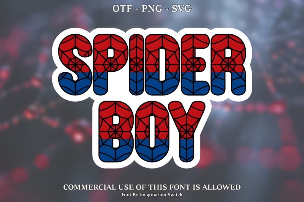
Chips: Vibe: comic kid • Best for: youth events • Readability: high at headline size
Signals: ⭐ 5.0 (3) • ❤️ 892
This is a “cool fonts alphabet and numbers” style vibe even when you’re not doing numbers-heavy promos. It’s playful, bold, and reads fast—perfect for sports days, kids clubs, and superhero-ish themes.
Use-case 1 (Post/Carousel): event name on the cover + date in a clean font.
Use-case 2 (Story/Reels): “Join the team” overlays with bright solid backgrounds.
Save/Share trigger: Save if you design for kids brands and youth activities.
⭐ 5.0 (3) + ❤️ 892—great for punchy kid-friendly headlines.
9) Neon Colored Font
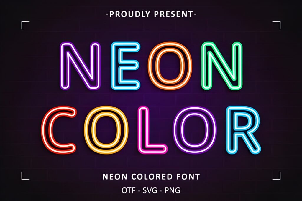
Chips: Vibe: neon glow • Best for: nightlife promos • Readability: medium (keep it big)
Signals: ⭐ 5.0 (2) • ❤️ 1075
Neon is risky because it already screams. My trick: one neon word, then everything else calm. Used that way, this alphabet looks premium and modern, not “too much.”
Use-case 1 (Post/Carousel): promo cover with one neon word (“LIVE,” “NIGHT,” “DROP”).
Use-case 2 (Story/Reels): overlay for DJ night, late sale, or launch countdown.
Save/Share trigger: Save if you build modern, high-contrast promo templates.
⭐ 5.0 (2) + ❤️ 1075—best when you keep the layout minimal.
10) American Football Font
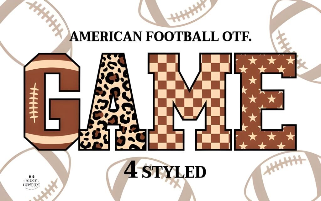
Chips: Vibe: sporty • Best for: team graphics • Readability: high
Signals: ⭐ 5.0 (1) • ❤️ 93
If your content needs numbers + impact, this is a practical “cool fonts alphabet and numbers” direction. It reads like a sports poster and makes scorelines or dates look intentional.
Use-case 1 (Post/Carousel): matchday announcement with big opponent name + time/date.
Use-case 2 (Story/Reels): “Game Day” overlays and countdowns.
Save/Share trigger: Save if you design sports content or youth leagues.
⭐ 5.0 (1) + ❤️ 93—nice niche pick for sports headlines.
11) Daisy Font
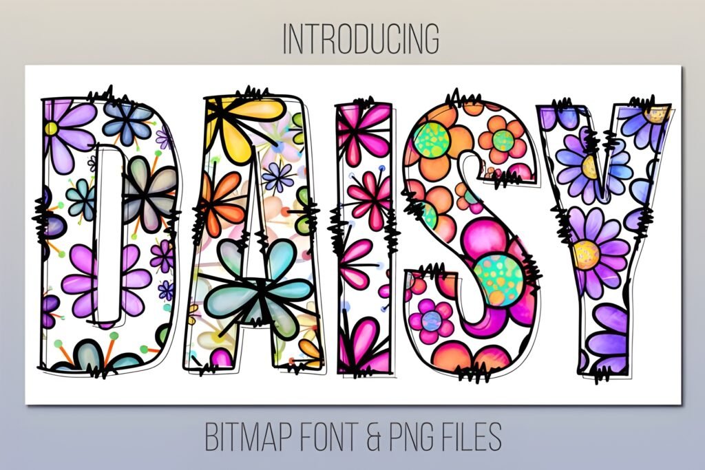
Chips: Vibe: floral • Best for: spring aesthetics • Readability: medium-high
Signals: ⭐ 4.4 (32) • ❤️ 7441
This is a big “aesthetic cute fonts alphabet” staple. It’s popular for a reason: you get a decorative vibe, but it can still function in real layouts if you keep the text short and the background calm.
Use-case 1 (Post/Carousel): cover slide title for spring launches, florals, lifestyle drops.
Use-case 2 (Story/Reels): “new collection” overlays on soft photos (add a subtle solid panel behind text).
Save/Share trigger: Save if you do seasonal aesthetics and want a recognizable floral alphabet look.
⭐ 4.4 (32) + ❤️ 7441—strong “floral aesthetic” favorite.
12) Dotted 3D Back to School Font
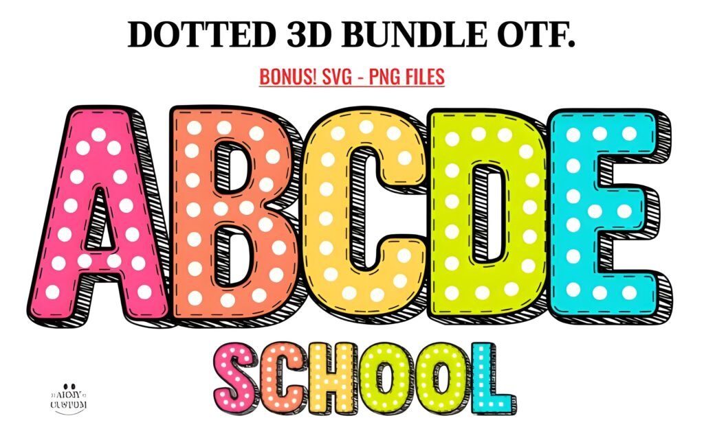
Chips: Vibe: dotted 3D • Best for: school promos • Readability: medium (use big sizes)
Signals: ⭐ 5.0 (2) • ❤️ 159
3D + dots means this font already has “texture,” so don’t over-style it. I’d use it for a hero word on a poster-like design, then keep the rest clean and flat.
Use-case 1 (Post/Carousel): “BACK TO SCHOOL” cover slide with simple shapes behind text.
Use-case 2 (Story/Reels): quick “school sale” overlay with a plain background.
Save/Share trigger: Save if you create seasonal school template packs every year.
⭐ 5.0 (2) + ❤️ 159—best for one big headline word.
13) Color of Christmas Font
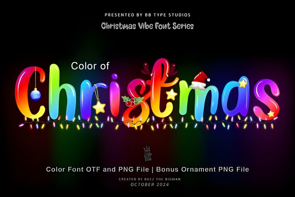
Chips: Vibe: Christmas color • Best for: holiday bundles • Readability: medium-high
Signals: ⭐ 4.7 (3) • ❤️ 652
When you want Christmas vibes without drowning your layout in ornaments, a festive alphabet does the heavy lifting. I’d keep it to a headline and let whitespace do the rest.
Use-case 1 (Post/Carousel): holiday sale cover + clean list of offer details inside.
Use-case 2 (Story/Reels): “gift guide” overlays for product clips.
Save/Share trigger: Save for Q4 campaigns and holiday weekend promos.
⭐ 4.7 (3) + ❤️ 652—solid seasonal pick for clean holiday layouts.
14) Boho Fall Font
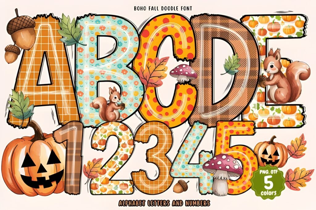
Chips: Vibe: boho autumn • Best for: seasonal drops • Readability: medium-high
Signals: ⭐ 5.0 (3) • ❤️ 599
This is “cozy cute” for fall. Think warm palettes, simple shapes, and one statement word. For an easy cute fonts alphabet approach, it’s friendly and predictable—meaning it won’t fight your layout.
Use-case 1 (Post/Carousel): fall collection cover + product list inside slides.
Use-case 2 (Story/Reels): “Autumn sale” overlays on video clips (keep contrast strong).
Save/Share trigger: Save if you run seasonal campaigns and want a consistent fall vibe.
⭐ 5.0 (3) + ❤️ 599—cozy seasonal alphabet for fall designs.
15) Halloween Bone Font
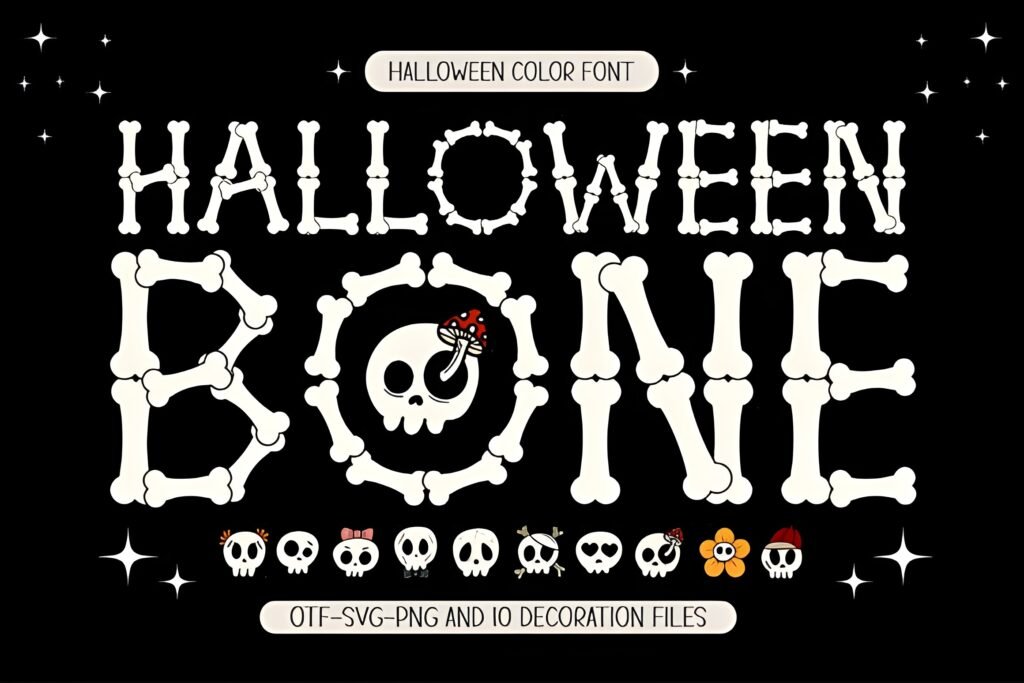
Chips: Vibe: spooky-cute • Best for: Halloween promos • Readability: medium-high
Signals: ⭐ 4.9 (9) • ❤️ 1538
This is a fun example of “cute but themed.” I’d use it for October campaigns where you want playful spooky energy rather than horror. Keep backgrounds simple and let the font be the decoration.
Use-case 1 (Post/Carousel): Halloween event cover, then details inside slides in a clean font.
Use-case 2 (Story/Reels): “Costume contest” overlays with one bold word.
Save/Share trigger: Save for October content calendars and themed promo packs.
⭐ 4.9 (9) + ❤️ 1538—great themed cute alphabet for Halloween.
16) Sweet Scribble Font
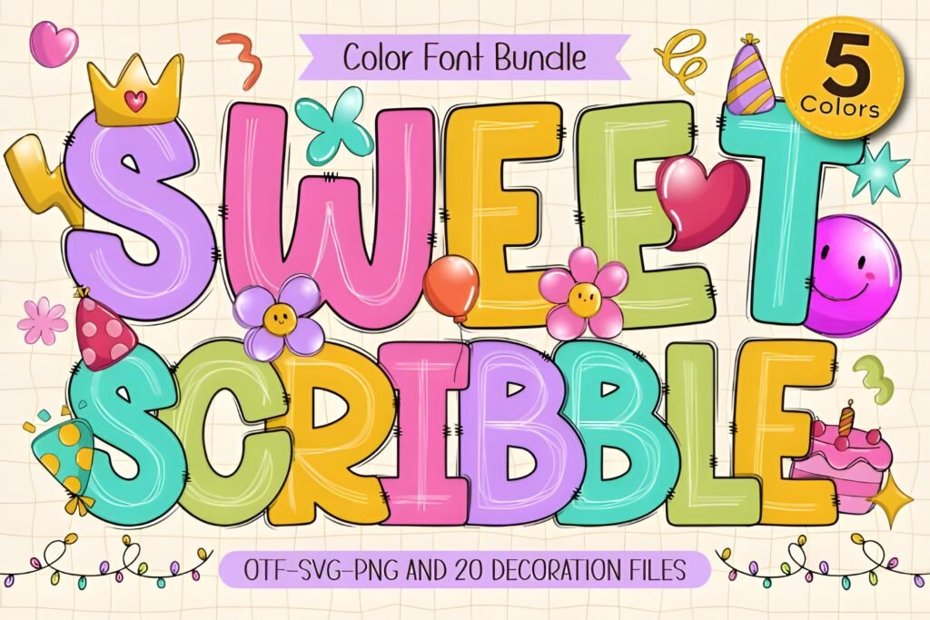
Chips: Vibe: cute handwriting • Best for: notes/labels • Readability: medium
Signals: ⭐ 5.0 (19) • ❤️ 723
If you specifically need a “cute fonts alphabet handwriting” style, this is a strong candidate. I use scribble alphabets for warm, personal designs—like stickers, planners, and social posts that should feel friendly.
Use-case 1 (Post/Carousel): “tip of the day” headings, small labels, callouts.
Use-case 2 (Story/Reels): subtle handwritten overlays on video (keep it short so it stays readable).
Save/Share trigger: Save if your brand voice is warm, personal, and casual.
⭐ 5.0 (19) + ❤️ 723—strong handwritten cute alphabet vibe.
17) School Font
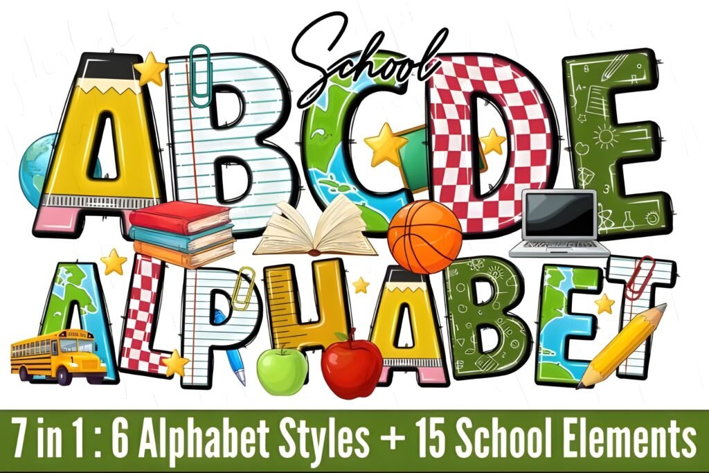
Chips: Vibe: playful school • Best for: teacher content • Readability: high
Signals: ⭐ 5.0 (6) • ❤️ 1098
This is one of those “easy cute fonts alphabet” tools you can build a whole template set around. It’s playful without being hard to read—which is exactly what you want for educational content and kids-themed social graphics.
Use-case 1 (Post/Carousel): classroom rules, learning tips, kids activities.
Use-case 2 (Story/Reels): “today’s schedule” overlay with clean spacing and strong contrast.
Save/Share trigger: Save if you design weekly education templates.
⭐ 5.0 (6) + ❤️ 1098—great for teacher and kids content kits.
18) Super Font
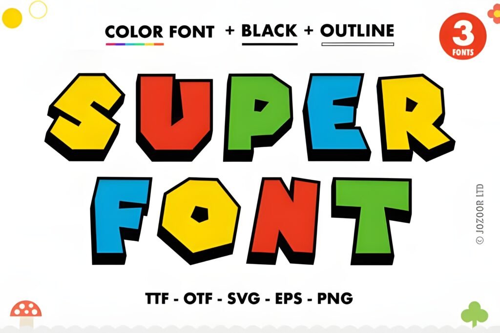
Chips: Vibe: bold + colorful • Best for: big hero headlines • Readability: high
Signals: ⭐ 4.7 (45) • ❤️ 10814
This is a heavyweight. If you want a cute fonts alphabet that still feels “designed” even before you add anything else—this is it. I’d use it for bold announcements and brand moments where the type is the main graphic.
Use-case 1 (Post/Carousel): carousel cover headline + clean, structured slides inside.
Use-case 2 (Story/Reels): big overlay hook text for “NEW,” “DROP,” “UPDATE,” “LIVE.”
Save/Share trigger: Save if you need a dependable “big headline” alphabet that pops.
⭐ 4.7 (45) + ❤️ 10814—massive favorite for bold, colorful titles.
19) Friendship Bracelet Font
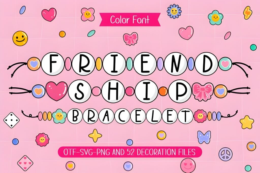
Chips: Vibe: beaded fun • Best for: playful labels • Readability: medium (use larger sizes)
Signals: ⭐ 4.1 (10) • ❤️ 1272
This one is pure “cute.” I treat it like a decorative element—great for names, short phrases, badges, and sticker-like typography. Keep the rest of the layout simple so the beads don’t overwhelm the design.
Use-case 1 (Post/Carousel): name templates, sticker sheets, highlight covers.
Use-case 2 (Story/Reels): playful “caption” overlays for quick hooks or series names.
Save/Share trigger: Save if you love cute label aesthetics and name-based templates.
⭐ 4.1 (10) + ❤️ 1272—best for short words, names, and fun labels.
Didn't find what you were looking for?
Use the search below to explore more options on Creative Fabrica.
Download prompts you can actually use (quick copy ideas)
- Template test: Download the font and build 3 reusable templates (cover, story, badge) today.
- Phone check: Download + preview it on mobile before committing to a full design set.
- Pairing rule: Use the cute alphabet for 2–5 words, then switch to a clean sans for the rest.
- Promo ready: Test “50% OFF” and “$19” immediately—numbers are the make-or-break moment.
- Carousel trick: Use the cute font only on slide 1; keep slide 2+ clean for readability.
- Brand consistency: Pick one cute alphabet per season (spring/fall/holiday) and reuse it weekly.
- Sticker workflow: Turn the alphabet into 10 sticker words (NEW, WOW, SALE, TODAY, etc.).
- Background discipline: If the font is textured (glitter/neon), keep the background flat.
Conclusion
A cute fonts alphabet should do one job perfectly: make your headline feel friendly and clickable—without sacrificing readability. My favorite workflow is simple: big cute headline, clean supporting text, generous spacing, and phone-first testing.
If you want the safest “all-around” vibe, start with Super Font for bold headlines and School Font for clean playful templates. If you need seasonal, Color of Christmas, Boho Fall, and Halloween Bone cover the calendar.
FAQ
1) What’s the easiest way to keep cute alphabet fonts readable?
Use them for short headlines only, increase spacing, and pair with a clean sans serif for body text.
2) Which cute fonts alphabet styles work best for promos with numbers?
Go for bold, structured styles (sports/comic vibes). Always test “50% OFF” and a price before you commit.
3) Should I use textured fonts (glitter/neon) with shadows and outlines?
Usually no. Textured fonts already have visual noise—keep backgrounds clean and effects minimal.
4) How do I pick between handwriting and block alphabets?
Handwriting feels personal but can lose readability. Block alphabets feel cleaner and are safer for carousels and templates.
5) Why do some fonts not show a public ⭐ rating?
Some product pages don’t display a visible rating section. In those cases, I don’t show stars—only what’s visible.
Open list (all items)
- Marvel Brothers Font
- Gold Glitter Font
- Daisy Block Alphabet Font
- Crayon Font
- Safari Font
- Colors Polka Dots Font
- Bubble Rainbow Scribble Font
- Spider Boy Font
- Neon Colored Font
- American Football Font
- Daisy Font
- Dotted 3d Back to School Font
- Color of Christmas Font
- Boho Fall Font
- Halloween Bone Font
- Sweet Scribble Font
- School Font
- Super Font
- Friendship Bracelet Font