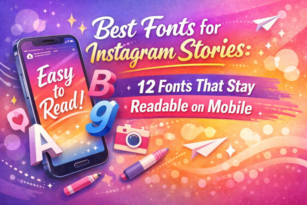
If you’ve ever designed a Story that looked perfect in Canva… and then turned into a tiny blur on your phone, welcome to the club. Instagram Stories are a readability test: small screens, fast scrolling, compression, and people who give you half a second before they swipe away.
So in this guide, I’m sharing 12 Instagram Story fonts I actually trust when the goal is simple: clean, readable, mobile-safe text that still looks aesthetic. For each font, you’ll get quick use cases (Post/Carousel + Story/Reels), creator-friendly tips, and a fast download button.
Affiliate Disclosure
Some links in this post are affiliate links. If you download a font through them, I may earn a small commission at no extra cost to you. It helps me keep publishing free typography guides. Thank you.
Jump to
- Quick comparison table
- How I choose readable Instagram Story fonts
- The 12 best fonts for Instagram Stories
- CTA phrases you can copy-paste
- Extra picks & alternates
- FAQ
- Open list (all fonts)
Quick Comparison Table (12 Fonts)
When you’re designing Stories, clarity wins. My rule: one decorative font for the headline, then keep everything else clean and short.
| Font | Best for Stories | Vibe | My quick tip |
|---|---|---|---|
| Tango Western | Bold titles, promos | Western / punchy | Keep it to 2–4 words, big size |
| Bela Yasmine | Beauty, quotes | Elegant script | Use on calm backgrounds + extra spacing |
| Lovely | Cute promos, lifestyle | Soft script | Short lines only, no paragraphs |
| Delightica | Headlines, shop drops | Sweet script | Outline/shadow for contrast on photos |
| Magic | Headers, “new” stickers | Playful | Pair with minimal body text font |
| Leafs | Wellness, handmade | Organic script | Warm palette + roomy margins |
| Grandista | Personal brand, quotes | Modern script | Perfect as a signature line |
| Merlin Birth Flower | Highlights, announcements | Decorative duo | Use flower as a tiny accent |
| April Birth Flower | Invites, dates | Romantic duo | Minimal ornaments for readability |
| California Sunset | Reels covers, travel | Bold script | High contrast + a bit of spacing |
| Memory | Daily updates | Casual handwritten | Keep lines short |
| Birdsong | Cozy captions | Handwritten | Use a slightly larger size |
How I Choose Readable Instagram Story Fonts (My Method)
- Fast read: if it takes effort, it fails.
- Contrast first: text must “pop” on mobile.
- Short copy: one message per slide.
- Spacing saves you: line-height + margins = readability.
- One decorative font: the rest stays clean.
- Safe zones: avoid top UI + bottom reply bar.
The 12 Best Fonts for Instagram Stories (Mobile-Readable Picks)
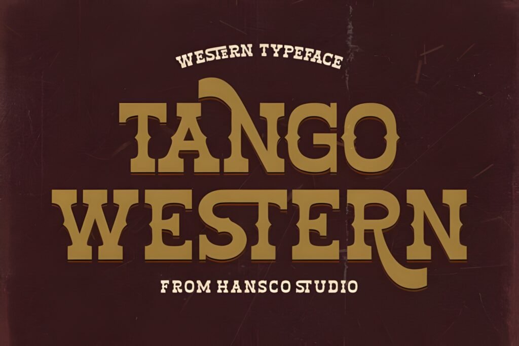
1) Tango Western Font
Font Card
- ⭐ 5.0/5 (2 reviews) • ❤️ 402 added to favorites
- Best for: bold Story headlines, sale alerts, event promos
- Quick tip: keep it to 2–4 words for maximum punch
Tango Western is my “stamp font.” The second it hits the screen, people get the message. It’s bold, confident, and built for fast scrolling—exactly what a Story needs when attention is expensive.
Example A (Post/Carousel)
Carousel cover: “SUMMER SALE” on slide 1 with big margins. Keep the rest of the carousel clean so the headline stays powerful.
Example B (Story/Reels)
Story promo: “TODAY ONLY” + one benefit. Add a soft overlay behind the text if it sits on a photo.
Save/Share trigger: Save this font if you run promos—even once a month. It’s a reusable headline machine.
✅ Best for: bold headlines • Keep it short for max readability
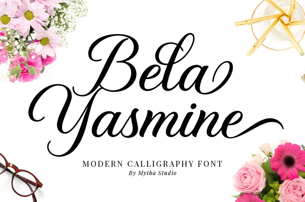
2) Bela Yasmine Font
Font Card
- ⭐ 5.0/5 (2 reviews) • ❤️ 321 added to favorites
- Best for: beauty creators, quote overlays, “soft luxury” Stories
- Quick tip: scripts need space + contrast to stay crisp
Bela Yasmine feels like a high-end label. I use it when I want “luxury” without screaming. Keep your lines short and your background calm, and it stays readable on mobile.
Example A (Post/Carousel)
Quote carousel: Bela Yasmine for the quote, clean sans font for the author/name. Instant premium look.
Example B (Story/Reels)
Story overlay: “New drop” / “Morning routine” as a headline. Add a beige overlay behind text if your background is busy.
Save/Share trigger: If your vibe is minimal/luxury, save this—Bela Yasmine is a conversion-friendly aesthetic.
✅ Best for: quotes & luxury • Use short lines and high contrast
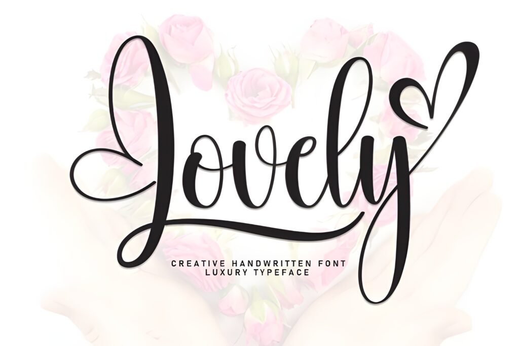
3) Lovely Font
Font Card
- ⭐ 5.0/5 (1 review) • ❤️ 70 added to favorites
- Best for: cozy intros, lifestyle Stories, gentle promos
- Quick tip: treat it like a sticker—one short phrase
Lovely makes your text feel like a friend talking, not a brand broadcasting. It’s perfect for “come with me” content, quick updates, and soft announcements.
Example A (Post/Carousel)
Mini announcement carousel: Slide 1 “Good news!” in Lovely, slides 2–3 in a clean font for details.
Example B (Story/Reels)
Story intro: “Quick update” / “Let’s talk” in Lovely, then switch to clean text for the explanation.
Save/Share trigger: Save Lovely if your audience likes personal, behind-the-scenes content.
✅ Best for: friendly intros • Keep it short and airy on mobile
4) Delightica Font
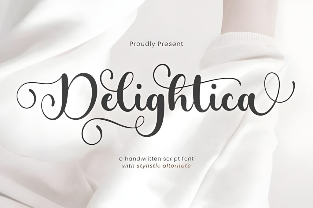
Font Card
- ⭐ 5.0/5 (1 review) • ❤️ 21 added to favorites
- Best for: shop drops, new products, quick “new in” Stories
- Quick tip: add a subtle shadow/outline over photos
Delightica is a “cute but useful” font. I like it for launch weeks because it makes your template feel fresh without changing your whole style.
Example A (Post/Carousel)
Product carousel: Delightica for “New!” tags on slide 1; clean font for specs/pricing.
Example B (Story/Reels)
Story sticker line: “Just dropped” + product name. Keep the CTA line clean and readable.
Save/Share trigger: Save Delightica for launch templates you can reuse every month.
✅ Best for: launches • Use a soft outline for photo backgrounds
5) Magic Font
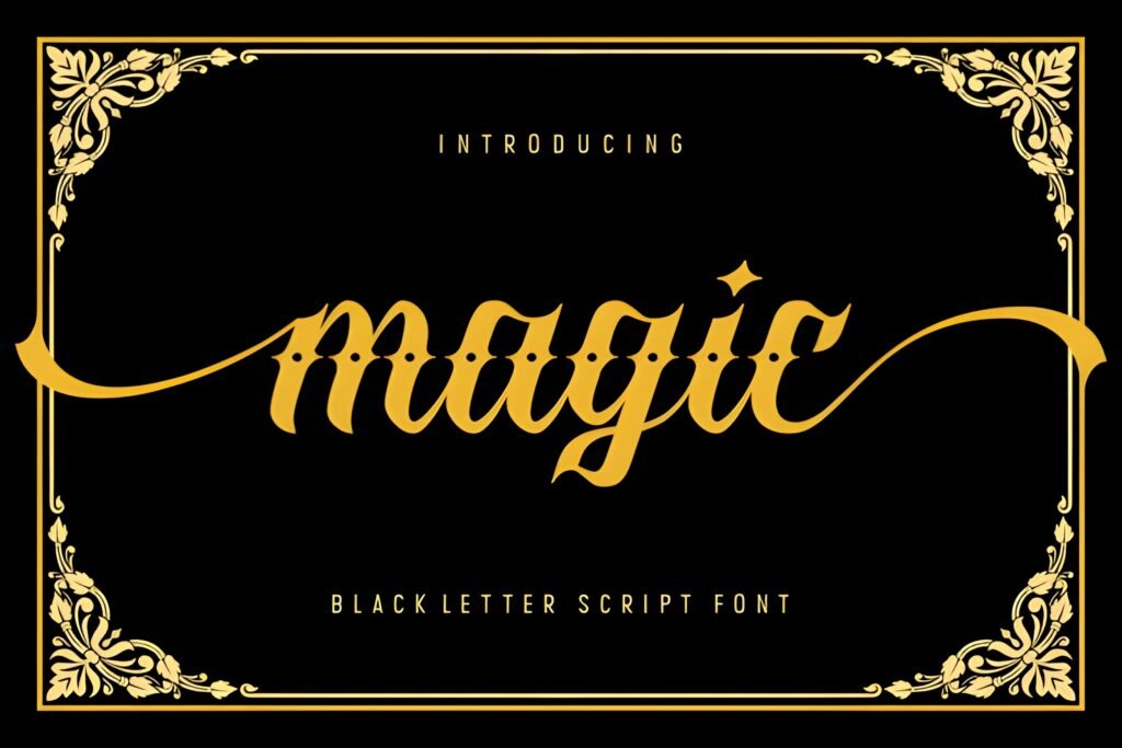
Font Card
- ⭐ 5.0/5 (1 review) • ❤️ 125 added to favorites
- Best for: playful hooks, “quick tip” Stories, mini tutorials
- Quick tip: use for the headline only—keep body text clean
Magic is my go-to when I want a Story to feel fun but still structured. It’s perfect for hooks, mini tips, and “tap through” content.
Example A (Post/Carousel)
Educational carousel: “3 mistakes” in Magic on slide 1; clean font for the list.
Example B (Story/Reels)
Story hook: “Don’t do this” in Magic, then switch to clean text for the explanation.
Save/Share trigger: Save Magic if you post tips—your hooks will instantly look more “creator” and less “corporate.”
✅ Best for: hooks • Use for headlines, keep everything else simple
6) Leafs Font
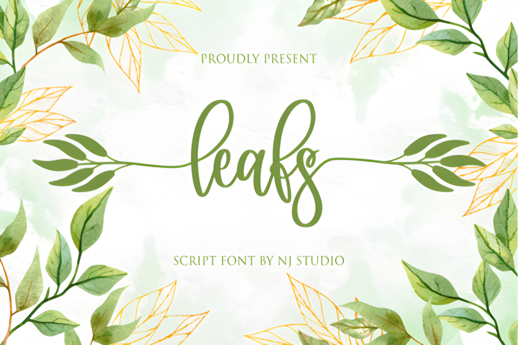
Font Card
- ⭐ 5.0/5 (3 reviews) • ❤️ 150 added to favorites
- Best for: wellness, handmade brands, calm Story templates
- Quick tip: warm tones + generous margins = instant aesthetic
Leafs feels organic and calm. If your templates are beige, cream, or earthy, this font slides in like it was made for them.
Example A (Post/Carousel)
Routine carousel: “My 3-step routine” as the cover in Leafs; steps in a clean font.
Example B (Story/Reels)
Story template: “Today’s intention” in Leafs; content line in clean text.
Save/Share trigger: Save this if your brand vibe is calm + minimal. It makes templates feel handcrafted.
✅ Best for: calm templates • Warm palette + spacing boosts readability
7) Grandista Font
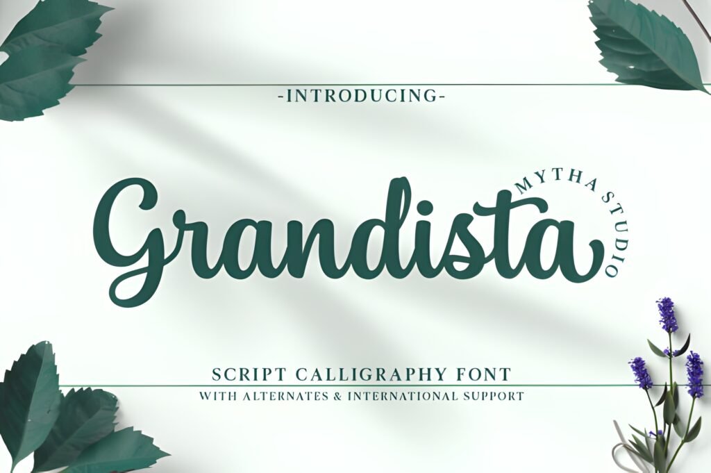
Font Card
- ⭐ 5.0/5 (3 reviews) • ❤️ 595 added to favorites
- Best for: personal brands, signature lines, quote headers
- Quick tip: use it as a small “name stamp” in Stories
Grandista is a branding shortcut. It makes your content feel consistent without you needing to redesign everything. It’s especially good for “signature” lines and short headers.
Example A (Post/Carousel)
Brand carousel: “Your next step” in Grandista on slide 1; clean, structured text on the inside slides.
Example B (Story/Reels)
Story outro: Add “— by [your name]” in Grandista as a subtle brand signature.
Save/Share trigger: Save this if you want a consistent look fast. It’s a “brand glue” font.
✅ Best for: personal branding • Use as a signature, not long text
8) Merlin Birth Flower Font
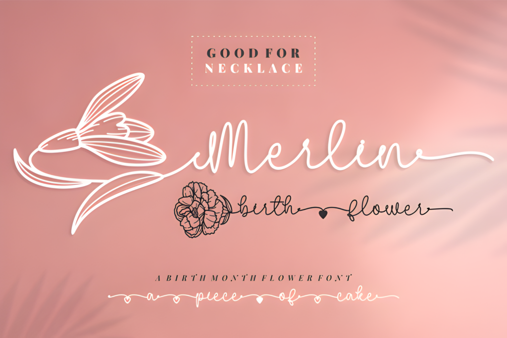
Font Card
- ⭐ 5.0/5 (4 reviews) • ❤️ 559 added to favorites
- Best for: highlight covers, announcements, decorative accents
- Quick tip: flower = accent, not the main event
Birth flower fonts are beautiful… and easy to overdo. Merlin works when you let it be an accent: one elegant title, one tiny flower mark, and you’re done.
Example A (Post/Carousel)
Carousel cover: Title in the script + a small flower in the corner for an instant premium look.
Example B (Story/Reels)
Announcement Story: “New collection” + date/time. Flower stamp next to the date. Clean CTA line beneath.
Save/Share trigger: Save this for highlight covers and seasonal announcements—those micro details increase “trust” instantly.
✅ Best for: highlights • Keep decorative elements minimal for clarity
9) April Birth Flower Font
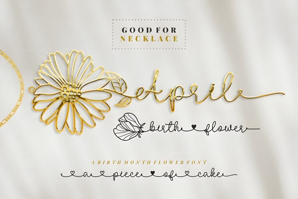
Font Card
- ⭐ 5.0/5 (5 reviews) • ❤️ 490 added to favorites
- Best for: “save the date” Stories, romantic brands, invites
- Quick tip: minimal ornaments + extra line-height
April Birth Flower turns simple text into an invitation. It looks especially good for dates, announcements, and anything that should feel “special” but still readable.
Example A (Post/Carousel)
Event carousel: Cover slide in April Birth Flower; details inside with clean typography.
Example B (Story/Reels)
Story RSVP: “Save the date” + “Tap to RSVP.” Use clean font for CTA line so nobody squints.
Save/Share trigger: Save this font for announcements—your Stories will look like designed invitations.
✅ Best for: invites • Minimal decor = maximum readability
10) California Sunset Font
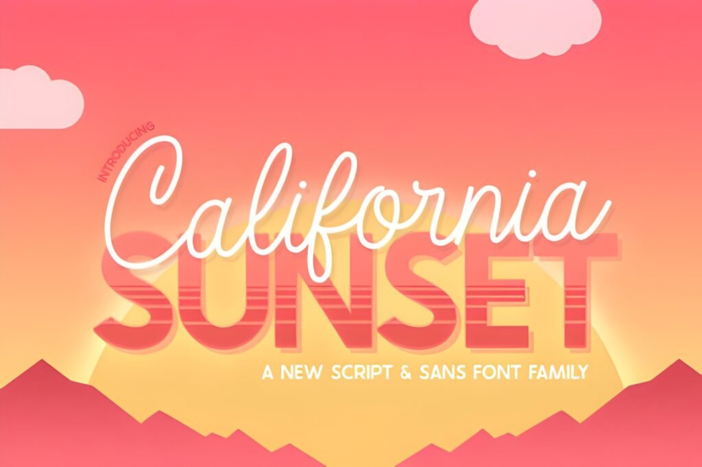
Font Card
- ⭐ 5.0/5 (3 reviews) • ❤️ 443 added to favorites
- Best for: Reels covers, travel/lifestyle headlines
- Quick tip: add a touch of spacing + keep contrast high
California Sunset is a visual-first headline font. If your background is gorgeous—travel, food, lifestyle—this font keeps the text readable without killing the vibe.
Example A (Post/Carousel)
Travel carousel: “Weekend guide” as cover headline; clean text inside for details.
Example B (Story/Reels)
Reels cover + Story teaser: Use the same headline across both for instant brand consistency.
Save/Share trigger: Save this if your content is visual-first. It makes headlines readable without feeling “boxed.”
✅ Best for: Reels covers • Short phrases + high contrast work best
11) Memory Font
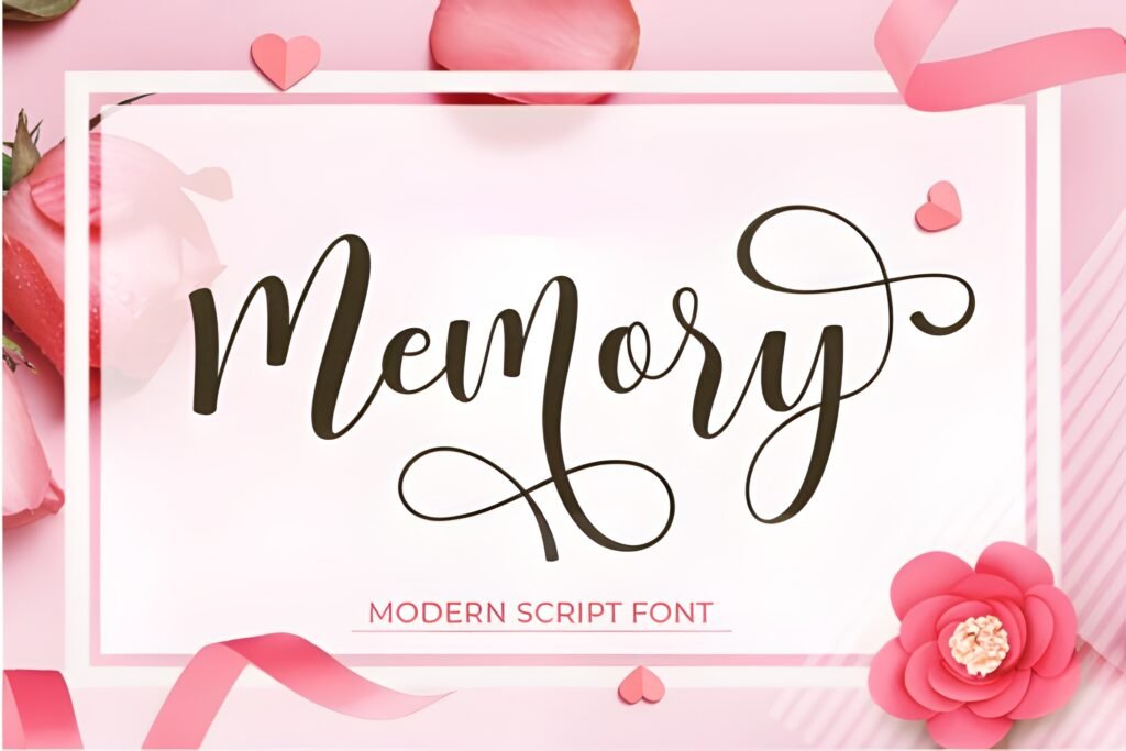
Font Card
- ⭐ 5.0/5 (4 reviews) • ❤️ 227 added to favorites
- Best for: daily updates, “talking Stories,” captions
- Quick tip: keep your lines short so it stays crisp
Memory is warm and human. It’s perfect when you’re speaking directly to your audience—quick updates, personal notes, “here’s what I learned” content.
Example A (Post/Carousel)
Personal carousel: “What I learned” as cover; clean font for bullet points inside.
Example B (Story/Reels)
On-screen captions: Use 1–2 lines while you talk. Memory feels like a natural note, not a subtitle.
Save/Share trigger: Save this if you post daily—Memory is easy to reuse without feeling repetitive.
✅ Best for: daily Stories • Short lines keep handwritten fonts readable
12) Birdsong Font
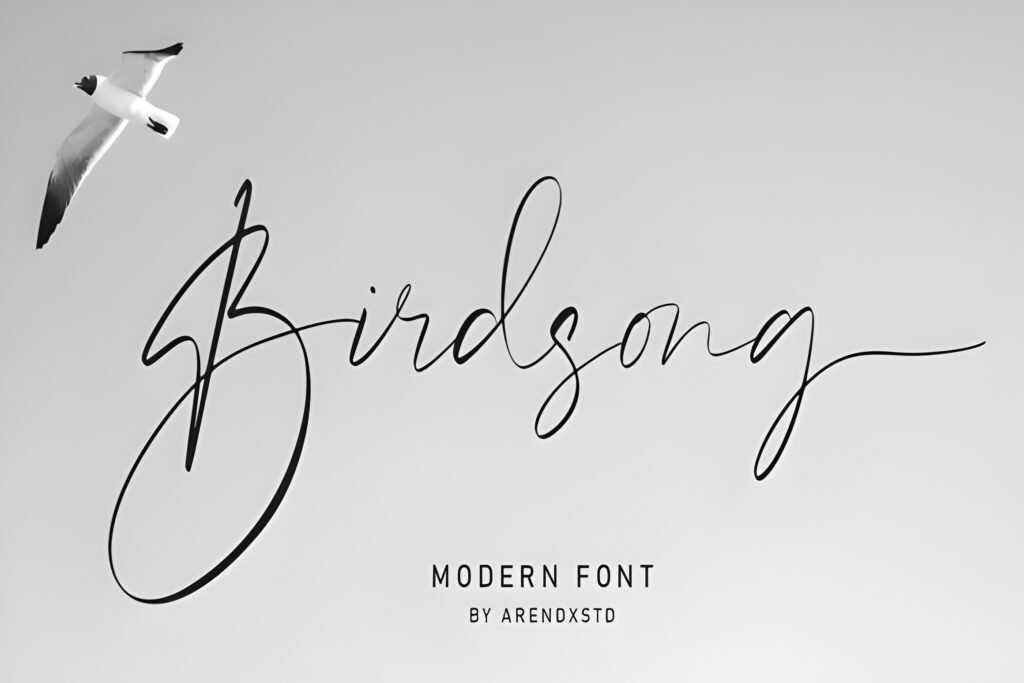
Font Card
- ⭐ 5.0/5 (1 review) • ❤️ 69 added to favorites
- Best for: cozy content, cute overlays, soft captions
- Quick tip: use a slightly larger size than you think
Birdsong is cozy and personal. It looks like a handwritten note—but to keep it readable, don’t go tiny. Give it room and size, and it stays crisp on mobile.
Example A (Post/Carousel)
Cozy carousel: “Little reminders” as cover headline; clean text inside for the details.
Example B (Story/Reels)
Story overlay: Use Birdsong for one emotional line (“You’ve got this”), then a clean font for the CTA (“Tap the link sticker”).
Save/Share trigger: Save Birdsong if your brand is soft and personal. It adds “human texture” instantly.
✅ Best for: cozy overlays • Go bigger on size to avoid mobile “scribble”
Didn't find what you were looking for?
Use the search below to explore more options on Creative Fabrica.
CTA Phrases (Copy-Paste for Stories)
- Tap the link sticker 👇
- Save this for later
- Want the template? DM me “STORY”
- Next slide = the good part
- Screenshot this
- Vote in the poll (I’m curious)
- Share this with a creator friend
- Which one is your favorite? 1–12
- Tap and hold to read (worth it)
- Quick tip—don’t skip this
- Reply “YES” and I’ll send the link
- Want part 2?
Extra Picks & Alternates
- Use one headline font + one clean body font for everything else.
- Reuse 3 layouts instead of designing new ones daily.
- Always add contrast (overlay on photos, or use solid backgrounds).
Conclusion
Readability is a design decision. Pick 2–3 fonts from this list, build a small template system, and your Stories will instantly look more consistent—and convert better—without you spending hours redesigning every slide.
FAQ
1) What makes a font mobile readable for Instagram Stories?
Short phrases, strong contrast, generous spacing, and a font that doesn’t rely on thin tiny strokes.
2) Should I use scripts for Story body text?
Usually no. Scripts are best as headlines or accents; body text should stay clean.
3) How big should Story text be?
Big enough to read instantly. If you’re unsure, go bigger.
4) Can I use these fonts for Reels covers too?
Yes—using the same font across Stories + Reels covers is a fast branding upgrade.
5) What’s the fastest typography upgrade today?
Fewer words, more contrast, and one decorative font per slide.