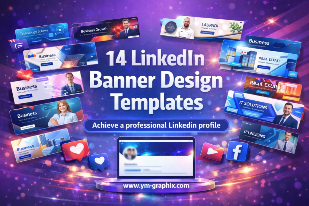
14 LinkedIn Banner Design Templates I’d Use for a More Professional Profile
Most people do not have a LinkedIn profile problem. They have a branding problem.
The headline may be solid. The experience may be real. The offer may be clear. But if the top of the profile looks empty, generic, or visually outdated, the whole page can feel less credible than it should. That is exactly why I keep paying attention to linkedin banner design. A strong banner does not just decorate a profile. It frames the first impression, supports positioning, and makes the page feel intentional.
In this guide, I’m sharing 14 Creative Fabrica picks I’d genuinely consider for business profiles, tech specialists, consultants, agencies, real estate professionals, and niche personal brands. I focused on templates that feel modern, practical, and visually clean, so you can find a linkedin banner design that fits your profile instead of forcing your profile to fit the template.
This article contains affiliate links. If you download through my links, I may earn a commission at no extra cost to you. I only include products that clearly fit the topic and make sense for LinkedIn profile branding.
Jump to reviews
Corporate,
Business,
IT Geometric,
Geo Business,
Business Template,
Geometric,
Pro Concept,
Pro Concept 2,
Pro Profile,
Classic Template,
Technology,
Real Estate,
Laupadi,
Baker
Why linkedin banner design matters more than people think
When I review profile branding, I usually notice the same issue: strong professionals using weak visuals. That disconnect matters. The top banner is one of the first things people see, so a polished linkedin banner design can help a profile look more established, more relevant, and more consistent with the person’s actual expertise.
I also like banner templates because they remove friction. Instead of staring at a blank canvas, I can start with a design direction that already feels professional and then adapt it for industry, message, and tone. That makes the process faster and often produces a better final result.
How I looked at these LinkedIn banner templates
I did not treat these as random downloads. I looked at them through a practical branding lens.
- Profile fit: does the banner title suggest a clear use case?
- Visual direction: does it sound corporate, geometric, niche-specific, or broadly adaptable?
- Branding strength: would this likely help a profile feel more polished at first glance?
- Use flexibility: can it serve consultants, founders, specialists, or creators without feeling awkward?
Full reviews: 14 LinkedIn banner picks
1) Corporate Social Media LinkedIn Banner
- Vibe: corporate polish
- Best for: consultants, agencies, executives
- Strength: credibility-first
- Use case: clean business branding
My take: This is the kind of template I would choose when I want the profile to look immediately serious and dependable. The corporate angle suggests structure, clarity, and a more formal visual tone, which can be very useful for service providers and decision-makers.
Why it works: A corporate-style linkedin banner design usually supports authority without overcomplicating the layout. It helps the page feel complete and more business-ready from the first second.
Quick takeaway: I would use this when trust and professionalism matter more than personality-heavy styling.
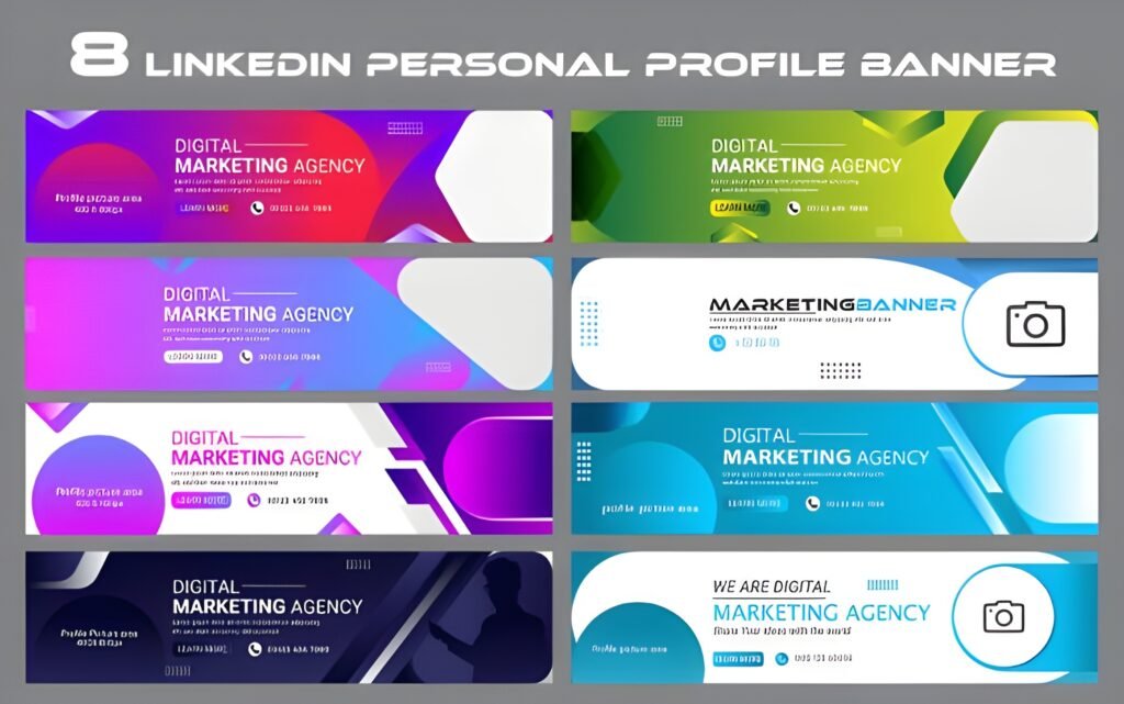
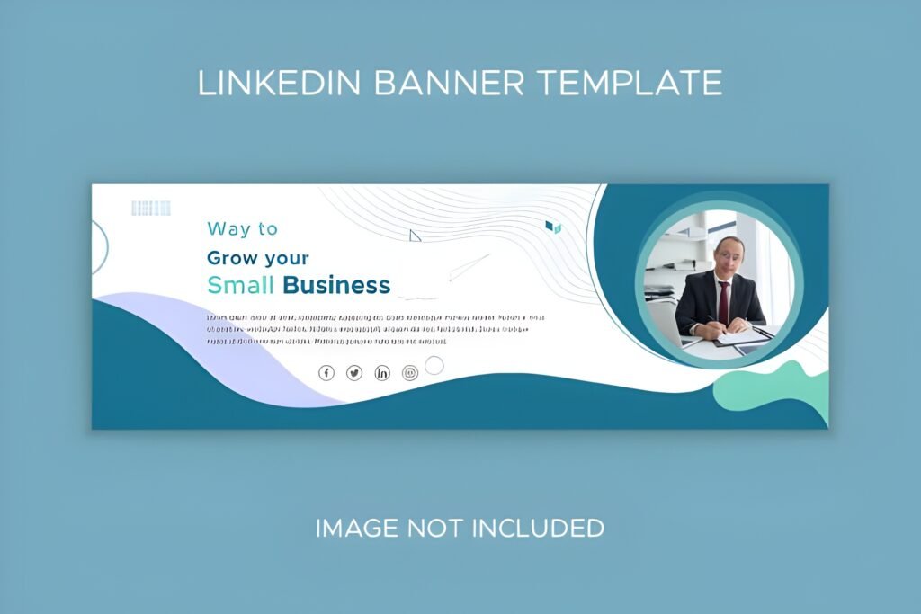
2) Business Linkedin Banner
- Vibe: professional everyday
- Best for: founders, marketers, freelancers
- Strength: versatile
- Use case: broad business profiles
My take: I like templates like this because they tend to sit in a very useful middle ground. They are professional enough for business positioning but not so narrow that they only fit one industry.
Why it works: A general business banner can support many types of profiles, from solo consultants to startup people, while still improving the visual consistency of the page.
Quick takeaway: If I wanted one safe, flexible starting point, this would be one of the first options I’d test.
3) IT Solutions Geometric LinkedIn Banner
- Vibe: modern tech
- Best for: IT, SaaS, digital services
- Strength: sharp structure
- Use case: technology positioning
My take: This is one of the clearer niche-specific options in the list. The IT + geometric direction signals precision, systems thinking, and a cleaner digital aesthetic.
Why it works: For technology-facing profiles, a banner usually looks stronger when it feels structured instead of decorative. Geometric layouts often help achieve exactly that.
Quick takeaway: I would shortlist this quickly for developers, tech consultants, software agencies, or solution-based businesses.
4) Business Geometric LinkedIn Banner
- Vibe: structured modernity
- Best for: polished business profiles
- Strength: visual rhythm
- Use case: crisp branding refresh
My take: I usually like business banners more when they have a visual system behind them, and geometric layouts often provide that. They can make even a simple profile feel more designed and more intentional.
Why it works: The combination of business positioning and geometric balance tends to create a banner that feels current without looking too experimental.
Quick takeaway: This is a smart fit when I want a professional look with a little more design character.
5) LinkedIn Banner Template for Business
- Vibe: adaptable business base
- Best for: flexible profile setups
- Strength: easy repositioning
- Use case: service-based branding
My take: This title tells me exactly what I want to hear from a practical profile asset: it is meant to function as a business-ready foundation. That can be very valuable if the goal is speed and clarity.
Why it works: A template framed for business use can usually be adapted across multiple roles without losing the professional tone people expect on LinkedIn.
Quick takeaway: I would use this when I need a dependable starting point rather than a highly niche design.
6) Geometric LinkedIn Banner
- Vibe: sleek geometry
- Best for: modern minimal profiles
- Strength: clean background energy
- Use case: contemporary look
My take: Pure geometric styles often work well when I want the banner to feel stylish but not overly crowded. They can create movement and modernity without pulling attention away from the profile photo and headline.
Why it works: A cleaner geometric linkedin banner design can help a page feel balanced, especially for professionals who want a modern visual identity without a heavy niche signal.
Quick takeaway: I’d consider this for minimalists who still want the profile to look designed.
7) Linkedin Banner Profesional Concept
- Vibe: career-focused
- Best for: specialists, managers, consultants
- Strength: polished presentation
- Use case: profile upgrade
My take: This sounds like one of those templates designed to make a profile feel more refined and promotion-ready. I like that because many LinkedIn users are not trying to be flashy. They are trying to look strong and credible.
Why it works: A professional concept banner can quietly improve the whole page by making the visual top section feel more deliberate and less neglected.
Quick takeaway: This is the sort of choice I’d make for a profile that needs to look cleaner, stronger, and more career-aligned.
8) Linkedin Banner Profesional Concept 2
- Vibe: polished alternative
- Best for: personal brand refinement
- Strength: second style option
- Use case: tone matching
My take: I always appreciate second concept versions because they create room for taste. Two banners can share the same professional intention while offering different visual moods.
Why it works: With profile branding, the smallest difference in style can determine whether the page feels generic or genuinely aligned with the person behind it.
Quick takeaway: I would compare this directly with the first concept and choose the one that feels more natural to the profile’s tone.
9) Profesional Linkedin Banner Concept
- Vibe: authority-led
- Best for: trusted service providers
- Strength: confident look
- Use case: serious personal brand
My take: This one reads like a template for people who want their profile to feel settled and professional rather than experimental. That can be a big advantage on LinkedIn, where clarity often wins over visual noise.
Why it works: A more authority-oriented banner can make experience and expertise feel better supported visually.
Quick takeaway: I would lean toward this for consultants, advisors, and profile owners who want a more serious top-of-page presence.
10) LinkedIn Banner Template
- Vibe: classic flexibility
- Best for: broad personal branding
- Strength: universal starting point
- Use case: simple profile reset
My take: A general template often ends up being one of the most useful assets because it leaves more room for custom positioning. Not everyone needs a niche-specific banner right away.
Why it works: Sometimes the strongest linkedin banner design is the one that gives a profile structure without locking it into one overly specific identity.
Quick takeaway: I’d use this when I want flexibility first and fine-tuning second.
11) Technology Linkedin Banner
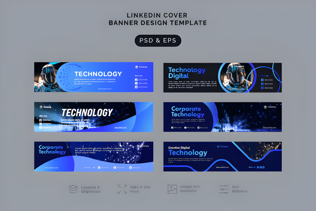
- Vibe: digital-forward
- Best for: developers, tech teams, SaaS
- Strength: relevant niche signal
- Use case: tech profile clarity
My take: This is a strong option when I want the profile to visually match the industry right away. For tech professionals, even a subtle niche signal can help the page feel more aligned.
Why it works: Industry-relevant banners often reduce ambiguity. Visitors understand the space faster, and the profile feels more targeted.
Quick takeaway: I’d place this high on the list for software, digital product, and innovation-focused profiles.
12) Real Estate LinkedIn Banner
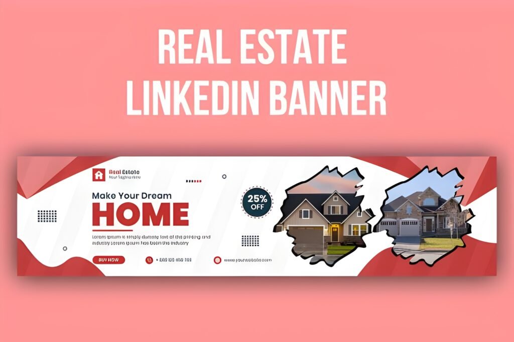
- Vibe: market-specific
- Best for: agents, brokers, property pros
- Strength: instant niche relevance
- Use case: real estate branding
My take: I like niche-specific banners when they make strategic sense, and real estate is a perfect example. A relevant banner can help the profile feel more specialized and more memorable at once.
Why it works: Instead of a generic top section, this kind of banner can visually reinforce the industry the profile serves.
Quick takeaway: I would absolutely favor this over a generic option for a property-focused LinkedIn presence.
13) Laupadi – Linkedin Banner
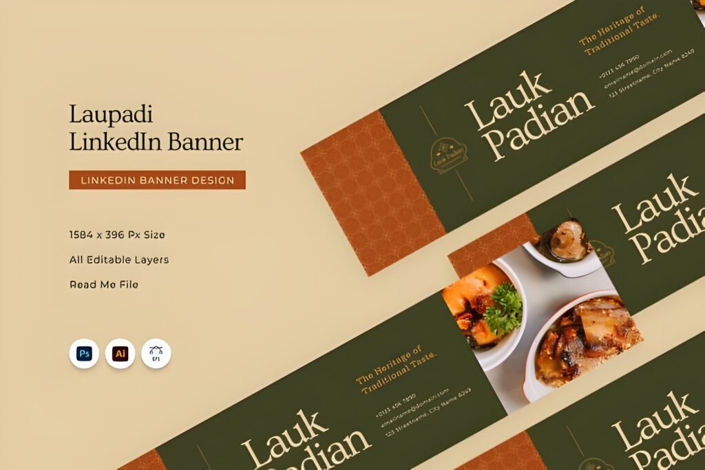
- Vibe: more distinctive
- Best for: personal brand differentiation
- Strength: memorability
- Use case: less generic presentation
My take: This is one of the more distinctive names in the list, and that alone makes me view it differently. Some profiles benefit from a little extra uniqueness, especially when the owner wants to avoid looking interchangeable.
Why it works: More individual-looking banners can help a personal brand stand out while still maintaining a professional tone.
Quick takeaway: I’d explore this when the goal is not just polish, but also recall value.
14) Professional Baker – LinkedIn Banner
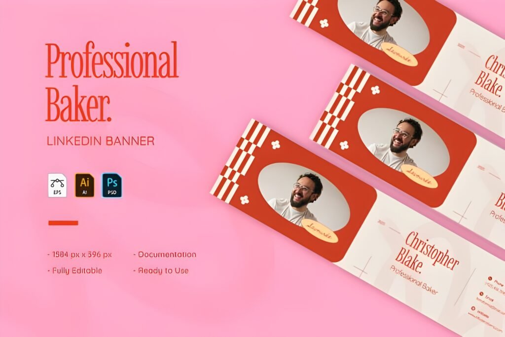
- Vibe: niche creative pro
- Best for: bakers, pastry artists, bakery owners
- Strength: personal craft identity
- Use case: industry-specific storytelling
My take: I genuinely like seeing options like this because they prove that linkedin banner design is not only for corporate and tech profiles. Niche professionals can benefit even more from a banner that reflects their real-world craft.
Why it works: A targeted industry banner can make a profile feel much more personal and much more connected to the work behind it.
Quick takeaway: If I had a bakery or pastry-based personal brand on LinkedIn, I would much rather use something like this than a generic business header.
Didn't find what you were looking for?
Use the search below to explore more options on Creative Fabrica.
Final thoughts
If I were refreshing a profile today, I would not treat the banner as an afterthought. A better linkedin banner design can make the whole page look more complete, more current, and more aligned with the person behind it.
The best choice depends on what you want your profile to communicate first: corporate trust, modern structure, industry relevance, or a more distinctive personal brand. But no matter which route you take, a polished banner is one of the fastest ways to make LinkedIn look more professional without rewriting the entire profile.
FAQ About LinkedIn Banner Design
What is the best size for a LinkedIn banner design?
The most common recommended size for a LinkedIn banner design is 1584 x 396 pixels. I always prefer starting with the correct proportions so the banner looks clean and does not crop important text or design elements.
Why is linkedin banner design important for a profile?
A strong linkedin banner design helps a profile look more polished, more intentional, and more professional. It supports your personal brand, gives visual context to your work, and improves the first impression before someone even reads your headline.
What should I include in a LinkedIn banner?
I usually recommend keeping it simple. A good banner can include your niche, brand colors, a short positioning message, or subtle visual elements related to your industry. The key is to keep the design clean so it supports the profile instead of overwhelming it.
Can I use a LinkedIn banner template for personal branding?
Yes, absolutely. I often use templates as a starting point because they save time and make the branding process easier. A well-chosen template can help create a stronger personal brand while still leaving room for customization.
Should a LinkedIn banner match my industry?
In many cases, yes. I think industry-relevant visuals can make a profile feel more targeted and more memorable. For example, a technology banner can work well for IT professionals, while a real estate banner can make a property-focused profile feel more relevant right away.
How do I choose the right linkedin banner design?
I usually choose based on the message I want the profile to send first. If the goal is trust, I look for something corporate and clean. If the goal is a modern look, I lean toward geometric styles. If the profile is niche-specific, I prefer a banner that reflects the industry directly.
Can a better banner really improve my LinkedIn profile?
Yes, it can. A better banner will not replace a strong headline or experience section, but it can make the whole profile feel more complete and more professional. Sometimes that visual upgrade is enough to create a much stronger first impression.
Are LinkedIn banner templates good for businesses and freelancers?
Yes, they are useful for both. I think templates are especially helpful for freelancers, consultants, agencies, and small businesses that want a polished look without spending too much time creating a banner from scratch.
If this post helped you, share it on social media
If you found this guide useful, I’d really appreciate it if you shared it in one of your social networks. It helps more people discover the right linkedin banner design and supports my blog at the same time.
Thank you for reading and for supporting my content 💜