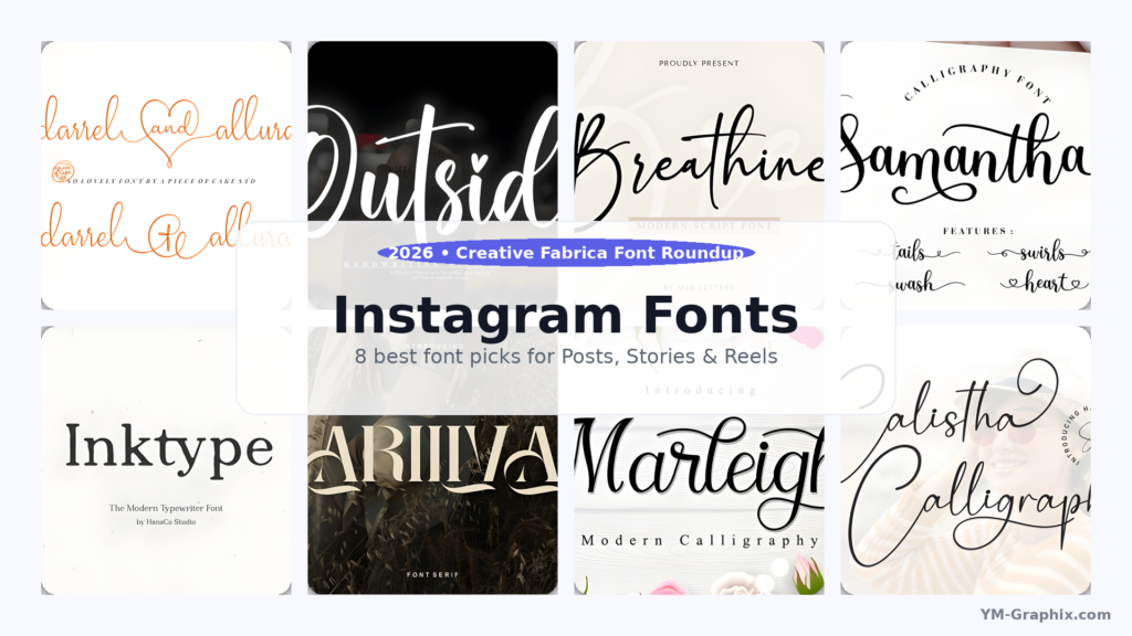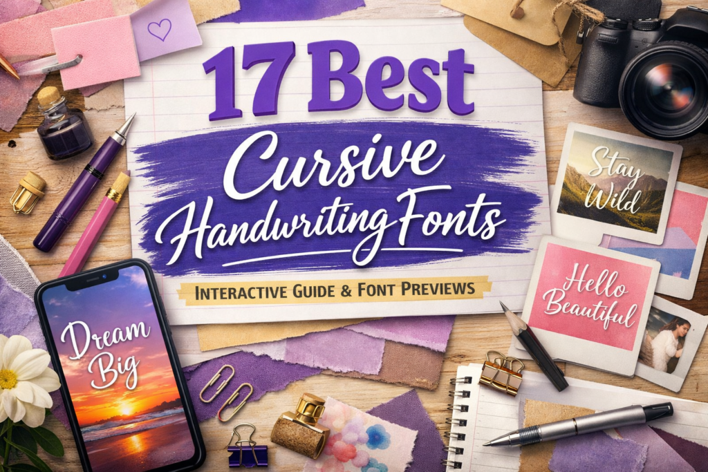
If your typography needs to feel more human—more “written,” less “typed”—this is your shortcut. Below you’ll find 17 cursive handwriting fonts curated for social posts, brand templates, and quick client-ready visuals.
This guide is built for scanning: jump links, a comparison table, and font cards with “best for,” readability notes, and ready-to-use content ideas (Post/Carousel + Story/Reels) so you can picture the font in a real design.
You already have one preview image per font—perfect. In each card, add your WordPress Media URL to the “Preview image” link (no extra tags needed).
Affiliate Disclosure
Some links in this post are affiliate links. If you click and download, I may earn a commission at no extra cost to you. I only include fonts that fit this guide’s goals and are easy to use in real design workflows.
Jump to
Quick comparison table
Use this as your fast filter. If you’re choosing for Instagram, prioritize readability + vibe. If you’re choosing for branding, prioritize consistency and clean joins.
| Font | Vibe | Best for | Readability | Quick pick |
|---|---|---|---|---|
| Cute Girls | Cute, playful | Reels covers, stickers | High | Youthful headline script |
| Pacific Again | Smooth signature | Brand posts, quotes | Medium/High | Clean “handwritten” look |
| Daisy | Soft & friendly | Templates, pins | High | Easy everyday cursive |
| Autography | Modern handwritten | Minimal branding | Medium/High | Polished cursive vibe |
| Lucky | Fun handwritten | Carousels, headlines | High | Friendly bold-ish script |
| Sweet Milky | Sweet & cozy | Kids, coloring, cute | High | Soft rounded cursive |
| Signature | Classic signature | Logos, watermarks | Medium | Elegant personal touch |
| Shabby | Textured/handmade | Craft, rustic posts | Medium | Authentic imperfect ink |
| Bulky | Chunky cute | Bold titles | High | Big friendly strokes |
| Angela Flower | Floral romantic | Invites, reels covers | Medium/High | Pretty cursive accent |
| Bestie | Trendy friendly | Lifestyle posts | High | Modern social script |
| Butterfly Wish | Whimsical | Feminine templates | Medium | Decorative cursive flair |
| Honeymoon | Wedding romantic | Invites, quotes | Medium | Classic love-story script |
| Cowgirls | Western playful | Boutique promos | High | Country-cute signature |
| Vintage | Retro handwritten | Packaging, labels | Medium/High | Old-school charm |
| Sunday | Bright & airy | Creators, blogs | High | Clean weekend cursive |
| Chika | Simple handwritten | Minimal captions | High | Fresh new pick |
My method: how I choose cursive handwriting fonts
A font can look gorgeous in a specimen image and still fail in real layouts. Here’s the quick framework I used so the picks work in templates—not just on a sales page.
- Readability at “phone size”: can you read it at Story scale without zooming?
- Stroke stability: do thick/thin parts hold up on light backgrounds and busy photos?
- Personality without chaos: cursive should feel human, not messy (unless you want messy on purpose).
- Pairing potential: every script needs a calm partner (simple sans/serif) so your layout breathes.
- Practical use-cases: I wrote two content prompts per font (Post/Carousel + Story/Reels) so you instantly know how to use it.
Font cards (all 17)
1) Cute Girls Font
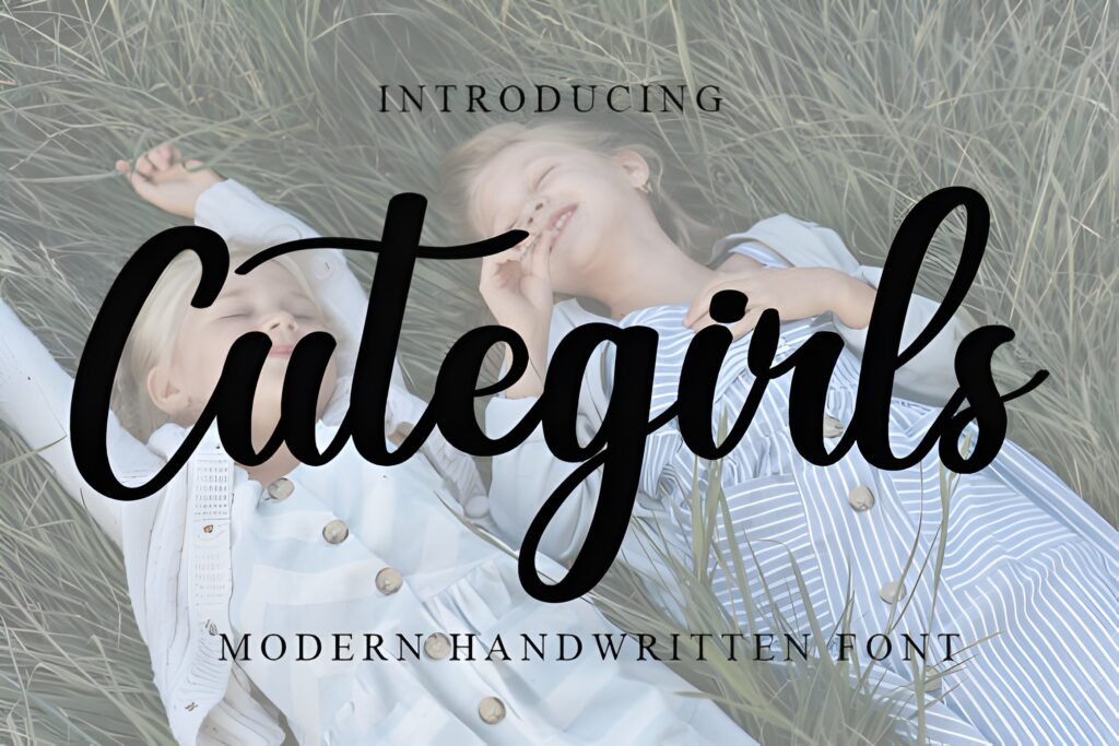
Chips: Vibe: cute + bubbly • Best for: playful covers • Readability: high
Expert take: Cute Girls is the kind of cursive that behaves like a friendly headline: it feels handwritten, but it still keeps letterforms clean enough for fast scrolling. If you design for lifestyle, kids, stationery, or “sweet” branding, this one gives instant warmth without looking childish.
Try it in a Post/Carousel: “3 tips” carousel cover with a two-word hook (keep it short), then use a neutral sans for body text.
Try it in a Story/Reels: Reel cover title + tiny subtitle; add a soft shadow behind the title if the background is a photo.
Save/share trigger: If you ever design “cute but polished” templates—save this card for your next batch day.
Marketplace signal: ⭐Rated 5.0/5 (4 reviews) • ❤️1,678 saves
Quick win for cute headline scripts in social templates.
2) Pacific Again Font
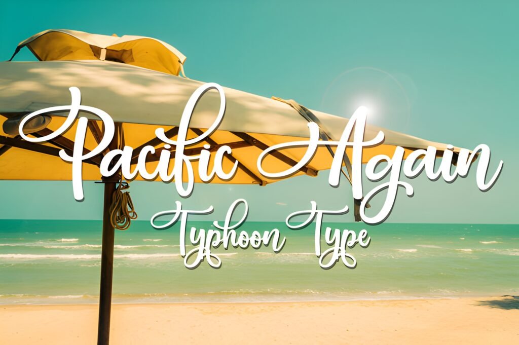
Chips: Vibe: smooth signature • Best for: clean quotes • Readability: medium/high
Expert take: Pacific Again feels like a confident signature—sleek, slightly stylish, and easy to pair with modern layouts. Use it when you want “human” energy but still need structure (especially on minimalist posts).
Try it in a Post/Carousel: Quote card: script for the key 1–2 words, sans for the rest. This creates hierarchy instantly.
Try it in a Story/Reels: “New drop” Story headline; keep tracking normal and avoid all caps.
Save/share trigger: Save it if your brand moodboard is “clean, calm, premium… but not cold.”
Marketplace signal: ⭐Rated 5.0/5 (2 reviews) • ❤️281 saves
A tidy signature look that pairs beautifully with minimal design.
3) Daisy Font
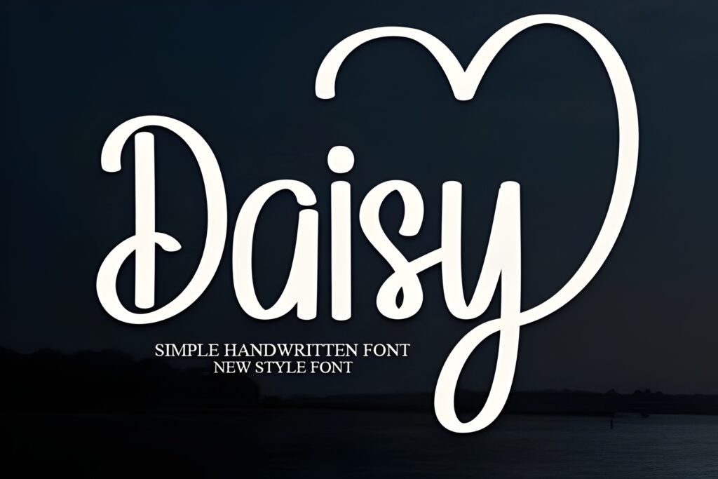
Chips: Vibe: soft + friendly • Best for: everyday templates • Readability: high
Expert take: Daisy is a “daily driver” cursive. It’s sweet, approachable, and doesn’t fight your layout. If you want cursive handwriting fonts that feel welcoming (not overly formal), Daisy is a smart choice.
Try it in a Post/Carousel: “Before / After” carousel cover: Daisy for the title, a simple sans for labels and steps.
Try it in a Story/Reels: Story caption overlay: keep it to 3–5 words and place it on a calm area of the image.
Save/share trigger: Save it for those weeks when you need a font that just works.
Marketplace signal: ⭐Rated 5.0/5 (1 review) • ❤️1,601 saves
A reliable, friendly cursive that stays readable on mobile.
4) Autography Font
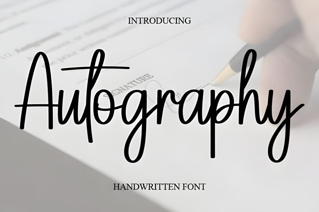
Chips: Vibe: modern handwritten • Best for: minimal branding • Readability: medium/high
Expert take: Autography leans “signature” without going too thin. It’s a great bridge font when you want cursive handwriting fonts in a modern layout: clean, elegant, and still human.
Try it in a Post/Carousel: “New collection” announcement: Autography for the collection name, sans for details and date.
Try it in a Story/Reels: Reel cover with a two-line title: script on line 1, sans on line 2.
Save/share trigger: Save this if you build premium-looking templates on tight deadlines.
Marketplace signal: ⭐Rated 5.0/5 (2 reviews) • ❤️1,423 saves
A modern handwritten look that stays clean in minimal layouts.
5) Lucky Font
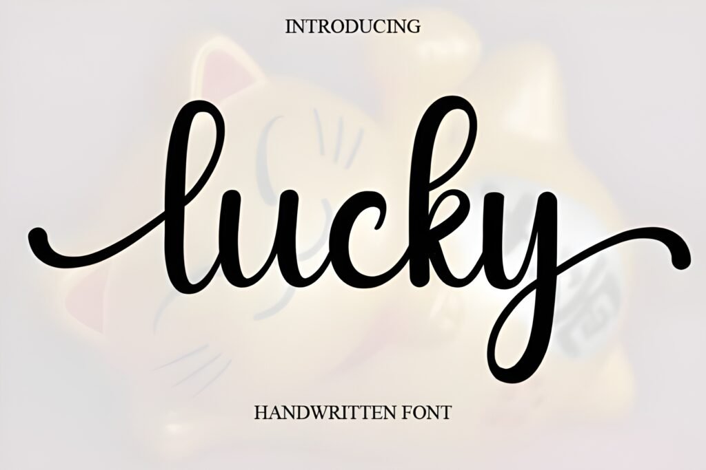
Chips: Vibe: fun handwritten • Best for: bold-ish titles • Readability: high
Expert take: Lucky has that “friendly marker” energy without turning into a novelty font. It’s ideal when you need your cursive headline to pop on a carousel cover while still feeling approachable.
Try it in a Post/Carousel: “Checklist” carousel: Lucky for the main title, then use bullet steps in a clean sans.
Try it in a Story/Reels: Story poll or Q&A: Lucky for the question header, sans for options.
Save/share trigger: Save it if you want cursive that reads instantly on a phone.
Marketplace signal: ⭐Rated 5.0/5 (2 reviews) • ❤️3,462 saves
A high-impact cursive that still feels friendly and usable.
6) Sweet Milky Font
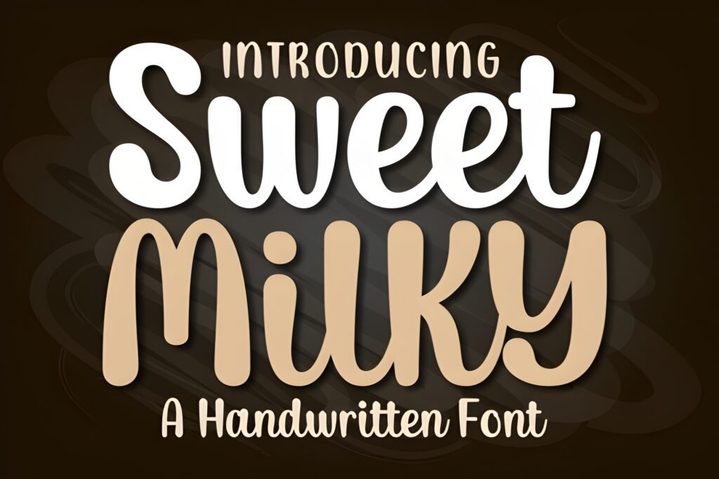
Chips: Vibe: sweet + cozy • Best for: cute projects • Readability: high
Expert take: Sweet Milky is soft, warm, and rounded—perfect when you want your typography to feel comforting. It’s especially nice in kid-friendly designs, cozy quotes, and “handmade” brand aesthetics.
Try it in a Post/Carousel: “Sunday reset” carousel: Sweet Milky for section headers, clean sans for the tips.
Try it in a Story/Reels: Story highlight cover text: keep it short (1–2 words) so the softness stays crisp.
Save/share trigger: If your audience loves “cozy & cute,” this is a keeper.
Marketplace signal: ⭐Rated 5.0/5 (1 review) • ❤️146 saves
Soft, sweet cursive that feels friendly in cute designs.
7) Signature Font
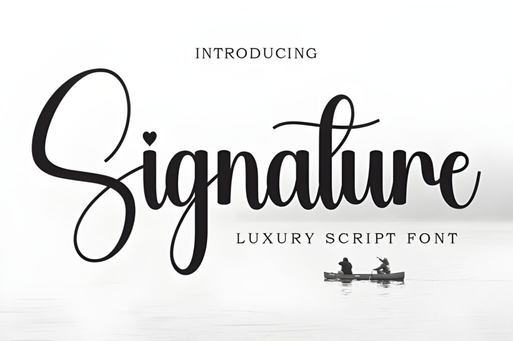
Chips: Vibe: classic signature • Best for: logos + watermarks • Readability: medium
Expert take: When you want a cursive that feels personal—like a name written by hand—Signature delivers. Use it as an accent: logos, name marks, corner watermarks, and elegant “by [name]” lines.
Try it in a Post/Carousel: End slide “Thanks for reading” + your brand name in script, then CTA in sans.
Try it in a Story/Reels: Use Signature for a small “new” sticker or corner tag—don’t make it the whole paragraph.
Save/share trigger: Save it if you like a “designer signature” finish on templates.
Marketplace signal: ⭐Rated 5.0/5 (3 reviews) • ❤️2,715 saves
Great for adding a personal signature accent to branding.
8) Shabby Font
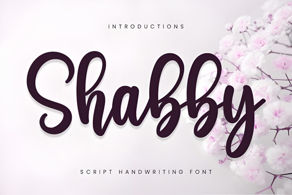
Chips: Vibe: handmade + textured • Best for: craft/rustic • Readability: medium
Expert take: Shabby gives you that real-handwritten feeling—slightly imperfect in a good way. This is one of the best cursive handwriting fonts when your design wants to feel “authentic,” like it was written with a pen on paper.
Try it in a Post/Carousel: Craft product carousel: use Shabby for the product name, and keep the price/details in a clean sans.
Try it in a Story/Reels: “Behind the scenes” Story: Shabby for the headline, then a simple sans for the bullet points.
Save/share trigger: Save it if you design for handmade shops, Etsy-style brands, or cozy creators.
Marketplace signal: ⭐Rated 4.8/5 (5 reviews) • ❤️547 saves
Perfect when you want “real handwriting” texture in your layout.
9) Bulky Font
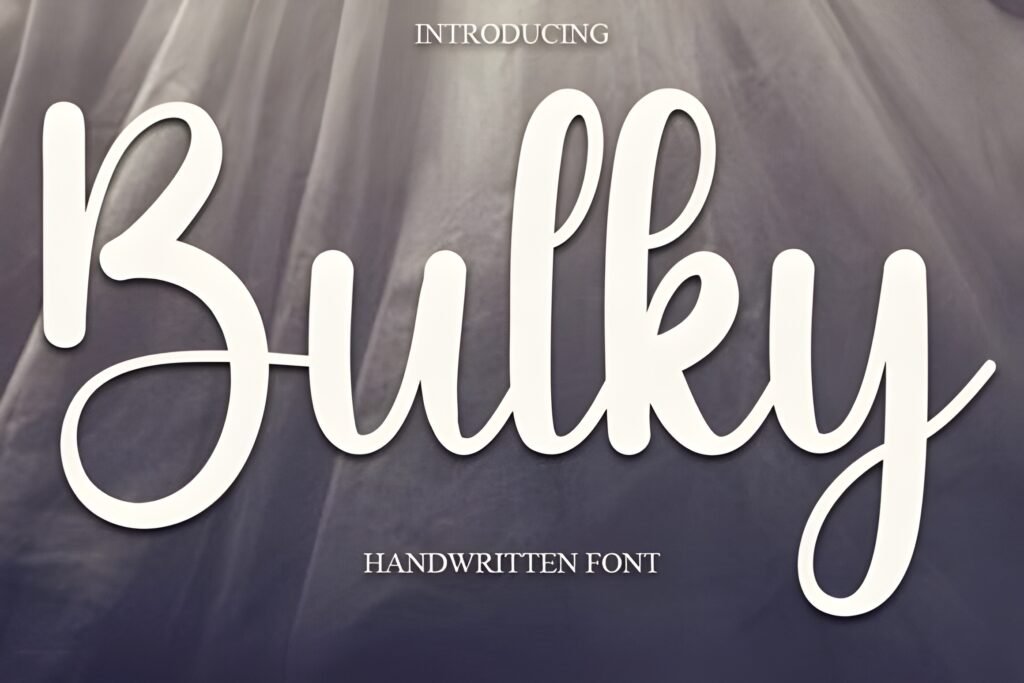
Chips: Vibe: chunky cute • Best for: punchy titles • Readability: high
Expert take: Bulky is your “make it pop” cursive. The thicker feel helps it stand out over backgrounds, making it a practical pick for carousels and promo graphics where scripts often disappear.
Try it in a Post/Carousel: Big title on slide 1, then repeat a smaller Bulky subhead on each slide for consistency.
Try it in a Story/Reels: Countdown Story: Bulky for “3 days left” + sans for details.
Save/share trigger: Save it if you need cursive that stays bold on busy photos.
Marketplace signal: ⭐Rated 5.0/5 (1 review) • ❤️200 saves
Chunky cursive that reads fast and holds attention.
10) Angela Flower Font
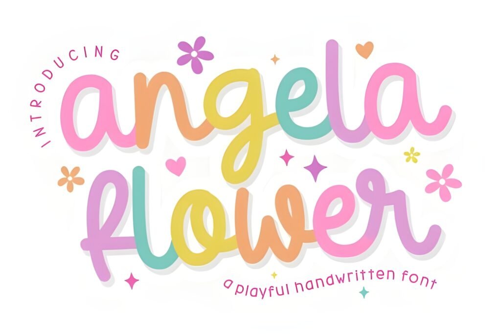
Chips: Vibe: romantic + floral • Best for: invites & covers • Readability: medium/high
Expert take: Angela Flower has a romantic, decorative feeling that works beautifully when you want elegance without going ultra-formal. Think “soft wedding,” “spring drop,” “pretty announcement.”
Try it in a Post/Carousel: Launch announcement: Angela Flower for the hero line, then a calm sans for date/time/offer details.
Try it in a Story/Reels: Reel cover for a floral collection: script title + small serif subtitle for contrast.
Save/share trigger: Save it if you design feminine brands that need a “pretty” signature moment.
Marketplace signal: ⭐Rated 5.0/5 (1 review) • ❤️1,006 saves
A romantic cursive accent for soft, elegant designs.
11) Bestie Font
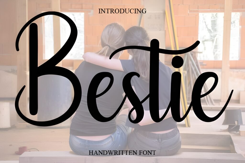
Chips: Vibe: trendy + friendly • Best for: lifestyle templates • Readability: high
Expert take: Bestie is a social-media-ready script: friendly, modern, and easy to build a consistent template system around. If you want a cursive handwriting font that doesn’t feel old-fashioned, start here.
Try it in a Post/Carousel: “Guide” carousel: Bestie for slide titles, sans for the steps. Keep titles consistent size across the deck.
Try it in a Story/Reels: Story “tips” sticker: script for “tips,” sans for the number (Tip 1, Tip 2…).
Save/share trigger: Save it if you batch-create templates for creators and coaches.
Marketplace signal: ⭐Rated 5.0/5 (9 reviews) • ❤️3,430 saves
A modern, template-friendly script made for social content.
12) Butterfly Wish Font
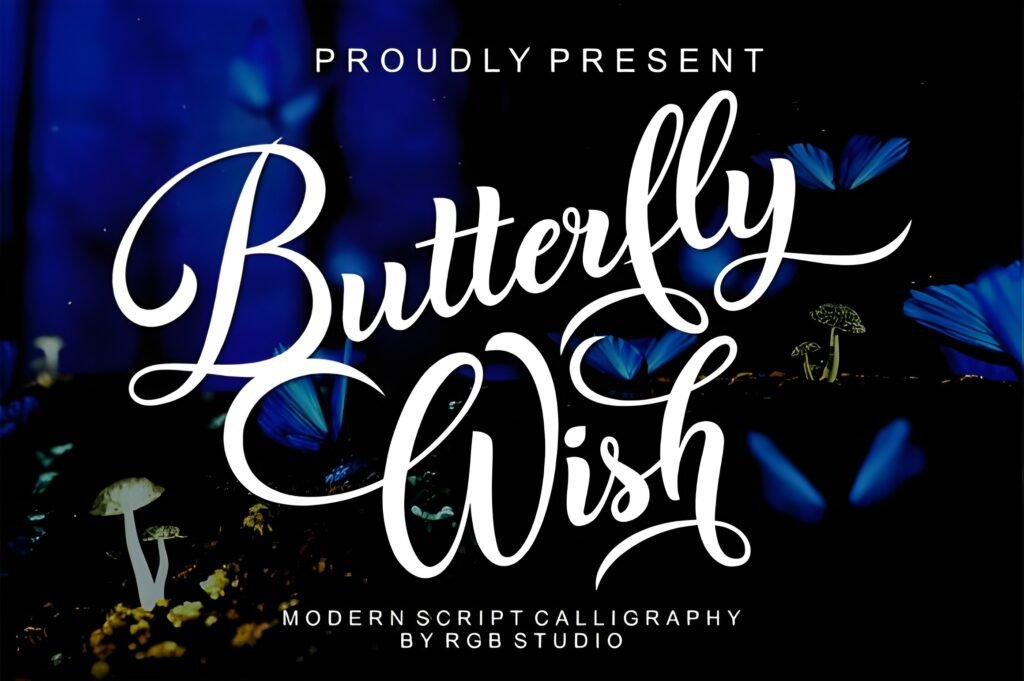
Chips: Vibe: whimsical + decorative • Best for: feminine templates • Readability: medium
Expert take: Butterfly Wish is where you go when “basic cursive” isn’t enough. It adds a touch of fantasy and softness, so it shines on covers, quotes, and gentle brand aesthetics.
Try it in a Post/Carousel: Cover slide with a short title; use generous spacing and keep the rest minimal so the font can be the star.
Try it in a Story/Reels: “Moodboard” Story: script title + tiny sans caption + 3–5 image tiles.
Save/share trigger: Save it when you want cursive that feels like a brand “signature style.”
Marketplace signal: ⭐Rated 5.0/5 (7 reviews) • ❤️1,938 saves
A whimsical cursive choice when you want extra personality.
13) Honeymoon Font
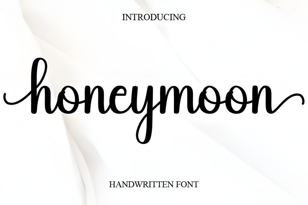
Chips: Vibe: romantic + timeless • Best for: weddings & love quotes • Readability: medium
Expert take: Honeymoon is classic romance: elegant, flowing, and perfect for “special moment” typography. Use it where emotion matters—wedding content, anniversary posts, heartfelt quote templates.
Try it in a Post/Carousel: Wedding invitation mock carousel: script for names, serif/sans for details, lots of white space.
Try it in a Story/Reels: Reel cover “Our story” / “The details” with a soft photo background and minimal overlay text.
Save/share trigger: Save it for any romantic collection, launch, or client moodboard.
Marketplace signal: ⭐Rated 5.0/5 (7 reviews) • ❤️2,668 saves
A timeless romantic script for invitations and elegant quotes.
14) Cowgirls Font
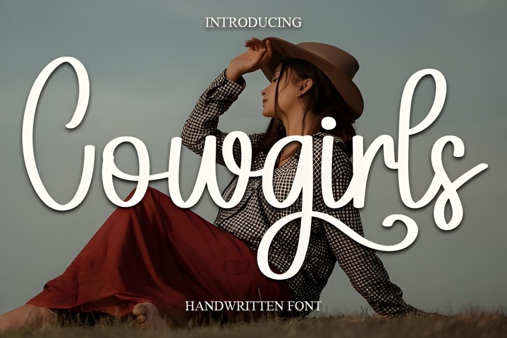
Chips: Vibe: western + playful • Best for: boutiques & promos • Readability: high
Expert take: Cowgirls adds personality fast—country-cute, boutique-friendly, and energetic. If your brand leans rustic, festival, handmade, or western-inspired, this can become a recognizable headline style.
Try it in a Post/Carousel: Product drop carousel: use Cowgirls for the drop name and keep prices in a stable sans for clarity.
Try it in a Story/Reels: Story “Sale ends tonight” headline; pair with a bold sans for the discount number.
Save/share trigger: Save it if you want your promo graphics to feel like a vibe, not just an announcement.
Marketplace signal: ⭐Rated 5.0/5 (2 reviews) • ❤️2,305 saves
A playful western-inspired script for boutique branding and promos.
15) Vintage Font
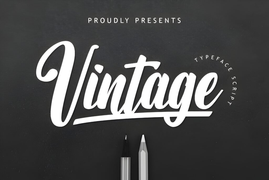
Chips: Vibe: retro handwritten • Best for: labels & packaging • Readability: medium/high
Expert take: Vintage is a strong pick when you want handwritten charm with a throwback feel. It works well in product branding, label mockups, retro posts, and “heritage” aesthetics—without needing heavy decoration.
Try it in a Post/Carousel: “New flavor / new product” carousel: use Vintage for the product name, serif for the description, and keep alignment consistent.
Try it in a Story/Reels: Story “limited edition” header; add a simple frame shape behind the text in your design tool if the background is busy.
Save/share trigger: Save it for any brand that wants “nostalgic but clean.”
Marketplace signal: ⭐Rated 5.0/5 (10 reviews) • ❤️2,936 saves
Retro charm that still feels clean and usable in modern layouts.
16) Sunday Font
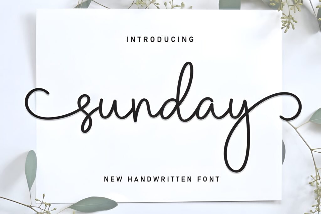
Chips: Vibe: bright + airy • Best for: creator content • Readability: high
Expert take: Sunday feels fresh and optimistic. If your layouts are light, your colors are pastel/neutral, and you want cursive handwriting fonts that stay cheerful—not dramatic—Sunday is a perfect match.
Try it in a Post/Carousel: “Weekly plan” carousel: script for section headers (Mon/Tue/Goals), sans for details.
Try it in a Story/Reels: Reel cover “Sunday reset” with a simple background and one accent icon in your design tool.
Save/share trigger: Save it if you want a clean cursive that feels modern and uplifting.
Marketplace signal: ⭐Rated 5.0/5 (3 reviews) • ❤️2,260 saves
A cheerful cursive that stays crisp on mobile screens.
17) Chika Font
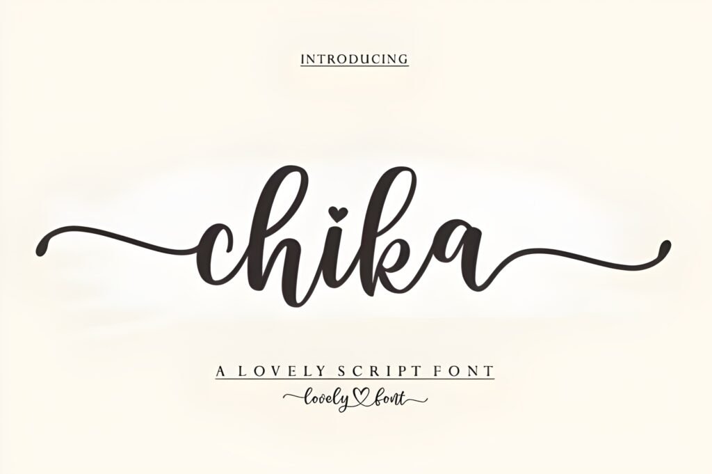
Chips: Vibe: simple handwritten • Best for: minimal overlays • Readability: high
Expert take: Chika is a clean, low-noise handwritten style—great when you want subtle personality without turning the whole design into a “script moment.” If you like minimal typography that still feels human, this is an easy pick.
Try it in a Post/Carousel: Minimal quote post: Chika for the main line, small sans for the author name and handle.
Try it in a Story/Reels: Small caption overlay near the bottom of a Reel cover, paired with a bold sans for the title.
Save/share trigger: Save it for “quiet” designs where the photo is the hero and type is the helper.
Marketplace signal: ⭐No public reviews yet • ❤️477 saves
A minimal handwritten pick that supports clean, modern layouts.
Designer note: If you want this longread to feel more interactive, add a “Pick your vibe” section above the cards in your editor (Cute / Signature / Romantic / Retro). Then link each vibe to 3–5 font anchors.
Didn't find what you were looking for?
Use the search below to explore more options on Creative Fabrica.
Fast workflow: how to test a cursive font in 3 minutes (no guesswork)
Instead of collecting fonts and never using them, run this quick test. It helps you decide if a cursive handwriting font will actually work in real layouts—on mobile, in templates, and in branding.
- Phone-size readability check: type a 3–5 word headline (example: “New post today”). If it’s hard to read at a small size, keep it for hero titles only—or skip it.
- Contrast test on a photo: place the headline on a busy image. If it disappears, add a subtle background shape behind the text (or pick a bolder script like Bulky).
- Two-line hierarchy test: line 1 = cursive (emotion), line 2 = clean sans (information). If that combo looks balanced, the font is template-friendly.
- Spacing sanity check: write a longer phrase (7–9 words). If letters collide or the rhythm feels messy, use the font only for short accents.
- Brand consistency test: apply it as a small corner watermark on 3 different posts. If it looks consistent every time, it’s a great “signature” font.
Shortcut picks: want “most readable”? start with Bestie, Daisy, Lucky, Sunday. Want “branding signature”? try Signature or Autography. Want “romantic”? Honeymoon or Angela Flower.
This section is designed to save you time: test → choose → download with confidence.
Conclusion
Cursive handwriting fonts work best when they’re treated like a “voice,” not a wall of text. Pick one that matches your brand mood, keep titles short, and pair it with a calm supporting font so the layout stays readable.
If you want the fastest result: start with Bestie for modern social templates, Signature for logo-style accents, and Honeymoon for romantic designs.
When you’re ready, use the download buttons inside each card to go straight to Creative Fabrica.
FAQ
1) What makes a good cursive handwriting font for Instagram?
Prioritize readability at small sizes, steady strokes, and clear letter connections. Use scripts for headlines and keep body copy in a simple sans.
2) How do I pair cursive handwriting fonts with other fonts?
Pair one script with one neutral sans (or a simple serif). Let the script be the personality and the sans carry the information.
3) Should I use cursive for long paragraphs?
Usually no. Cursive is strongest in short phrases: titles, names, accents, and quick hooks.
4) What’s the quickest way to test a font before committing?
Drop it into a template you already use (carousel cover + Story layout). If it holds up in those two places, it’s a good practical choice.
5) Which fonts here are safest for “readability first”?
Start with Bestie, Daisy, Lucky, and Sunday—then adjust based on your brand vibe.
6) Can I use these fonts for logos?
Yes—signature-style scripts often work well for logos and marks. Keep the logo text short and check legibility in small sizes.