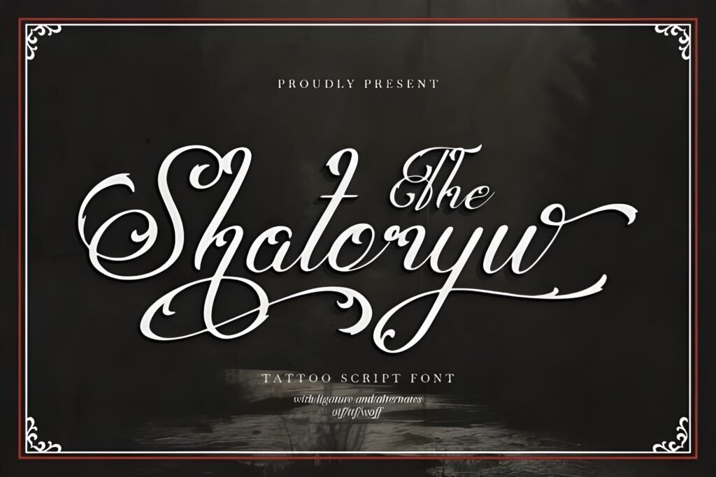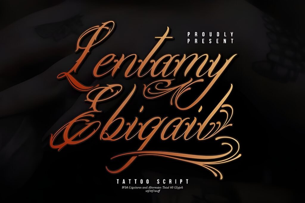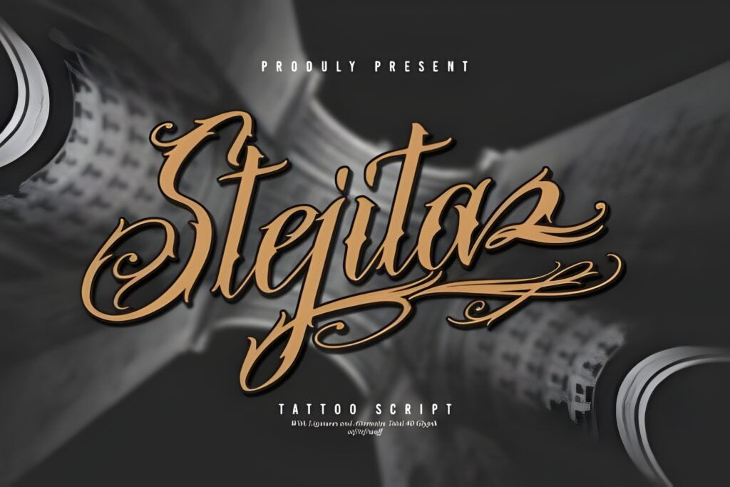
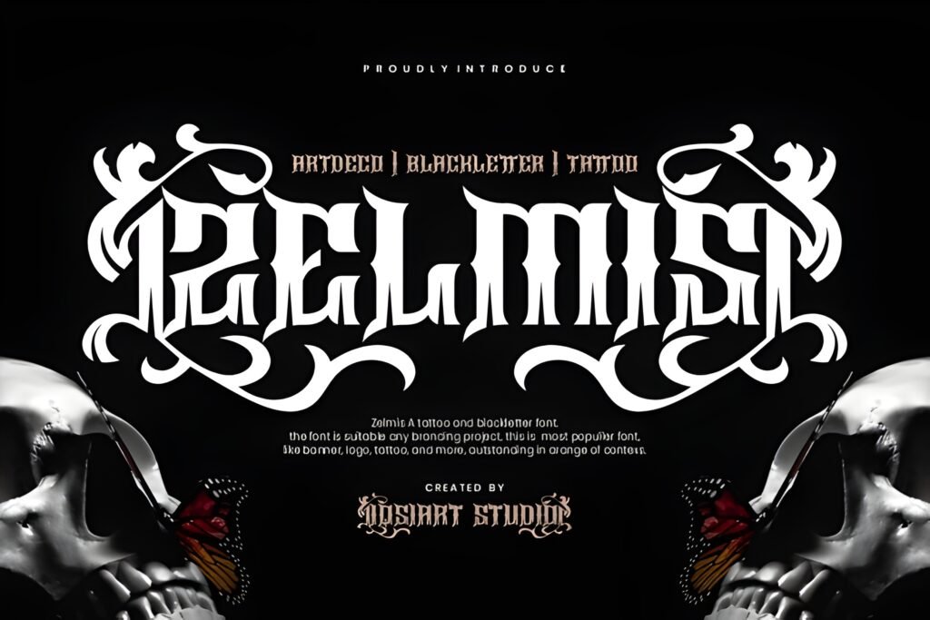
Zelmis Font is a display typeface that merges blackletter’s bold structure with the ornamental qualities of Art Deco and the expressive flair of tattoo culture. Its letterforms feature intricate serifs and decorative flourishes, creating a visual style that is both commanding and detailed. This font is designed to make text stand out with a strong presence, suitable for projects seeking a blend of gothic tradition and modern boldness.
Disclosure: This post contains an affiliate link. We may earn a commission at no extra cost to you.
What Makes Zelmis Font Distinctive?
The font’s defining characteristics include sharp serifs and ornamental details that add complexity to each character. Its bold strokes contribute to high visibility and impact, making it suitable for large-scale uses. The style fuses historical blackletter elements with Art Deco’s geometric elegance and tattoo-inspired artistry, resulting in a unique hybrid aesthetic. It includes uppercase letters, numerals, and essential punctuation, supporting a range of textual needs within its stylistic scope.
Best Uses for Zelmis Font
Zelmis is particularly suited for tattoo designs, where names, quotes, or symbolic phrases benefit from its artistic flair. It also works well in branding contexts that aim for a gothic or vintage vibe, such as band logos, apparel prints, and posters. Editorial layouts that require a dramatic headline or display element can leverage its ornamental complexity to draw attention. The font’s boldness and detail make it less suited for body text or small sizes, where legibility could be compromised.
How to Pair Zelmis Font
For complementary typography, consider pairing Zelmis as the headline font with a clean sans-serif for subheads and body text to provide contrast and readability. For example, use Zelmis for main titles, a geometric sans-serif like Futura or Montserrat for subheadings, and a neutral sans-serif such as Open Sans or Roboto for body copy. This hierarchy maintains Zelmis’s visual impact while ensuring overall clarity and balance in the design.
Practical Design Tips
Use generous whitespace around Zelmis to prevent its intricate details from feeling crowded. Scale the font large enough to showcase its ornamental flourishes without losing definition. Limit its use to headlines, logos, or short phrases to maximize legibility and impact. When applying it to apparel or posters, consider monochrome or limited color palettes to emphasize its gothic and Art Deco influences. Avoid pairing it with other highly decorative fonts to maintain visual hierarchy and prevent clutter.
Frequently Asked Questions
Can Zelmis Font be used for body text?
Due to its bold strokes and intricate ornamental details, Zelmis is best reserved for headlines or display purposes rather than extended body text, where legibility at smaller sizes may be reduced.
Is Zelmis suitable for modern branding projects?
Yes, especially for brands seeking a gothic, vintage, or tattoo-inspired aesthetic. Its fusion style can add distinctive character to logos and promotional materials, though pairing it with simpler fonts is advisable for balance.
What types of projects benefit most from Zelmis Font?
Projects such as tattoo designs, band artwork, apparel prints, posters, and editorial headlines that require a bold, ornamental display font with a mix of blackletter and Art Deco influences will find Zelmis particularly effective.