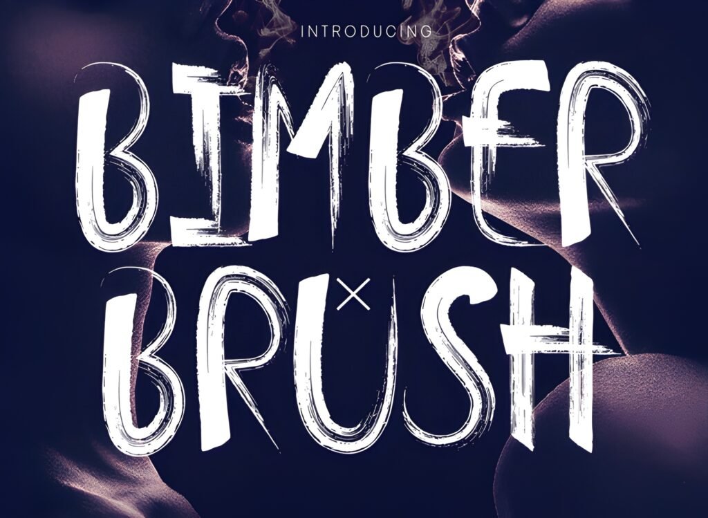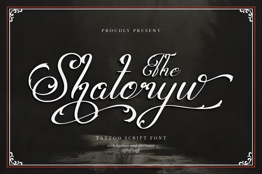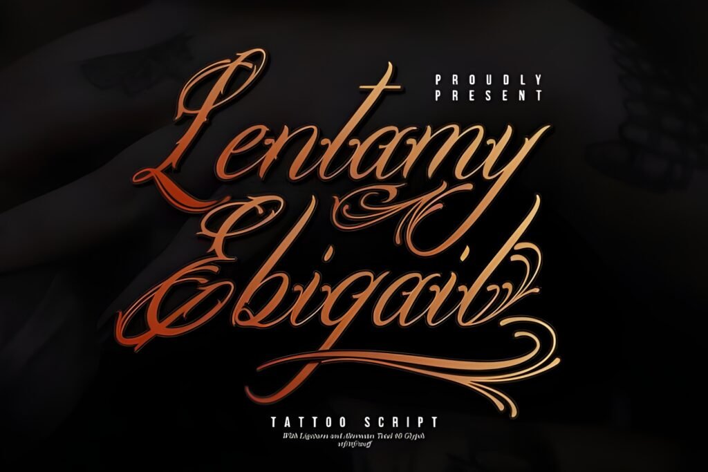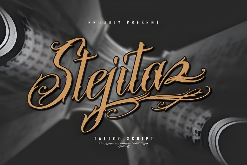
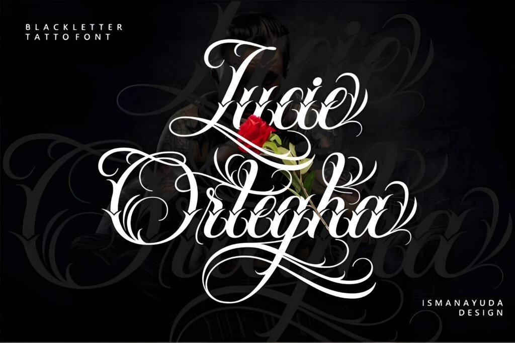
Lucie Ortegha Font merges the fluidity of script handwriting with the sharp, dramatic elements of blackletter, creating a typeface that stands out with a handcrafted, bold character. This fusion results in a style that feels both artistic and edgy, suitable for designs that seek to convey individuality and a strong visual presence.
Disclosure: This post contains an affiliate link. We may earn a commission at no extra cost to you.
What Makes Lucie Ortegha Font Distinctive?
The font balances smooth calligraphic strokes with gothic accents, offering a readable yet decorative appearance. Its handcrafted aesthetic lends authenticity and personality, making it suitable for projects needing a distinctive flair. The style resonates with gothic heritage while incorporating a modern twist, making it versatile for various creative uses.
Best Uses for Lucie Ortegha Font
Ideal for tattoo designs, especially names, quotes, or symbolic phrases that benefit from artistic impact. It also suits band logos, posters, apparel prints, mockups, and creative branding where a bold, rebellious vibe is desired. The font’s unique blend of script and blackletter makes it a strong choice for lifestyle projects that emphasize strength and individuality.
How to Pair Lucie Ortegha Font
Pair with a clean sans-serif for body text to maintain readability when using Lucie Ortegha as a headline or logo font. For example, use Lucie Ortegha for headlines or brand names, and a simple sans-serif like Helvetica or Open Sans for subheadings and body copy. Alternatively, a minimal serif font can complement the gothic elements when used for subheads, creating a balanced hierarchy.
Practical Design Tips
Use ample whitespace around the font to let its detailed strokes breathe, especially in larger sizes. Scale the font prominently for headlines or logos to emphasize its bold personality. When combining with other typefaces, keep supporting fonts simple and neutral to avoid visual competition. Consider dark or muted backgrounds to enhance the gothic mood, and limit the use of Lucie Ortegha to short text blocks to preserve legibility and impact.
Frequently Asked Questions
Can Lucie Ortegha be used for long paragraphs of text?
Given its decorative and bold style, it is best suited for short phrases, headlines, or logos rather than extended body text to maintain readability.
Is this font appropriate for branding outside tattoo or music-related projects?
Yes, it can work for any creative branding that benefits from a strong, artistic, and slightly gothic aesthetic, but consider pairing it with simpler fonts to avoid overwhelming the design.
How should I approach spacing when using this font?
Allow generous whitespace around the font to highlight its intricate strokes and avoid clutter, especially in larger display uses.