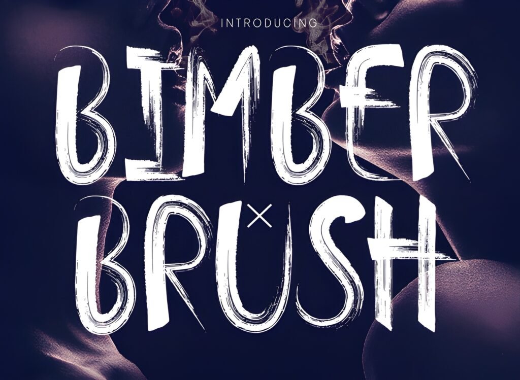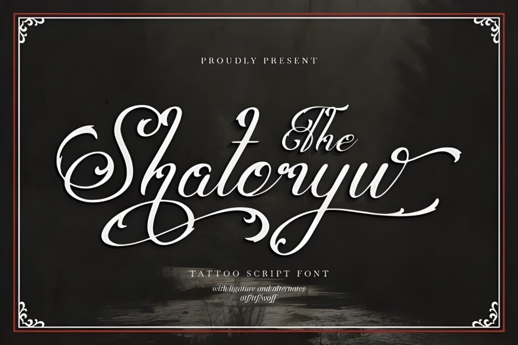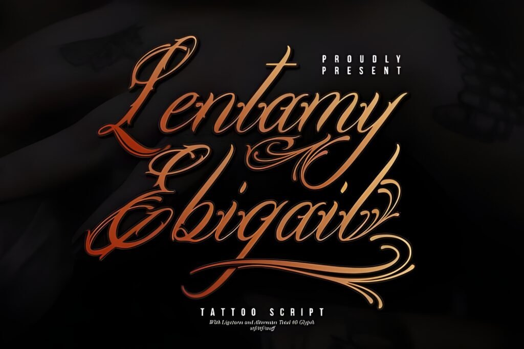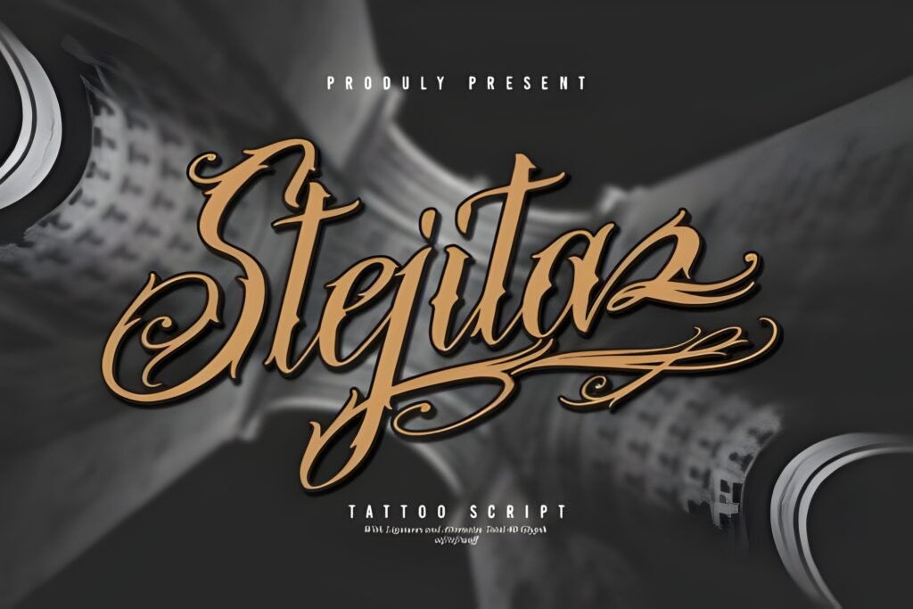
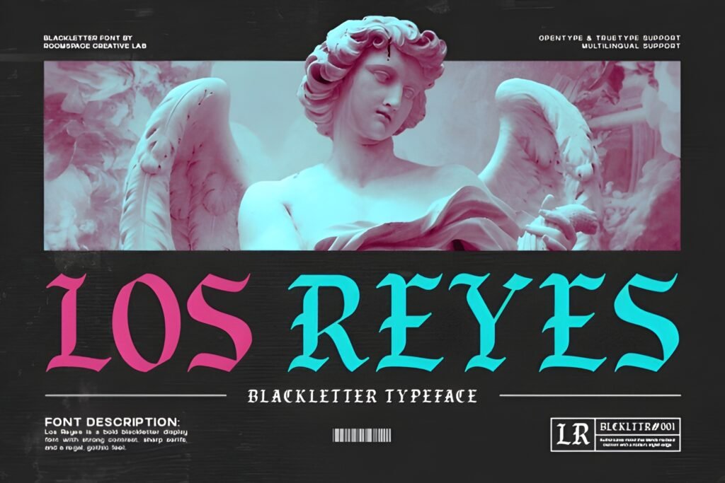
Los Reyes Font is a blackletter typeface that combines gothic tradition with a modern edge. Its sharp serifs and strong contrast create a bold, medieval-inspired look that carries a regal and classic mood. The font’s angular strokes and decorative details suggest authority and artistry, making it suitable for designs that require a powerful and timeless aesthetic.
Disclosure: This post contains an affiliate link. We may earn a commission at no extra cost to you.
What Makes Los Reyes Font Distinctive?
This font features dramatic contrast between thick and thin strokes, sharp serifs, and a gothic style that balances ornamental flair with readability. It is crafted to work well in both digital and print contexts, offering a commanding presence without sacrificing clarity. The overall design evokes heritage and strength, with a contemporary finish that suits a variety of creative projects.
Best Uses for Los Reyes Font
Los Reyes is particularly fitting for tattoo designs, especially for names, quotes, or symbolic phrases that benefit from a gothic flair. It also works well for branding in streetwear or barbershop logos, album covers, posters, and packaging where a bold, regal statement is desired. Its decorative yet legible style supports projects that want to convey tradition alongside modern craftsmanship.
How to Pair Los Reyes Font
For effective typography combinations, pair Los Reyes as a headline font with a clean sans serif for subheadings and body text to maintain readability and balance. For example, use Los Reyes for headlines or logos, a geometric sans serif like Montserrat for subheads, and a simple humanist sans serif such as Open Sans for body copy. This hierarchy emphasizes the font’s dramatic style while ensuring supporting text remains accessible.
Practical Design Tips
Use generous whitespace around Los Reyes to let its intricate details stand out without visual clutter. Scale the font larger for impactful headlines or tattoo designs, where its sharp serifs and contrast can be fully appreciated. Avoid using it for long paragraphs; instead, reserve it for short phrases or titles. Combining it with minimalist layouts and neutral color palettes can highlight its medieval character without overwhelming the overall design.
Frequently Asked Questions
Can Los Reyes be used for body text in print or digital projects?
Given its decorative blackletter style and strong contrast, Los Reyes is best suited for display use such as headlines or short phrases rather than extended body text, where readability may be compromised.
Is Los Reyes appropriate for modern branding beyond tattoo art?
Yes, its blend of gothic tradition with contemporary craftsmanship allows it to work well in branding contexts like streetwear, barbershop logos, and lifestyle graphics that want to convey heritage and boldness.
What layout considerations enhance the impact of Los Reyes?
Using ample whitespace, larger font sizes, and pairing with simpler sans serifs for supporting text helps maintain clarity and emphasizes the font’s ornamental and regal qualities.