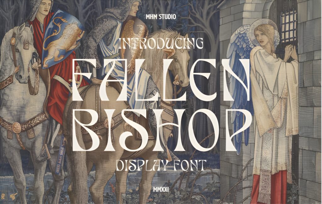
The Fallen Bishop Serif revives the style of Old English lettering with sharp serifs and a vintage aesthetic. It channels Gothic tradition and medieval influences, making it suitable for designs that require a historic or fantasy atmosphere. This font’s distinctive character lends itself to projects where a bold, classic presence is desired.
Disclosure: This post contains an affiliate link. We may earn a commission at no extra cost to you.
What Makes Fallen Bishop Font Distinctive?
This serif font features pronounced serifs and a vintage Old English style that evokes a sense of heritage and craftsmanship. Its design suggests a blend of Gothic and medieval influences, contributing to a textured, decorative appearance. The font’s visual weight and intricate letterforms can add depth and character to display text.
Best Uses for Fallen Bishop Font
The Fallen Bishop Serif is well suited for projects such as posters, book covers, certificates, apparel prints, invitations, and decorative packaging that aim to convey authenticity or a vintage feel. It works particularly well in contexts that benefit from a historical or fantasy theme, where the font’s ornate style can enhance the overall mood.
How to Pair Fallen Bishop Font
For complementary typography, pair this font with clean, modern sans-serifs used for body text to balance its complexity. For example, use The Fallen Bishop Serif for headlines or titles, and a simple sans-serif like Helvetica or Open Sans for subheads and body copy. This contrast helps maintain readability while emphasizing the font’s decorative qualities.
Practical Design Tips
Use The Fallen Bishop Serif primarily at larger sizes to showcase its detailed serifs and vintage character. Allow generous whitespace around text to prevent visual clutter, especially in dense layouts. When combining with other fonts, keep supporting typefaces minimal and straightforward to avoid competing with the font’s ornate style. Consider using it in centered or symmetrical compositions to enhance its formal, historic vibe.
Frequently Asked Questions
Can The Fallen Bishop Serif be used for body text?
Due to its intricate Old English style and sharp serifs, it is best reserved for headlines or display text rather than extended body copy, where readability could be compromised.
What types of projects benefit most from this font?
Projects with historical, fantasy, or vintage themes—such as book covers, certificates, or decorative packaging—can leverage this font’s distinctive style to add authenticity and visual interest.
How should I balance The Fallen Bishop Serif with other fonts?
Pair it with clean, simple sans-serifs for subheads and body text to create contrast and maintain legibility, using the serif font primarily for impactful headlines or titles.