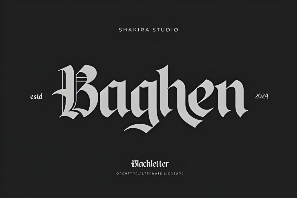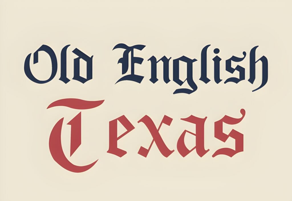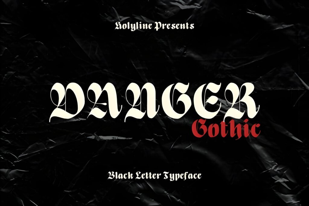
Danger Gothic is a blackletter typeface that revisits the Old English style with a modern sensibility. It features bold shapes and elegant curves, creating a look that balances playfulness with sophistication. This font is designed to bring a distinctive personality to headlines and display text, making it suitable for projects that benefit from a strong, stylized presence.
Disclosure: This post contains an affiliate link. We may earn a commission at no extra cost to you.
What Makes Danger Gothic Font Distinctive?
The font’s design combines traditional Gothic elements with contemporary flair, resulting in a casual yet striking appearance. Its boldness and unique letterforms suggest it works best at larger sizes where its details can be appreciated. The style lends itself well to creative applications needing a blend of classic and modern aesthetics, particularly in visual statements rather than extended body text.
Best Uses for Danger Gothic Font
Danger Gothic is well suited for headlines, magazine covers, custom logos, product packaging, and social media graphics where an eye-catching, original look is desired. It can also be effective for quotes, merchandise branding, watermarks, and labels that require a distinctive Gothic-inspired style with a fresh twist.
How to Pair Danger Gothic Font
For complementary typography, pair this font with clean, simple sans-serif styles used as body text or subheads to provide contrast and improve readability. For example, use Danger Gothic for headlines and a neutral sans-serif like Helvetica or Open Sans for body copy. Another approach is to combine it with a minimal serif font for subheadings, maintaining a balance between decorative and functional text elements.
Practical Design Tips
Use ample whitespace around Danger Gothic to let its bold shapes stand out without crowding. Scale the font prominently for headlines or logos to emphasize its unique curves and Gothic character. Avoid using it in dense blocks of text; instead, reserve it for short phrases or titles. When combining with other fonts, maintain clear hierarchy by limiting Danger Gothic to the most prominent text elements and using simpler fonts for supporting content. Consider dark or muted backgrounds to enhance the font’s visual impact and maintain legibility.
Frequently Asked Questions
Is Danger Gothic suitable for body text?
Given its bold and stylized blackletter design, Danger Gothic is best reserved for headlines or display use rather than extended body text, where readability could be compromised.
Can Danger Gothic be used for branding projects?
Yes, its distinctive modern Gothic style can add personality to branding, especially for fashion, editorial, or creative product packaging that benefits from a unique typographic voice.
What kind of projects benefit most from this font?
Projects that require a strong visual statement like magazine covers, logos, social media posts, and merchandise labels can leverage Danger Gothic’s blend of tradition and modernity effectively.