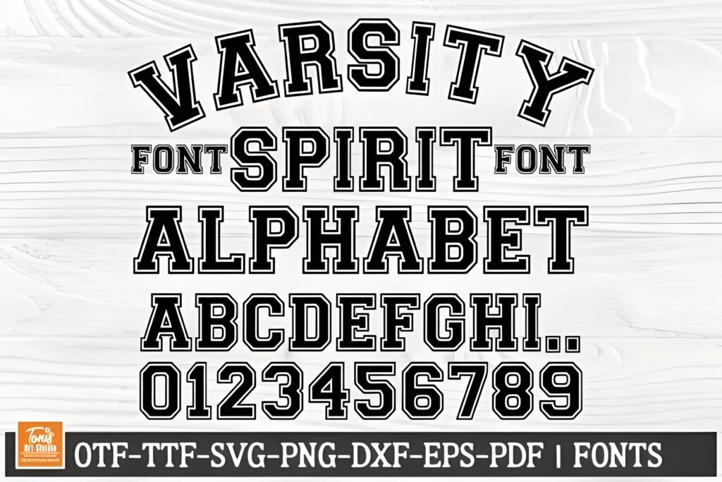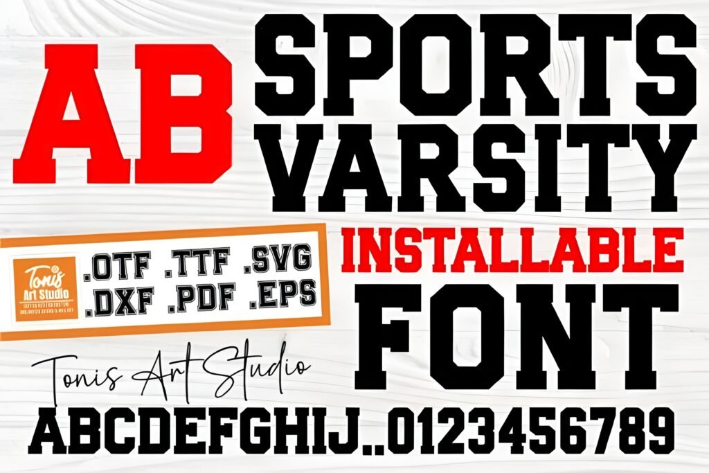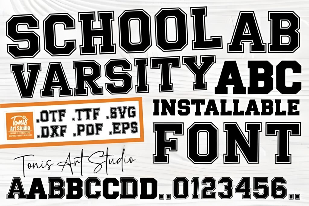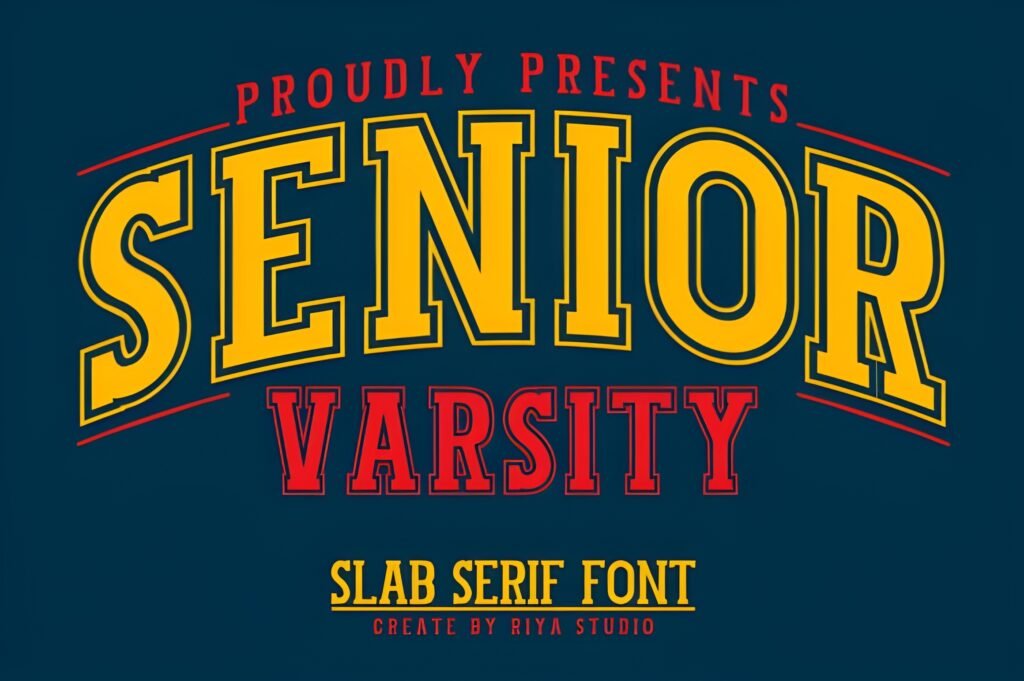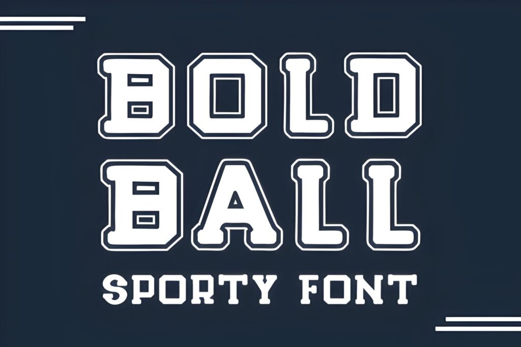
Bold Ball is a collegiate-inspired font that draws from varsity jacket lettering and athletic banners. Its uppercase letters feature a distinctive white outline, creating a layered effect, while the lowercase characters are solid and straightforward. This contrast offers a balance between boldness and readability, making it suitable for designs that need to convey energy and school spirit.
Disclosure: This post contains an affiliate link. We may earn a commission at no extra cost to you.
What Makes Bold Ball Font Distinctive?
The font’s uppercase letters stand out with a white outline that adds dimension and visual interest. Lowercase letters maintain clarity with a solid fill, supporting legibility in longer text. Bold Ball’s style is rooted in sports and collegiate aesthetics, emphasizing strength and dynamic presence. It is designed for use in both digital and print contexts and is compatible with common design software and cutting machines.
Best Uses for Bold Ball Font
Bold Ball works well for sports-related branding such as team logos, jerseys, and event posters. It is also appropriate for spirit wear, banners, and product packaging where a collegiate or athletic vibe is desired. The font’s layered uppercase can highlight headlines or key words, while the lowercase can support secondary text or smaller details.
How to Pair Bold Ball Font
For a balanced typographic hierarchy, pair Bold Ball’s uppercase headline with a clean sans-serif for subheadings and body text, such as Montserrat or Open Sans. In a sports event poster, use Bold Ball uppercase for the main event title, Montserrat semi-bold for date and location subheadings, and Open Sans regular for additional information. For apparel branding, Bold Ball uppercase can serve as the logo or team name, complemented by a simple sans-serif tagline in lowercase.
Practical Design Tips
Use generous whitespace around the outlined uppercase letters to prevent visual clutter and maintain impact. Scale the uppercase text larger to emphasize its layered effect, while keeping lowercase text smaller and more compact for readability. Consider contrasting Bold Ball with a minimalist font to avoid competing textures. In print, ensure the white outline reproduces clearly by testing on different backgrounds, especially darker colors. For digital use, layering the font over solid or gradient backgrounds can enhance its dynamic style.
Frequently Asked Questions
Can Bold Ball be used for long paragraphs of text?
Given its distinctive outlined uppercase and solid lowercase, Bold Ball is best suited for headlines, logos, and short phrases rather than extended body text, where readability might be affected.
Is Bold Ball suitable for both print and digital projects?
Yes, the font is designed to work well in both print and digital formats, but attention should be paid to how the outlined uppercase letters render on various backgrounds.
What types of projects benefit most from this font’s style?
Projects related to sports, school branding, athletic promotions, and spirit wear will benefit from Bold Ball’s collegiate and dynamic aesthetic.