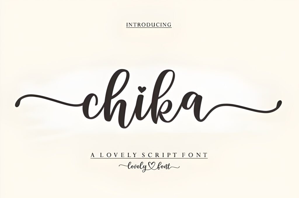
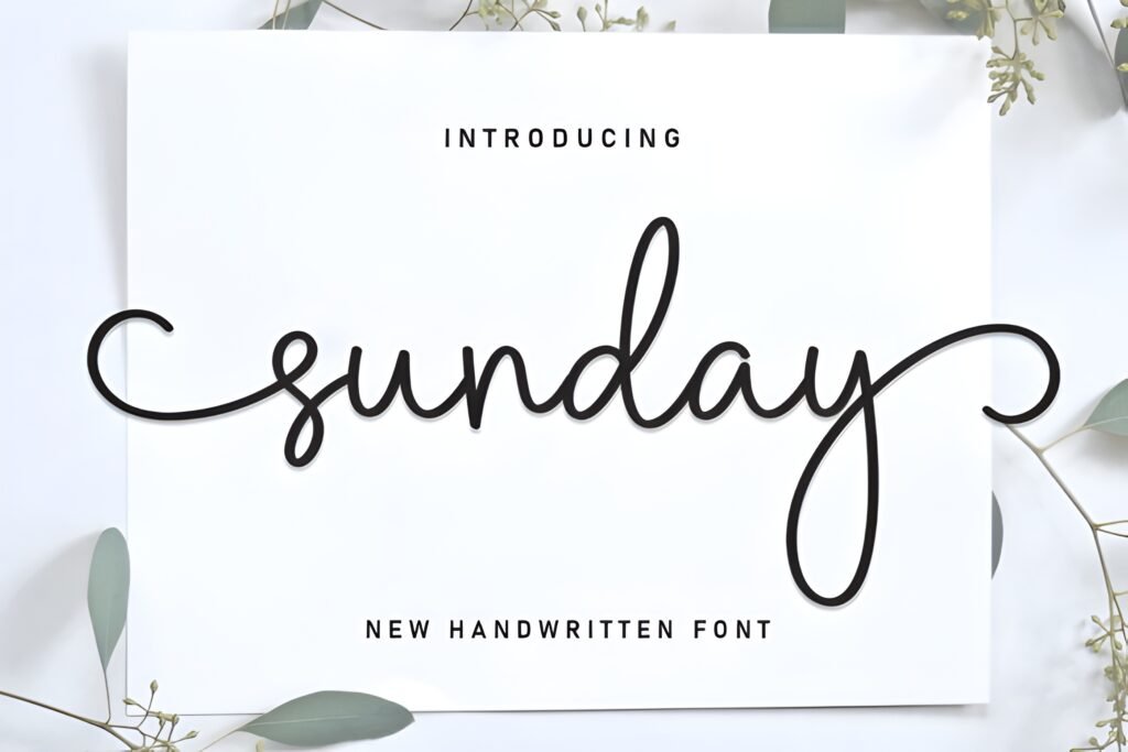
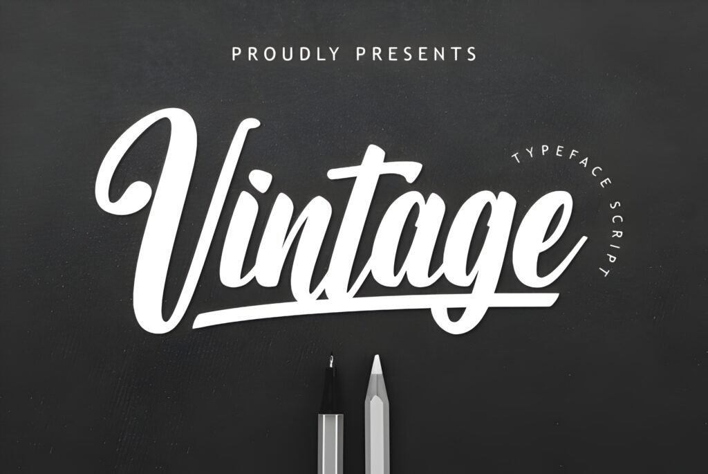
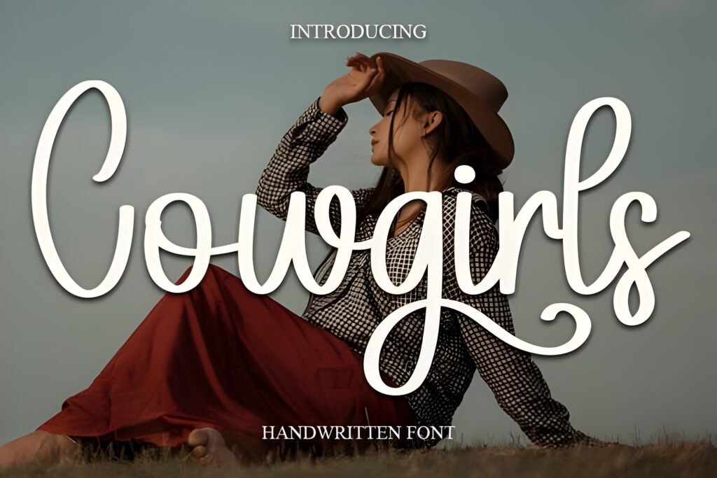
Loading is a sweet cursive handwritten font designed to evoke the feeling of ink swirling gracefully across paper. Its strokes combine softness with personality, creating a style that balances romantic charm with casual ease. This makes it suitable for projects that require a human touch without appearing overly formal.
Disclosure: This post contains an affiliate link. We may earn a commission at no extra cost to you.
What Makes Loading Font Distinctive?
The font features gentle cursive strokes that suggest a handwritten note or love letter. It is PUA encoded, allowing access to additional glyphs and alternates, which can help customize the look of your text. The overall style carries a joyful and romantic tone, lending itself well to designs that want to convey warmth and approachability.
Best Uses for Loading Font
Loading is well suited for wedding invitations that aim to feel intimate and personal, logos that benefit from a lively, human heartbeat, fashion lookbooks seeking a soft yet stylish script, greeting cards that want to express warmth, and elegant promotional materials that balance fancy with casual. Its handwritten nature makes it ideal for any context where a personal, flowing script is desired.
How to Pair Loading Font
For effective typography combinations, consider pairing Loading as the headline font with a clean sans-serif for subheadings and body text to maintain readability and contrast. For example, use Loading for headlines or invitations’ main titles, a sans-serif like Montserrat or Lato for subheads, and a neutral serif such as Merriweather for body copy. This hierarchy preserves the font’s decorative appeal while ensuring text blocks remain clear.
Practical Design Tips
Use generous whitespace around Loading’s cursive letters to prevent visual clutter and allow its flowing strokes to breathe. Scale the font larger for headlines or focal points to highlight its graceful motion. When setting longer passages, reserve Loading for short phrases or names to maintain legibility. Combining it with simpler, geometric typefaces enhances contrast and keeps the design balanced. Avoid overly dense layouts that compete with the font’s delicate rhythm.
Frequently Asked Questions
Can Loading be used for body text in long paragraphs?
Given its cursive and decorative nature, Loading is better suited for short phrases, headlines, or names rather than extended body text, where readability may suffer.
Does Loading include alternate characters for customization?
Yes, it is PUA encoded, which means you can access additional glyphs and alternates to tailor the font’s appearance to your design.
What types of projects benefit most from Loading’s style?
Projects that aim to convey romance, warmth, or a personal touch—such as wedding stationery, greeting cards, fashion lookbooks, and logos with a human feel—are ideal candidates.