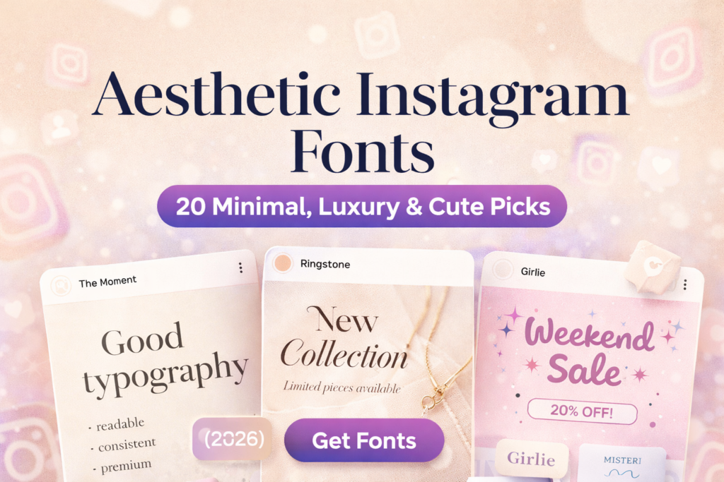
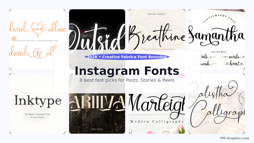
Looking for Instagram fonts that make your content look instantly more premium? Here are 8 stylish fonts for quote posts,
carousel tips, Stories, and Reels covers — with simple pairing tips and centered ⬇ Download buttons.
Affiliate Disclosure
Some links in this article are affiliate links. If you download through them, I may earn a commission at no extra cost to you.
Thanks for supporting my work!
Instagram is a scroll-first platform. Your post has a split second to earn attention — and typography does that job before anyone reads a word.
Fonts are like outfits: the message can be great, but if the styling feels “off”, people scroll past.
This guide focuses on Instagram fonts that are practical and good-looking: bold enough for cover slides and Reels titles,
readable enough for carousel tips, and stylish enough for aesthetic quotes. Let’s build a font toolkit you’ll actually use.
Table of Contents
Why Instagram Fonts Matter (More Than You Think)
Fonts set the mood instantly. The same sentence can feel luxurious, playful, minimal, or bold depending on type choice.
That “vibe” is branding — even if you never call it branding.
Typography also affects readability. And readability affects behaviour: if a carousel is easy to read, people save it.
If a quote is instantly clear, people share it. That’s why choosing the right Instagram fonts is not decoration —
it’s performance.
How to Choose Fonts for Instagram (Fast Checklist)
1) Match the font to the format
- Quote posts: script headline + readable serif for the author/name
- Educational carousels: readable serif for body text + one accent font for emphasis
- Reels covers: bold headline font + short words + high contrast
- Brand announcements: elegant serif + generous spacing
2) Do the “thumb distance” test
Export a post and look at it on your phone like a normal viewer would. If you can’t read the headline in 2–3 seconds,
simplify: fewer words, bigger text, calmer font, more spacing.
3) Keep it clean: 1–2 fonts per post
Two fonts feel intentional. Three fonts can work if one is subtle. Four fonts usually looks chaotic.
Your goal is a strong hierarchy, not a font contest.
Quick Pairing Formula (So It Always Looks Pro)
Pairing formula: Script headline (short) + Readable serif body + Plenty of whitespace.
Think of it like a good outfit: one statement piece, one neutral base, and clean “space” around it. That’s how you make
Instagram fonts look premium without overdesigning.
8 Best Instagram Fonts (With Centered Download Buttons)
Here are 8 Creative Fabrica fonts that work well for a global audience — from elegant scripts to editorial serifs.
Each pick includes a quick “best for” so you can choose fast.
1) Darrel Allura — Elegant Script for Luxury Quote Posts
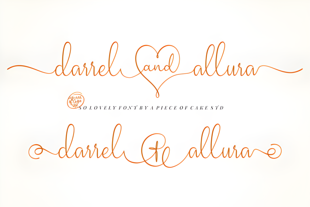
Best for: quotes, beauty/lifestyle branding, premium highlights
Darrel Allura gives that polished “signature” feel. Use it for a short headline, a name, or one key phrase you want to spotlight.
The secret is restraint: fewer words, more whitespace, bigger impact.
Tip: Keep the script to one line if possible. Pair with a serif for details.
2) Outside — Friendly Handwritten Style for Stories
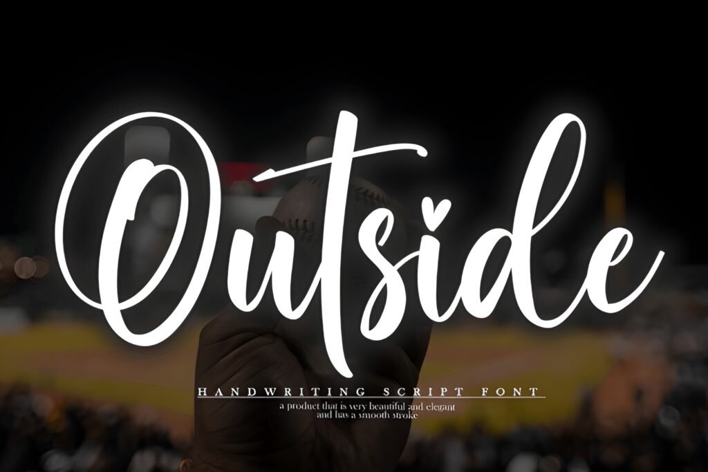
Best for: Stories, behind-the-scenes, community content, casual prompts
Outside feels warm and human — perfect for Stories where you want a friendly tone. Use it for polls, Q&As, quick reminders,
and short tips. It’s the “approachable voice” font.
Tip: Keep lines short and use high contrast for instant readability.
3) Breathine — Modern Script for Chic Minimal Designs
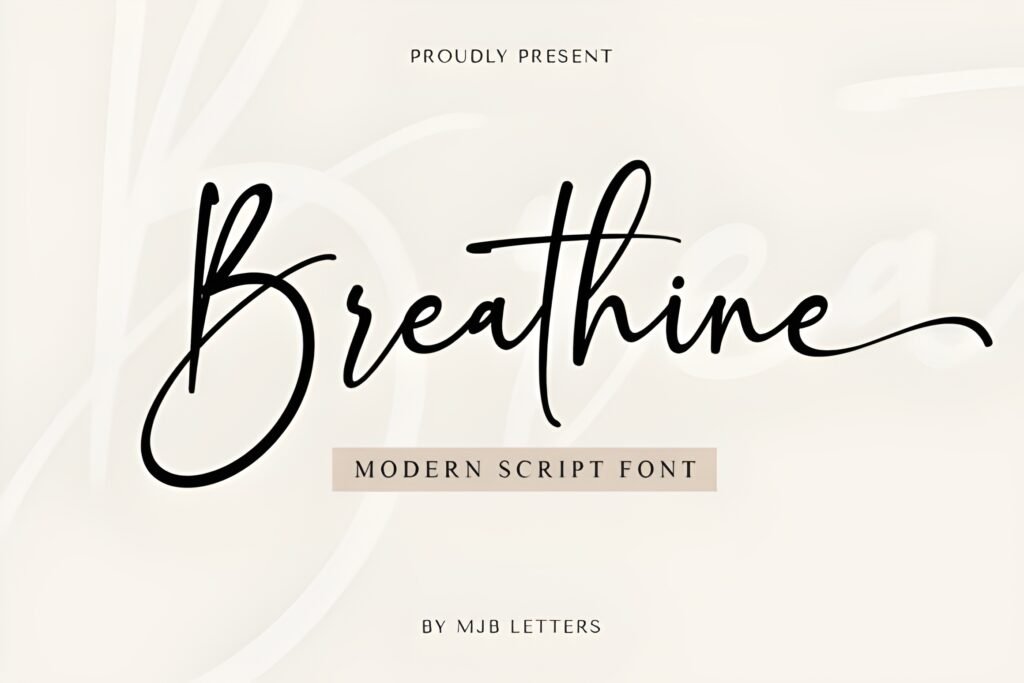
Best for: wellness, fashion, modern personal brands, aesthetic quotes
Breathine is stylish without being loud. It works beautifully for minimal layouts: a calm headline, a simple background,
and a clean supporting font underneath. If you want “modern elegance”, start here.
Tip: Use Breathine for the headline and a serif for the body text.
4) Samantha Calligraphy — Clean Calligraphy for Elegant Headlines
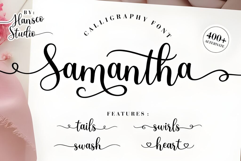
Best for: boutique promos, beauty, wedding/event aesthetics
Samantha Calligraphy gives a refined handwritten look that stays readable when you use it for short phrases.
It’s great for a headline, a Reels cover title, or a premium promo graphic.
Tip: Keep it to 3–6 words. Use a serif underneath for details.
5) Inktype — Editorial Serif for Save-Worthy Carousels
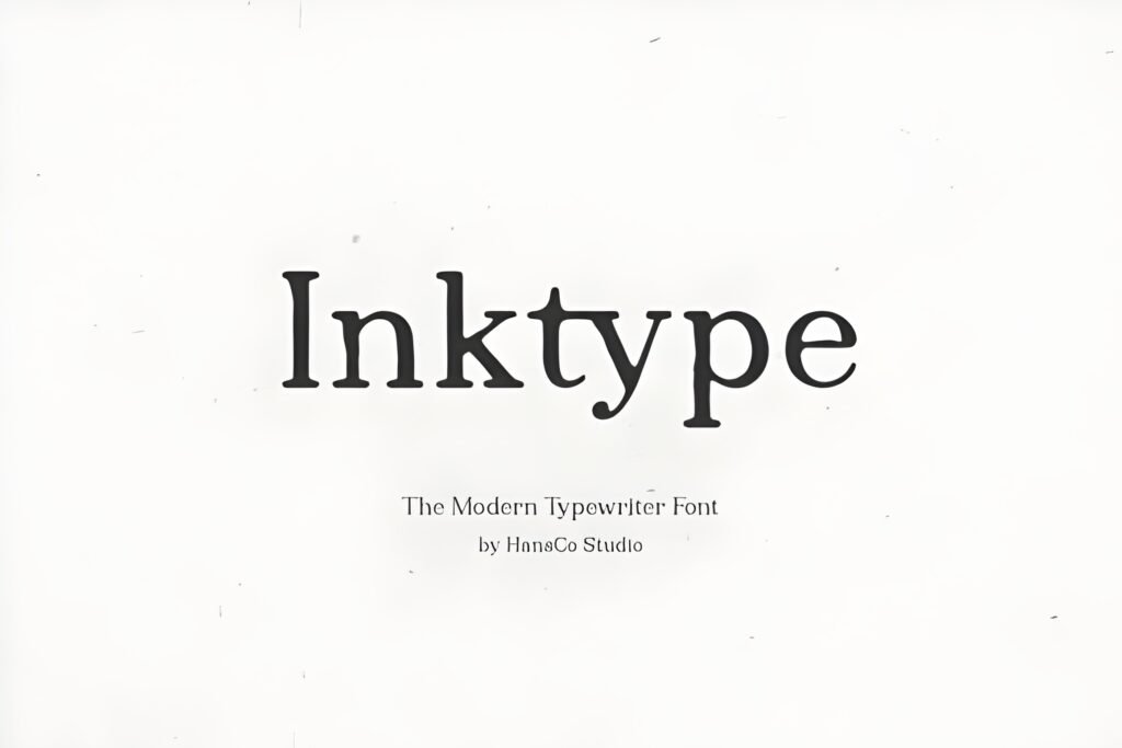
Best for: educational carousels, blog promo graphics, editorial layouts
Inktype helps you build carousels that feel structured and credible — like a mini magazine spread.
Use it for short paragraphs, step-by-step slides, and clear teaching posts.
Tip: Increase line spacing slightly to keep slides airy and readable.
6) Ariliva — Elegant Serif for Clean Brand Announcements
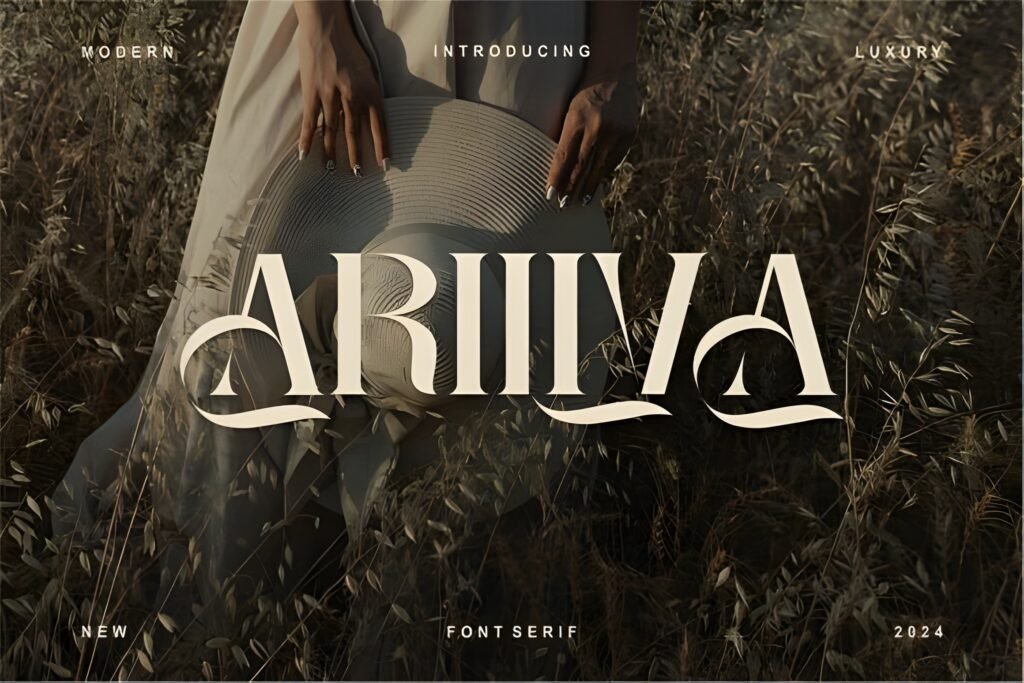
Best for: product launches, minimal branding, professional feeds
Ariliva is calm, clean, and premium — perfect for announcements that need to feel “official” but still stylish.
If your feed is text-heavy, this one keeps things readable and polished.
Tip: Use it for headings + labels (NEW, UPDATE, LAUNCH) with plenty of whitespace.
7) Marleigh — Bold Typeface for Reels Covers & Headlines
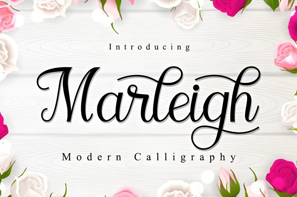
Best for: Reels cover titles, carousel cover slides, promo banners
Marleigh has strong personality — a “main character” typeface that works on cover slides without extra decoration.
Use it for big, confident headlines. Then pair with a calmer font for the subtitle.
Tip: Keep the headline short. Strong fonts look best when they have space.
8) Calistha Calligraphy — Romantic Script for Aesthetic Quotes
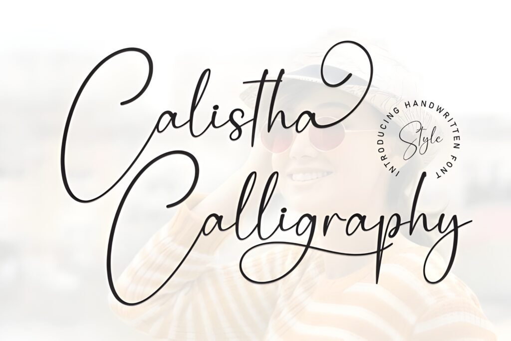
Best for: romantic aesthetics, feminine brands, elegant quote posts
Calistha Calligraphy is soft, elegant, and emotional — perfect for aesthetic quotes and premium lifestyle content.
Keep your background simple and let the curves do the work.
Tip: Use short phrases and avoid long script paragraphs.
Didn't find what you were looking for?
Use the search below to explore more options on Creative Fabrica.
Best Use Cases: Posts, Stories, Reels & Carousels
Instagram Stories (fast, casual, human)
Stories are perfect for quick engagement. Go for readability and a friendly vibe — and keep lines short.
- Best picks: Outside, Breathine
- Great for: polls, Q&A, reminders, mini tips
Reels Covers (tiny billboard energy)
Your Reel cover should be readable even as a tiny grid thumbnail. Use short words and strong contrast.
- Best picks: Marleigh, Samantha Calligraphy (short title)
- Layout idea: one strong keyword + one smaller subtitle
Quote Posts (aesthetic + emotion)
Scripts shine here — just keep them short and pair with a calmer font for the supporting text.
- Best picks: Darrel Allura, Breathine, Calistha Calligraphy
- Pairing idea: script headline + serif author name (Inktype/Ariliva)
Educational Carousels (save-worthy clarity)
If your audience needs to read, use calm typography and clean spacing. Serif fonts make carousels feel credible and structured.
- Best picks: Inktype, Ariliva
- Best for: tutorials, checklists, step-by-step slides
Design Tips That Make Instagram Fonts Look Expensive
1) Use fewer words
Premium design often looks premium because it’s not trying too hard. Short headlines + whitespace = instant upgrade.
2) Create hierarchy with size, not more fonts
Make the headline bigger, the subtitle smaller, and keep spacing consistent. Clean hierarchy beats “font soup” every time.
3) Spacing is the silent designer
Increase line height slightly, align elements consistently, and keep margins even. Your post will look intentional even with a simple template.
Common Mistakes to Avoid
Mistake #1: Script fonts for long paragraphs
Scripts are beautiful for headlines — not for body text. Keep scripts short and let a serif do the heavy reading.
Mistake #2: Low contrast
If it’s not readable, it’s not shareable. Always test your post on a phone before publishing.
Mistake #3: Too many styles at once
Two fonts per post is usually enough. Use size and spacing for variety instead of adding more fonts.
Conclusion: The Fastest Way to Upgrade Your Instagram Design
Choosing the right Instagram fonts is one of the quickest upgrades you can make.
Start simple: pick one headline font you love, pair it with a readable serif, and use confident spacing.
Save this list, test one new font this week, and watch how much more consistent (and premium) your content feels.
FAQ
1) What are the best Instagram fonts for quote posts?
Use a script for the headline (Darrel Allura, Breathine, Calistha) and a serif for the author name (Inktype or Ariliva).
2) Which Instagram fonts work best for carousels?
Inktype and Ariliva are safer for body text because they’re calm and readable. Scripts are best as accents.
3) How many fonts should I use per post?
Two fonts is ideal: one for the headline and one for supporting text. Consistency across posts matters more than variety.
4) How do I make typography look premium fast?
Use fewer words, more whitespace, strong hierarchy (big headline + smaller subtitle), and high contrast for readability.
5) Where can I download these fonts?
Use the centered ⬇ Download buttons above to get each font on Creative Fabrica.