Want your Instagram posts to look instantly “designed” — without spending hours tweaking templates?
The secret isn’t more fonts. It’s better pairings.
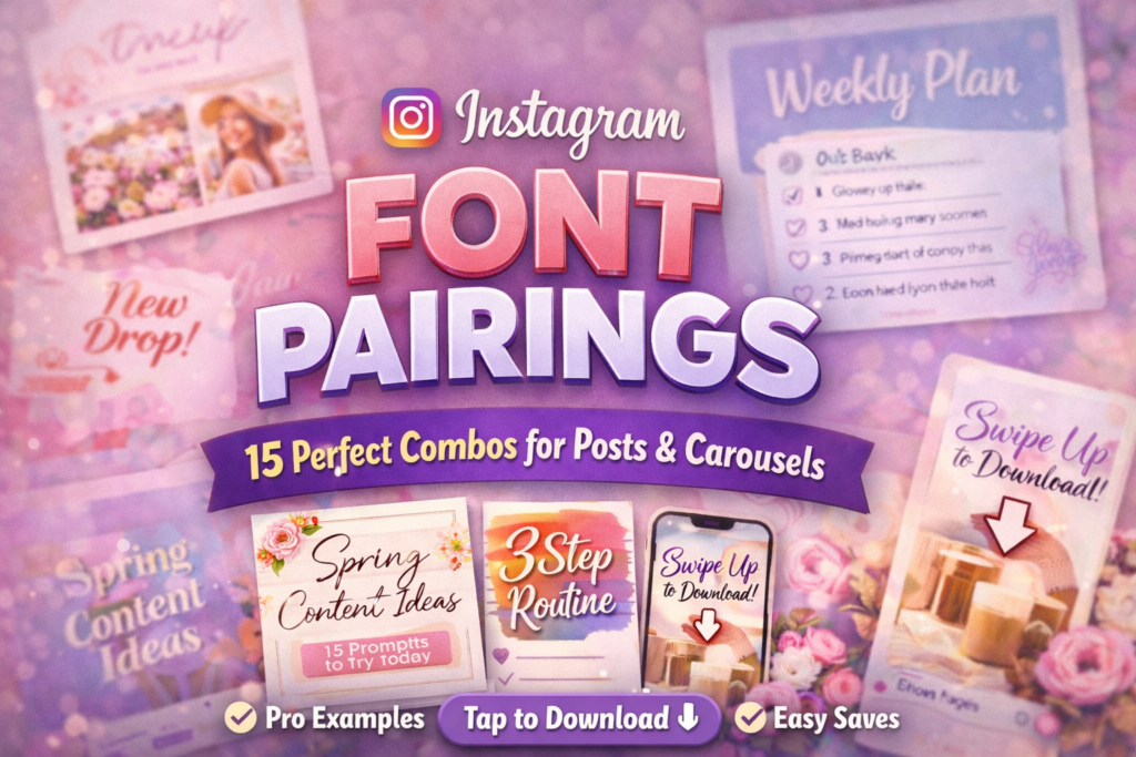
In this guide, I’ll show you 15 aesthetic Instagram font pairings built for readability, consistency, and saves.
Each block includes my expert notes, 2 real-style project examples (Post + Story/Reels), and a ⬇ Download button.
Affiliate Disclosure
Some links are affiliate links. If you download through them, I may earn a commission at no extra cost to you.
Thanks for supporting the blog.
My “perfect pairing” rule: one expressive font for headlines + one calm font for details.
If both fonts are loud, your design becomes noise.
Jump to:
Quick Pairing Table (Pick Your Combo Fast)
Use this table when you want a fast choice. Then scroll down for the full expert notes and examples.
Most creators only need 2–3 stable pairings to keep a feed consistent for weeks.
| Main Font | Best Partner | Vibe | Best for | Why it works |
|---|---|---|---|---|
| Christine Birth Flower Duo | Qedysans | Cute / Floral | Carousels, covers | Decor + clean readability |
| Potery Script | Inno | Luxury script | Quotes, launches | Elegant headline + sharp details |
| Seraphim | Qedysans | Editorial | Carousels, brand posts | Premium + scannable text |
| Monogram Handwriting | Cogley | Personal / warm | Stories, BTS | Human touch + clean caption |
| Young Morin | Inno | Modern luxe | Covers, promos | High contrast hierarchy |
| Sunday Eighties | Qedysans | Retro pop | Reels covers | Fun headline + clean support |
How I Build Instagram Font Pairings (Expert Method)
I build pairings for one reason: to make your content easier to consume. When text is easy, people stay longer.
When people stay longer, you get more saves. When you get more saves, your reach (and conversion) improves.
- Grid test: I zoom out until the cover is tiny. If the headline fails, I switch the headline font or shorten the hook.
- One “hero” + one “support”: hero font carries the vibe, support font carries clarity.
- Spacing sells: whitespace is what turns a “nice font” into a premium design.
- Repeat the system: your best pairing should appear again and again. Consistency builds brand memory.
CTA Phrases (Copy/Paste) That People Actually Click
Use these phrases under your carousel/post, or inside Stories with a link sticker. They’re short, clear, and action-based.
- Save this for your next post ✅
- Tap to download the font ⬇
- Use this pairing for your next carousel
- Want my full template pack? (add link)
- Comment “FONT” and I’ll send the link (great for engagement)
- Share this with a creator friend 💬
- Try this cover style for Reels this week
- Download + test it on your brand colors
15 Fonts + Best Pairing + 2 Project Examples + Download Buttons (V4)
Each block gives you a pairing you can reuse for weeks. Read the notes, pick 2–3 combos, repeat them across posts,
and your feed will start looking like a real brand (not random templates).
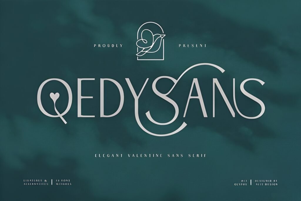
1) Christine Birth Flower Duo Font
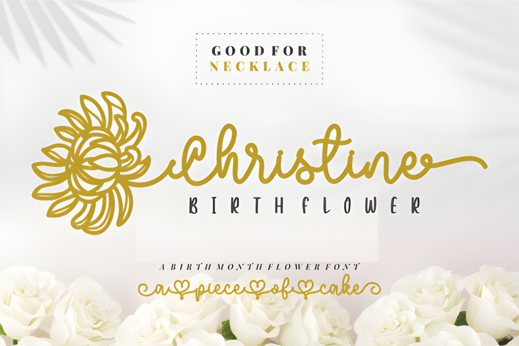
Best partner: Qedysans
Use as: Headline
Expert take: This is the “pretty, polished, feminine” pairing starter. Christine is decorative (flowers = instant charm),
so your support font must be calm. Qedysans keeps the design readable and modern — which is exactly what makes floral content convert
instead of looking like a scrapbook. Use Christine for the big statement, then let Qedysans do the heavy lifting in subtitles and bullets.
Project example (Post): Carousel cover: “Spring Content Ideas” (Christine) + subtitle “15 prompts you can use today” (Qedysans).
Project example (Story/Reels): Story promo: “New Freebie” (Christine) + “Tap the link sticker to download” (Qedysans).
Save/Share trigger: Save this if you create beauty, lifestyle, journaling, or wedding-style content. Share with a friend who loves floral aesthetics.
2) Potery Script Font
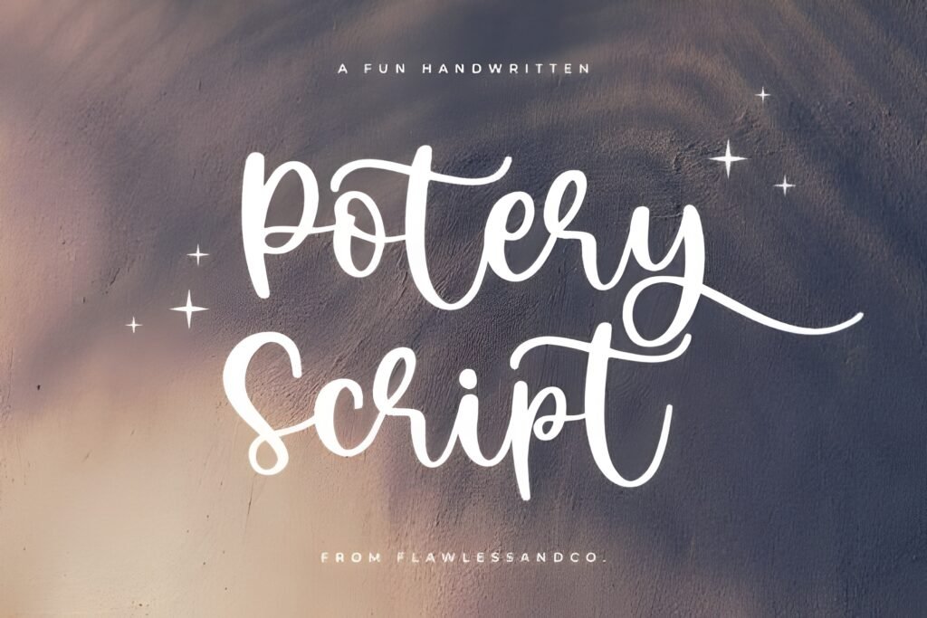
Best partner: Inno
Use as: Accent headline
Expert take: Potery Script is a “one-line magic” font — it turns a simple phrase into a premium statement.
The mistake people make is using script for paragraphs. Don’t. Use Potery for 2–5 words.
Pair it with Inno for sharp, clean supporting text. This combo is perfect when you sell something (services, products, presets)
because it increases perceived value without looking heavy.
Project example (Post): Quote post: “Quiet Luxury” (Potery) + “A calm brand sells faster.” (Inno).
Project example (Story/Reels): Reel cover: “New Offer” (Potery) + “3 spots left” (Inno).
Save/Share trigger: Save this pairing if you do coaching, beauty, fashion, or boutique brands. Share with someone launching an offer.
3) Seraphim Font
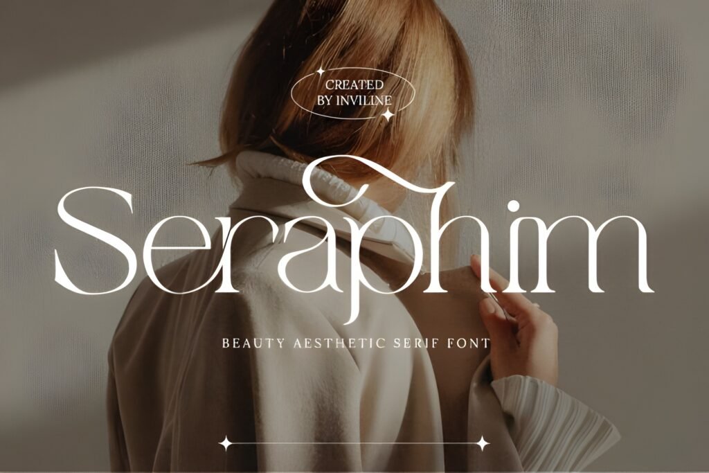
Best partner: Qedysans
Use as: Headline
Expert take: Seraphim gives you that “magazine cover” vibe — crisp, modern, and premium.
This is a top choice for carousels because it makes titles feel authoritative. Pair it with Qedysans for clean, scannable bullets.
The result: your content reads fast, looks premium, and earns more saves (because people can actually use it).
Project example (Post): Carousel: “Content Strategy” (Seraphim) + steps 1–5 in Qedysans.
Project example (Story/Reels): Story cover: “Weekly Plan” (Seraphim) + checklist items in Qedysans.
Save/Share trigger: Save this if you post educational content. Share with a friend who makes carousel tutorials.
4) Monogram Handwriting Font
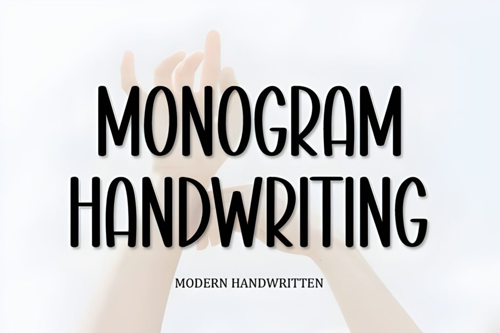
Best partner: Cogley
Use as: Accent
Expert take: This font feels like a handwritten note — perfect for creators who want warmth and authenticity.
Pair it with Cogley to keep your design clean and readable. The combo works because it feels personal but still “designed”.
Use Monogram Handwriting for short emotional hooks, then let Cogley handle details.
Project example (Post): Quote: “You can do hard things” (Monogram) + “Save this reminder” (Cogley).
Project example (Story/Reels): Story: “Behind the scenes” (Monogram) + “New post at 6PM” (Cogley).
Save/Share trigger: Save if you post personal updates or BTS. Share with a creator friend who loves “human” branding.
5) Young Morin Font
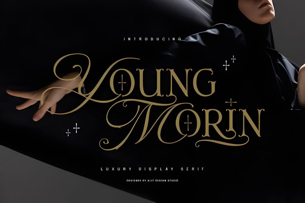
Best partner: Inno
Use as: Headline
Expert take: Young Morin is the kind of headline font that makes a post feel premium even with a simple layout.
Pair it with Inno for tight, modern supporting text. This combo is perfect for offers, announcements, and clean carousels.
If your brand is “minimal but expensive”, this pairing will carry it.
Project example (Post): Launch post: “Now Available” (Young Morin) + “Details inside → swipe” (Inno).
Project example (Story/Reels): Reel cover: “My routine” (Young Morin) + “3 steps” (Inno).
Save/Share trigger: Save if you sell services or products. Share with someone who wants a “clean luxury” aesthetic.
6) Indigo Font Duo
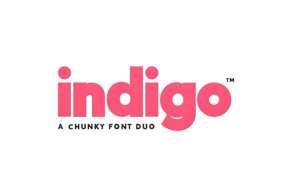
Best partner: Qedysans
Use as: Headlines + accents
Expert take: Font duos are cheat codes for consistency. Indigo already gives you harmony inside the family,
and pairing it with Qedysans makes your carousels extra readable.
Use Indigo’s stronger style for headlines, the softer style for subheads, and keep body text in Qedysans. This is the kind of “system”
you can repeat all month without your feed feeling repetitive.
Project example (Post): Carousel: “Instagram Design Rules” (Indigo headline) + steps in Qedysans.
Project example (Story/Reels): Story template: “Quick Tip” (Indigo) + “Tap to save” (Qedysans).
Save/Share trigger: Save if you want an easy repeatable style system. Share with someone who struggles with consistency.
7) Sunday Eighties Font
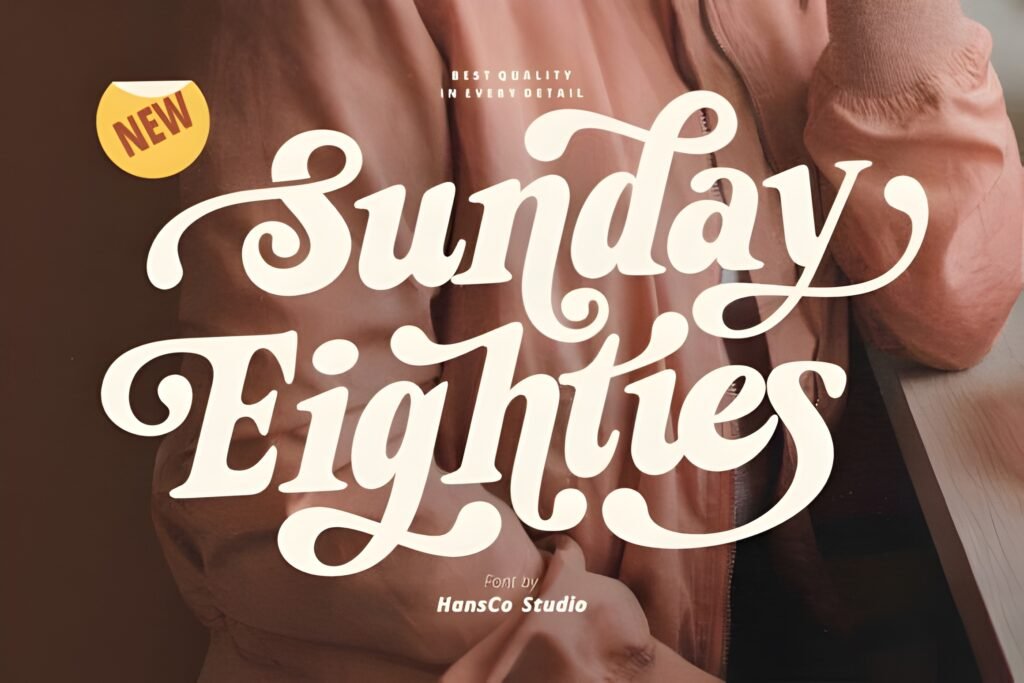
Best partner: Qedysans
Use as: Reels cover headline
Expert take: Sunday Eighties is pure fun — and fun wins clicks when your cover is readable.
The trick is keeping the rest clean. Pair it with Qedysans so your subtitle doesn’t compete.
This combo is perfect for creators who want energy but still want a feed that looks intentional.
Project example (Post): Promo post: “New Drop!” (Sunday Eighties) + “Swipe to see details” (Qedysans).
Project example (Story/Reels): Reel cover: “3 hacks” (Sunday Eighties) + “for better reach” (Qedysans).
Save/Share trigger: Save this if you need more clicky Reels covers. Share with a friend who loves retro style.
8) Modern Writing Font
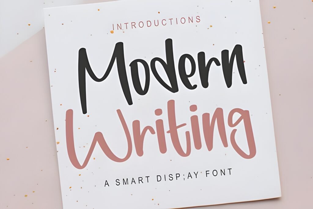
Best partner: Inno
Use as: Accent hook
Expert take: Modern Writing is that perfect “note-to-a-friend” font — warm, modern, and still readable.
Pair it with Inno for clean structure. This combo works extremely well for Stories and carousels because it feels personal,
but the layout stays professional. Personal + professional = the exact mix that drives trust (and clicks).
Project example (Post): Carousel cover: “Let’s fix your bio” (Modern Writing) + checklist in Inno.
Project example (Story/Reels): Story: “Quick tip” (Modern Writing) + “Save this” (Inno).
Save/Share trigger: Save if you teach, coach, or share tips. Share with someone who posts motivational content.
9) Alive Font
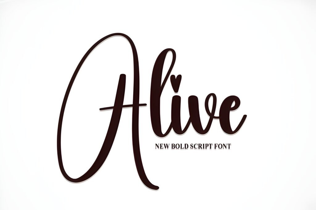
Best partner: Qedysans
Use as: Cover hook
Expert take: Alive is a great “hook font” — clean, energetic, and built for quick reading.
Pair it with Qedysans so your post remains scannable. This combo is especially strong for carousels where each slide has a mini headline.
The more your audience can scan, the more they swipe. The more they swipe, the more Instagram pushes it.
Project example (Post): Carousel: “Stop doing this” (Alive) + “Here’s why” details (Qedysans).
Project example (Story/Reels): Reel cover: “Before / After” (Alive) + “Swipe to see” (Qedysans).
Save/Share trigger: Save if you make educational carousels. Share with someone who wants more swipes.
10) Kindred Youth Font
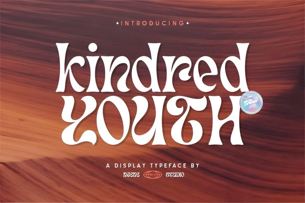
Best partner: Inno
Use as: Headline
Expert take: Kindred Youth has that playful, friendly vibe that works great for lifestyle, fun brands, and creators who want “approachable”.
Pair it with Inno so the rest stays clean. The key here is contrast: fun headline + clean structure.
That combo creates designs that feel easy and “scroll-stoppable” without being messy.
Project example (Post): Carousel cover: “Content ideas” (Kindred Youth) + list in Inno.
Project example (Story/Reels): Story promo: “New post!” (Kindred Youth) + “Tap to read” (Inno).
Save/Share trigger: Save if your brand is playful/cute. Share with someone who runs a small creative business.
11) Happiest Font
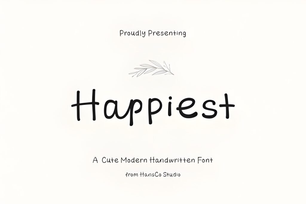
Best partner: Qedysans
Use as: Sticker headline
Expert take: Happiest is a “mood booster” font. It makes posts feel friendly and bright — perfect for promos, announcements, and fun content.
Pair it with Qedysans so you can still deliver clear information (prices, details, steps). Cute sells when it stays readable.
Think: happy headline, clean details, strong contrast.
Project example (Post): Promo post: “Sale Today” (Happiest) + discount details (Qedysans).
Project example (Story/Reels): Story: “Free download” (Happiest) + “Tap the link sticker” (Qedysans).
Save/Share trigger: Save if you run promos often. Share with someone who posts cute product stickers.
12) Qedysans Font
Best partner: Seraphim
Use as: Body / Details
Expert take: Qedysans is the underrated hero of this list — it’s the font that makes everything else work.
If you post carousels, you need a readable body font. Qedysans is smooth, modern, and scannable.
Pair it with a stronger headline font like Seraphim (editorial) or Sunday Eighties (fun) and your system is done.
Project example (Post): Carousel slide text: 3–5 short lines in Qedysans (high contrast, generous line spacing).
Project example (Story/Reels): Story checklist: “3 steps” in Qedysans + headline in Seraphim.
Save/Share trigger: Save if you write a lot of text on slides. Share with anyone who struggles with readable carousels.
13) Beauty Story Font
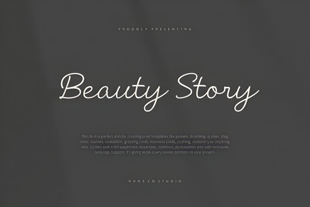
Best partner: Inno
Use as: Headline
Expert take: Beauty Story is made for soft luxury brands — beauty, skincare, lifestyle, feminine coaching, boutique shops.
Pair it with Inno to keep your details modern and sharp. This combo makes your content look premium without being cold.
The best use: clean background, one elegant headline, short subtitle, and lots of space.
Project example (Post): Quote: “Glow season” (Beauty Story) + “3 simple habits” (Inno).
Project example (Story/Reels): Story promo: “New routine” (Beauty Story) + “Tap to save” (Inno).
Save/Share trigger: Save if you create beauty/lifestyle content. Share with a friend who loves premium feminine aesthetics.
14) Inno Font
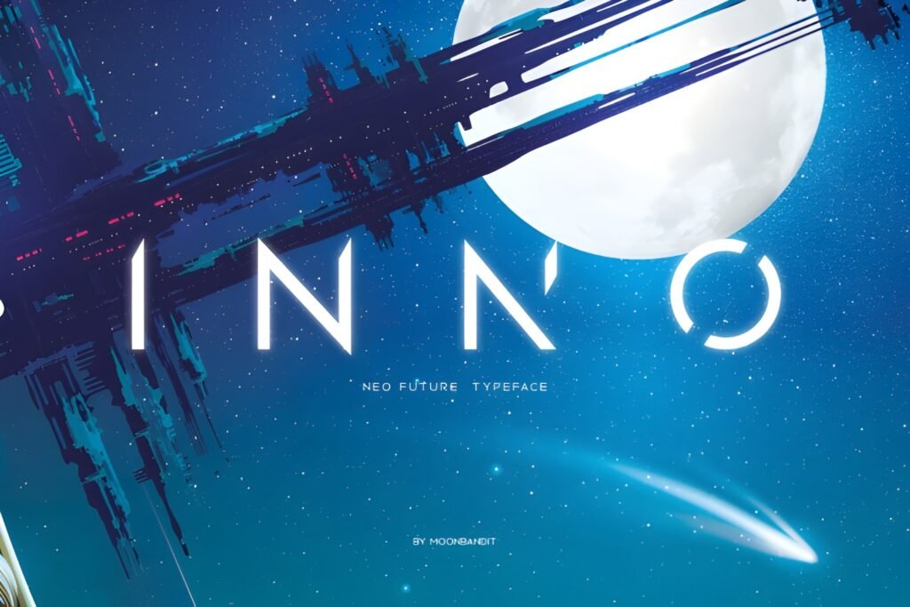
Best partner: Potery Script
Use as: Body / Details
Expert take: Inno is the “make it clear” font. It’s perfect for subtitles, bullets, pricing, and tiny captions.
Pair it with a decorative headline like Potery Script or Beauty Story and your content looks premium and readable.
If you do carousels, Inno can be your default body font.
Project example (Post): Carousel: headings in Potery, body steps in Inno (easy to scan, easy to save).
Project example (Story/Reels): Story offer: “New offer” headline (Potery) + “Ends tonight” (Inno).
Save/Share trigger: Save if you want a “go-to” body font. Share with someone who writes lots of text on slides.
15) Cogley Font
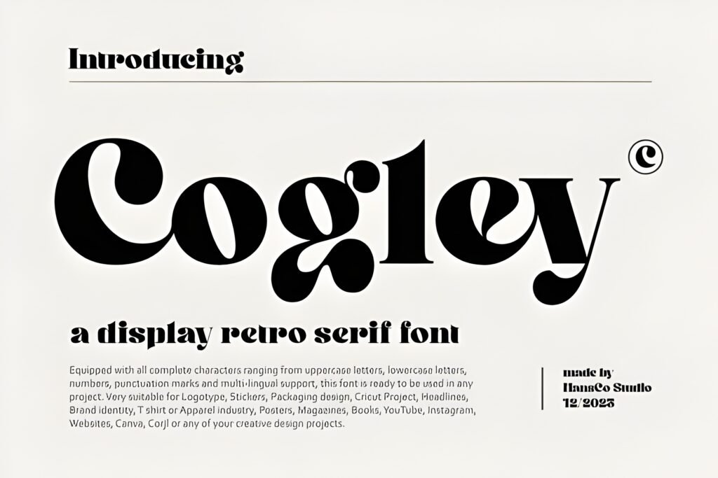
Best partner: Monogram Handwriting
Use as: Body + captions
Expert take: Cogley is the calm, reliable font you use when you want the design to feel clean and timeless.
It pairs beautifully with handwritten accents like Monogram Handwriting. Handwritten adds personality; Cogley adds structure.
Together they feel warm, human, and professional — which is perfect for creators who want trust and conversions.
Project example (Post): Quote: “Small steps daily” (Monogram) + “Save this for later” (Cogley).
Project example (Story/Reels): Story: “Quick update” (Monogram) + “Full post is live” (Cogley).
Save/Share trigger: Save if you want a clean caption font that still feels friendly. Share with a creator who loves handwriting aesthetics.
Didn't find what you were looking for?
Use the search below to explore more options on Creative Fabrica.
Expert Conclusion: A Pairing System Beats Random Fonts
The fastest way to upgrade your Instagram design isn’t chasing new fonts — it’s building a repeatable system:
headline font + body font + spacing + contrast. Choose 2–3 pairings from this list and repeat them across carousels and covers.
Consistency builds brand memory. Brand memory builds trust. Trust builds clicks.
If you want an easy starter system: use Seraphim + Qedysans for educational carousels, Potery Script + Inno for premium offers,
and Sunday Eighties + Qedysans for clicky Reels covers. That trio covers most creators.
All 15 Fonts (Quick “Open” List)
FAQ
1) How many fonts should I use per Instagram post?
Two is ideal: one headline font + one body font. More fonts usually reduce clarity and consistency.
2) What’s the best pairing for carousels?
Use a strong headline font (Seraphim / Young Morin) + a readable body font (Qedysans / Inno).
3) What pairing works best for Reels covers?
Sunday Eighties + Qedysans is great for clicky covers. Keep the title 2–4 words for readability.
4) How do I make fonts look “luxury”?
Use space + contrast. Luxury is usually quiet: short headlines, neutral backgrounds, and clean body text.
5) How often should I change my font pairing system?
Not often. Use the same 2–3 pairings for 2–4 weeks. Consistency builds recognition and trust.