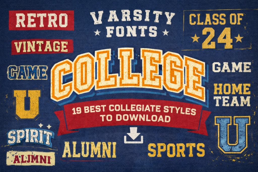
Varsity lettering is supposed to feel instant: bold, confident, and unmistakably collegiate. The problem is that the wrong varsity font can look cramped, too wide, or unreadable at thumbnail size.
Below is my designer-curated list of varsity fonts with practical use-cases. Pick a mood, download a few options, and build faster templates for jerseys, logos, posters, and merch.
Affiliate Disclosure: This post contains affiliate links. If you click and download a font, I may earn a commission at no extra cost to you. I only include items that fit the varsity/collegiate design use-case.
Jump to:
- Quick comparison table
- My method (how I choose)
- The 19 varsity font picks
- Styling cheat sheet (make varsity type look pro)
- Extra picks & smart alternatives
- Conclusion
- FAQ
- Open list (all links)
Fonts in this list:
- Varsity Football Team Font
- Varsity Team Font
- Brown College Font
- College Retro Font
- College Black Font
- Varsity Grubby Font
- Cheer Varsity Font
- Varsity Vintage Font
- Grungejersey Regular Font
- University Font
- Golden Varsity Font
- Jersey Retro Grunge Font
- Varsity Signature Font
- Senior Varsity Font
- School Varsity Font
- Sports Varsity Font
- Varsity Spirit Font
- Bold Ball Font
- College Block Font
Quick comparison table
Shortlist here, then jump to the full blocks for examples and designer tips.
| Font | Style keyword | Vibe | Best for | Link |
|---|---|---|---|---|
| Varsity Football Team Font | athletic varsity font | Football, game-day bold | posters, merch, team headers | Download |
| Varsity Team Font | collegiate varsity font | Versatile team branding | club logos, banners, templates | Download |
| Brown College Font | classic collegiate | Heritage campus | alumni, campus events, editorial | Download |
| College Retro Font | vintage varsity font | Throwback retro | retro flyers, stickers, headers | Download |
| College Black Font | varsity font black | Dark, punchy | bold tiles, dark-mode promos, merch | Download |
| Varsity Grubby Font | distressed varsity font | Grunge + worn-in | streetwear, rugged posters, vintage athletics | Download |
| Cheer Varsity Font | varsity letters font | Cheer + spirit | pep rally posts, cheer flyers, chants | Download |
| Varsity Vintage Font | vintage varsity font | Classic vintage | heritage badges, retro merch, labels | Download |
| Grungejersey Regular Font | distressed varsity font | Jersey + grit | numbers, matchday promos, rugged branding | Download |
| University Font | best varsity fonts | Clean university classic | institutional headers, clubs, certificates | Download |
| Golden Varsity Font | varsity font bold | Championship / trophy | finals promos, awards, premium merch | Download |
| Jersey Retro Grunge Font | distressed varsity font | Retro + grunge combo | retro sports branding, apparel, posters | Download |
| Varsity Signature Font | signature accent | Signature accent | player names, collabs, highlight posts | Download |
| Senior Varsity Font | senior year | Senior season | senior night, class tees, yearbook art | Download |
| School Varsity Font | school spirit | Friendly school pride | spirit week, PTA events, school clubs | Download |
| Sports Varsity Font | athletic varsity font | All-sports athletic | logos, jerseys, event promos | Download |
| Varsity Spirit Font | spirit lettering | High-energy spirit | chant tiles, school socials, sticker packs | Download |
| Bold Ball Font | varsity font bold | Playful bold sports | kids teams, rec leagues, fun branding | Download |
| College Block Font | varsity font block | Clean block classic | initials, monograms, grid-perfect wordmarks | Download |
My method: how I choose varsity fonts
I don’t pick varsity type from a preview alone. I test it like a system—because most “college” designs live across many formats: a logo, a poster, a hoodie graphic, and a set of social tiles.
- Silhouette first: It should read as varsity from a distance.
- Spacing test: I type a long school name and a short chant. If either breaks, I move on.
- Numbers check: If you need jersey numbers, I test “00”, “11”, and “88” immediately. Those combos expose weird spacing fast.
- Alphabet coverage: For badges and monograms, confirm you have what you need from the varsity font alphabet (your full varsity font ABC for headings and short chants).
- Texture control: Clean for institutional work; distressed varsity font styles for rugged merch; vintage varsity font styles for heritage looks.
- Pairing plan: Varsity for headlines, a neutral sans for details. That keeps the design readable and conversion-friendly.
My repeatable shortcut: I build one master layout (solid + outline + shadow variations) and swap different varsity letters font options until the vibe locks in.
The 19 varsity font picks
Each block includes chips (vibe/level/best-for/quick note), two examples, a save/share trigger, and a download button.
Varsity Football Team Font
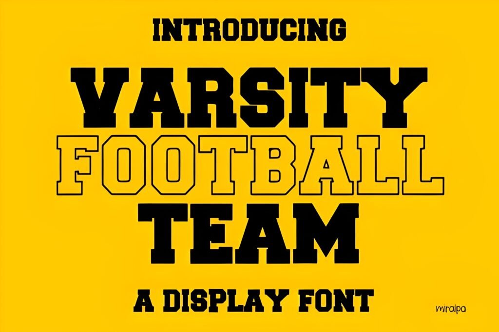
Level: Beginner
Best for: posters, merch, team headers
Quick note: Outline it for a jersey patch vibe.
When I need instant game-day credibility, I start with this athletic varsity font direction and keep the message short. Add a simple outline or shadow in your design app and it reads like real kit lettering.
- Example A: Friday-night poster: team name + big number, then date/venue in a clean sans.
- Example B: T-shirt front: city/mascot stack with a two-digit number underneath.
Save/Share: Save it for fast sports graphics where readability matters more than tricks.
Download it and test “HOME TEAM 00” in your layout—opens in a new tab.
Varsity Team Font
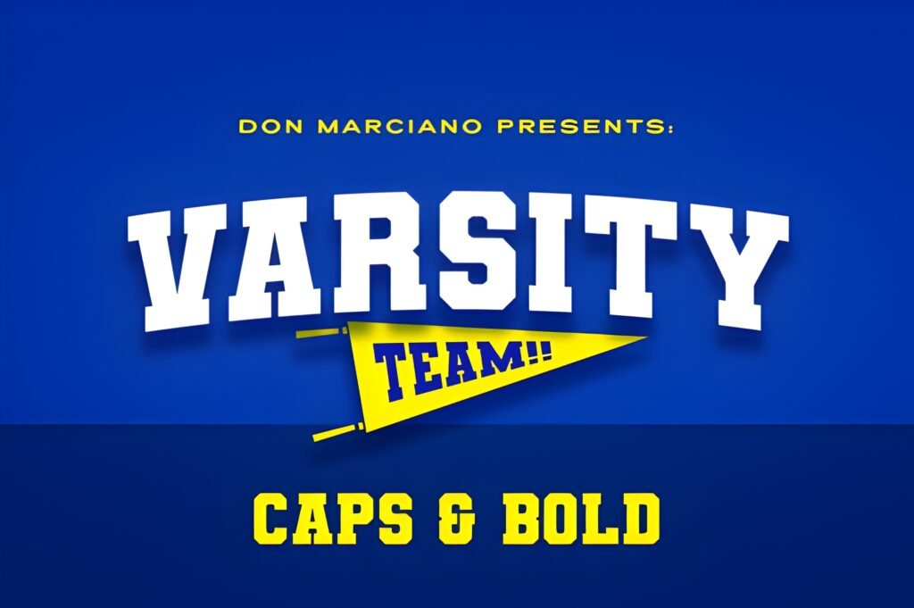
Level: Beginner–Intermediate
Best for: club logos, banners, templates
Quick note: Pair with a condensed sans for details.
I keep one “default” collegiate varsity font for repeat work, and this is the type of pick that fits. It’s a solid base for a system: wordmark, badge, and social templates that stay consistent.
- Example A: Bracket template: headings in this font, stats in a neutral sans for clarity.
- Example B: Minimal badge: initials centered, school name around, simple border shape.
Save/Share: Bookmark it if you build reusable layouts for teams or leagues.
Download it and check logo + banner consistency fast—opens in a new tab.
Brown College Font
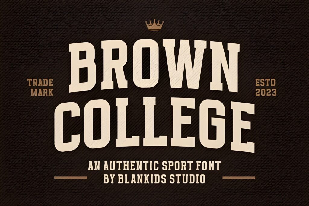
Level: Intermediate
Best for: alumni, campus events, editorial
Quick note: Best with warm, minimal palettes.
Not every varsity project should shout. For a more established, traditional mood, I use a heritage college style like this and let spacing and composition do the work.
- Example A: Alumni weekend poster: strong headline, then a clean schedule list below.
- Example B: Sweatshirt graphic: arched name, class year centered, small crest icon.
Save/Share: Save this for school branding that needs respect and clarity.
Download it and set a long school name to test spacing—opens in a new tab.
College Retro Font
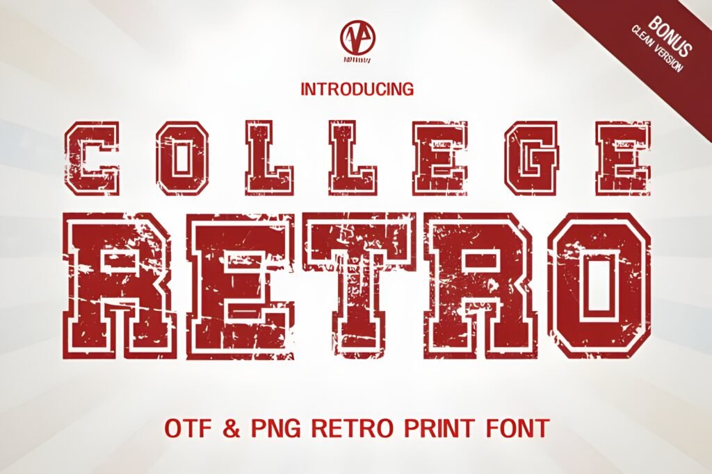
Level: Beginner
Best for: retro flyers, stickers, headers
Quick note: One hero word + one subline works best.
If you want nostalgia without heavy distress, a college retro style is a safe win. I keep layouts simple—retro type looks best when it’s the main event.
- Example A: Campus party flyer: big headline, curved subhead, then date/location in a thin sans.
- Example B: Sticker phrases: “HOME TEAM” or “GAME DAY” with simple frames and stars.
Save/Share: Share this pick with anyone designing throwback merch or posters.
Download it and try one outlined hero word—opens in a new tab.
College Black Font
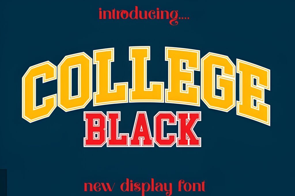
Level: Beginner–Intermediate
Best for: bold tiles, dark-mode promos, merch
Quick note: Strong “varsity font black” feel.
When the brief is “make it hit harder,” I lean into a darker, heavier look and keep everything else clean. Use tight palettes and sharp alignment so the weight feels premium, not messy.
- Example A: Black-on-cream poster: headline here, then minimal rules and icons for balance.
- Example B: Monochrome hoodie: bold wordmark chest, small motto or coords on sleeve.
Save/Share: Save it for night-game promos and high-contrast social graphics.
Download it and test a high-contrast layout quickly—opens in a new tab.
Varsity Grubby Font
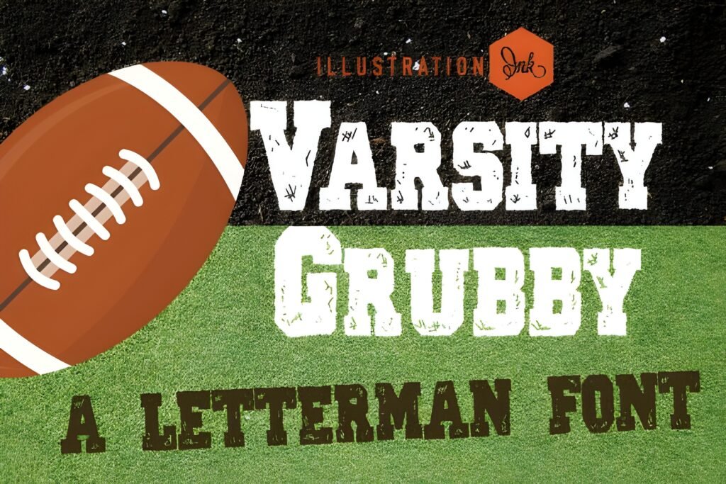
Level: Intermediate
Best for: streetwear, rugged posters, vintage athletics
Quick note: A true distressed varsity font headline.
I use grubby, distressed varsity fonts when I want “played hard” energy fast. The trick is balance: let the headline be rough, but keep the supporting text clean and small.
- Example A: Streetwear tee: one distressed word, then a clean “EST.” line beneath.
- Example B: Grunge poster: distressed headline, big number backdrop, clean info bar.
Save/Share: Save this as your texture option for merch drops and gritty campaigns.
Download it and compare clean vs distressed headlines—opens in a new tab.
Cheer Varsity Font
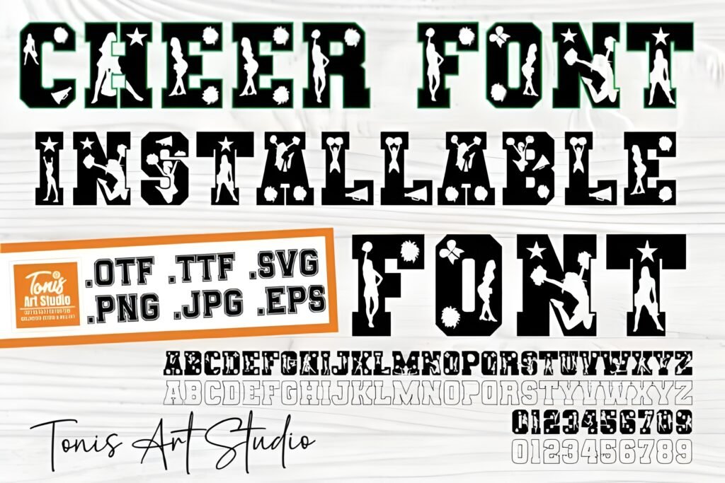
Level: Beginner
Best for: pep rally posts, cheer flyers, chants
Quick note: Short chants + outlines look great.
Cheer design needs energy, not heaviness. I like this style for upbeat school spirit graphics—stack short words, outline them, and you get a readable tile even on a phone.
- Example A: IG story set: “GO TEAM” hero, then a slide with time/location and a CTA.
- Example B: Megaphone sticker: one word outlined with spark shapes around it.
Save/Share: Save it for spirit season—quick wins for social packs.
Download it and build a 5-slide chant pack—opens in a new tab.
Varsity Vintage Font
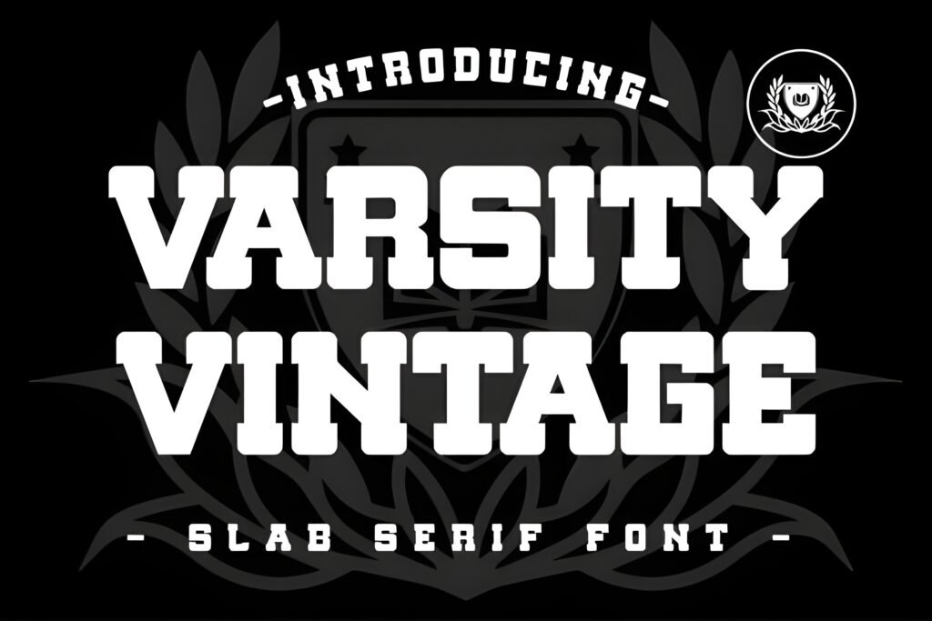
Level: Beginner–Intermediate
Best for: heritage badges, retro merch, labels
Quick note: Strong vintage varsity font mood.
When a client asks for “classic college,” I reach for a vintage varsity direction and keep the composition badge-like. Pair it with a calm serif or neutral sans so the headline feels intentional.
- Example A: Badge logo: arched name, mascot icon, year + motto in small supporting type.
- Example B: Retro label: big headline, thin border, then tiny product details.
Save/Share: Bookmark it if you’re building evergreen templates that won’t date fast.
Download it and sketch a badge-style arc headline—opens in a new tab.
Grungejersey Regular Font
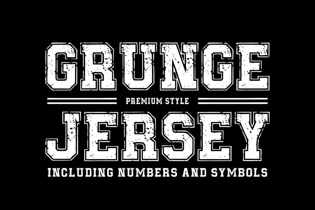
Level: Intermediate
Best for: numbers, matchday promos, rugged branding
Quick note: Always test numerals first.
For a locker-room feel, a grunge-jersey style adds character quickly. I use it large, then keep dates, venues, and sponsor lines in clean type for scanability.
- Example A: Matchday poster: huge number, team name across, then clean info blocks.
- Example B: Thumbnail: one bold word, clean subtitle, strong photo crop.
Save/Share: Save it for jersey-driven layouts where texture is part of the story.
Download it and check numerals 0–9 for jersey use—opens in a new tab.
University Font
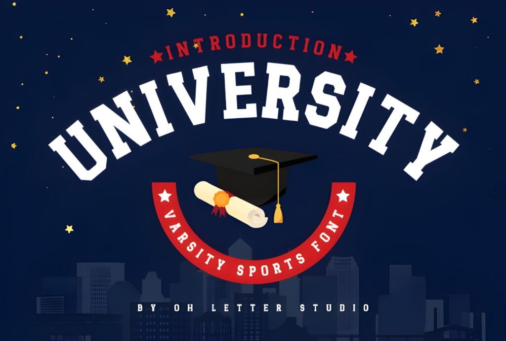
Level: Beginner
Best for: institutional headers, clubs, certificates
Quick note: A safe “best varsity fonts” baseline.
A dependable university font is the fastest way to get a varsity look that works everywhere. If you’re unsure which direction to pick, start here, build the layout, then swap styles if needed.
- Example A: Certificate header: university name headline, thin rule, recipient name in serif.
- Example B: Club logo: initials centered in a badge shape with simple dividers.
Save/Share: Save this as your baseline for quick drafts and scalable templates.
Download it as your baseline, then swap styles later—opens in a new tab.
Golden Varsity Font
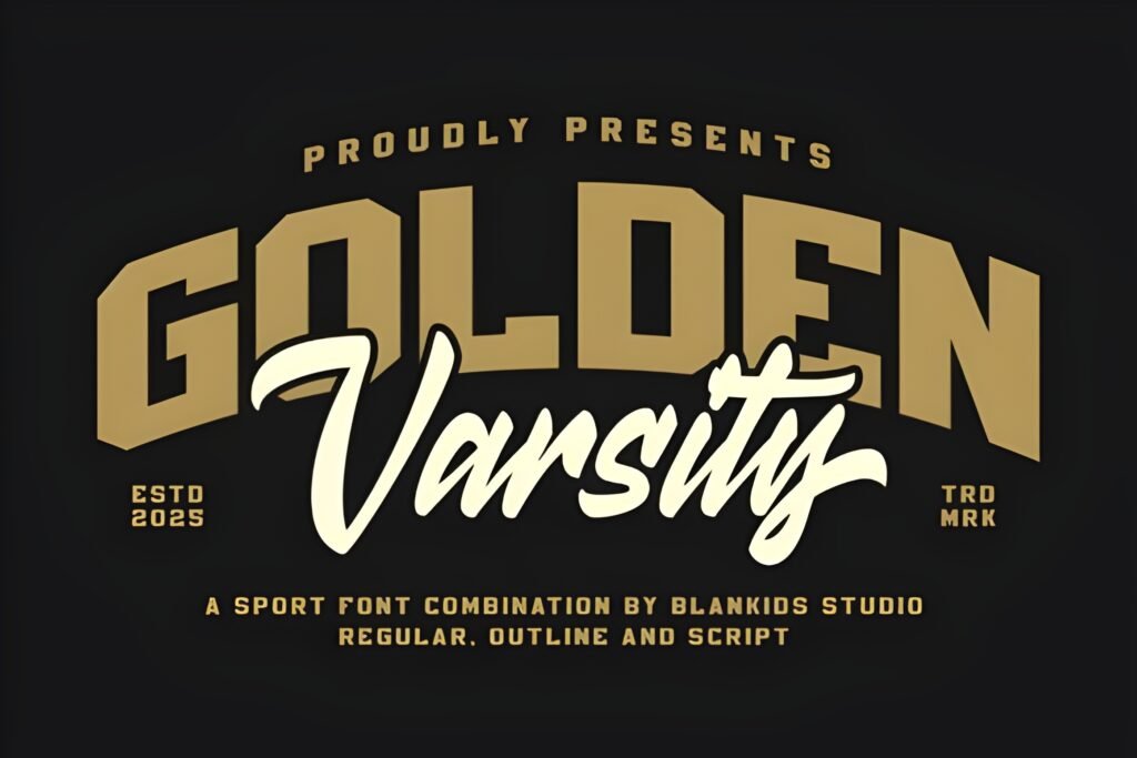
Level: Intermediate
Best for: finals promos, awards, premium merch
Quick note: Add metallic feel in the design layer.
When the theme is victory, I want typography that feels celebratory. A bold varsity direction pairs well with clean layouts—one strong headline, one supporting line, done.
- Example A: Championship poster: headline plus a gold-style effect applied in your artwork.
- Example B: Award badge: “MVP” hero, laurel icon behind, event name in small caps.
Save/Share: Save it for finals season and any “winner” campaign.
Download it and try a simple “CHAMPIONS” layout—opens in a new tab.
Jersey Retro Grunge Font
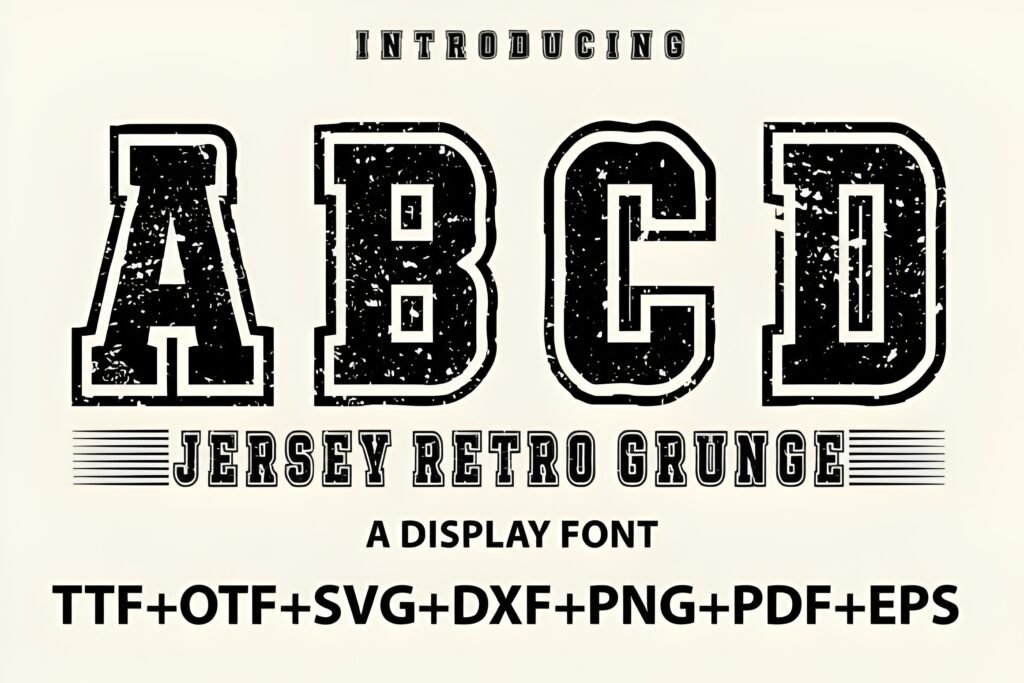
Level: Intermediate
Best for: retro sports branding, apparel, posters
Quick note: Use 2 main colors to control noise.
Retro plus grit gives instant authenticity. I use this for limited drops and throwback campaigns—then keep palettes tight so the texture doesn’t overwhelm the design.
- Example A: Jersey mockup graphic: team name, number below, simple stripe element.
- Example B: Vintage event poster: distressed headline, clean blocks for date/venue/tickets.
Save/Share: Save this for capsule collections where “history” is the vibe.
Download it and try a two-color retro poster layout—opens in a new tab.
Varsity Signature Font
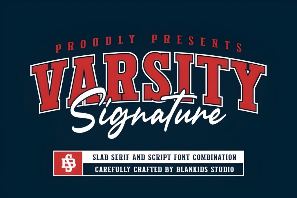
Level: Intermediate–Advanced
Best for: player names, collabs, highlight posts
Quick note: Use as a second line under block type.
A signature-style varsity font is my favorite contrast tool. Use it once—under a block headline or beside a badge—so your design feels custom without losing athletic energy.
- Example A: Player spotlight: team name bold, then surname in this signature style.
- Example B: Collab tee: headline up top, signature line beneath, small crest on sleeve.
Save/Share: Save it if you like mixing styles—signature accents upgrade templates fast.
Download it and use it as a signature accent line—opens in a new tab.
Senior Varsity Font
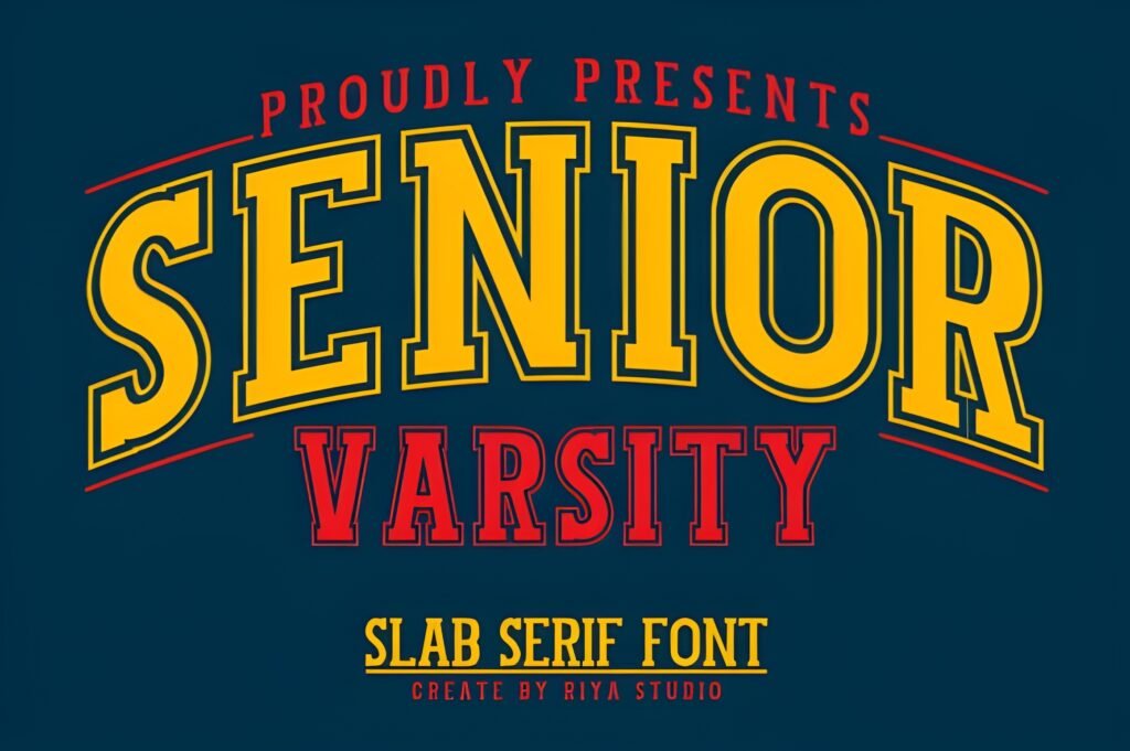
Level: Beginner
Best for: senior night, class tees, yearbook art
Quick note: Built for big years and numbers.
Senior-themed designs repeat every year, so I keep a dedicated senior varsity option ready. It’s ideal when the year or jersey number needs to be the visual hero.
- Example A: Senior banner: “SENIOR” headline, name below, large number backdrop.
- Example B: Class tee: “CLASS OF ____” stacked with school name and a simple icon.
Save/Share: Save it for seasonal school work—fast reuse, consistent results.
Download it and mock up “CLASS OF ____” fast—opens in a new tab.
School Varsity Font
Level: Beginner
Best for: spirit week, PTA events, school clubs
Quick note: Prioritize readability over effects.
For community-facing projects, I keep the varsity vibe straightforward. This kind of school style works well on posters and flyers where the audience needs to scan quickly.
- Example A: Spirit week poster: day names in this font, activities in a clean sans.
- Example B: Fundraiser flyer: bold headline, 3 bullets, clear CTA and contact line.
Save/Share: Save it for broad audiences—students, parents, staff, all at once.
Download it and build a clean schedule poster—opens in a new tab.
Sports Varsity Font
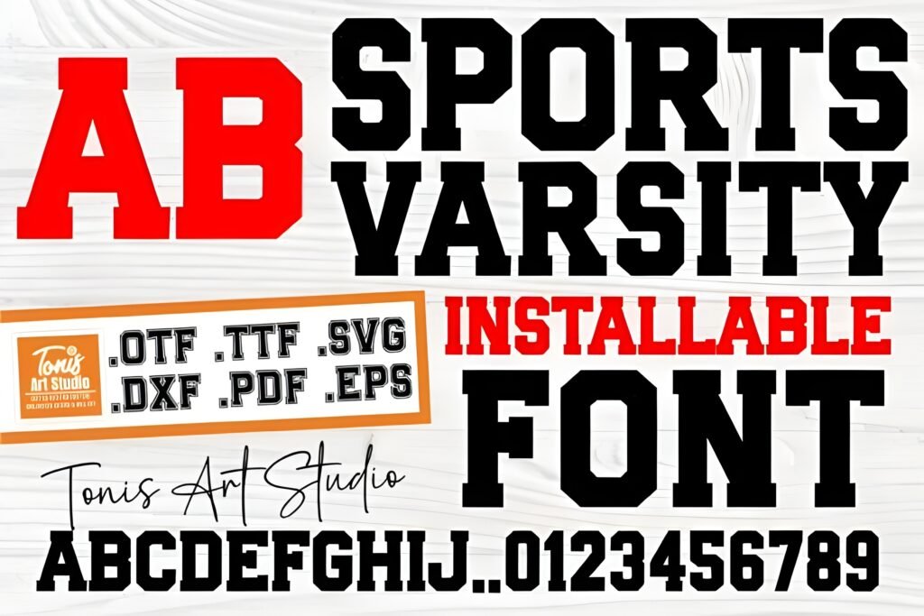
Level: Beginner–Intermediate
Best for: logos, jerseys, event promos
Quick note: A flexible athletic varsity font.
When one brand system must cover multiple sports, I avoid overly specific styles. A general sports varsity option stays consistent across camps, leagues, and school athletics.
- Example A: Camp hero header: headline here, short subhead, then CTA buttons below.
- Example B: Logo lockup: arched team name with centered initials or number and dividers.
Save/Share: Save it as your multi-sport default for scalable branding.
Download it and test across multi-sport templates—opens in a new tab.
Varsity Spirit Font
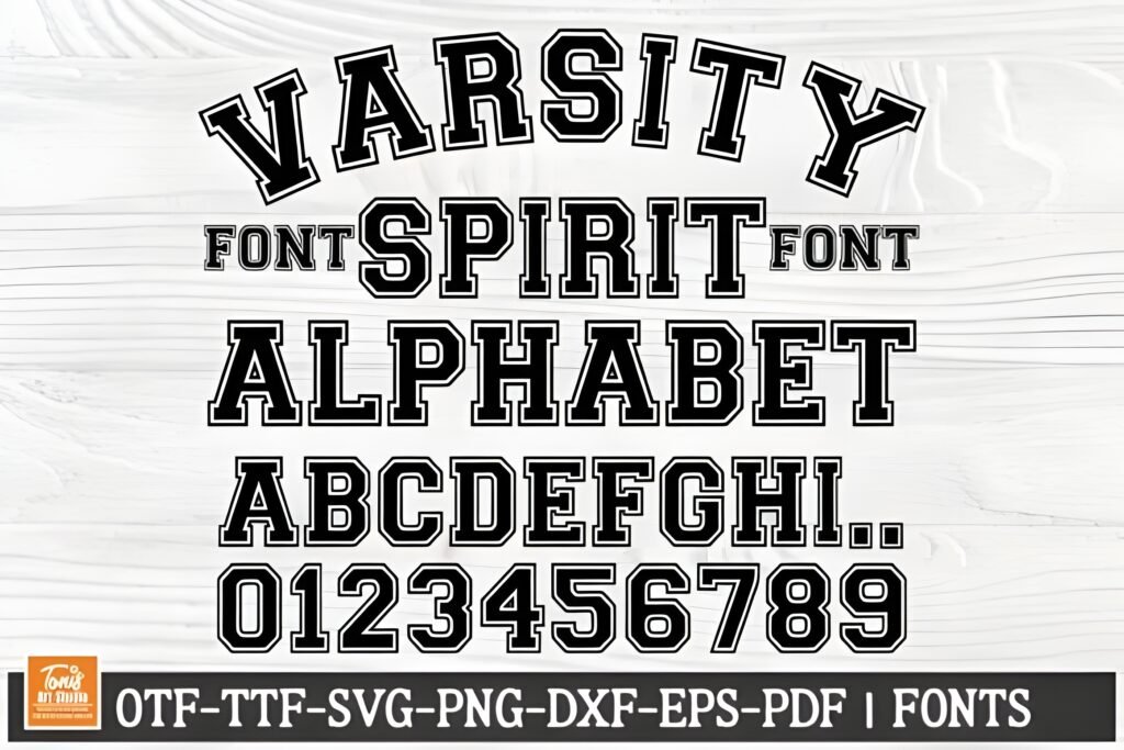
Level: Beginner
Best for: chant tiles, school socials, sticker packs
Quick note: Keep it 1–3 words per tile.
Spirit graphics are about momentum: big words, quick reads, high contrast. I place this style inside simple shapes (ribbons, starbursts) to make swipeable packs that feel loud and clear.
- Example A: Chant set: “DEFENSE” and “LET’S GO” as separate tiles with bold outlines.
- Example B: Sticker: one word + thick border, plus tiny spark elements.
Save/Share: Save it for social packs—spirit typography performs well in stories.
Download it and create 1–3 word story tiles—opens in a new tab.
Bold Ball Font
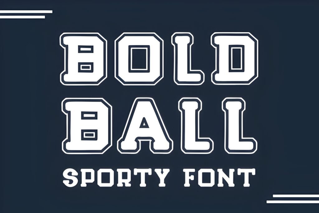
Level: Beginner
Best for: kids teams, rec leagues, fun branding
Quick note: A softer varsity font bold option.
Not every sports design should feel intense. I use a friendlier bold style for youth leagues and community tournaments—strong enough to read, playful enough to feel welcoming.
- Example A: Kids tournament poster: friendly headline, bright blocks, clear date/venue.
- Example B: Playful logo: short name + simple ball icon + small tagline.
Save/Share: Save it for lighter briefs where you still need strong varsity letters.
Download it and test a friendly logo lockup—opens in a new tab.
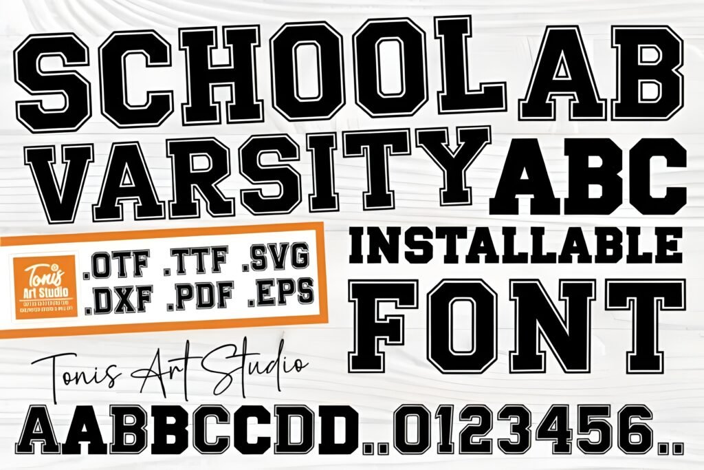
College Block Font
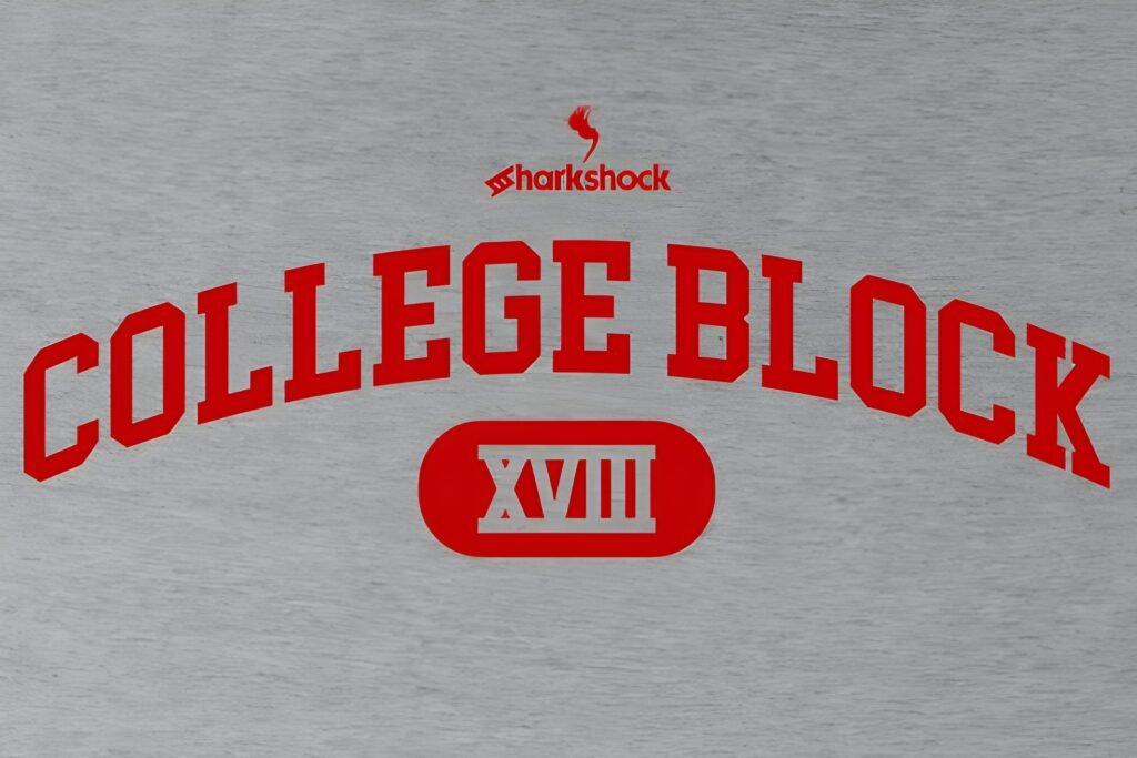
Level: Beginner
Best for: initials, monograms, grid-perfect wordmarks
Quick note: The go-to varsity font block look.
Block varsity letters are the backbone of team branding. I use this style when I want something that aligns perfectly on a grid and stays readable at any size.
- Example A: Monogram badge: 2–3 initials inside a shield, then add an outline in design.
- Example B: Banner headline: big block word, then a clean sans subhead for details.
Save/Share: Save this as your foundation font for consistent, fast templates.
Download it for a grid-perfect block wordmark—opens in a new tab.
Didn't find what you were looking for?
Use the search below to explore more options on Creative Fabrica.
Styling cheat sheet: make varsity fonts look pro
If you’re a creative designer, the font choice is only half the result. The other half is how you build the system around it—spacing, hierarchy, and a few repeatable effects that work across posters, apparel, and digital tiles.
My 5-minute varsity test (I do this before I commit)
- Type three strings: a long name, a short chant, and a number combo. Example: “WESTFIELD ACADEMY”, “GO TEAM”, “00”.
- Check silhouette at small size: zoom out until the headline is thumbnail-sized. If it still reads, it’s a keeper.
- Push tracking slightly: most varsity fonts need a touch more space between letters to feel athletic instead of cramped.
- Test the varsity font alphabet use-case: if you need initials, monograms, or a full varsity font ABC for multi-post templates, confirm the characters you need on the font page before you build 20 assets.
- Choose your “detail font” now: keep your body text clean (neutral sans) so your varsity headline stays the hero.
Outline recipe (the one that makes varsity type feel “real”)
- Layer 1 (Fill): your main color.
- Layer 2 (Inner stroke): thin stroke in a darker or lighter tone to add edge definition.
- Layer 3 (Outer stroke): thicker stroke that creates the patch/jersey look.
- Optional shadow: subtle drop shadow for posters; avoid heavy shadows for print-on-apparel.
This approach works especially well with a varsity font block style or a heavier varsity font bold option because the shapes stay stable when you add strokes.
When to go clean vs distressed
- Clean collegiate varsity font: best for institutional work, readable schedules, certificates, and any design that must scale down.
- Vintage varsity font: best for heritage badges, retro merch, and editorial-style campus graphics.
- Distressed varsity font: best for streetwear, rugged posters, and throwback athletics. Keep supporting text clean so the design remains scannable.
Color control (so your design doesn’t look “template-y”)
- Use a 2-color system: one main color + one accent, plus a neutral. This keeps varsity layouts sharp and fast.
- Varsity font black look: black + warm off-white is a classic combo for premium contrast. Add a single accent (gold, red, or blue) only if needed.
- Don’t texture everything: if the type is distressed, keep the background cleaner. If the background is noisy, keep the type clean.
Pairing suggestions (simple, reliable, and readable)
| Varsity headline vibe | Best pairing for details | Where it shines |
|---|---|---|
| Clean collegiate | Neutral sans (regular weight) | schedules, tickets, event promos |
| Vintage / heritage | Simple serif or calm sans | badges, labels, editorial campus posters |
| Distressed / grunge | Condensed sans for tight info | streetwear, rugged matchday posters |
| Spirit / cheer | Bold sans for numbers + labels | story packs, chant tiles, sticker sets |
Export tip (so you don’t lose the font later)
For client handoff or print, I outline the headline text in my design file once it’s approved. That keeps the varsity letters consistent even if the font isn’t installed on another machine. For web previews, export a crisp PNG at 2x size so the shapes stay sharp.
Extra picks & smart alternatives
- Outline in the design layer: One font can become three logo variations (solid, outlined, shadowed).
- Use simple shapes: Shields, circles, ribbons, and stripes make varsity type feel “real.”
- Keep small text clean: Stats, addresses, and schedules convert better in a neutral sans.
- Control noise: If your headline is distressed, keep the background clean (and vice versa).
Conclusion
Varsity fonts work because they’re simple, confident, and instantly recognizable. The fastest way to get a strong result is to pick the right mood (clean, vintage, distressed, or spirit-driven), keep your layout structured, and let the headline do its job.
If you only download a few: keep one clean collegiate default, one varsity font block for grid-perfect logos, and one distressed option for merch. That trio covers most real-world briefs.
FAQ
What makes varsity fonts different from normal block fonts?
Varsity fonts borrow from athletic lettering: bold geometry, strong presence, and fast readability. They’re designed to feel like team identity, not generic typography.
Should I choose a clean collegiate varsity font or a distressed varsity font?
Clean styles are safer for institutional work and small sizes. Distressed styles are better for rugged merch and vintage-athletics moods. If readability is critical, go clean and add texture in the design layer.
Do varsity fonts include a full varsity font alphabet and numbers?
Often yes, but not always. If you need a complete varsity font alphabet (or a full varsity font ABC for headings), open the product page and confirm the characters you need—especially numerals for jersey designs.
How do I make varsity letters look authentic on a logo?
Use composition: arched name, centered initials or number, a badge shape, and consistent spacing. Authenticity comes from structure more than effects.
Can I use these fonts for client work and merch?
Check the license on the product page before commercial use, especially for print-on-demand and resale items.
What’s the quickest way to test “best varsity fonts” for my project?
Download 2–3 options, set your real team/school name plus “00”, then compare readability at thumbnail size. The best choice is the one that stays clear with minimal adjustments.
Open list: all varsity font links
If you want to browse fast, here are all items in one place:
- Varsity Football Team Font
- Varsity Team Font
- Brown College Font
- College Retro Font
- College Black Font
- Varsity Grubby Font
- Cheer Varsity Font
- Varsity Vintage Font
- Grungejersey Regular Font
- University Font
- Golden Varsity Font
- Jersey Retro Grunge Font
- Varsity Signature Font
- Senior Varsity Font
- School Varsity Font
- Sports Varsity Font
- Varsity Spirit Font
- Bold Ball Font
- College Block Font