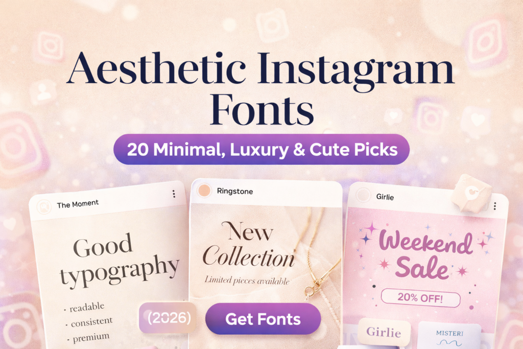
If your content is good but your feed still looks “random”, it’s usually not your photos — it’s your typography system.
I test fonts the same way I test Reels covers: if it doesn’t read fast on the grid, it’s out.
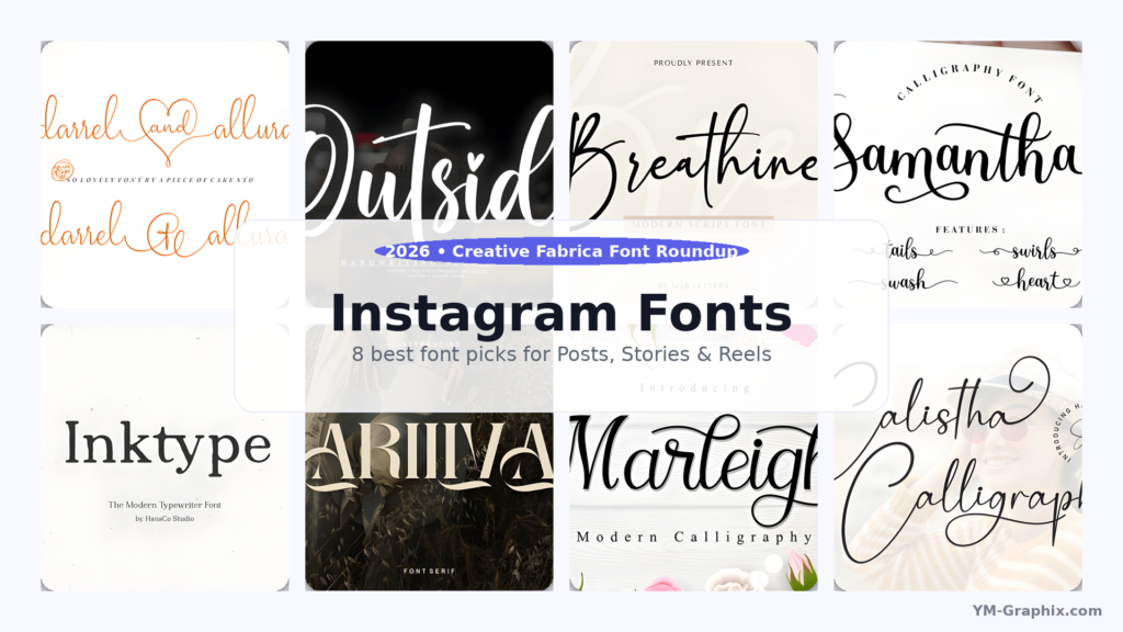
Below are 20 aesthetic Instagram fonts with my expert notes, real usage examples, and a centered ⬇ Download button under each.
Affiliate Disclosure
Some links are affiliate links. If you download through them, I may earn a commission at no extra cost to you.
Thanks for supporting my work.
Trademark note: Names like “Disney” may be trademarks of their owners. This post is not affiliated with or endorsed by any brand mentioned.
My “premium feed” rule: one hero font for headlines + one calm font for body text.
Add whitespace and contrast — and your feed instantly looks more expensive.
Jump to:
Quick Comparison Table (Pick Your Vibe in 10 Seconds)
This is the “fast lane”. If you don’t want to read everything, pick your vibe and use the matching font block below.
My advice: choose one main vibe for your feed (minimal / luxury / cute) and one accent vibe (handwritten / bold).
| Font | Vibe | Best for | Grid test | My take |
|---|---|---|---|---|
| The Moment | Minimal | Carousels, quotes, clean covers | Excellent | My #1 “safe” pick |
| Ringstone | Luxury | Boutique branding, launches | Very good | Instant premium feel |
| Balton Stencil | Bold | Reels cover titles | Excellent | Clicks love readable covers |
| Butter Donat | Cute | Promos, stickers, fun posts | Good | Cute but still clear |
| Misteri | Support | Subtitles, body text | Excellent | Best pairing partner |
How I Choose Fonts for Instagram (My Expert Method)
Here’s the exact process I use before I commit to a “feed font system”. It’s simple, fast, and it’s built for results — not just aesthetics.
- The grid test: I shrink the cover to thumbnail size. If the headline isn’t readable in 2 seconds, I change the font or shorten the words.
- Contrast rule: pretty colors are nice, but readable contrast makes people stop and click. Dark text on light backgrounds (or the opposite) wins.
- Two-font system: one hero (headline) + one calm support (subtitles/body). Most feeds look messy because people use 4–6 fonts.
- Whitespace is design: spacing is the secret sauce. The same font looks cheap when crowded — and expensive when it has room to breathe.
- Consistency beats novelty: I’d rather use two fonts all month than switch fonts every post. Consistency creates trust, saves, and follows.
My quick recommendation:
Start with The Moment for your base (clean) and add Ringstone or Adelia Signature as a luxury accent.
For Reels covers, add Balton Stencil for readability.
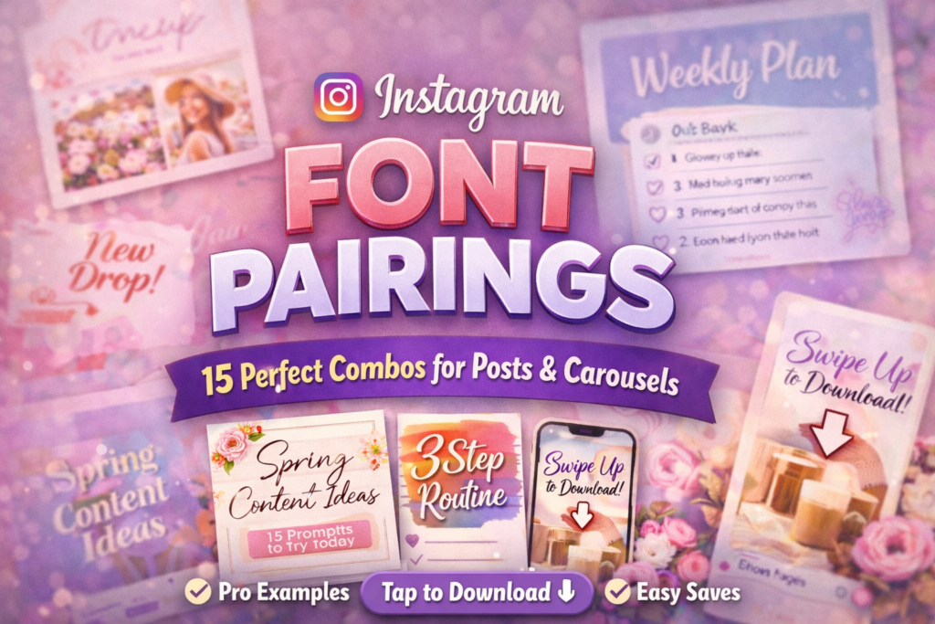
Easy Font Pairing Rules (So Every Post Looks Designed)
Pairing fonts is like styling an outfit: if the jacket is loud, keep the shoes simple. Same with fonts.
Decorative headline + calm supporting text is the combo that looks professional.
- Rule #1: If your headline font is decorative (script/cute), keep your body font minimal (Misteri / Outbreak / Cornelia).
- Rule #2: Use size + spacing for hierarchy, not extra fonts.
- Rule #3: Reels cover titles should be 2–4 words. Short titles get more clicks from the grid.
- Rule #4: Don’t mix two decorative fonts. One decorative font is a “feature”, two is a fight.
20 Aesthetic Instagram Fonts (Expert Reviews + Examples + Download Buttons)
Each font below includes: my honest expert opinion, a real example you can copy, a tiny layout recipe, and a centered ⬇ Download button.
1) The Moment Font
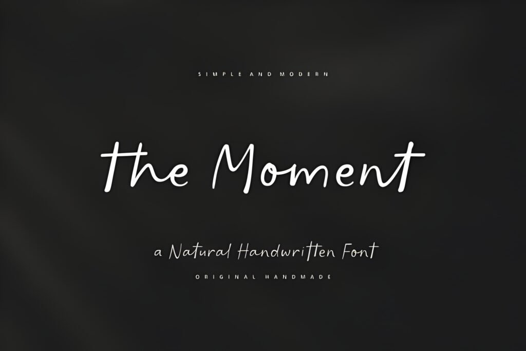
Best for Carousels
High readability
Expert take: If I had to pick one font to build a clean Instagram brand around, I’d start here.
The Moment gives that “designer template” look without trying too hard. It’s minimal, modern, and it stays readable when people view your post on a small phone screen.
That readability is what turns casual scrollers into saves — and saves turn into growth.
Example use: Carousel cover: “5 Instagram Design Mistakes” + subtitle: “Fix these today”.
Try this layout: Big headline (2–4 words) → smaller subtitle → lots of whitespace → one accent line.
Pairing tip: The Moment (headline) + Misteri (body/subtitles) = clean system.
2) Ringstone Font
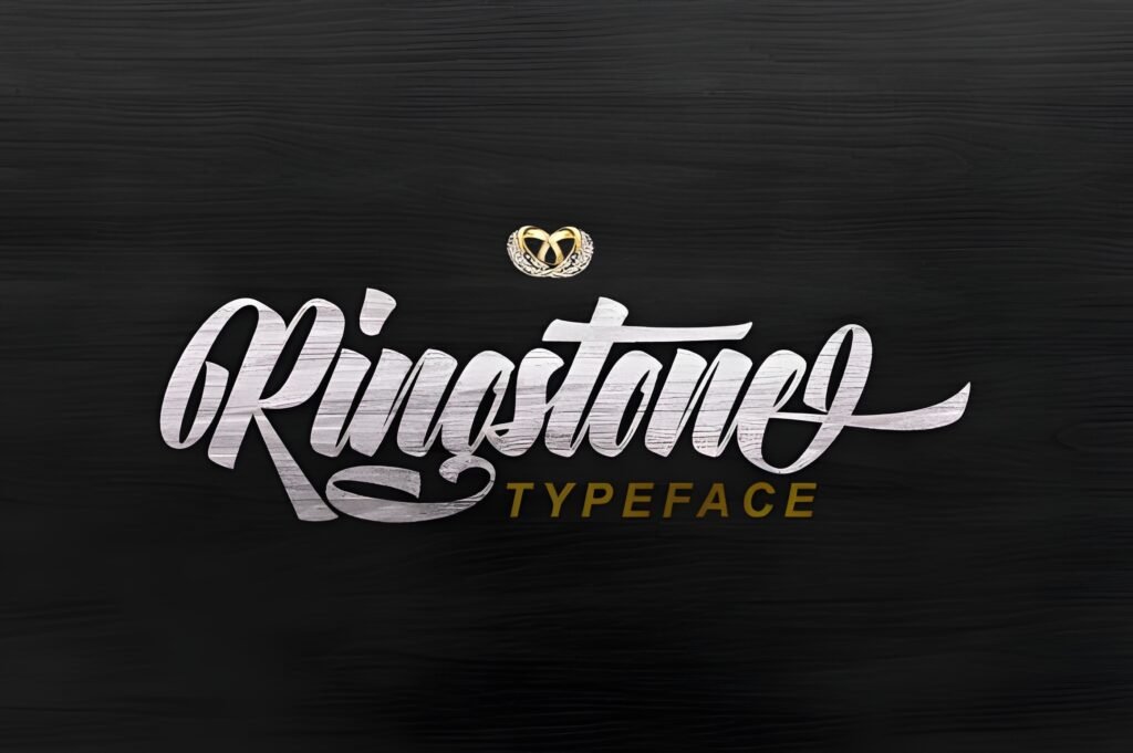
Best for Launches
Premium vibe
Expert take: Ringstone is the font I use when I want something to look expensive instantly.
It has that boutique/editorial personality that makes even a simple “New collection” post feel like a brand campaign.
If you sell anything — services, presets, products — luxury typography can lift perceived value. That helps conversion.
Example use: Product post: “New Collection” + small line: “Limited pieces available”.
Try this layout: Headline centered → thin divider line → small details → CTA sticker in Stories.
Pairing tip: Ringstone + Cornelia (clean details) looks very “high-end”.
3) Disney Font
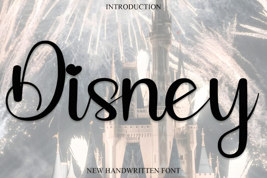
Themed posts
Stories + Highlights
Expert take: This is not your everyday minimal font — it’s a “special occasion” font.
I love fonts like this for themed posts, kids content, seasonal campaigns, or playful Reels covers. It grabs attention because it feels nostalgic and story-like.
Used strategically (not on every post), it becomes a memorable style “moment” — and memorable moments drive shares.
Example use: Story template: “Magic Day” + small line: “Behind the scenes”.
Try this layout: Big playful word → add sparkles/stars → keep details in a clean font below.
Pairing tip: Disney (headline) + Outbreak (details) keeps it readable.
4) Amanda Birth Flower Duo Font
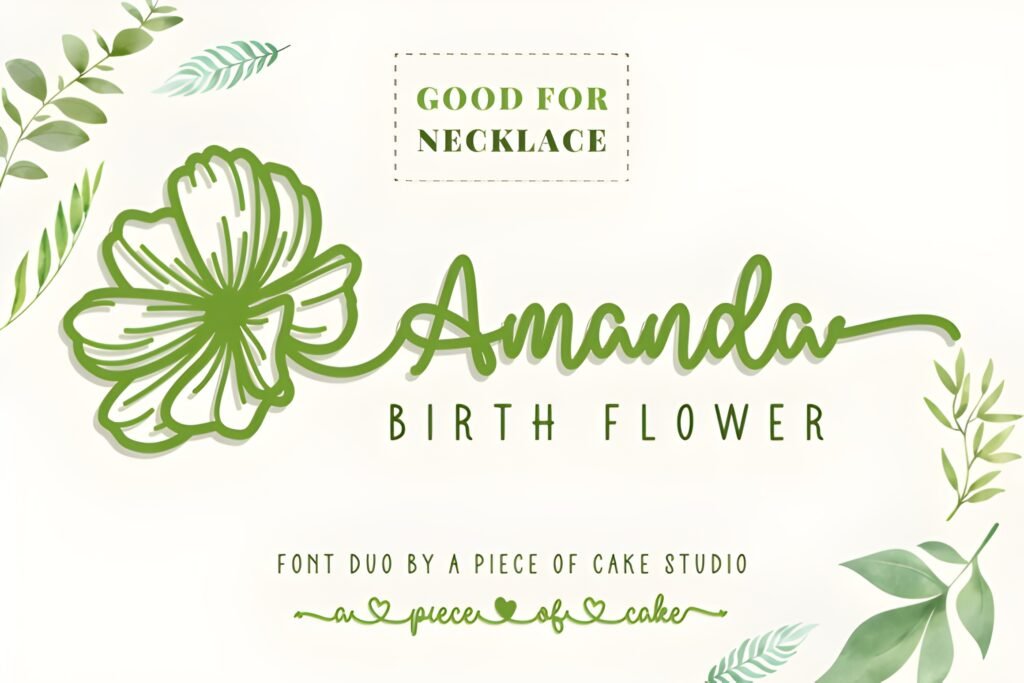
Feminine branding
Gift / Craft vibes
Expert take: Decorative floral fonts are a cheat code for “pretty”.
Amanda Birth Flower Duo is especially useful when you want your post to feel handcrafted, thoughtful, and feminine — without looking childish.
It’s great for creators in beauty, journaling, wedding content, crafts, and small business packaging aesthetics.
Example use: Highlight cover set: “Skincare • Tips • Reviews” with a simple floral icon.
Try this layout: Decorative headline → thin line → clean bullet list in Misteri.
Pairing tip: Amanda Duo + Misteri keeps the design balanced.
5) Hilton Fontain Font
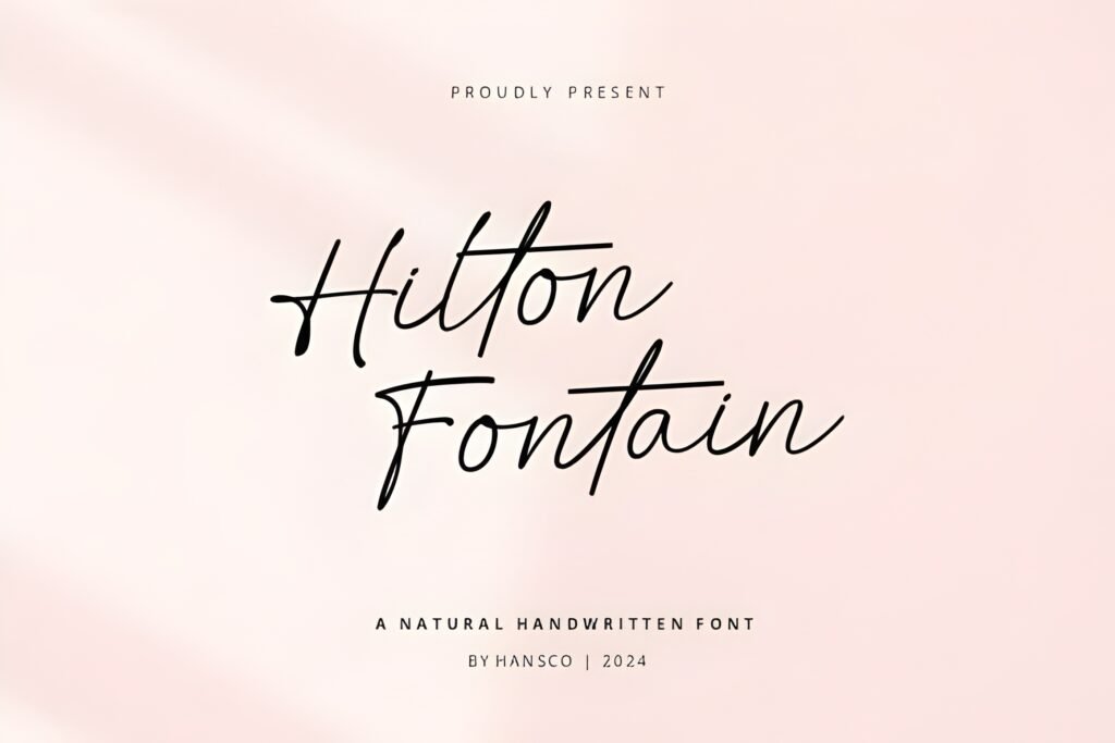
Beauty / Boutique
Elegant quotes
Expert take: Hilton Fontain is the “quiet luxury” type.
It doesn’t scream. It whispers. And that’s exactly what premium brands do.
Use it for calm, elegant posts where the spacing and the mood do the selling — the font just makes it feel refined.
Example use: Quote post: “Quiet confidence.” on a clean neutral background.
Try this layout: Headline top-left → big whitespace → tiny caption bottom-right.
Pairing tip: Hilton Fontain + Cornelia is a classy system.
6) Shikia Font
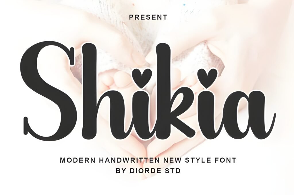
Fashion / Lifestyle
Clean + premium
Expert take: Shikia is a stylish modern luxury vibe — perfect when you want premium without looking old-school.
I like it for fashion, beauty, lifestyle, creators who sell digital products, and anyone building a personal brand that wants to feel “editorial”.
It’s the type of font that makes a simple layout feel intentional.
Example use: Reels cover: “Outfit Formula” + subtitle: “3 steps”.
Try this layout: Headline centered → subtitle in Outbreak → small logo mark.
Pairing tip: Shikia + Outbreak keeps it readable.
7) Balton Stencil Font
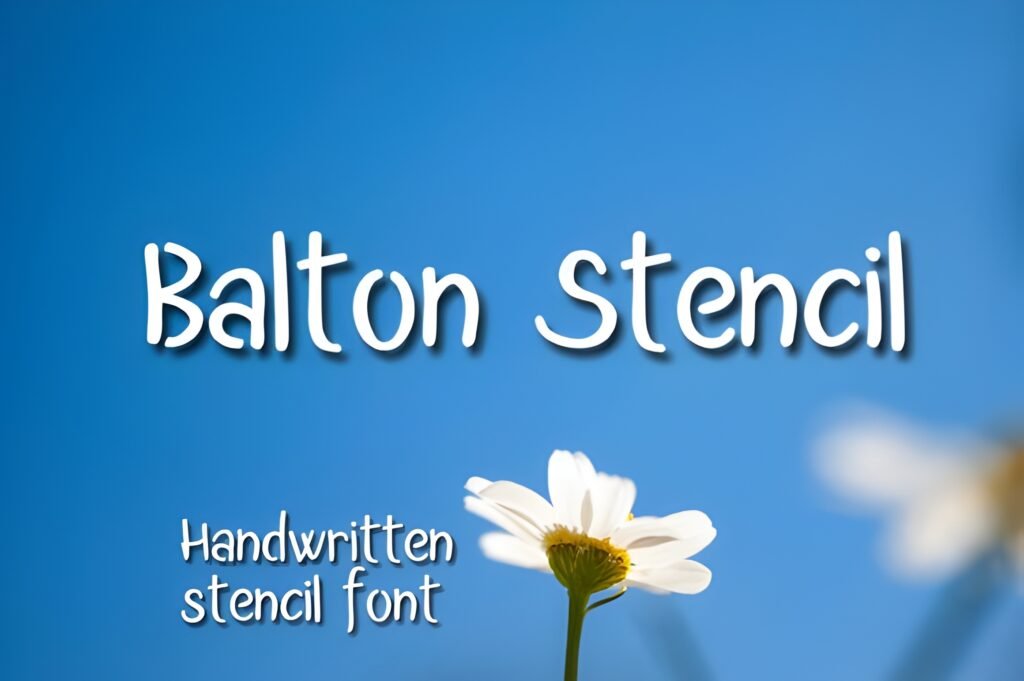
Best for Reels covers
Grid readability
Expert take: If you want more clicks on Reels, don’t underestimate cover typography.
Balton Stencil reads like a headline — and headlines are what get clicks from the grid. This is the “make it obvious” font.
When your audience knows what the Reel is about in one glance, they’re more likely to tap.
Example use: Reels cover: “3 Mistakes” + subtitle: “Fix this today”.
Try this layout: 2–4 word title → big contrast → one keyword highlighted with color.
Pairing tip: Balton + Cornelia keeps the subtitle classy.
8) Feeling Font
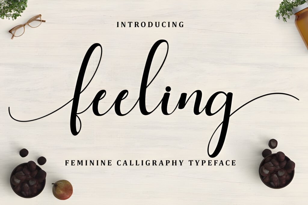
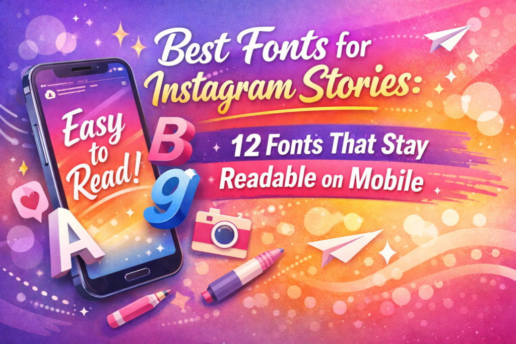
Stories
Warm + readable
Expert take: Feeling is my “safe handwritten” choice — warm, human, but not messy.
Use it when you want your content to feel personal, like a note from a friend. That emotional tone increases replies in Stories,
which boosts relationship with your audience (and relationship boosts conversion).
Example use: Story quote: “You’re doing better than you think.”
Try this layout: One sentence in Feeling → small “—your reminder” line in Misteri.
Pairing tip: Feeling + Misteri is cozy + clean.
9) Relationship Font
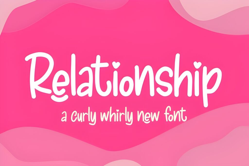
Quotes
Short headlines
Expert take: Relationship is a “soft luxury” script — emotional, premium, and perfect for short statements.
Here’s the key: don’t overuse it. One line is powerful. A whole paragraph becomes hard to read.
When used correctly, it feels like a boutique invitation — and that vibe sells.
Example use: Quote headline: “Soft life.” + small author line below.
Try this layout: One phrase → big whitespace → tiny footer line for context.
Pairing tip: Relationship + Cornelia = romance + clarity.
10) Misteri Font
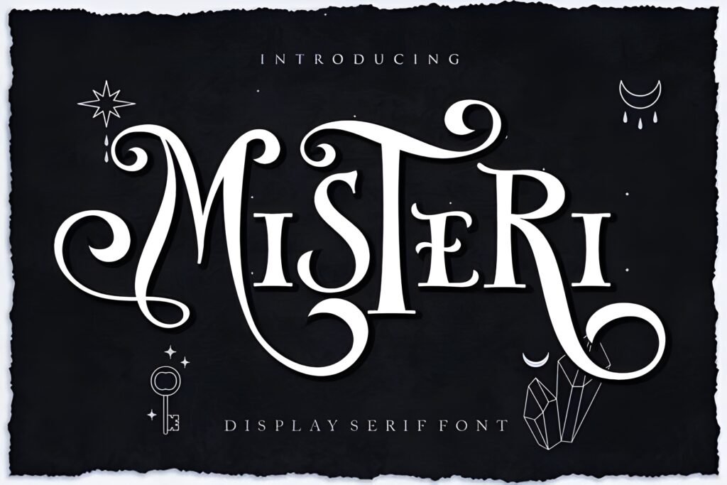
Body text
Pairs with everything
Expert take: Misteri is the best “supporting font” in this list. If you want your feed to look consistent,
you need a calm font that can handle subtitles, bullet points, pricing, and small details. Misteri does that.
It won’t steal attention — it will make your designs feel professional.
Example use: Carousel slide: 3–5 short lines of tips (high contrast, generous line spacing).
Try this layout: Headline font on top → Misteri bullets below → one CTA line at the bottom.
Pairing tip: Use Misteri under Ringstone, Shikia, Adelia, or Relationship.
11) Outbreak Font
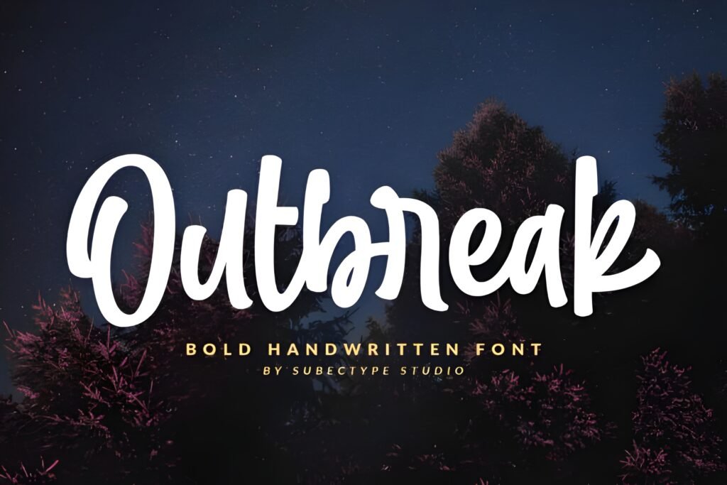
Educational posts
Save-worthy
Expert take: Outbreak is for creators who want people to actually read their content.
If you’re posting tips, tutorials, “how-to” slides, or mini-guides, readability is your conversion engine.
The easier it is to read, the more saves you get — and saves are basically Instagram saying “this is valuable”.
Example use: “Do this / Not this” carousel with clear labels and consistent spacing.
Try this layout: Title → 3 bullet tips → one “CTA” line: “Save this for later”.
Pairing tip: Outbreak + Ringstone (headline) looks premium + readable.
12) Girlie Font
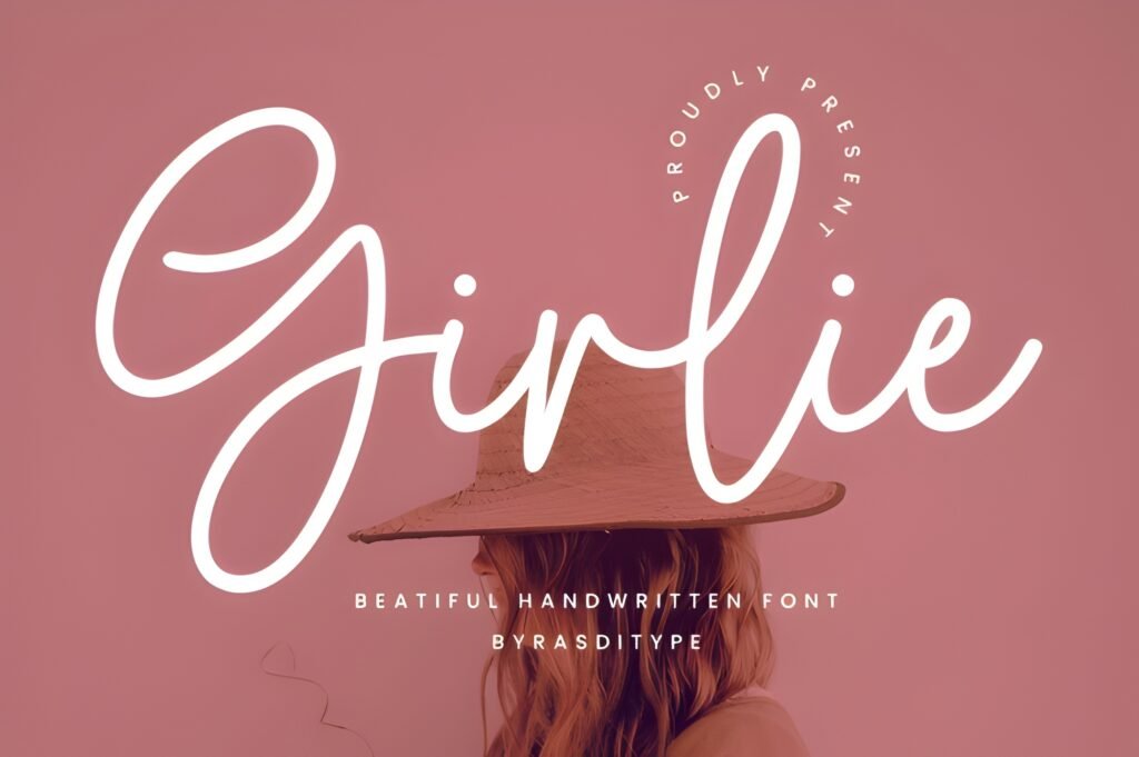
Small business
Stories
Expert take: Girlie is cute without being hard to read — and that’s rare.
I like it for playful labels (NEW, SALE, TODAY), Stories promos, and small business announcements.
It makes the brand feel approachable, which helps people click because it feels friendly, not corporate.
Example use: Story promo: “Weekend Sale” + price line in Misteri.
Try this layout: Girlie headline → clean price/offer line → simple sticker CTA.
Pairing tip: Girlie + Cornelia (details) = cute but clean.
13) Elliestone Script Font
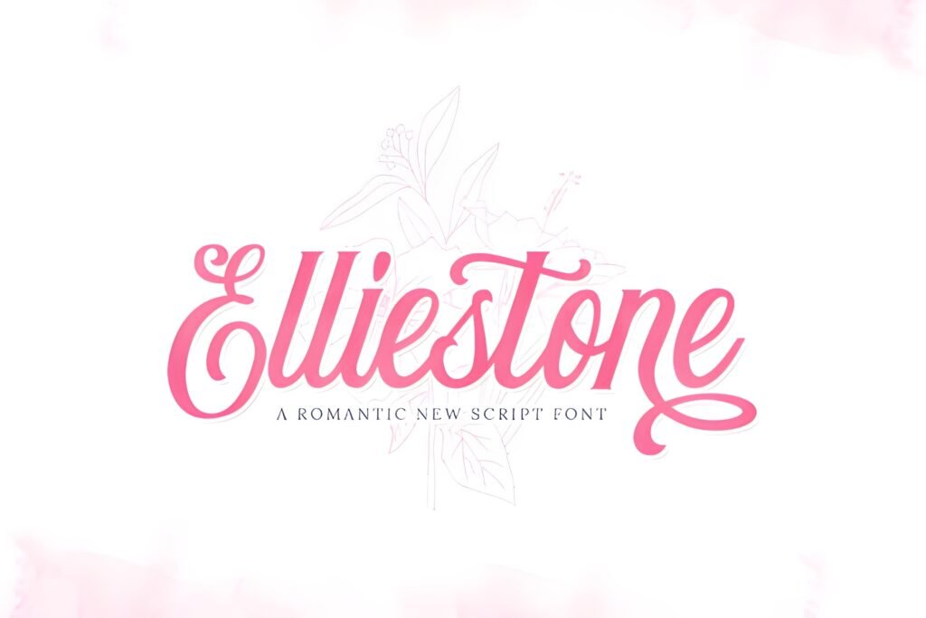
Aesthetic quotes
Accent font
Expert take: Elliestone is one of my favorite accent scripts because it feels modern, not overly “wedding”.
I use fonts like this as a single hero phrase — a headline, a hook, or a signature line.
That creates contrast: clean layout + one expressive phrase. Contrast is what makes people stop.
Example use: Quote headline: “Choose yourself.” + small line: “Save this”.
Try this layout: Script headline → minimal body text → tiny watermark in corner.
Pairing tip: Elliestone + Outbreak for readable supporting text.
14) Cornelia Font
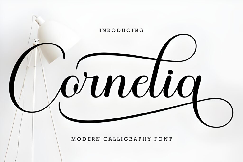
Brand posts
Clean system
Expert take: Cornelia is “quiet premium”. It’s the kind of font that looks expensive because it doesn’t try to be loud.
If you want your feed to feel curated, use Cornelia with neutral backgrounds, strong contrast, and lots of spacing.
It’s perfect for product brands, photographers, designers, and creators who want a clean signature style.
Example use: Brand statement: “Less, but better.” + small footer: “New post every Monday”.
Try this layout: Centered headline → tiny subtitle → thin divider line → logo mark.
Pairing tip: Cornelia + Adelia Signature makes branding feel personal.
15) Washington Calligraphy Font
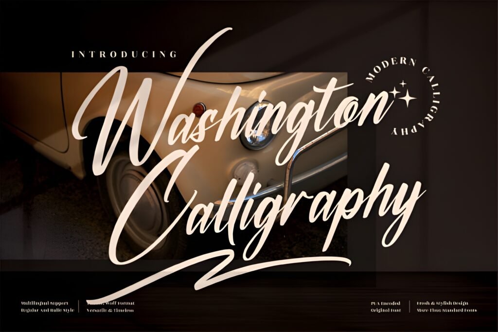
Elegant headlines
Short text only
Expert take: Washington Calligraphy is a classic elegant script. I’d use it when the vibe is romantic, premium, or ceremonial.
It’s especially good for wedding niches, beauty quotes, luxury lifestyle, and anything that benefits from a “handwritten elegance” mood.
Just keep it short — calligraphy fonts need space.
Example use: Quote: “Stay graceful.” + small line in Cornelia: “Save for later”.
Try this layout: Calligraphy headline → minimal caption → tiny handle watermark.
Pairing tip: Washington + Cornelia = elegant + readable.
16) Butter Donat Font
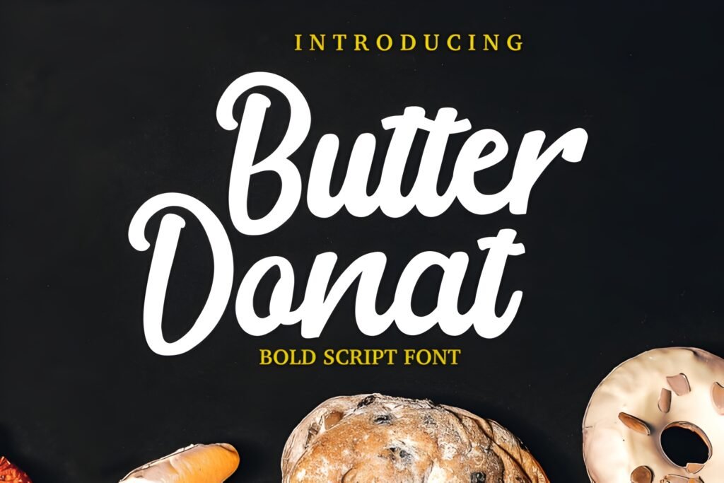
Promos
Sticker vibes
Expert take: Butter Donat is cute, bubbly, and memorable — my favorite “fun” pick in this list.
It’s great when you want your post to feel cheerful and approachable. That approachable vibe increases clicks because the content feels friendly.
Use it with clean backgrounds so it looks like a premium sticker, not a messy headline.
Example use: Product sticker: “New!” or “Limited” + details in Misteri.
Try this layout: Bubble headline → simple price line → CTA: “Tap to shop”.
Pairing tip: Butter Donat + Misteri = cute + clean.
17) Beprity Stencil Font
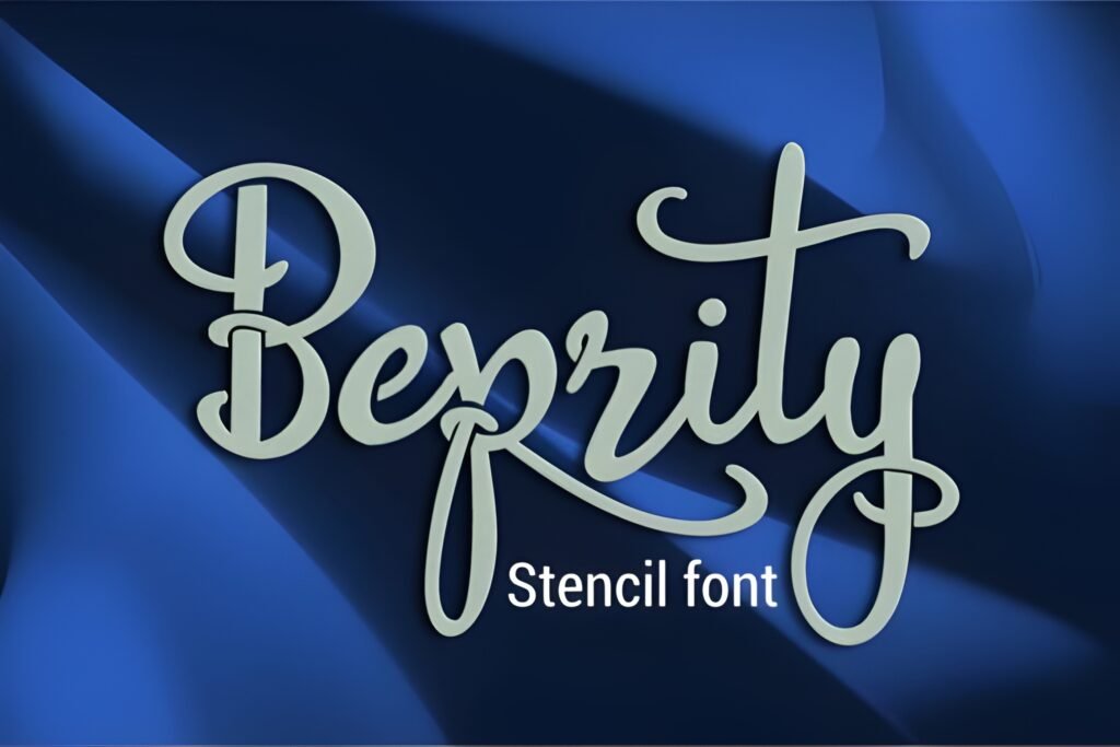
Reels titles
High impact
Expert take: Beprity Stencil is confident and modern. I like it when the title is the main hook:
“Do this”, “Stop doing that”, “3 mistakes”, “This changed everything”. Those hooks perform because they are instantly understood.
Pair it with a calm font and your cover becomes click-friendly.
Example use: Reel cover: “DO THIS” + subtitle: “for better reach”.
Try this layout: Bold title top → photo/video frame → subtitle bottom.
Pairing tip: Beprity + Cornelia keeps it clean and premium.
18) Dancing Candy Font
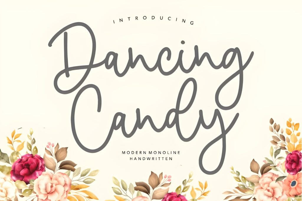
Highlights
Fun promos
Expert take: Dancing Candy is an “energy font”. It makes designs feel lively and youthful.
I use fonts like this for highlights covers, stickers, playful Stories, and fun promos. It’s great when you want the brand to feel friendly and approachable.
Keep the background clean and let the font be the fun element — that’s the difference between cute and chaotic.
Example use: Story sticker: “Let’s go!” or “New drop”.
Try this layout: Short playful phrase → one icon → details in Misteri below.
Pairing tip: Dancing Candy + Misteri keeps it readable.
19) My Ugly Handwritting Font
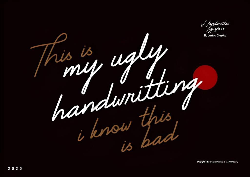
Meme-style
Relatable tone
Expert take: Imperfect fonts are powerful because they feel human.
My Ugly Handwritting works when you want content to feel honest, funny, or like a diary note — perfect for relatable creators, memes, behind-the-scenes posts,
or “quick reminder” Stories. Authenticity drives replies, and replies drive trust. Trust drives conversion.
Example use: Story: “Quick reminder: you’ve got this.” + tiny footer: “Save this”.
Try this layout: Handwritten line → simple underline → small clean caption.
Pairing tip: My Ugly Handwritting + Outbreak = authentic + readable.
20) Adelia Signature Font
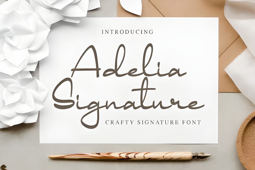
Personal branding
Logo-like accent
Expert take: Signature fonts are perfect for personal brands because they feel like a “name”.
Adelia Signature works best as an accent: a subtle watermark, a corner signature, a headline flourish, or a logo-like element.
That tiny detail can make your posts look branded — and branded posts convert better because they feel professional.
Example use: Corner mark: “by [Your Name]” on Reels covers or quote posts.
Try this layout: Minimal headline → signature in corner → small CTA line at bottom.
Pairing tip: Adelia Signature + Cornelia looks premium and clean.
Didn't find what you were looking for?
Use the search below to explore more options on Creative Fabrica.
Additional Fonts: More Styles for Variety (How to Use Them Without Ruining Your Aesthetic)
A lot of creators make one mistake: they find a cool font and then use it everywhere. The feed becomes noisy.
Here’s the smarter approach: use your “main system” (Minimal + Support) for 70–80% of content,
then use “seasonal” fonts (cute, playful, bold, themed) for special moments: launches, holidays, promos, milestones.
If you want variety without chaos, follow this rule: special fonts = headlines only. Keep details in Misteri/Outbreak/Cornelia.
That balance is what looks “designed”.
My favorite “system” combo:
- Base feed: The Moment (headline) + Misteri (body)
- Luxury posts: Ringstone (headline) + Cornelia (details)
- Reels covers: Balton Stencil (headline) + Outbreak (subtitle)
- Personal brand touch: Adelia Signature (accent) + Cornelia (body)
Expert Conclusion: Fonts Don’t Just Look Good — They Sell
Your typography isn’t decoration. It’s communication. It tells people what to look at, what matters, and what your brand feels like.
When your fonts are consistent, your feed feels trustworthy. When your covers are readable, your Reels get more clicks.
When your posts feel premium, people are more likely to buy.
If you want the simplest path: pick The Moment as your base, pair it with Misteri,
then add Ringstone for luxury moments and Balton Stencil for Reels cover readability.
That single system covers minimal, premium, and performance — without making your feed look messy.
My final advice: don’t chase “new fonts” every day. Chase a system you can repeat. Repetition is what creates a recognizable brand.
All 20 Fonts (Quick “Open” List)
- The Moment — open
- Ringstone — open
- Disney — open
- Amanda Birth Flower Duo — open
- Hilton Fontain — open
- Shikia — open
- Balton Stencil — open
- Feeling — open
- Relationship — open
- Misteri — open
- Outbreak — open
- Girlie — open
- Elliestone Script — open
- Cornelia — open
- Washington Calligraphy — open
- Butter Donat — open
- Beprity Stencil — open
- Dancing Candy — open
- My Ugly Handwritting — open
- Adelia Signature — open
FAQ (Quick Answers)
1) What are the best aesthetic Instagram fonts for a minimalist feed?
The Moment, Misteri, Outbreak, and Cornelia are strong minimal picks that stay readable and clean.
2) Which font is best for a luxury Instagram aesthetic?
Ringstone is my top luxury choice. Pair it with Cornelia for clean supporting text.
3) What fonts work best for Reels cover titles?
Balton Stencil and Beprity Stencil are built for thumbnail readability. Keep titles short (2–4 words).
4) How many fonts should I use per post?
Two fonts is ideal: one headline font + one supporting font. Spacing does the rest.
5) What’s the fastest way to make my feed look more professional?
Pick a consistent font system (The Moment + Misteri), use high contrast, and leave more whitespace.
6) Where can I download these fonts?
Use the ⬇ Download buttons under each font to open it on Creative Fabrica.
7) Can I mix cute fonts with luxury fonts?
Yes — but only if one is the headline and the other is minimal support. Don’t mix two decorative fonts together.